


Table of Contents
How to Edit Soft Dreamy Photos in Lightroom
You can get a soft, dreamy look in Lightroom with 10 controls and 3 steps. I’d keep the photo a bit brighter, lower contrast, pull down highlights, lift shadows, soften detail with Texture and Clarity, add a small amount of negative Dehaze, then finish with a light tone-curve fade and grain.
Here’s the whole idea in plain English:
- Step 1: Build a bright base with Exposure, Contrast, Highlights, Shadows, and White Balance
- Step 2: Soften the image with Texture, Clarity, and a small amount of Dehaze
- Step 3: Finish the mood with the Tone Curve and Grain
A few slider ranges from the article:
- Exposure:
+0.20 to +0.50 - Contrast:
−10 to −30 - Highlights:
−20 to −50 - Shadows:
+10 to +40 - Texture: around
−15 - Clarity: around
−10 - Dehaze:
−3 to −15 - Grain Amount: about
20–25
I’d also keep two rules in mind:
- Soft does not mean blurry
- Small moves work better than heavy edits
This style works best on portraits, backlit shots, window-lit rooms, pastel scenes, and RAW files with room in both bright and dark areas. If the photo was shot in hard midday sun or already looks hazy, I’d use a lighter touch.
Short version: brighten a little, flatten contrast a little, smooth detail a little, and stop before the image looks dull.
That’s the full workflow in one view, and it sets up the rest of the article well.
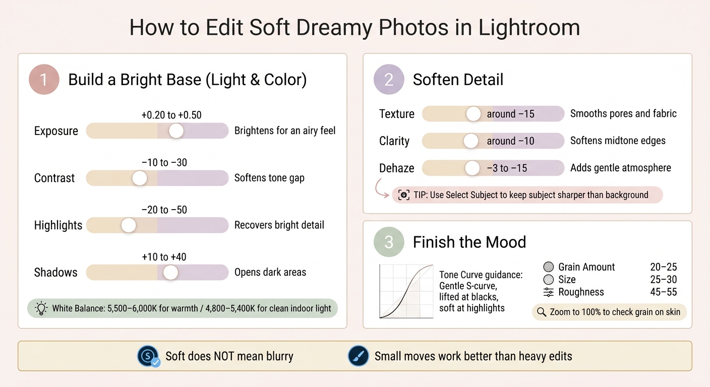
Soft Dreamy Lightroom Edit: 3-Step Workflow with Slider Values
How to Get That Dreamy Soft Look in Lightroom

sbb-itb-b27063b
Step 1: Set the Base Light and Color
Start with a bright, low-contrast base before you touch Texture or Clarity. Build light and color first.
Adjust Exposure, Contrast, Highlights, and Shadows
Begin with Exposure. A small bump - about +0.20 to +0.50 stops - is a good place to start for many dreamy edits. You want the photo to feel airy and bright, not blown out. Keep an eye on the histogram. If bright skin or sky starts to clip, back it off a bit.
Next, lower Contrast. Dropping it by around −10 to −30 softens the difference between light and dark areas and gets rid of that punchy, dramatic look that fights against a dreamy style. Keep things soft for now. You can bring shape back later with the Tone Curve.
Then adjust Highlights and Shadows together. Pull Highlights down to roughly −20 to −50 to bring back detail in bright spots like white clothes, skin, or open sky. Lift Shadows to about +10 to +40 to open up darker parts of the frame. This squeezes the dynamic range a bit and helps the image feel softer. Just don't go so far that the blacks turn gray and flat. A little depth still matters.
| Slider | Suggested Range | What It Does |
|---|---|---|
| Exposure | +0.20 to +0.50 | Brightens the whole image for an airy feel |
| Contrast | −10 to −30 | Softens the gap between tones |
| Highlights | −20 to −50 | Brings back detail in bright skin, skies, and fabric |
| Shadows | +10 to +40 | Opens darker areas without making them flat |
These base moves should feel light and restrained, not finished.
Set White Balance for a Warm or Neutral Mood
White balance does more to shape the mood than most people think. For outdoor portraits or golden-hour shots, set Temperature around 5,500–6,000K and Tint at +5 to +8 for warmth that makes skin look soft and glowy. For indoor lifestyle photos lit by a window, aim closer to 4,800–5,400K and keep Tint near neutral so whites stay clean and skin stays natural.
A simple way to start: use the White Balance Selector on something neutral, then nudge Temperature warmer or cooler based on the mood you want. If whites start looking yellow or the shadows go blue, bring the Temperature down.
Once the color looks natural, move on to softening detail in the next step.
Step 2: Soften Detail While Keeping the Subject Clear
Once your base light and color are in place, the next move is to soften detail and add a bit of atmosphere without making the whole photo fall flat. This is where Texture, Clarity, and Dehaze do most of the work.
Lower Texture and Clarity for a Smoother Look
Texture affects medium-size detail like pores, hair, and fabric weave. Pulling it down smooths those areas without wiping out the main shape of the image. Clarity changes midtone edge contrast, so lowering it softens the shift between light and dark across the frame.
For most dreamy edits, a solid starting point is Texture around −15 and Clarity around −10. Then adjust based on the photo in front of you. If skin starts to look plastic, ease up on Texture. On faces, pushing Texture past about −40 often starts to look over-smoothed.
A simple way to handle this: add a light global softness first, then use Select Subject to keep the subject sharper. You can bring Texture up a little on the subject and keep Clarity close to 0, while the background stays softer.
If the image still feels too crisp, use Dehaze as a last, gentle pass.
Use Dehaze Sparingly to Add Atmosphere
A small negative Dehaze setting can add a soft haze, which works especially well in backlit scenes or photos that already have some natural haze. For dreamy edits, keep it in a small negative range, about −3 to −15. If you want to hold onto more structure, stay closer to the lighter end of that range.
The key here is restraint. Small negative Dehaze adjustments can add haze without draining the frame, but too much will start to make the image look washed out.
If skin tones begin to look gray or lose color, pull Dehaze back and lean more on Texture and Clarity for softness instead. It also helps to set white balance before touching Dehaze, since that slider can shift the overall color balance.

The Ultimate Lightroom Preset Bundle – 1,291 Presets + Video LUTs
$89.00
$1,662.00
The Ultimate Presets.io Bundle combines The Master Preset Bundle Volume I and The Master Preset Bundle Volume II into one complete collection, giving you every editing style you need in a single download. Save $37 vs. Volume I and II… continue reading

Step 3: Shape the Tone Curve and Add Grain
Lift the Black Point and Soften Highlights with the Tone Curve
Once you've softened detail, finish the edit with a gentle curve and a light layer of grain, or use trending Lightroom presets to speed up the process.
Use the tone curve for finer control after the base edit. Open the point curve, then lift the black point a little, nudge the midtones up, and pull the highlights down just enough to keep the image airy. Dark areas like hair or shadowed clothing should still hold texture and separation, just without that harsh, crunchy look. Keep the curve smooth and easy. Sharp bends usually make the photo feel forced.
Add Light Grain for a Film-Like Finish
Add grain at the end. In Effects, start light: Amount around 20–25, Size around 25–30, and Roughness around 45–55. That gives the image texture without crowding facial detail.
If you're editing landscape or environmental shots, you can push the grain a bit higher to add more atmosphere. Just don't overdo it.
After setting the sliders, zoom to 100% and check how the grain sits on skin, smooth backgrounds, and out-of-focus areas. Then zoom back out and see how it feels at a normal viewing size. If it starts to read like noise, lower the Amount or Size. The goal is subtle grain that feels like film texture, not digital mess.
Conclusion: Keep the Edit Soft, Light, and Consistent
This workflow follows a clear order for a reason. Start with base exposure and light, then adjust White Balance for either warmth or a clean, airy feel. Next, apply slightly negative Texture and Clarity across the image, use Dehaze with a light touch, and shape the overall feel with the Tone Curve. Finish with a subtle layer of Grain. The key is to keep each move small so the edit stays airy, smooth, and under control.
After the look is in place, restraint does the heavy lifting. If any adjustment starts to stand out, pull it back until it feels like mood, not a filter.
Save the finished look as a custom preset so you can use the same mood across the shoot.
If you want a faster starting point, use a preset and then tweak it by hand. Presets.io offers Lightroom presets you can use as a base, then fine-tune White Balance, Texture, and Clarity to match the photo.
The goal is a calm, light, natural result that still feels real.
FAQs
Can I get this look on JPEGs, or is RAW better?
You can get this soft, dreamy look with JPEGs, but RAW works much better.
RAW files keep more of the original image data. That gives you more room to push highlights, shadows, and color without the image falling apart. JPEGs are already compressed and processed, so you have less detail to work with.
That gap shows up fast when you start editing. With JPEGs, artifacts like noise and banding tend to become more obvious, especially in skies, skin tones, and other smooth areas.
How do I keep dreamy edits from looking blurry or washed out?
Keep softness and detail in balance. If you lower clarity or dehaze for a dreamy look, make small moves - around -4 to -5 - so the image doesn’t turn flat or look over-processed.
Instead of only pulling down contrast, use the Tone Curve to lift shadows or blacks. And when you add softness, apply it only where it helps with AI masking or the Adjustment Brush so your subject stays sharp.
Which photos work best for a soft dreamy Lightroom edit?
Photos with soft, natural light tend to work best. Golden hour, open shade, and overcast days are great picks because they give you diffused light with fewer harsh shadows and blown highlights.
RAW files are your best bet if you want to keep more detail and tonal range. This look fits especially well with portraits, weddings, lifestyle scenes, and nature photos, especially when the background is light and the overall feel is airy.