

Table of Contents
- Mastering Film Tone in Lightroom: Pro Guide
- How to make your photos look like FILM! (Lightroom Tutorial)
- Build Film Contrast with the Point Curve
- Refine the Look with HSL, Color Grading, and Calibration
- Turn Your Film-Tone Edit into Repeatable Presets
- Conclusion: A Simple Pro System for Film Tone in Lightroom
- FAQs
Mastering Film Tone in Lightroom: Pro Guide
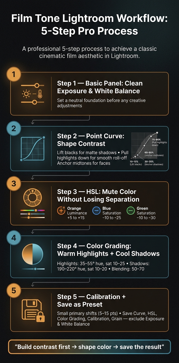
You don’t get a film look in Lightroom from one slider. I get it by working in a set order: Basic panel, Point Curve, HSL, Color Grading, and Calibration.
Here’s the short version:
- I start with clean exposure and white balance
- I use the Point Curveto shape the look:
- lift blacks for a matte shadow floor
- soften highlights for smoother roll-off
- keep midtones clear so faces still look good
- I use HSL to mute loud colors without making everything dull
- I use Color Grading to add warm highlights and cool shadows
- I use Calibration last for small primary color shifts
- Then I save the look as a preset without baking in exposure, white balance, or local edits
A simple film-tone edit in Lightroom often uses small moves, not big ones. In practice, that can mean Orange Luminance +5 to +15, Blue Saturation -10 to -25, highlight grading around 35–55°, shadow grading around 190–220°, and calibration shifts often within 5–15 points.
If I had to sum up the whole process in one line, it would be this: build contrast first, then shape color, then save the result so I can use it again.
The rest of the article walks through that exact workflow in plain steps, with curve placement, color ranges, and Lightroom preset tips.
Film Tone Lightroom Workflow: 5-Step Pro Process
How to make your photos look like FILM! (Lightroom Tutorial)
sbb-itb-b27063b
Build Film Contrast with the Point Curve
Use the Point Curve when you want to place contrast exactly where you want it. The Contrast slider is broad. The Point Curve is selective. After you lock in the curve, you can fine-tune color with HSL, grading, and calibration.
Why the Point Curve Works Better Than the Parametric Curve
The Parametric Curve gives you four region sliders - Highlights, Lights, Darks, and Shadows. It’s handy for fast edits, but it’s less exact when you need to target a very specific tonal range. It also can’t move the endpoints.
The Point Curve removes those limits. You can shape tone with much more control: lift the black point for a matte shadow floor, pull the white point down to cap brightness, and drop anchors anywhere along the tonal range.
A Step-by-Step Film Curve for Soft Highlights and Controlled Shadows
Start with a straight diagonal line. Then place four anchors:
- deep shadows at about 10–15%
- lower midtones at about 30–35%
- upper midtones at about 60–65%
- highlights at about 75–80%
From there, build a gentle S-curve. Pull the lower-midtone anchor down a touch to add density. Lift the upper-midtone anchor slightly to brighten the tonal range where faces usually sit.
Next, pull the highlight point down a little to create smoother roll-off, which helps bright areas keep texture instead of clipping. If you want a matte look, lift the black point to taste so shadows land in dark gray instead of pure black. You can also lower the white point a bit to soften the brightest tones.
Use the table below as a quick guide.
| Curve Type | Black Point | White Point | Midtone Contrast | Visual Result |
|---|---|---|---|---|
| Straight S-curve | At zero | At maximum | Moderate S-shape | Defined blacks, crisp highlights, modern punch |
| Matte film curve | Lifted to taste | Lowered slightly | Slight S in midtones | Soft shadow floor, compressed highlights, analog feel |
Scene type matters here.
For high-contrast outdoor scenes, flatten the S-curve and lift the black point more to calm harsh shadows. For low-contrast indoor portraits, use a slightly stronger midtone S, but keep endpoint moves light. Push those too far and the image starts to feel flat instead of matte.
Using RGB Channel Curves for Subtle Color Contrast
Use RGB channel curves only after the main luminance curve is set. That order matters. First shape brightness, then add small color shifts for separation.
In the Red channel, lift an upper-midtone anchor slightly to warm skin and sunlit parts of the frame. In the Blue channel, pull a shadow anchor down a few units to cool darker areas. Use Green only when you need a specific fix, because it can shift foliage and skin very fast.
Keep every channel move small. Each adjustment changes both hue and luminance, so staying within a few curve ticks is the safer play. Big sweeps can create banding in smooth gradients like skies, posterization, and muddy skin tones.
The goal is subtle color contrast. Think analog character, not heavy processing. Toggle the Tone Curve panel on and off to check the result before moving on.
After tonal contrast is set, use HSL to mute color without losing separation.
Refine the Look with HSL, Color Grading, and Calibration
Once the point curve is set, use HSL, Color Grading, and Calibration to dial in color.
Use HSL to Mute Color and Control Tonal Separation
The HSL panel is where color strength and separation get cleaned up after the curve is in place. Go one color at a time. That helps you keep the separation the curve already created instead of flattening everything together. The goal here is simple: hold onto the tonal structure from the curve while muting colors that feel too loud.
For skin tones, start with Orange and Red. Those two channels do most of the heavy lifting. Push Orange Luminance up by about +5 to +15 to open up faces in the midtones. If cheeks or lips start to look a little hot, bring Red Luminance down slightly, around −5 to −10. That usually gives skin a smoother roll-off.
| HSL Adjustment | Target Area | Typical Range | Film-Tone Effect |
|---|---|---|---|
| Orange Luminance ↑ | Skin tones | +5 to +15 | Brighter, more open faces; midtone lift |
| Red Luminance ↓ | Lips, cheeks | −5 to −10 | Softer reds; smoother skin roll-off |
| Blue Saturation ↓ | Skies, cool shadows | −10 to −25 | Muted skies; reduces digital punch |
| Blue Luminance ↓ | Skies, background | −10 to −25 | Deeper skies; stronger subject separation |
| Green Saturation ↓ | Foliage | −10 to −30 | Softer greens; vintage feel |
| Green Luminance ↓ | Foliage | −5 to −20 | Keeps foliage from competing with skin tones |
| Green Hue → Yellow | Foliage | +5 to +15 | Warmer foliage tone |
| Green Hue → Teal | Foliage | −5 to −15 | Cooler palette |
| Yellow Luminance ↑ | Grass, leaves | +5 to +10 | Restores detail without adding saturation |
Once that color separation looks right, move to Color Grading to shape the overall split.
Balance Warm Highlights and Cool Shadows with Color Grading
The Color Grading panel gives you separate wheels for Shadows, Midtones, and Highlights. If you want a film-style split, warm up the highlights and cool down the shadows. Set Highlights to an orange-yellow hue, around 35–55° on the wheel, with saturation around 10–25. Set Shadows to a blue-teal hue, around 190–220°, with saturation around 10–20. Leave Midtones close to neutral. A saturation range of 0 to 10 usually helps keep skin tones and other main subjects from turning muddy.
The sliders that make or break this look are Blending and Balance. Set Blending around 50–70 so the warm and cool areas flow into each other instead of clashing. Then check skin tones while adjusting Balance. If faces start picking up too much of the cool shadow grade, nudge Balance in a positive direction, around +5 to +30.
Use Calibration last for the base palette shift.
Use Calibration to Shift Primary Colors
Calibration changes the underlying primaries, so even small moves can affect the whole frame. That’s why it works best after HSL and Color Grading. You’ve already shaped the image by that point; Calibration is for the final palette push.
Two directions tend to work well for film tone:
| Direction | Adjustment | Value Range | Effect |
|---|---|---|---|
| Cool Cinematic | Blue Primary Hue | −5 to −15 | Pushes blues toward teal/cyan for a cooler overall palette |
| Cool Cinematic | Blue Primary Saturation | +5 to +20 | Strengthens cool depth in shadow areas |
| Cool Cinematic | Red Primary Saturation | −5 to −15 | Keeps warm tones from overpowering the palette |
| Warm Vintage | Red Primary Hue | −5 to −10 | Shifts reds toward orange-yellow for warmer skin and earth tones |
Keep every Calibration move small. A shift of even 10 points can change the whole image in a visible way. Watch the full frame, not just one area, so the result stays film-like. If you land on settings you’ll want again, save them as a preset.

The Ultimate Presets.IO Bundle

$89.00
$1,662.00
The Ultimate Presets.io Bundle combines The Master Preset Bundle Volume I and The Master Preset Bundle Volume II into one complete collection, giving you every editing style you need in a single download. Save $37 vs. Volume I and II… continue reading
Turn Your Film-Tone Edit into Repeatable Presets
Once your Point Curve, HSL, Color Grading, and Calibration are dialed in, save the full look as a preset. That takes one finished edit and turns it into a repeatable base you can use again and again.
What to Save in a Film-Tone Preset
Not every slider should go into a preset. Save the style, not the photo-specific fixes.
Include these core settings:
- Point Curve, including global RGB and channel curves
- HSL/Color Mixer
- Color Grading
- Calibration
- Effects/Grain
Leave these out:
- Exposure
- White Balance
- Local adjustments
If you bake those into the preset, every photo you apply it to can end up too bright, too dark, or stuck with the wrong color cast.
If you want something lighter, save only the Tone Curve and, if needed, the RGB channel curves too. Think of it like a contrast module. You can stack it on top of other edits without wiping out your Basic panel settings.
Once you save the right controls, the process gets a lot more repeatable.
How Preset-Assisted Editing Speeds Up Your Workflow
A good preset saves the tonal structure, not just a few clicks.
| Aspect | Manual Workflow | Preset-Assisted Workflow |
|---|---|---|
| Approach | Rebuild the look on every image | Apply the base once, then adjust Exposure, White Balance, and small scene-specific details |
| Consistency | Higher risk of subtle variation between images | Core contrast and color logic reused across all images |
| Creative control | Maximum micro-control, but slower | High-level look locked in; fine-tuning still possible |
| Ideal use case | Experimental or one-off artistic work | Client delivery, social content, weddings, large shoots |
A simple way to work: group photos with similar lighting, apply the preset once, then sync it across the set. That keeps the look steady without forcing you to rebuild it frame by frame.
Where Presets.io Fits Into a Film-Tone Workflow

If you'd rather start from a proven base than build from scratch, Presets.io offers film look, cinematic, vintage, and mobile Lightroom presets that can work as strong starting points. Apply one, tweak the Point Curve or HSL, then save your own version.
Presets.io also works across desktop and mobile. Its installation guides show how to sync presets across Lightroom Classic, Lightroom (cloud), and Lightroom Mobile. So the same film-tone recipe is there whether you're editing a client gallery on your desktop or wrapping up a social post on your phone.
Conclusion: A Simple Pro System for Film Tone in Lightroom
Once the curve, color, and calibration are in place, the process gets pretty simple: set exposure first, shape tone with the Point Curve, fine-tune color with HSL and Color Grading, then wrap up with small Calibration shifts. That sequence matters. Each move sets up the next one and helps you keep control instead of chasing fixes later.
Believable film tone comes from restraint. You get the look through lifted blacks, softer highlights, and controlled color - not by pushing sliders to the edge.
Save the final result as a preset, and the workflow becomes repeatable.
FAQs
Can I get a film look without using Calibration?
Yes - you can create a professional film look without the Calibration panel.
Use the Tone Curve to add a gentle S-curve. Then tweak HSL to shift colors and pull back saturation. Lower Clarity and Texture to soften the image a bit, and add Grain for that analog feel.
If you want a faster starting point, Presets.io film presets can package these edits into a one-click setup while still giving you room to fine-tune the final look.
How do I keep skin tones natural with warm highlights and cool shadows?
Use the Color Grading panel to add a slight warmth to highlights and a cool teal tone to shadows. That small push can give the image more depth without making it feel overdone. After that, refine skin tones in the HSL panel.
In the orange and red channels, make gentle adjustments so skin stays vibrant but still looks natural. Small moves usually work best here. If you want the same look across repeat edits, save these settings as a custom preset through Presets.io.
Should I use the same film-tone preset on every photo?
A film-tone preset is a strong starting point for visual consistency, but it usually isn’t a one-size-fits-all fix.
Think of it as your base layer. From there, make small tweaks to exposure, white balance, or HSL settings so each photo still feels natural and stays in line with the rest of the set.