


Table of Contents
Warm Tone Film Emulation: Guide for Beginners
Want the warm film look fast? Start with a preset, then fix five things by hand: white balance, exposure, tone curve, color, and grain. That’s the whole process in plain English.
I’d boil this guide down like this:
- Warm film looks lean on warmer whites, softer contrast, lifted blacks, and light grain
- Presets help with speed, but they are not the final edit
- The main Lightroom controls are:
- White Balance
- Exposure
- Tone Curve
- Color Mixer / HSL
- Color Grading
- Grain
- The two most common problems are:
- Orange or yellow skin
- Flat, muddy shadows
Here’s the part most beginners need to hear: small moves win. A shift of +3 to +8 Tint, skin warmth near 6,300–6,600 K, and low grading saturation like 5 to 15 often gets you much closer than pushing sliders hard.
In other words: warm film emulation is less about adding lots of color and more about controlling tone. You warm the photo a bit, soften contrast, mute some greens and blues, keep skin clean, and stop shadows from turning gray.
If I had to sum up the workflow in one line, it would be this: preset, white balance, exposure, tone curve, then color check before export.
How To Create A Warm Film Look Using Lightroom Classic
sbb-itb-b27063b
Use Presets as a Starting Point, Not a Final Edit
A preset gives you a fast film-style base. With one click, it applies a linked set of changes to white balance, tone, color, grain, and profile. Use it as a starting point, not the finished edit.
What a Warm Film Preset Typically Changes
A warm film preset usually changes more than most beginners expect. It warms the Temperature, lifts blacks so shadows sit above pure black, softens contrast with the Tone Curve, mutes greens and blues in the Color Mixer, pushes highlights toward gold or amber in Color Grading, and adds grain to take the edge off digital sharpness.
RAW and JPEG files don’t react the same way to a preset. RAW files give you more room for stronger edits, so a preset at full strength will often still feel under control. JPEGs already come with contrast and saturation baked in by the camera. Because of that, the exact same preset can turn too warm or too crushed much faster. If you’re editing JPEGs, it makes sense to pull things back right away.
How to Apply and Dial Back a Preset in Lightroom
Here’s a simple workflow: import your image, open Develop, and apply your warm film preset. Then stop and ask: does this look too yellow, too dark, or too heavy?
If the answer is yes, start with the preset Amount slider. Then tweak Temperature if the photo feels too warm, lift Exposure and Shadows if it looks too dark, and check the Color Mixer if skin tones start drifting orange. If the look still feels too strong, pull back contrast, grain, or Color Grading saturation. Small fixes like these help you keep the film feel without forcing the same look onto every photo.
Once the preset is close, go panel by panel and fine-tune the image.
How Presets.io Fits Into This Workflow
Preset packs help most when they show you how the warm film look is built. Presets.io offers warm film, vintage, and cinematic Lightroom preset collections for desktop and mobile, plus installation guides that walk you through setup.
For beginners, the main value is speed and learning by taking the look apart. After you apply a preset, inspect each panel - Basic, Tone Curve, HSL, Color Grading, Effects - and see what changed. That turns the preset into a map for the manual edits that come next.
How to Build the Warm Tone Film Look Step by Step
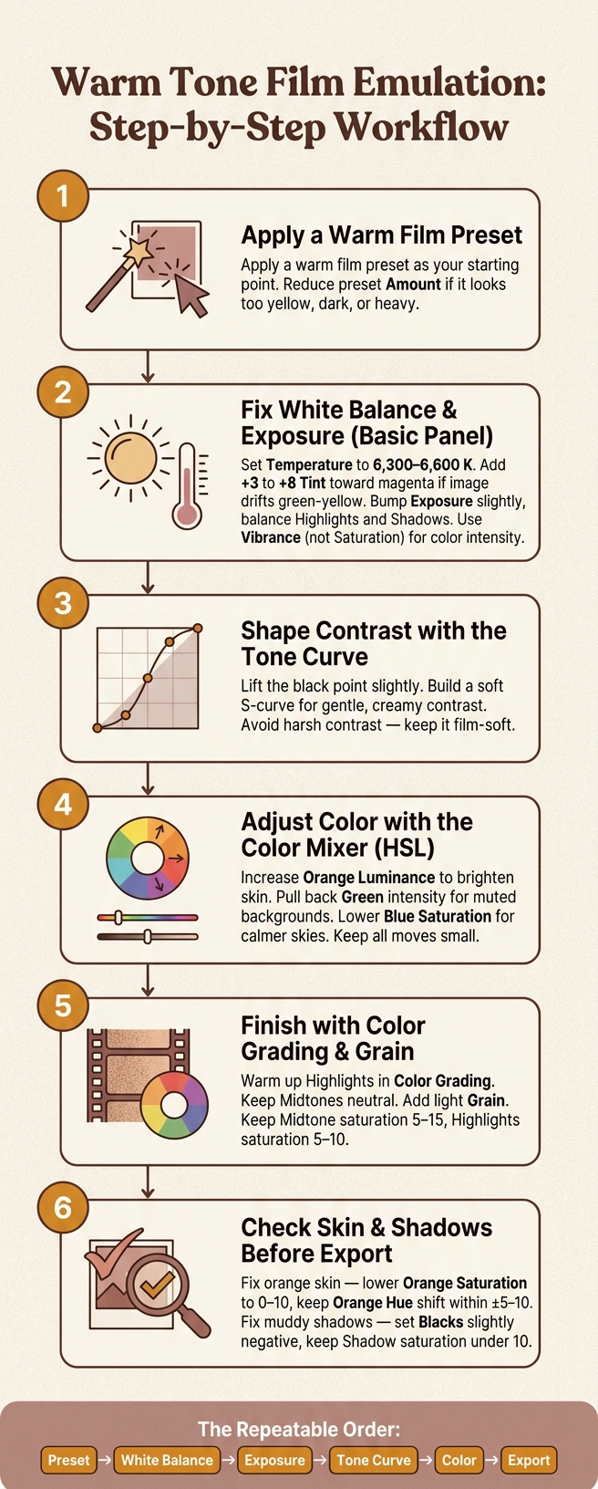
Warm Tone Film Emulation Workflow for Beginners
Start in the Basic Panel: White Balance and Exposure
Start in Lightroom’s main panels and treat the preset as a starting point, not the final edit. From there, dial in exposure, color, and contrast by hand.
Set exposure first. Then balance highlights and shadows. A small bump in exposure often helps, but keep the bright parts under control and bring back some detail in darker areas. After that, warm the white balance in small moves. If the photo starts to drift yellow-green, add a slight magenta tint to pull it back into place.
Use Vibrance as your main control for color intensity. It tends to feel more natural than pushing saturation across the whole image. Keep global contrast light here since the Tone Curve will do most of that work next.
Once exposure and white balance feel right, move on to contrast.
Shape Contrast with the Tone Curve and Color Mixer
The Tone Curve is where the film look starts to show up. Lift the black point a little, then build a soft S-curve. That gives you gentle contrast without making the image feel harsh. It’s also what creates the softer, creamier film response described above.
Then head to the Color Mixer and zero in on three channels:
- Increase orange luminance to brighten skin tones
- Pull back green intensity in the background for more muted greens
- Lower blue saturation a bit for a calmer sky
Small moves matter here. Push too far, and the image can start to look edited instead of just nicely shaped.
Finish with Color Grading, Grain, and Profile Checks
Once the curve and color are in place, finish the look with color grading, grain, and a quick profile check.
In Color Grading, warm up the highlights, leave the midtones neutral, and add light grain. Before you lock in the edit, check the profile one more time.
This is also the moment to review skin tones and shadow depth before export.

The Ultimate Lightroom Preset Bundle – 1,291 Presets + Video LUTs
$89.00
$1,662.00
The Ultimate Presets.io Bundle combines The Master Preset Bundle Volume I and The Master Preset Bundle Volume II into one complete collection, giving you every editing style you need in a single download. Save $37 vs. Volume I and II… continue reading

Fix Common Problems Before Exporting
After color grading, check skin and shadows before export. These are the two warm-film issues that show up most often: orange skin and muddy shadows.
How to Fix Orange or Yellow Skin Tones
Orange skin usually comes from three places: Temperature pushed too far in the Basic panel, Orange Saturation set too high in the HSL/Color Mixer, or heavy warm grading in Highlights or Midtones.
Start with white balance. Pull Temperature back toward 6,300–6,600 K. That often brings back natural skin detail without stripping out the warmth. If the image starts to lean a bit green, nudge Tint toward magenta by about +3 to +8 instead of adding more warmth.
Then check the HSL/Color Mixer. Bring Orange Saturation down to around 0 to +10. Keep Orange Hue shifts within ±5 to 10 points so skin doesn’t drift into that sunburned or plastic look. If bright spots on the forehead or nose turn yellow, lower Yellow Saturation toward 0 to +5.
Last, review Color Grading. Keep Midtone saturation in the 5 to 15 range and Highlights around 5 to 10 so bright skin stays clean.
If skin looks good, move to the shadows.
How to Keep Shadows Deep Instead of Muddy
Now fix shadow depth. Set Blacks slightly negative, lower Shadows, and cut back shadow saturation. In the Tone Curve, pull the leftmost point closer to the baseline. A small lift can work for a film-style fade, but too much turns deep shadows into flat gray.
Then check Color Grading. Keep Shadow saturation under 10, or move the shadow hue a little cooler so warm grading doesn’t spill into darker parts of the image.
Conclusion: A Simple Workflow You Can Repeat
Warm-tone film emulation works best when you follow a set order. Start with a preset, fix white balance and exposure, shape the tone curve, and then adjust color. Once you lock in the look, build each edit the same way: preset, white balance, exposure, tone curve, then color. That order keeps the process controlled and easy to repeat.
Go easy on color changes. A gentle S-curve, modest HSL tweaks, and low-saturation Color Grading do most of the work for a warm film look. Small moves usually beat one big push.
Before exporting, check skin tones and shadow depth across a few frames. In plain terms: look at skin and shadows one more time before you export. The most convincing film warmth looks natural, not filtered, and those two checks help keep it there.
FAQs
Should I edit RAW or JPEG for this look?
Edit RAW, not JPEG. Lightroom film-look presets work best with RAW because RAW files hold more sensor data. That gives you more room for non-destructive edits like exposure, curves, white balance, and shadow detail.
If you only have JPEGs, you’ll have less room to work with. It’s harder to build a warm film look without ending up with muddy shadows or skin tones that feel off.
How do I know if my warm edit has gone too far?
It’s gone too far when the image starts to feel too warm, skin looks overcooked, and shadows turn muddy or crushed.
In Lightroom, zoom in and check the orange and red channels in the HSL panel, especially on skin tones. Make small 5–10 point tweaks, then pull back if orange or red saturation or luminance starts to jump. It also helps to ease off contrast, clarity, or dehaze when tonal transitions begin to look harsh or unnatural.
Which Lightroom panel matters most for film contrast?
The Tone Curve panel is the main place to shape film contrast in Lightroom. If you want that classic film feel, this is where most of the work happens.
A common move is a gentle S-curve. You tweak the shadow and highlight points to build that film-style contrast: softer blacks and slightly lifted highlights instead of harsh, crunchy tones.
Don’t lean too hard on global Contrast or Clarity alone. Those sliders can help, but they shouldn’t do the heavy lifting here. Use the Tone Curve to set the overall contrast shape first, then fine-tune the other controls after.