

Table of Contents
How to Create Retro Color Palettes in Lightroom
Retro color palettes let you recreate the warm, faded tones of the '70s or the bold, high-contrast look of the '80s in Lightroom. Here's how you can achieve these timeless aesthetics:
- Start with a balanced photo: Ensure proper exposure, white balance, and lens corrections for predictable edits.
- Use the Tone Curve: Lift blacks for a faded effect or create an S-curve for bold contrast.
- Adjust colors in HSL and Calibration panels: Shift hues for warmer tones (1970s) or vibrant magentas and teals (1980s).
- Add subtle color casts: Use the Color Grading panel to tint shadows and highlights.
- Finish with texture: Add grain and a slight vignette for a film-like quality.
Want to save time? Create and save presets for these looks or try ready-made options from sources like Presets.io. Whether you're going for a soft vintage vibe or a striking retro punch, Lightroom's tools make it easy to replicate these styles.
The Secret to Get Vintage Film Look In Lightroom
sbb-itb-b27063b
Preparing Your Image for Retro Color Grading
Before diving into the Tone Curve or Color Grading panel, it’s essential to start with a photo that’s well-exposed and balanced. A solid base ensures your color adjustments will behave predictably and give you the results you’re aiming for.
Choosing the Right Photo
Not every image lends itself to a retro vibe. Portraits, street photography, and interiors with rich textures tend to be the best candidates. These types of photos offer the tonal depth and details that retro color grading thrives on. Think of a weathered brick wall, a face lit by soft sunlight, or a bustling city sidewalk - these subjects naturally evoke a vintage feel.
Another key consideration is staying visually consistent with the era you’re emulating. For example, if you’re aiming for a '70s or '80s aesthetic, avoid elements that scream "modern" - like smartphones, contemporary brand logos, or minimalist interiors. These details can break the illusion, no matter how carefully you apply your color grading.
Once you’ve chosen a photo that fits the retro theme, it’s time to fine-tune its overall balance with some basic corrections.
Making Basic Global Corrections
Start by neutralizing the white balance. Use the White Balance Eyedropper tool to click on a neutral gray or white area in the image. This removes any unintended color cast, making it easier to shift tones toward those warm '70s yellows or bold '80s magentas later on. Next, adjust the exposure so the histogram avoids clipping at either end. To create a soft, even foundation, lower the Highlights slightly and raise the Shadows - this step is crucial since retro styles often involve lifted blacks and faded highlights. Preserving tonal data here helps you avoid issues like noise or banding down the line.
Head over to the Lens Corrections panel and enable both Remove Chromatic Aberration and Enable Profile Corrections. This clears out any lens distortion or natural vignetting, giving you a clean slate to work with before you intentionally add stylistic effects later. Finally, use the Level or Auto button in the Transform panel to straighten the image. Retro aesthetics rely on clean, intentional framing, and a crooked horizon can distract from the overall look right from the start.
Building a Retro Color Palette with Lightroom Tools
Creating a retro aesthetic in Lightroom involves using tools like the Tone Curve, Color Mixer, Calibration, and Color Grading. Each of these tools contributes to achieving that nostalgic, vintage vibe.
Softening Contrast with the Tone Curve
The Tone Curve is a great starting point for crafting retro looks. Switch to Point Curve mode for more precise control. Start by gently lifting the bottom-left point (the black point) to fade the blacks, giving your image a washed-out, matte finish that feels like an old film print. Then, slightly lower the top-right point (the white point) to soften highlights and remove the harshness often associated with digital images.
For more nuanced results, adjust individual RGB channels. For example, raise the Red channel in the shadows to add warmth, or drop the Blue channel in the highlights to introduce a yellowish tint. These subtle tweaks can help mimic the hues of specific vintage film stocks, setting your image apart from generic faded effects.
| Adjustment Target | Tone Curve Action | Retro Visual Effect |
|---|---|---|
| True Blacks | Lift bottom-left point | Faded, matte blacks |
| Highlights | Lower top-right point | Softer highlights with less digital harshness |
| Shadow Tint | Adjust Green/Blue channels | Film-like color shifts |
| Overall Contrast | Apply a subtle "S" curve | Adds depth while preserving retro tones |
Tip: Use midtone adjustments in the Tone Curve to brighten your image without compromising the overall contrast.
Once your contrast is softened, move on to fine-tuning colors with the Color Mixer and Calibration tools.
Shaping Colors with the Color Mixer and Calibration Panel
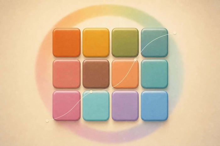
With the tonal foundation in place, the HSL/Color Mixer panel lets you refine individual colors. To achieve a warm, aged look, shift oranges and yellows slightly toward red and reduce their saturation. For cooler, cinematic vibes, adjust blues and cyans toward teal while also lowering their saturation for a more subdued effect.
The Calibration panel, tucked away at the bottom of the Develop module, is another hidden gem. Shifting the Red Primary hue slider toward orange can warm up the image in a way that feels more organic than simply adjusting the White Balance. Similarly, reducing the Blue Primary saturation can desaturate cooler tones across the image, reinforcing a faded, analog feel.
Once you’ve refined your hues, the next step is to use the Color Grading panel to add subtle color casts.
Adding Color Casts with the Color Grading Panel
The Color Grading panel is perfect for applying targeted color tones to shadows, midtones, and highlights. For a retro look, try adding a warm orange or red tint to the shadows, evoking the warmth of vintage film. Then, balance it with a cool teal or blue tint in the highlights to create a complementary contrast that adds depth without overpowering the image.
The Midtones wheel is where you can tie everything together. Use it to unify the warm shadows and cool highlights, creating a cohesive mood. Keep adjustments subtle - this ensures the color casts enhance the atmosphere rather than feeling forced. For example, amber and orange tones can give a Kodak-inspired warmth, while cooler greens and blues in the midtones can evoke a Fuji-like aesthetic.
Adding Texture and Atmosphere
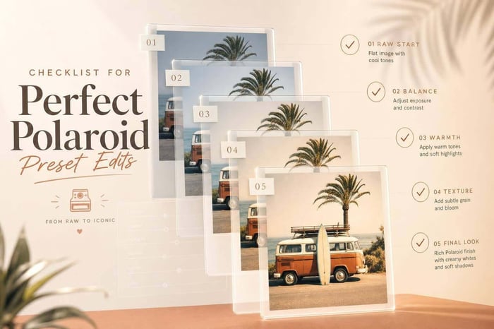
To complete the retro transformation, add some texture and imperfections for that film-like quality. Slightly reduce clarity to soften midtone contrast, achieving a dreamy, soft-focus effect reminiscent of images from the '70s and '80s. add a touch of grain through the Effects panel to mimic the texture of 35mm film, giving your photo a tactile, nostalgic feel. Finally, apply a subtle vignette to draw attention inward, replicating the natural light falloff seen in vintage lenses.
The Ultimate Presets.IO Bundle

$89.00
$1,662.00
The Ultimate Presets.io Bundle combines The Master Preset Bundle Volume I and The Master Preset Bundle Volume II into one complete collection, giving you every editing style you need in a single download. Save $37 vs. Volume I and II… continue reading
Creating 70s and 80s Retro Looks
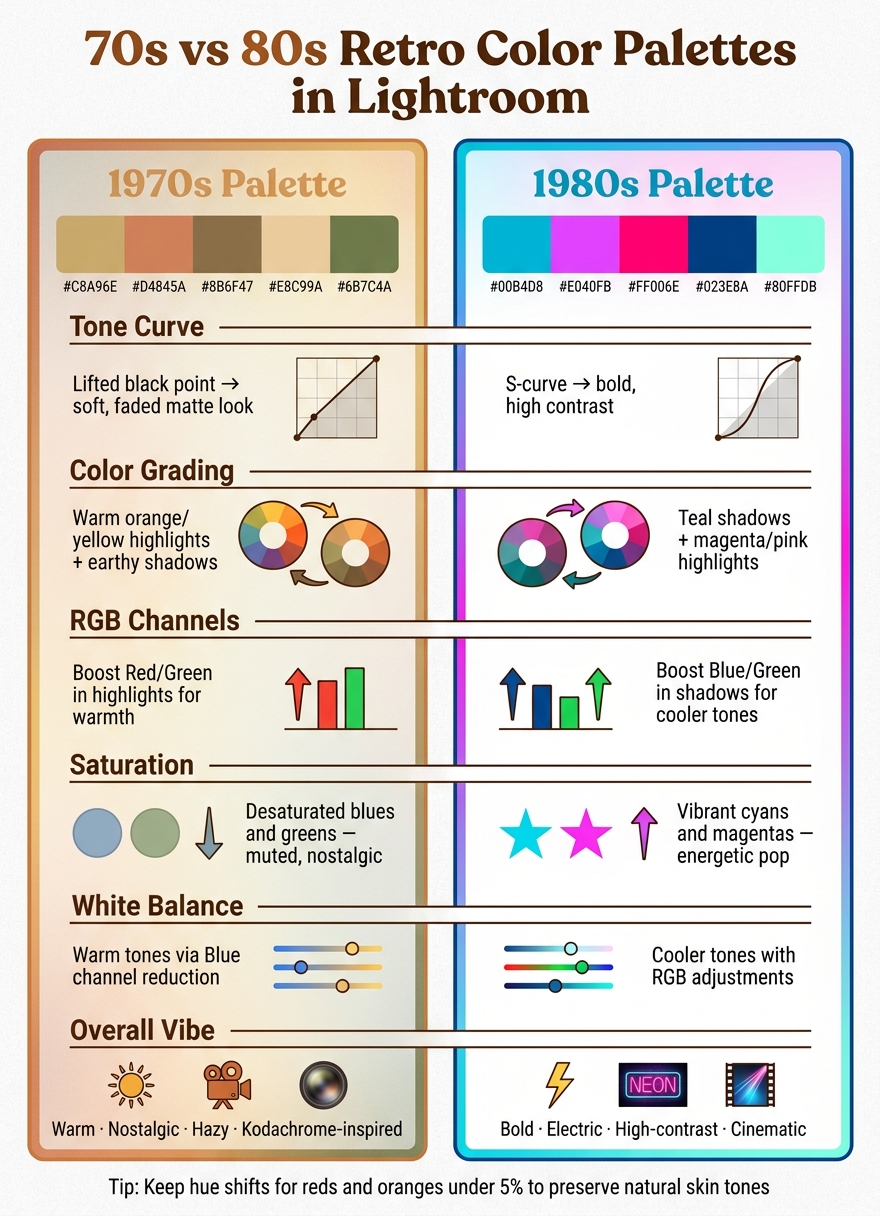
70s vs 80s Lightroom Retro Color Palettes: Key Settings Compared
Lightroom's tools make it easy to recreate the iconic visuals of the 1970s and 1980s. Each decade has a distinct vibe, and with a few focused adjustments, you can nail those signature retro styles. Building on your global corrections and tonal tweaks, these era-specific steps will help refine the look even more.
Building a 70s-Inspired Warm, Faded Palette
The 70s aesthetic is all about warmth, muted hues, and a soft, hazy vibe - like vintage Kodachrome film. Start by switching to the Point Curve mode in the Tone Curve panel. Add three anchor points (shadows, midtones, and highlights), and then lift the black point slightly to create that flat, matte effect.
In the HSL panel, adjust the red and green channels in the highlights to warm up the image. Desaturate blues and greens to achieve that authentic, faded look. For skin tones, tweak reds and oranges carefully - keep hue shifts under 5% to avoid unnatural results. Finally, add a touch of grain in the Effects panel to mimic the texture of old film, or use a vintage look preset to automate the process.
Crafting an 80s-Inspired Bold, Colorful Palette
The 80s were all about energy, bold colors, and high contrast. To achieve this, create an S-curve in the Tone Curve panel. Deepen the blacks and lift the highlights to enhance the contrast and give the image a crisp, vibrant quality.
For color, focus on the shadows and highlights. Shift shadows toward teal using adjustments in the Blue and Green channels. In the Color Grading panel, add a magenta tint to the highlights to create that signature teal-and-magenta combo. Instead of using the global saturation slider, selectively boost cyans and magentas in the HSL panel for a more controlled pop of color that preserves skin tones.
70s vs. 80s Palettes: Key Differences
Here’s a quick breakdown of the main differences between the two styles:
| Setting | 70s-Inspired Palette | 80s-Inspired Palette |
|---|---|---|
| Tone Curve | Lifted black point for a soft, faded look | S-curve for bold, high contrast |
| Color Grading | Warm orange/yellow highlights, earthy shadows | Teal shadows, magenta/pink highlights |
| RGB Channels | Boost Red/Green in highlights for warmth | Boost Blue/Green in shadows for cooler tones |
| Saturation | Desaturated blues and greens | Vibrant cyans and magentas |
| White Balance | Warm tones via Blue channel | Cooler tones with RGB adjustments |
The 70s palette leans into warm, nostalgic vibes, while the 80s palette brings bold, electrifying energy. Once you’re comfortable with these styles, you can mix elements from both decades to create hybrid looks or push each aesthetic even further. For more inspiration, explore other trending Lightroom presets to expand your creative toolkit.
Saving and Reusing Retro Palettes
Creating and saving presets can save you a ton of time when working with retro-style edits. Once you’ve crafted a 70s or 80s-inspired look you love, saving it as a preset means you won’t have to recreate it from scratch every time. This is especially handy when working in Lightroom.
Saving Retro Palettes as Presets
In both Lightroom Classic and the cloud version, head over to the Presets panel, click the plus (+) icon, and choose Create Preset. On Lightroom mobile for Android, open your edited photo, tap the three-dot (…) icon, and select Create Preset.
Give your preset a name that reflects its style, like 70s Warm Faded or 80s Teal Magenta, and assign it to a folder for easy access. A critical step here is choosing which settings to save. Only include the adjustments you’ve made. As photographer Denny Tang advises:
"The more settings you use, the slower your preset will be... Lightroom isn't the fastest software so it's important to keep your presets lightweight."
For example, skip saving settings like Exposure and White Balance. This ensures your preset focuses on the stylistic elements and doesn’t override foundational edits.
Once saved, presets can be adjusted to fit the unique needs of each new photo.
Adjusting Saved Palettes for New Photos
No two photos are the same, so presets will often need a little tweaking to match the specific lighting or composition of a shot. Instead of re-editing from scratch, make small adjustments to maintain the retro vibe. Here are some common tweaks:
| Adjustment | Recommended Tweak | Why It Helps |
|---|---|---|
| Exposure | ±0.1 to 0.3 | Adapts to varying lighting conditions |
| Tone Curve | Lift the bottom-left point | Enhances or softens the faded black effect |
| Saturation | Decrease Greens/Yellows | Reduces overly vibrant digital colors |
| Contrast | Lower slightly | Keeps the vintage aesthetic soft and subtle |
| Grain | Amount: 20, Size: 25, Roughness: 50 | Adds an organic, film-like texture |
For more precise control, use the Point Curve mode in the Tone Curve panel. This allows you to fine-tune shadows, midtones, and highlights. When adjusting hues, especially reds and oranges, keep changes minimal - under 5% - to preserve natural skin tones.
If you’re looking for a jumpstart, consider using ready-made presets.
Using Ready-Made Presets from Presets.io
Ready-made presets can simplify the process of achieving a retro look. Websites like Presets.io offer a variety of vintage and film-inspired presets for both Lightroom desktop and mobile. These presets often include advanced adjustments, such as RGB Tone Curve edits, to replicate the unique characteristics of specific film stocks. For example, they can subtly tint shadows or highlights for a more authentic retro feel.
Wrapping It Up
Crafting vintage color palettes in Lightroom boils down to a few essential steps: adjust the black point on the Tone Curve for that classic faded film vibe, tweak HSL hues (keeping reds and oranges minimal, under 5%), and introduce subtle color casts using the Color Grading panel.
Once you've nailed your retro adjustments, the next step is to make them reusable. Save your stylistic tweaks - like Tone Curve and HSL settings - as lightweight presets. This keeps your workflow flexible and efficient.
For an even quicker approach, you can skip the manual curve adjustments by trying Presets.io's vintage presets. These presets handle the complex RGB edits for you, letting you focus on fine-tuning the final look.
Whether you're channeling a 70s or 80s aesthetic, the process stays consistent: start with proper corrections, refine your tones, adjust your colors, and save your custom presets. With these steps, you can easily recreate timeless vintage styles again and again.
FAQs
Should I edit RAW or JPEG for retro looks?
When aiming for retro looks in Lightroom, it's best to shoot in RAW format. This format gives you more flexibility during editing and maintains higher image quality. With RAW files, you can fine-tune tone, color, and grain - essential elements for achieving that authentic retro vibe. While you can edit JPEGs, they don't offer the same level of adjustment options and can lose quality more easily during the process.
Why does my preset look different on new photos?
Presets might not look the same on every photo because they’re tailored to the specific settings of the images they were originally created for. Variations in lighting, color balance, and exposure can significantly influence the outcome. To keep your edits consistent, fine-tune elements like tone curves, color grading, or grain after applying a preset. Think of presets as a foundation - they often need adjustments to complement the unique characteristics of each photo.
How do I keep skin tones natural with a retro palette?
To keep natural skin tones while working with a retro palette in Lightroom, begin with a properly exposed photo and tweak the white balance to achieve a warm, even tone. Use the HSL sliders to fine-tune hue, saturation, and luminance, but steer clear of oversaturating the colors. For more accurate adjustments, use tools like the People mask to focus specifically on skin areas. Finally, balance elements like color grading, the tone curve, and grain to create that retro vibe without losing the authenticity of the skin tones.