

Table of Contents
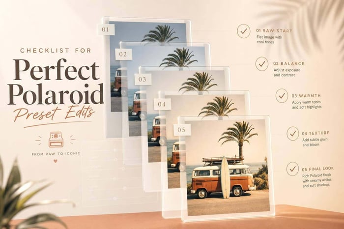
Checklist for Perfect Polaroid Preset Edits
A Polaroid preset are a quick way to give your digital photos the nostalgic charm of instant film. But to get the best results, you need more than just a one-click solution. Here's a simple workflow to follow:
- Start with High-Quality Images: Use RAW files for better detail and dynamic range.
- Prep Before Applying Presets:
- Correct exposure and white balance.
- Enable lens corrections to avoid heavy vignettes.
- Straighten and crop (square crops work great for Polaroid vibes).
- Apply the Preset: Treat it as a stylistic layer, not a fix-all.
- Refine Details:
- Adjust tone curves for faded shadows.
- Tweak colors (e.g., shift greens to yellow, blues to teal).
- Add grain for texture and a light vignette for focus.
- Ensure Consistency Across Photos: Sync stylistic edits but adjust exposure and white balance individually.
- Export with Care:
- Use JPEG (sRGB) for web or TIFF (Adobe RGB) for print.
- Keep sharpening subtle to maintain the soft film look.
- Save Custom Presets: Exclude exposure and white balance so they’re ready for future projects.
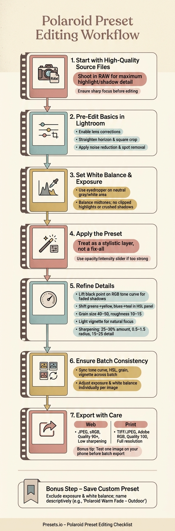
Polaroid Preset Editing Workflow: Step-by-Step Checklist
How To Create A Retro Polaroid Lightroom Preset!
sbb-itb-b27063b
Preparing Your Image Before Applying Polaroid Presets
A preset works best when paired with a solid foundation. As Asanka, the creator of AAAPresets, puts it, presets are powerful creative tools, but they’re not magic fixes. Skipping the prep work can result in muddy shadows, blown-out highlights, or unnatural skin tones - issues that become even more pronounced when the preset’s warmth and contrast are applied.
Start with High-Quality Source Files
Shoot and edit in RAW whenever possible. RAW files retain much more detail in highlights and shadows compared to JPEGs, which is critical when applying Polaroid presets. These presets often push tones in various directions, and a well-exposed RAW file ensures you have recoverable highlight and shadow details. If your highlights are blown out or shadows are unrecoverable before you even start, no amount of editing will fix it. Additionally, sharp focus is a must. Since Polaroid presets tend to add grain and softness, any blur in the original image will only be magnified.
Once you’ve secured a clean, high-quality base file, it’s time to move on to the essential pre-edit adjustments in Lightroom.
Pre-Edit Basics in Lightroom
After importing your RAW file into Lightroom, focus on these foundational edits to set yourself up for success. Start by enabling lens corrections to remove distortions or vignetting caused by your lens. This step ensures the preset’s vignette effect doesn’t become too heavy. Then, straighten the horizon and crop the image to its final composition. For an authentic Polaroid vibe, a square crop works great. Lastly, apply noise reduction and clean up sensor dust - high-contrast presets can make these imperfections stand out even more.
Set White Balance and Exposure
Presets are essentially saved adjustment recipes, so starting with a balanced white balance and exposure is crucial to avoid unexpected results. Use the eyedropper tool to correct white balance by selecting a neutral area, like a gray or white surface, in your image. Skipping this step could lead to exaggerated color shifts once the preset is applied.
For exposure, aim to keep your midtones balanced, ensuring there are no clipped highlights or lost shadow details. The histogram is your best friend here - it provides an accurate snapshot of your exposure, which can sometimes be misleading if you rely solely on your screen. Professional photographer Paige Tingey highlights the importance of this step:
"A preset can have a lot of potential, but if the image is too dark or too bright, it will be hard to judge the rest of the edit accurately."
Here’s a quick reference table for essential pre-edit steps:
| Pre-Edit Step | Key Tool in Lightroom | Why It Matters |
|---|---|---|
| White Balance | Temp/Tint sliders, Eyedropper | Prevents presets from amplifying unwanted color casts |
| Exposure | Exposure, Highlights, Shadows | Maintains detail before applying tonal adjustments |
| Lens Correction | Profile Corrections | Avoids double-vignetting from both lens and preset |
| Composition | Crop, Straighten | Ensures grain and vignette align with the final frame |
| Detail | Noise Reduction, Spot Removal | Stops preset sharpening from exaggerating flaws |
Applying Polaroid Presets Correctly
How to Apply Presets
Once you've made your initial corrections, applying a Polaroid preset is straightforward. Open the Presets panel in Lightroom's Develop module, locate your chosen Polaroid preset, and click on it. The adjustments will apply instantly, and you can hover over different presets to preview their effects before making a selection.
Think of the preset as a stylistic touch, layered on top of your manual corrections. The best approach is to follow a three-step workflow: start with manual base corrections, apply the preset, and then fine-tune the details afterward.
If the preset feels overpowering, use Lightroom's intensity or opacity slider to dial it back before moving on to further tweaks.
Once the preset is in place, take time to review and adjust key elements of the image as needed.
Refining Individual Images After Applying a Preset
Presets are a great starting point, but they rarely deliver a perfect result on their own. After applying your Polaroid preset, check for common issues like clipped highlights, overly dark shadows, or an unnatural color tone.
To achieve that classic faded Polaroid vibe, head to the Tone Curve (RGB channel) and gently lift the bottom-left point. This adjustment raises the black point, reducing contrast and creating a softer, film-like quality. When fine-tuning grain, zoom in to 100% to ensure it appears as a subtle texture rather than harsh digital noise. For sharpening, aim for settings like 25–30% amount, 0.5–1.5 radius, and 15–25 detail - this keeps edges crisp without making skin or fabric look unnatural.
If you want to try different looks without altering your original image, right-click the photo in Lightroom and select Create Virtual Copy. This allows you to experiment freely with other presets or adjustments.
Find Polaroid Presets on Presets.io
A thoughtfully curated preset collection can save you a great deal of time. Presets.io offers a variety of Polaroid-inspired and vintage film presets designed to work well in different lighting conditions, whether you're shooting outdoors in bright sunlight or indoors under softer light. New presets are added weekly, and each collection includes simple installation guides to help you get started quickly.
The Ultimate Presets.IO Bundle

$89.00
$1,662.00
The Ultimate Presets.io Bundle combines The Master Preset Bundle Volume I and The Master Preset Bundle Volume II into one complete collection, giving you every editing style you need in a single download. Save $37 vs. Volume I and II… continue reading
Core Adjustments for a Polaroid Look
Tonal Adjustments
Once your preset is applied, fine-tuning the tonal sliders is key to achieving that classic Polaroid vibe. Start by reducing the exposure by -0.3 to -0.5 EV. This subtle tweak helps mimic the softer, less clinical tones of film. As Joey Kamphuis from The Editing Studio explains:
"Digital sensors react clinically. Film reacts organically."
Next, lower the highlights by -20 to -40 to create a smoother transition in the brightest areas, avoiding the harshness of digital highlights. Raise the shadows by +10 to +20 to ensure darker areas retain detail instead of becoming overly dark. To complete the effect, lift the blacks by +30 to +40, giving the image a soft, matte finish. Finally, reduce the overall contrast by -10 to -15 for a dreamy, understated feel rather than a bold, punchy look.
Setting the Tone Curve
After adjusting the tonal sliders, use the tone curve to refine the image's contrast. In the RGB channel, lift the bottom-left anchor point slightly to fade the shadows, creating that signature Polaroid softness. Lower the top-right anchor point to keep highlights from appearing overly bright.
"Polaroid film has a signature faded look. In the RGB channel, drag the bottom left dot slightly upwards to reduce contrast." - Maryna Yurlovska, Skylum
Once the anchor points are in place, create a gentle S-curve by adding subtle points in the shadow and highlight areas. Keep the adjustments mild - you're aiming for a balanced look with depth, not dramatic contrast. For added authenticity, tweak the Red and Green channels individually to replicate the slightly unpredictable color shifts of real Polaroid film.
Color and Grain Adjustments
With the tonal and contrast adjustments complete, move on to refining color and texture. In the HSL panel, shift greens toward yellow and blues toward teal. These changes alone go a long way in capturing the vintage Polaroid aesthetic. To further enhance the look, reduce the luminance of overly vibrant colors, as Polaroid film naturally mutes intense tones. Be cautious with reds and oranges - leaving them as they are ensures skin tones remain natural.
To add texture, set grain size to 40–50 and roughness to 10–15. This mimics the organic feel of film presets. Finish with a light vignette to subtly draw the viewer's eye inward, imitating the natural light fall-off of vintage instant camera lenses. These adjustments bring the Polaroid look to life, ready for final tweaks and export.
Consistency, Export, and Custom Presets
Keeping Consistency Across a Batch
To achieve a unified Polaroid aesthetic in a series of photos, start by perfecting your strongest image. Once you’ve nailed the look, you can sync the stylistic adjustments across the rest of the batch. This ensures a cohesive feel throughout.
However, before syncing, take the time to individually adjust exposure and white balance for each image. These settings often vary too much to apply universally. Focus on syncing elements like the tone curve, HSL shifts, grain, and vignette instead. Also, don’t forget to enable lens corrections for every image before syncing. Many Polaroid presets include a stylistic vignette, and combining this with natural edge darkening from your lens can create an overdone or unnatural effect. If a preset feels too intense, try lowering its strength or tweaking the exposure rather than removing it altogether.
Export Settings for Polaroid Edits
Exporting your images is just as important as editing them. As Asanka, the creator of AAAPresets, explains:
"Think of your edit as 'instructions,' and your export as 'translation + packaging.' Your preset isn't disappearing - your edit is translated into a final file optimized for browsers, phones, apps, and screens."
For web or social media, export your files as JPEG in sRGB with a quality setting of 90 or higher. Dropping below 90 can introduce banding, especially in the soft gradients and pastel tones that define the Polaroid style. For print, switch to TIFF or high-quality JPEG in Adobe RGB at full resolution to preserve the vibrant greens and cyans often present in Polaroid-inspired edits. Keep sharpening at Low or Standard for screen use; over-sharpening can ruin the soft, organic quality of your edits.
Before exporting an entire batch, test one image by sending it to your phone. Bright desktop monitors can sometimes trick you into thinking an image is balanced, only for it to look too dark on a typical smartphone screen.
| Export Setting | Web / Social | |
|---|---|---|
| File Format | JPEG | TIFF or JPEG |
| Color Space | sRGB | Adobe RGB |
| Quality | 90 (minimum) | 100 |
| Sharpening | Low / Standard | Adjust to paper type |
| Resizing | Match platform width | Full resolution |
Once you’ve finalized the export settings, you’ll have a polished file ready for its intended use.
Saving Custom Polaroid Presets
When you’ve perfected a look, save it as a custom Lightroom preset to avoid starting from scratch in future projects. Be sure to exclude settings like exposure and white balance, as these need to be adjusted individually for each image. Instead, focus on locking in the tone curve, HSL adjustments, grain, and vignette - these are the elements that define your Polaroid style.
Give your preset a clear, descriptive name, such as “Polaroid Warm Fade – Outdoor” or “Polaroid Cool Matte – Studio.” Over time, you’ll build a library of presets that can be applied quickly, helping you maintain consistency and save time on future projects.
Conclusion
This checklist highlights the importance of intentional and consistent edits. By sticking to a structured workflow, you can transform uneven shots into a polished Polaroid series. Start with the basics - adjust exposure and white balance, apply a preset, and then refine the details - to create purposeful results.
As Joey Kamphuis explains:
"Presets give you structure. Instead of building every image from scratch, you start 80% of the way there. That's how professionals scale their workflow without sacrificing quality."
That remaining 20% is where your unique style comes through.
Tools like Presets.io simplify the process. They offer carefully crafted Lightroom and mobile preset collections tailored to specific aesthetics, including vintage and film-inspired looks that are ideal for achieving a Polaroid vibe. Instead of starting from scratch, you can begin with a solid preset and then customize it to match your vision.
To wrap up your edits, fine-tune elements like grain, tone, and color. Save these adjustments as a custom preset for future use. Use the checklist to confirm every key step is covered. By following this workflow, you’ll consistently nail that timeless Polaroid aesthetic.
FAQs
Why does my Polaroid preset look too strong?
When using a Polaroid preset, the effect might feel overpowering because presets typically apply at full intensity. To tone it down, try adjusting the Amount slider. Aiming for a more subtle, natural look - often below 40% - can make a big difference.
If you notice harsh edges or halos caused by contrast or sharpness tweaks, spend some time fine-tuning these settings. Softening them will help you achieve a smoother, more realistic Polaroid aesthetic.
Which edits should I sync across a batch (and which shouldn’t I)?
When applying Polaroid presets, focus on syncing adjustments that promote consistency across your photos. Key elements to sync include tone, color, exposure, and contrast. These settings are ideal for batch editing, helping you achieve a cohesive style effortlessly.
However, steer clear of syncing edits that are specific to individual scenes, like darkening skies or using selective masks. These types of adjustments require manual fine-tuning for each image to ensure accuracy and avoid creating an unnatural appearance.
What export settings preserve the Polaroid look for web and print?
To keep the Polaroid aesthetic intact during export, stick to these settings:
File format: Choose JPEG for broad compatibility.
Color profile: Use sRGB to keep colors consistent across online platforms.
Quality: Set between 85–100 to minimize compression while preserving detail.
Resize: Adjust dimensions based on platform requirements (e.g., 1080px for web use).
Output sharpening: Opt for low or standard sharpening suitable for screens.
Be careful not to over-sharpen, and consider adding subtle grain effects to amplify the vintage vibe.