

Table of Contents
Golden Hour Presets: A Complete Guide for Beginners
A golden hour preset is a starting point, not a fix-all. If I want warm sunset color that still looks natural, I need to match the preset to the light, then adjust exposure, white balance, highlights, and shadows by hand.
Here’s the short version:
- Golden hour light shifts by season, so one preset won’t look the same in summer, fall, winter, and spring.
- These presets work best on warm, low-angle light like sunrise, sunset, beaches, ridgelines, and backlit trees.
- They often fail on blue hour, flat overcast light, or neutral daytime shots because the warmth can look forced.
- Lightroompresets usually change white balance, contrast, highlights, shadows, and orange/yellow tones.
- Mobile and desktop setup is different: Desktop and Classic use
.xmp, while Mobile often needs sync or a.dngworkaround for iPhone. - Small edits matter most after the preset: highlight recovery, shadow lift, sky masks, and orange balance.
A few numbers stand out. Golden hour color often falls around 2,000–4,000K, and a small HSL shift like Orange Hue +5 to +10 or Orange Saturation +10 to +15 is often enough. Push past that, and the photo can turn too orange, fast.
If I had to boil the workflow down to one line, it would be this: pick the preset by light first, season second, then fine-tune one photo before syncing the rest.
| What matters most | What to do |
|---|---|
| Scene light | Use backlit, soft light, or high-recovery presets based on the photo |
| Season | Use it as a small guide, not the main decision-maker |
| File setup | Import .xmp on Desktop/Classic; use sync or .dngon Android |
| First manual fixes | Check exposure, white balance, highlights, shadows, and orange tones |
| Common mistake | Adding too much warmth in more than one place |
Below, I walk through the full process in plain English so you can get warm, soft edits without overdoing them.
How To Add Golden Hour Tones In Lightroom
sbb-itb-b27063b
How Golden Hour Presets Work for Landscape Photos
A Lightroom preset is a saved group of slider settings. Golden hour presets mix white balance, contrast, color, and tone edits to echo the warm glow of low-angle light.
For landscape photos, that usually means warming the image without throwing away sky detail or flattening the texture in the foreground. That balance matters most in landscape editing, where the sky, the land, and the overall color mix can shift a lot from one season to the next.
What a Golden Hour Preset Changes in Lightroom
Golden hour presets often warm the white balance, pull back highlights, lift shadows, soften contrast, and push oranges and yellows while dialing down blues and greens. Many also add warm color grading for a subtle cinematic finish.
That said, not every warm photo needs this treatment. Scene and timing matter. These presets work best when the image already has warm, directional light to build on.
When to Use Golden Hour Presets Over Other Seasonal Looks
Golden hour presets are made for low-angle sunlight at sunrise or sunset. They tend to work best on scenes like backlit trees, open fields, ridgelines, and beaches.
They don't fit every image. Blue-hour shots - taken just before sunrise or just after sunset - lean cool and moody, so a golden hour preset can fight the scene instead of helping it. Neutral daytime or overcast edits usually need a more balanced, lifelike look, and a strong warmth boost can throw that off. If the light is cool or flat, the preset will often look unnatural.
| Look Type | Best Use Case | Lighting Characteristics |
|---|---|---|
| Golden Hour | Sunrise, sunset, backlit landscapes, beaches | Warm, soft, directional |
| Blue Hour | Just before sunrise or just after sunset | Cool, moody, deep blues |
| Bright Daylight | General outdoor, midday, or overcast travel | Bright, even light |
| Neutral/Daytime | Documentary or architectural shots | Balanced, realistic |
Once you know when a golden hour preset makes sense, the next step is picking preset collections that fit your light and your scene.
How to Choose the Right Golden Hour Preset
Pick a preset that fits the light already in your photo.
Match the Preset to Your Light, Season, and Scene
First, look at the lighting. That matters more than anything else. Different light calls for different preset strength and different handling of highlights and shadows:
- Backlit scenes (sun behind the subject): pick presets that lift shadows and protect highlights
- Direct or front-lit light: focus on highlight recovery so bright areas don’t blow out
- Shade lit by reflected sky light: use presets that open up shadows with less highlight protection
- Coastal or beach scenes: water and sand reflections often clip highlights, so Soft Light or Backlit styles tend to work best
- Overcast or hazy light: go with a subtler preset with a bit more warmth and dehaze to bring back contrast
Season helps shape the look, but it shouldn’t override the light. Fall, summer, and spring scenes can each shift color balance a little. Still, the lighting in the photo should always be your first filter.
Use Preview Images and Descriptions to Pick the Right Preset
Preset names and preview images can save you time. Labels like Backlit, Soft Light, or Hard Light usually tell you more than a generic “Golden Hour” preset name. Descriptions help too. If you want a cinematic, vintage, or warm landscape feel, look for wording that lines up with that style.
Presets.io offers curated Lightroom and mobile preset collections, including warm, cinematic, vintage, and film-inspired looks, plus installation guides made for beginners.
Comparison Table: Golden Hour Preset Styles and Best Use Cases
| Preset Style | Warmth Level | Contrast Level | Best-Fit Scenes |
|---|---|---|---|
| Warm Base | Moderate | Natural | Versatile; landscapes and urban scenes |
| Sun-Kissed | High | Punchy | Direct light; sun-drenched outdoor scenes |
| Soft Glow | Subtle/Pastel | Low/Soft | Romantic portraits; soft pastel skies |
| Rich Sunset | Very High | High | Dramatic skies; deep orange/golden horizons |
| Backlit/HDR | Balanced | High Recovery | Coastal, mountains, forests |
| Cinematic/Matte | Warm/Amber | Deep/Matte | Editorial lifestyle; urban edges; rich blacks |
Use this table as a shortcut. Start with the Best-Fit Scenes column, then check whether the warmth and contrast match the mood you want.
After that, you’re ready to install the preset and fine-tune exposure and white balance.
How to Install, Apply, and Adjust Golden Hour Presets
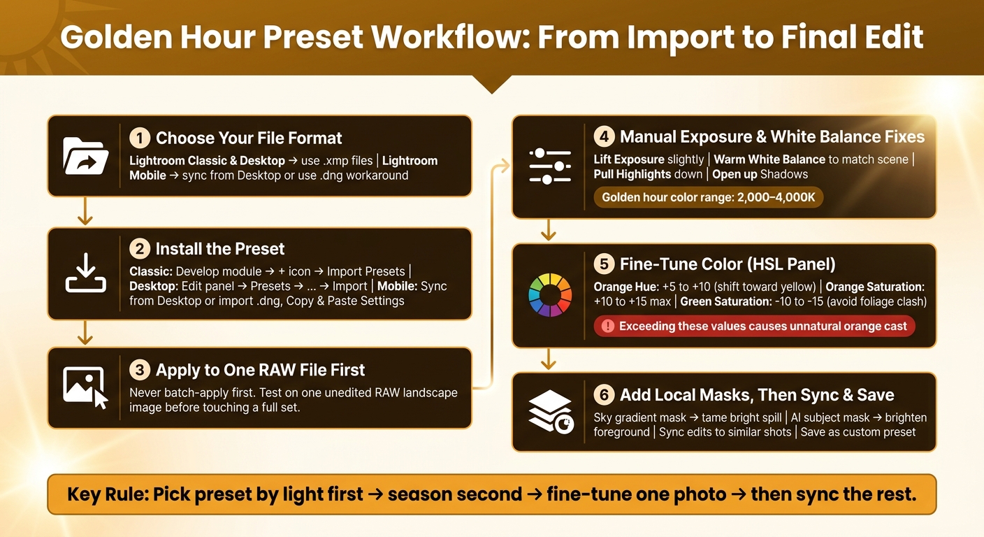
Golden Hour Preset Workflow: From Import to Final Edit
Once you’ve chosen a preset style, getting it into Lightroom only takes a few minutes. After that, the main job is simple: apply it, then tune each photo to match the light that’s actually in the frame.
Install Presets in Lightroom Desktop and Lightroom Mobile

The file format matters here. Lightroom Classic and Lightroom Desktop use .xmp files. Lightroom Mobile can’t read .xmp files on its own, so you’ll need either a synced preset from Desktop or a .dng file that you import by hand.
For Lightroom Classic, open the Develop module, click the + icon in the Presets panel, and choose Import Presets. Then find your .xmp files and click Import.
For Lightroom Desktop (the cloud version), open the Edit panel, click Presets at the bottom, then select the three-dot menu (...) and choose Import Presets.
For Lightroom Mobile, the easiest path is to install the preset on Lightroom Desktop first and let it sync. Once that’s done, the preset should show up under Presets > Yours. If you’re using a .dng file instead, import it into Lightroom Mobile as a photo, tap the three-dot menu, choose Copy Settings, then open the image you want to edit and Paste Settings.
It also helps to name preset folders clearly, like "Golden Hour Landscapes" or "Fall Sunset." That saves time later, especially when your preset library starts to get crowded.
Once the preset is installed, open one RAW landscape and make your first pass before you touch a full batch.
Apply a Preset, Then Adjust Exposure, White Balance, and Color
A preset should be your starting point, not the whole edit.
Apply it to an unedited RAW file first. Then make small manual fixes to Exposure, White Balance, Highlights, and Shadows. If the effect feels too heavy, pull back the preset amount slider.
A good first move is to lift Exposure a bit, warm White Balance, bring Highlights down, and open up Shadows. For color, push Orange Hue a little toward yellow (+5 to +10), and keep Orange Saturation around +10 to +15 so the image stays warm without drifting into that too-orange look.
When one part of the photo needs its own treatment, local masks do the heavy lifting. Add a gradient mask over the sky to tame bright spill near the sun. Or use an AI subject mask if you want to brighten a foreground subject without changing the rest of the frame.
That gives you a clean base to shape into your own golden hour edit later.
Workflow Table: What the Preset Handles vs. What You Adjust Manually
| Editing Step | Preset Handles | Manual Review Required |
|---|---|---|
| Apply Preset | Yes | No - one click sets the baseline |
| Exposure Correction | Partial | Yes - adjust for each shot's brightness |
| White Balance | Partial | Yes - match the actual warmth of the scene |
| Highlight Recovery | Yes | Yes - check for sky or skin clipping |
| Orange/Yellow balance | Yes | Yes - confirm the Orange channel isn't oversaturated |
| Local Masks | No | Yes - sky gradients and subject masks are always manual |

The Ultimate Presets.IO Bundle
$89.00
$1,662.00
The Ultimate Presets.io Bundle combines The Master Preset Bundle Volume I and The Master Preset Bundle Volume II into one complete collection, giving you every editing style you need in a single download. Save $37 vs. Volume I and II… continue reading

Build Your Own Golden Hour Look and Avoid Common Mistakes
Build a Custom Preset From a Good Starting Point
Once you apply a preset, turn the best result into a look you can reuse. Start with one that already feels close to your goal - maybe a warm sunset style or a softer golden tone - then fine-tune it across a small batch of photos taken in the same light. Work with one scene type at a time, like a fall forest, beach sunset, or hazy summer evening. Presets.io has curated collections that make solid starting points for these kinds of scenes.
There’s a simple order that helps. Set your White Balance first. A slightly warm setting gives you that golden base without drifting too far into orange. After that, shape the tones. Pull Highlights down to -35 or -50, lift Shadows to +15 or +25, and use the HSL panel to nudge Orange Hue a bit toward yellow (+5 to +10) while keeping Orange Saturation under +15. Then lower Green Saturation by -10 to -15 so the foliage doesn’t clash with the warm tones. When one image feels right, sync those edits across the batch and save the result as a custom preset.
Comparison Table: Benefits and Risks of Using Golden Hour Presets
Use this table to see when a preset saves time and when you still need to step in by hand.
| Benefit | Risk | How to Fix It | |
|---|---|---|---|
| Speed | One-click transformation saves time | Mismatch with the source exposure creates extra correction work | Refine one image first, then sync similar photos |
| Consistency | Keeps a repeatable look across a gallery or feed | One preset breaks when light changes fast | Save separate variations for different lighting conditions |
| Creative Direction | Helps beginners understand how professional looks are built (HSL, Tone Curve) | Over-editing can lead to orange skin, crushed shadows, or blown highlights | Scale back extra warmth and keep the rest of the edit restrained |
| Atmosphere | Enhances a dreamy or cinematic feel | Applying a warm preset to cool or overcast light can look unnatural | Set White Balance first, then adjust warmth gradually |
Conclusion: The Beginner Workflow to Remember
If you only keep one idea in mind, make the light feel believable. Follow this workflow: learn what a golden hour preset changes, choose one that fits your scene and season, apply it to a single image, and then fine-tune it before syncing a full batch.
The best edits still feel like actual light, not color poured on top. Warmth should feel natural, not forced. If you start stacking Temperature boosts, warm Color Grading, and high Orange Saturation at the same time, pull one back. That’s usually when the orange cast starts to show up. The aim is a photo that feels like golden hour - not one that screams “edited.”
FAQs
Can I use golden hour presets on JPEG photos?
Yes - you can use golden hour presets on JPEG photos, and Presets.io’s Golden Hour Preset Collection works with both RAW and JPG files.
RAW files give you more room to edit, especially if you want to tweak highlights, shadows, or color. But JPEGs can still look great and take on that warm, cinematic glow people love.
After you apply a preset, you can fine-tune the image in Lightroom by adjusting settings like:
- Exposure
- Contrast
- White balance
That extra tweaking helps the photo feel more natural and better matched to your lighting.
How do I know if a preset is too warm?
A preset is probably too warm when skin tones start looking orange, highlights feel blown out, or the photo loses depth. If the image turns bright orange instead of a soft golden tone, the temperature or saturation is likely set too high.
Set the white balance first, then apply the preset. If the look still feels off, try keeping orange saturation under 10 and nudge the orange hue a bit toward yellow for a more natural golden-amber finish.
Should I create separate presets for each season?
Not necessarily. Keeping a different preset for every season can make your workflow more confusing than it needs to be.
A better move is to build a small library of base presets that reflect your overall style. Then use those presets as a starting point, not a final edit.
After you apply one, adjust the image based on the scene in front of you. In most cases, that means tweaking:
- Exposure
- White balance
- Contrast
That way, you keep a consistent look without boxing yourself into rigid seasonal edits. Different light, weather, and mood can still call for small changes, even when your core style stays the same.