
Table of Contents
- 5 Common Problems with Black and White Wedding Presets
- 7 Step Advanced Black & White Editing in Lightroom | Master Your Craft
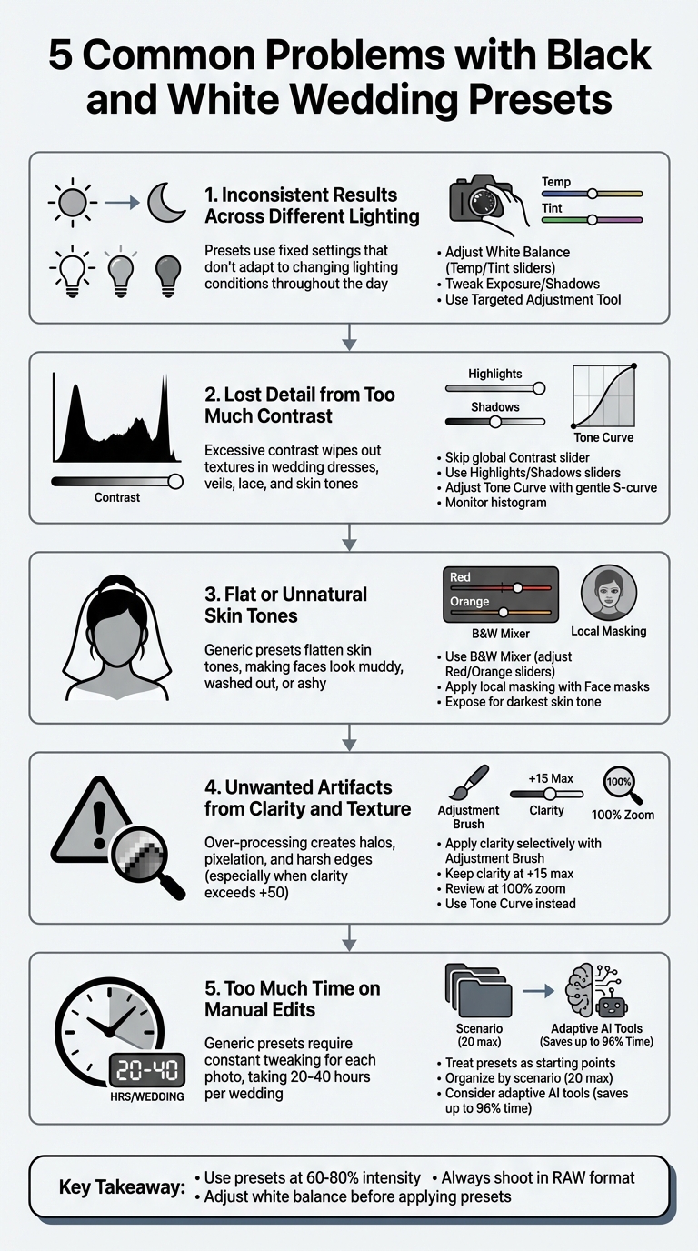
- Problem 1: Inconsistent Results Across Different Lighting
- Problem 2: Lost Detail from Too Much Contrast
- Problem 3: Flat or Unnatural Skin Tones
- Problem 4: Unwanted Artifacts from Clarity and Texture
- Problem 5: Too Much Time Spent on Manual Edits
- How to Use Black and White Wedding Presets Correctly
- Conclusion
- FAQs
5 Common Problems with Black and White Wedding Presets
Black and white wedding presets are popular for creating timeless photos and speeding up editing. However, they often fall short, causing issues like inconsistent lighting, lost detail, unnatural skin tones, and unwanted artifacts. These problems can lead to time-consuming manual adjustments, defeating the purpose of presets. Here's a quick overview of the five main challenges and how to handle them:
- Inconsistent Lighting: Presets struggle with varying light conditions, leading to uneven results.
- Lost Detail: Excessive contrast erases textures in dresses, veils, and skin tones.
- Flat Skin Tones: Generic presets fail to preserve depth, especially with diverse skin tones.
- Artifacts from Clarity/Texture: Overuse creates halos, pixelation, and harsh edges.
- Time-Consuming Edits: Generic presets often require extensive manual tweaks.
To fix these issues, adjust white balance, exposure, and the B&W Mixer for each photo. Use local tools for precise edits and avoid relying solely on global adjustments. Treat presets as starting points rather than one-click solutions to ensure polished, professional results.
5 Common Problems with Black and White Wedding Presets and Solutions
7 Step Advanced Black & White Editing in Lightroom | Master Your Craft
sbb-itb-b27063b
Problem 1: Inconsistent Results Across Different Lighting
Wedding photographers often grapple with a frustrating challenge: lighting conditions can change drastically throughout the day. A sunlit outdoor ceremony at 2:00 PM creates a completely different visual dynamic compared to a dimly lit reception at 8:00 PM. Applying the same black and white preset to both situations can lead to wildly inconsistent results - some photos may look stunning, while others lose important details or feel flat.
Why Lighting Affects Black and White Presets
The main issue lies in the fact that presets rely on fixed settings that don’t adapt to the unique exposure or dynamic range of each photo. Amanda from White Pine Photography sheds light on this common struggle:
Presets are amazing tools... Just make sure to remember that they are a base and that jump scare you get on first application is nothing to be worried about.
White balance plays a huge role in this inconsistency. A preset can appear muddy or overly harsh if the color temperature and tint of the original image don’t align with what the preset was designed for. When presets convert colors to gray tones, warm tungsten lighting and cool daylight will produce different shades of gray, even with identical settings. The Contrast slider often makes things worse. Photographer Andrew S. Gibson describes it as a "blunt instrument" that simultaneously brightens highlights and darkens shadows, erasing delicate details in high-contrast scenes like weddings. These limitations make it essential to fine-tune presets to suit varying lighting conditions.
How to Fix Lighting Problems
Start by adjusting the white balance with the Temp and Tint sliders or the dropper tool to bring out the best in your preset. If the image appears too dark, tweak the Exposure or brighten the Shadows to better suit the specific lighting scenario.
Instead of relying on the global Contrast slider, use more precise adjustments like Highlights, Shadows, or local tools in the Masks panel to retain fine details. For even more control, use the Targeted Adjustment Tool (TAT) in the B&W panel. By clicking and dragging over specific areas, you can adjust the brightness of tones tied to particular colors with pinpoint accuracy. These targeted tweaks can help ensure your black and white edits shine across all lighting conditions.
Problem 2: Lost Detail from Too Much Contrast
Lighting issues can throw off consistency, but excessive contrast introduces a whole new problem: it wipes out detail. Detail is what gives wedding photos their timeless, polished feel, and it’s especially crucial when showcasing intricate elements like lace, silk, or subtle skin tones. While contrast can add drama, overdoing it often comes at the expense of depth and texture.
How High Contrast Harms Wedding Photos
Many presets rely on heavy contrast adjustments, which can backfire. Photographer Andrew S. Gibson explains:
"The Contrast slider is bit of a blunt instrument in the Develop module as it effectively does two things at the same time – darken the shadows and lighten the highlights."
This dual adjustment can wreak havoc. Overexposed highlights bleach out delicate textures in wedding dresses, veils, and lace, while overly dark shadows turn areas like a groom’s tuxedo or the bride’s dark hair into indistinguishable black patches. Even portraits aren’t safe - skin tones lose their natural gradations, leaving faces looking flat and lifeless. Gibson emphasizes the risk: "it's easy to go too far and add too much [contrast], losing subtlety and detail in both shadows and highlights."
How to Protect Detail in Your Photos
The good news? You can avoid this problem with more refined techniques. Skip the global Contrast slider and focus on targeted adjustments. For example:
- Use the Highlights and Shadows sliders to fine-tune specific areas. Lowering highlights can bring back texture in overexposed wedding dresses.
- Adjust the Tone Curve to create a gentle S-curve. This method lifts highlights and deepens shadows but keeps mid-tones intact for a balanced look.
- Take advantage of the Targeted Adjustment tool to tweak brightness in precise areas, like lace or hair, without affecting the whole image.
Finally, keep an eye on the histogram. A balanced photo will show a healthy range of mid-tones, with highlights and shadows tapering off gently at the edges - no clipping allowed! These steps ensure you preserve the detail and depth that make wedding photos truly memorable.

The Master Preset Bundle: Volume II

$69.00
$990.00
The Master Preset Bundle Volume II New Looks. More Styles. Even More Creative Control. Get 66 brand-new Presets.io collections in one powerful Volume 2 bundle — crafted to expand your editing range, refresh your workflow, and deliver polished, professional results in… continue reading
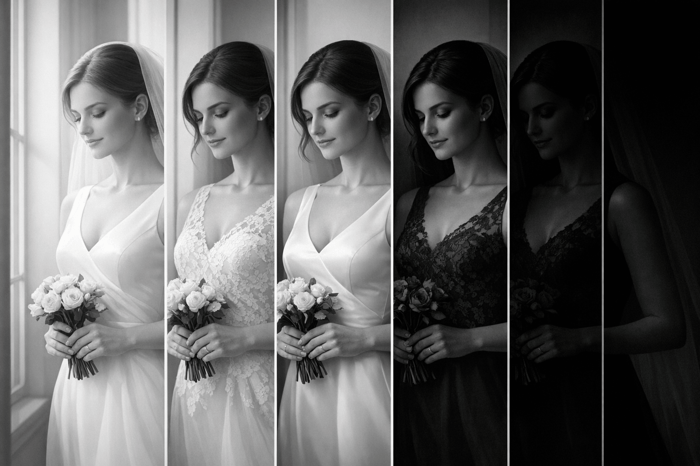
Problem 3: Flat or Unnatural Skin Tones
You've worked on lighting and contrast, but skin tones often pose a unique challenge in black-and-white photography. When converting to grayscale, the process primarily uses the red, orange, and yellow channels to create gray tones. Unfortunately, generic presets often treat these channels the same way, leading to flattened and unnatural-looking skin. This issue becomes even more pronounced in settings with diverse subjects, like weddings.
Why Skin Tones Are Difficult in Black and White
Skin tones are tricky because they require nuance to maintain depth and dimension. During the conversion process, most skin tones are heavily influenced by the red and orange channels. When these channels are handled uniformly, the result can be faces that look muddy, overly gray, or washed out. Photographer Andrew S. Gibson highlights this challenge:
"The correct tonality for most skin colors is in the range from light gray to dark gray... It's easy to over brighten portraits or add too much contrast in order to make the model's skin white."
This problem is magnified by varying skin tones. Lighter skin reflects more light, making it prone to blown-out highlights and loss of detail. On the other hand, darker skin absorbs more light, with its richness often sitting in the midtones. Standard presets frequently overdo contrast or apply heavy "dehazing", which can make darker skin tones appear overly dark or "ashy." At the same time, lighter skin may be pushed to pure white, erasing textures and details entirely.
How to Correct Skin Tone Problems
The key to fixing skin tone issues lies in the B&W Mixer panel, where the red and orange sliders become your best friends. These sliders allow you to fine-tune skin tones without impacting the rest of the image. For example, lightening the orange slider often restores brightness and focus to the face. As MacKintosh Photo explains:
"Adjusting the orange slider... will bring more focus to your subject's face without affecting the whole image. A subtle touch here can make a world of difference."
The yellow slider is another tool to refine midtones, particularly in situations where tungsten lighting creates a muddy appearance. For photos with diverse subjects, expose for the darkest skin tone to preserve shadow detail, then selectively lift highlights for lighter skin during post-processing. You can also use the targeted adjustment tool in the B&W Mixer to click directly on skin areas, allowing the software to automatically adjust the sliders for better results.
For even more precision, try local masking techniques. Use a "People" or "Face" mask to apply subtle exposure boosts or reduce clarity specifically on the skin. This keeps faces soft and natural without compromising the overall aesthetic of the image. These tailored adjustments ensure skin tones look realistic and balanced, which is especially important for the timeless appeal of black-and-white wedding photography.
Problem 4: Unwanted Artifacts from Clarity and Texture
Overusing clarity or texture adjustments can introduce visual flaws that compromise the quality of your images. These flaws often appear as halos, pixelation, or harsh edges, becoming particularly noticeable in close-up portraits or highly detailed shots.
What Clarity and Texture Problems Look Like
Beyond issues with skin tones, clarity and texture adjustments can also diminish overall image quality.
Clarity works by boosting midtone contrast to add depth. However, when pushed too far - typically beyond +50 - it can create halos around high-contrast edges. For instance, you might see these halos where a dark suit meets a bright background or where a subject stands against a bright sky. Photographer Andrew S. Gibson highlights this problem:
"The tones can pixelate, and lines (such as horizon lines) can end up looking like a row of pixels rather than a solid straight line."
In wedding portraits, such as those edited with wedding Luminar NEO presets, excessive clarity can highlight skin imperfections like wrinkles, pores, or blemishes, sometimes making subjects appear older. It might also create unnatural highlights in hair or beards, giving the illusion of premature graying . These effects detract from the timeless elegance often sought in wedding photography.
Detail shots are also vulnerable. Applying clarity globally can sharpen areas that should remain soft, such as blurred backgrounds, leading to digital artifacts. For intricate wedding details like lace, jewelry, or fabric, over-processing can make them appear overly sharp or artificial.
How to Adjust Clarity Without Creating Artifacts
The solution lies in applying clarity selectively rather than globally. Use tools like the Adjustment Brush to target specific areas - such as eyes or textured fabrics - while leaving skin and soft backgrounds untouched. Keep clarity adjustments to a modest +15, and for more tonal separation, tweak Highlights and Shadows instead. As Gibson advises:
"Clarity is often more effective when applied locally rather than to the entire photo."
Always review your edits at 100% zoom to check for halos around high-contrast edges. If halos appear, reduce clarity until the edges look natural, even if that means setting clarity back to zero.
For portraits, use clarity sparingly and keep sharpening sliders close to their default settings to avoid a digital, over-processed look . Instead of relying heavily on clarity, consider using the tone curve to add contrast selectively. This approach helps preserve the classic, polished style that’s crucial in wedding photography, particularly for black-and-white images. By fine-tuning these adjustments, you can maintain the timeless quality that makes wedding photos so special.
Problem 5: Too Much Time Spent on Manual Edits
One of the biggest frustrations in wedding photography is the time spent on manual adjustments, even when using presets. Presets are supposed to simplify the editing process with a single click, but when you're working through hundreds of photos, you often find yourself tweaking white balance, exposure, and contrast for nearly every image. This extra effort defeats the purpose of presets and disrupts the efficiency they promise.
Why Generic Presets Require Constant Tweaks
The main issue with generic presets is their lack of adaptability. They apply the same adjustments to every photo, regardless of differences in lighting conditions. Wedding photography is particularly challenging because the lighting varies dramatically - from the soft morning light during preparation, to the harsh midday sun at the ceremony, to the warm, moody glow of the reception.
Since presets can't adjust to these changing conditions, you’re left correcting white balance and exposure for almost every shot. As Itamar Haim from Imagen explains:
Because presets aren't adaptive, you often spend just as much time correcting the preset as you would have editing from a closer starting point.
Tips to Streamline Your Editing Workflow
To cut down on manual edits, rethink how you use presets. Instead of expecting them to be a one-click solution, treat them as a starting point. After applying a preset, immediately fine-tune the white balance and exposure using a neutral reference, like a white dress or a gray suit. This simple step can resolve most of the issues upfront.
For even faster results, organize your vintage Lightroom presets or other styles by specific scenarios, such as "Outdoor Ceremony" or "Tungsten Reception." Keeping your library to around 20 scenario-specific presets reduces decision fatigue and keeps your workflow efficient.
If editing an entire wedding gallery still takes 20–40 hours, it might be time to explore adaptive AI editing tools. These tools analyze each photo's unique lighting and apply tailored adjustments automatically. Many photographers have reported saving up to 96% of their post-production time with AI-powered solutions, freeing them to focus on creative enhancements rather than repetitive edits.
How to Use Black and White Wedding Presets Correctly
Black and white presets are a starting point, not a magic button for perfect edits. Before diving into a preset, adjust the white balance first. Why? Because the color temperature directly influences how tones are rendered in grayscale. As Visual Flow explains:
It's important to note that color temperature settings DO affect the tonality of black & white images. Be sure to adjust your white balance, just like you'd do when editing a color photo.
Presets serve as a foundation, but they shine when paired with thoughtful adjustments tailored to each photograph. These initial tweaks set the stage for more refined editing in your wedding photography workflow.
Customizing Presets for Wedding Work
When creating or saving a custom preset, it’s essential to leave out variable settings like White Balance, Exposure, Graduated/Radial Filters, Lens Corrections, and Transform. Why? This approach ensures your preset provides a consistent style without overriding the unique characteristics of each image.
Focus your preset on adjustments that define the overall style. For instance, tweaking the Point Curve - such as lifting the bottom-left black point by 10% - can transform pure blacks into soft, rich grays. When it comes to texture and clarity, less is often more. Additionally, zoom in on skin tones, especially when darkening backgrounds, to ensure your edits enhance rather than detract from the subject.
After setting up the base, use the B&W Mixer for fine-tuning tonal conversions.
Using the B&W Mixer for Better Results
The B&W Mixer (or Black & White Mix panel) gives you precise control over how individual colors translate into grayscale. For portraits, the orange slider can brighten skin, while the red luminance slider helps tone down redness or flushes .
To simplify busy backgrounds, darken the green and yellow sliders without affecting your subject. The B&W Mixer is also a lifesaver in mixed lighting scenarios, such as when tungsten indoor lighting clashes with blue window light. It helps unify these competing tones into a cohesive grayscale range. However, proceed with caution - over-adjusting can strip essential details from skin tones, so keep a close eye on your subject's face during these edits.
Conclusion
Black and white wedding presets are excellent starting points, but they require thoughtful tweaks to achieve professional-quality results. To refine your editing process, begin by correcting white balance and exposure before applying your preset at around 60–80% intensity. As Asanka, the creator of AAAPresets, advises:
"Use presets for direction and speed, then manually correct WB/exposure/black point for the specific image."
This approach avoids the overly flat or washed-out look that can result from relying solely on one-click presets.
Shooting in RAW format is essential for maintaining the dynamic range needed to recover highlights and shadows without introducing banding or artifacts . RAW files also retain the full color data that makes the B&W Mixer so effective. For example, you can use the orange slider to brighten skin tones or adjust the green and yellow sliders to darken distracting elements in the background.
It’s important to recognize the limitations of black and white editing. While it can unify mixed lighting and enhance certain elements, it won’t rescue a poorly composed or fundamentally weak image. As DVLOP puts it:
"Don't expect a black and white edit to magically fix a weak photo. If the image isn't great to begin with, it's probably best to leave it out of your deliverables."
FAQs
Why does the same black-and-white preset look different on each photo?
Black-and-white presets often vary in appearance from one photo to another because they apply set adjustments that interact uniquely with each image's lighting, colors, and contrast. Elements like exposure levels, tonal range, and the original color palette all play a role in how the preset transforms the image. To achieve a consistent look, photographers usually tweak the preset after applying it, fine-tuning sliders to match the specific traits of each photo.
How can I keep dress and suit details from getting crushed or blown out?
To keep the intricate details of dresses and suits visible in black-and-white wedding photography, getting the exposure right is crucial. Use your camera's histogram to ensure you're not overexposing bright areas, as this can erase important details. Pay special attention to reflective fabrics and intense lighting conditions, adjusting your settings accordingly. While tools like Lightroom or Photoshop can assist in recovering highlights, the real secret lies in capturing a well-balanced exposure during the shoot itself.
What’s the fastest way to get natural skin tones in black and white?
The fastest way to get natural-looking skin tones in black and white photography is by using Lightroom's B&W Mixer tool. This tool allows you to tweak the brightness of the original colors - such as skin tones, yellows, and greens - to achieve a well-balanced and realistic appearance. It puts you in control, ensuring the skin tones in your final image look as natural as possible.