
Table of Contents
Abstract Juxtapositions in Lightroom Presets
Abstract juxtapositions in photography combine opposites - like fragile and strong, natural and artificial - to create striking visuals. This technique invites viewers to pause and explore contrasts in color, texture, and size. Lightroom presets simplify editing by enhancing these contrasts with one-click adjustments, making it easier to refine tones and textures. Key tools like HSL, Clarity, and AI masking allow photographers to emphasize contrasts and craft surreal, thought-provoking images. For best results, choose presets that amplify contrasts, control color, and work seamlessly with Lightroom’s masking tools.
Key Takeaways:
- Abstract juxtapositions pair opposites (e.g., natural vs. man-made) to create impactful visuals.
- Lightroom presets streamline editing by applying pre-designed adjustments.
- Tools like HSL, Clarity, and masking refine contrasts and textures.
- Select presets focused on color grading, tonal contrast, and artistic effects.
- Export settings for web and print ensure your work maintains its impact across platforms.
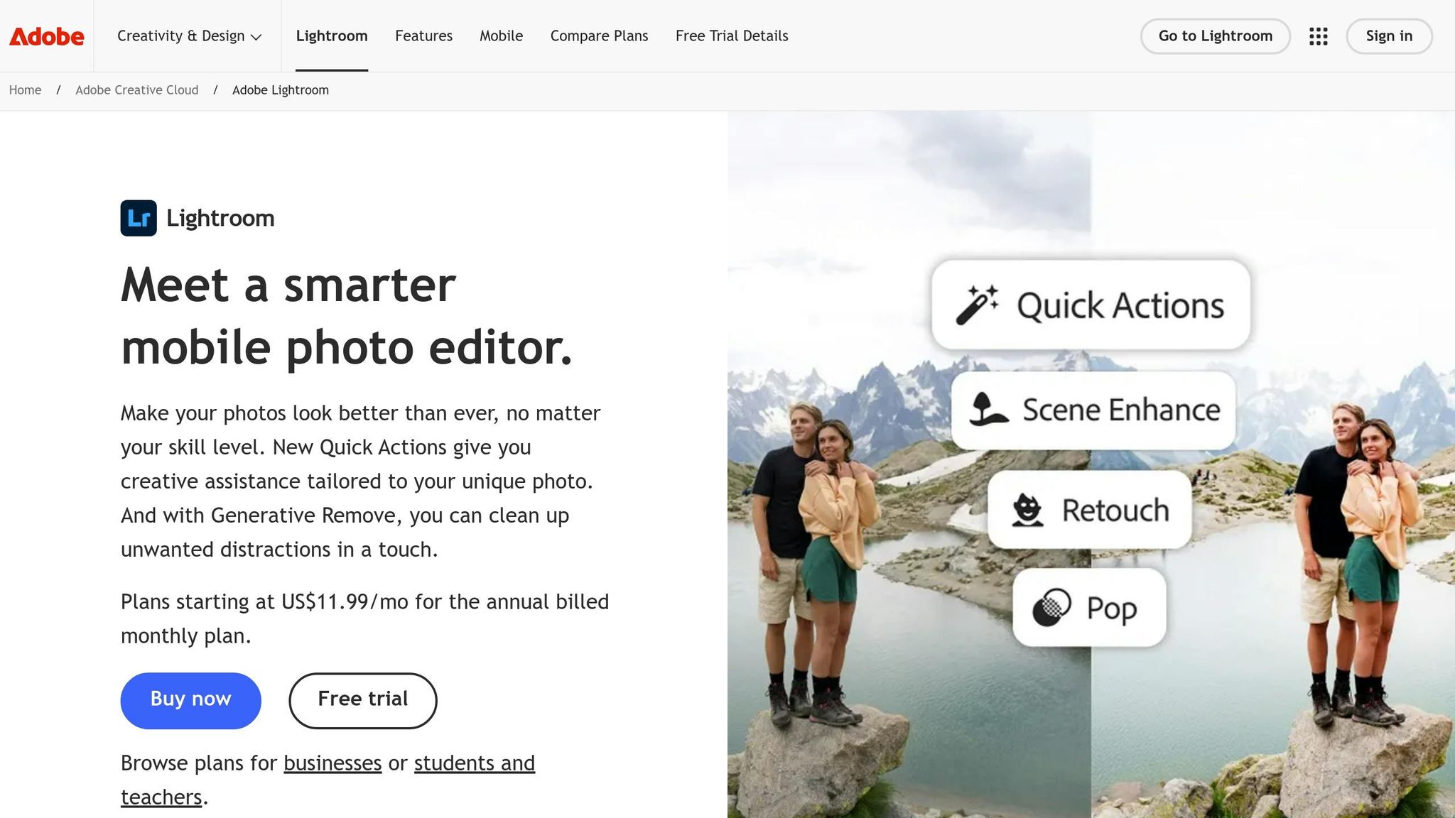
Lightroom presets, such as those from Presets.io, offer curated collections like Cinematic and Vintage Film Bundles, which help photographers achieve bold contrasts and surreal effects. By combining thoughtful shooting techniques with precise editing, you can transform everyday scenes into visually engaging art.
How to Create a Fun Abstract Art Piece with Lightroom Classic

sbb-itb-b27063b
Techniques for Creating Abstract Juxtapositions
Creating abstract juxtapositions involves deliberately combining contrasting elements during both the capture and editing stages. The aim is to make these contrasts feel intentional and visually compelling. To achieve this, think about factors like size, color, shape, texture, and depth even before taking the shot. Once in Lightroom, you can refine these contrasts further. Let’s break down how to emphasize contrast through color, texture, and depth.
Contrasting Size, Color, and Shape
Lightroom's HSL (Hue, Saturation, Luminance) and Clarity tools are your best friends when it comes to enhancing visual tension. Start by using the color wheel to identify complementary color pairs - like Blue/Yellow, Red/Cyan, or Green/Magenta. Then, refine these contrasts in the HSL panel by muting colors that might distract from your intended focus. For instance, if you’re photographing a bright yellow flower against a blue industrial wall, desaturate greens and oranges to make the yellow-blue contrast stand out even more.
"Working with color is as much about the colors you can't see as it is about the ones you can see." - William Palfrey
Instead of ramping up saturation across the board, use Lightroom’s Color Booster to deepen surrounding tones while enhancing your target hues. This technique creates what’s known as perceived saturation, where specific shapes and colors pop without looking overly processed. To double-check your composition, temporarily convert the image to black and white by setting Saturation to -100%. This helps you assess whether the contrast in shape and luminance alone is effective.
For tonal contrast, adjust the Whites and Blacks sliders to stretch the dynamic range of your image. Holding down Alt/Option as you drag these sliders lets you see where pixels clip to pure white or black, ensuring a strong contrast between light and dark areas. Pair this with the Clarity slider to enhance textures in key areas or soften less important ones, creating a striking interplay between sharp and abstract forms.
Combining Natural and Artificial Elements
The contrast between organic and man-made textures tells powerful visual stories. Think of a flower breaking through cracked concrete or a tree growing inside an abandoned structure - these scenes highlight the tension between nature and human intervention. In Lightroom, you can enhance this dynamic using selective sharpening and HSL adjustments. Sharpen the natural elements to emphasize their organic details, while softening artificial backgrounds to create a clear separation.
"This juxtaposition can make us question our impact on the environment and the delicate balance between nature and human intervention." - Evoto AI
To amplify these contrasts, use the HSL panel to adjust the luminance of specific colors. For example, darken a gray concrete wall while brightening green foliage to make the natural element stand out. The dodge and burn technique is another effective tool: brighten the natural subject while darkening its surroundings, guiding the viewer’s eye to the intended focal point.
Using Foreground and Background Dynamics
Spatial layering adds depth and richness to abstract juxtapositions. Instead of placing contrasting elements side by side, arrange them across different planes in your composition. For example, a shallow depth of field can keep a delicate raindrop in sharp focus while blurring a sprawling cityscape in the background, emphasizing the relationship between the small and the vast.
Lightroom’s Luminance and Color Range masks are perfect for isolating specific parts of your image to apply targeted adjustments. You can use these tools to make a small, bright foreground object pop against a darker background, creating a stark contrast in size and tone. To push this effect further, adjust the Tone Curve by lifting the bottom-left point, which flattens shadows and simplifies shapes for a more surreal feel.
Perspective also plays a major role. Shooting from a low angle can make small foreground objects appear larger and more imposing against towering structures. Conversely, a high angle can shrink natural elements, emphasizing their vulnerability within industrial settings. These spatial techniques, combined with Lightroom’s precise editing tools, allow you to create dynamic compositions that feel both intentional and impactful.
Selecting Lightroom Presets for Abstract Effects
When diving into creative editing, the right Lightroom presets can take your abstract photography to the next level. They streamline your workflow while giving you the flexibility to maintain your artistic vision. The trick is to find presets that highlight the contrasts you’re working with - whether it’s bold color clashes, striking tonal differences, or surreal atmospheres. A good preset acts as a starting point, letting you fine-tune the details without spending hours on adjustments.
Best Presets for Abstract Photography
Presets.io offers several preset collections that are particularly well-suited for abstract photography. The Cinematic Bundle is a standout choice, featuring options like Neon Light and Dramatic. These presets are perfect for urban scenes where artificial lighting meets textured surfaces. If you’re after high-contrast black-and-white effects, the Film Noir preset within this bundle emphasizes shape and luminance, drawing attention to the forms in your composition. This bundle is priced at $39.00.
For a softer, dreamier effect, the Vintage Film Bundle is worth exploring. It includes presets like Tokyo Blues and Morning Mist, which give your images a nostalgic, ethereal quality - ideal for blending natural and industrial elements. Another option is the Aesthetic Collection, which delivers darker, moodier effects to enhance atmospheric tension. It’s available for $15.00 (regularly $27.00). One user shared their experience:
"10 come in the pack so it gives a really nice selection of choices all with the similar moody/darker effects".
For those who love the timeless feel of film, the Analog Preset Collection adds grain and texture, creating a bridge between the organic and the artificial. This collection is particularly effective when working with subjects that contrast natural and man-made elements. These curated collections showcase the kind of features to prioritize in presets, which we’ll explore further below.
What to Look for in Presets
The best presets for abstract photography are those that enhance contrasts and provide precise control over color and tone. Here’s what to keep in mind:
- Strong Color Grading: Look for presets that emphasize complementary hues, such as warm tones against cool backgrounds, or saturated areas juxtaposed with muted ones. This creates visual tension and makes your images pop.
- Robust Tonal Contrast: Presets that push the dynamic range between highlights and shadows help define shapes and add depth, making your compositions more striking.
- Masking Compatibility: Ensure the presets work seamlessly with Lightroom’s masking tools. This allows you to apply effects selectively, so you can fine-tune specific elements without altering the entire image.
- Artistic Filters: Features like grain, vignetting, or split toning can amplify the surreal quality of your work. These effects are especially useful for enhancing contrasts in size or shadows.
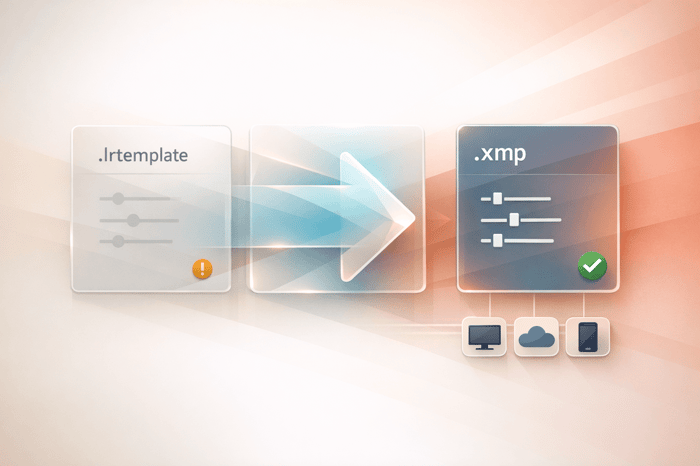
Presets.io collections typically include 10 presets per pack in formats like DNG (mobile), XMP (desktop), and CUBE (video LUT), ensuring you can maintain a cohesive look across different platforms. By choosing presets with these qualities, you can elevate your abstract photography while keeping your creative process efficient and enjoyable.
Step-by-Step Workflow for Abstract Edits in Lightroom
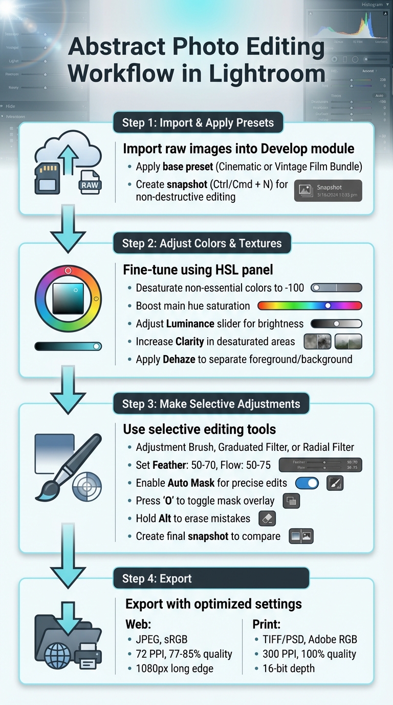
Step-by-Step Lightroom Workflow for Abstract Photo Editing
Once you've chosen the right presets, follow these steps to create abstract edits in Lightroom that emphasize contrasts and highlight striking juxtapositions.
Importing and Applying Presets
Begin by importing your raw images into Lightroom's Develop module. From the Presets panel, apply a base preset - like those from Presets.io's Cinematic or Vintage Film Bundle - to establish the initial tone and contrast. Save this stage by creating a snapshot. Simply click the + button next to Snapshots (or press Ctrl/Cmd + N). This non-destructive approach allows you to revisit this point later without losing any progress.
Adjusting Colors and Textures
Once the preset is applied, fine-tune the image using the HSL panel. Desaturate colors that aren’t essential by setting them to -100, while boosting the saturation of the main hue to make it stand out. This contrast creates a surreal effect, with one vivid element popping against a muted background. Use the Luminance slider to adjust brightness and the Hue slider to introduce unusual tones. For added detail, increase Clarity in the desaturated areas and apply the Dehaze slider in the Effects panel to separate the foreground from the background, enhancing the overall abstract feel.
Making Selective Adjustments
Selective adjustments are where your abstract vision truly comes to life. Use tools like the Adjustment Brush, Graduated Filter, or Radial Filter with a feather set to 50–70 and a flow of 50–75. Turn on Auto Mask to keep edits confined to specific shapes, preventing unwanted spillover. You can toggle the mask overlay by pressing 'O' for a clearer view of your adjustments, and hold Alt to erase any mistakes. These tools allow you to precisely control brightness, saturation, and clarity on specific elements, ensuring your contrasts and juxtapositions feel intentional and well-balanced. After completing these edits, create another snapshot to compare this stage with your initial base preset.

The Master Preset Bundle: Volume II

$69.00
$990.00
The Master Preset Bundle Volume II New Looks. More Styles. Even More Creative Control. Get 66 brand-new Presets.io collections in one powerful Volume 2 bundle — crafted to expand your editing range, refresh your workflow, and deliver polished, professional results in… continue reading
Exporting Abstract Images
After refining your abstract compositions with The Master Preset Bundle in Lightroom, exporting them with the right settings is crucial to maintaining their visual impact. Whether your work is destined for a smartphone screen or gallery-quality paper, the following export techniques ensure your abstract contrasts and details remain striking.
Export Settings for Web and Print
When exporting for web use, opt for JPEG with sRGB color space at 72 PPI. For social media platforms, set the JPEG quality between 77%-85% to balance image clarity and file size. On Instagram, export at 1080 pixels on the long edge (or 1080 × 1350 pixels for 4:5 portrait images) to avoid excessive compression. For Facebook, use 2048 pixels on the long edge, keeping file sizes under 15 MB for optimal display.
For print, use TIFF or PSD files with either Adobe RGB or ProPhoto RGB color profiles at 300 PPI and 100% quality. These settings preserve the broader color range and subtle tonal shifts that define abstract images. Ensure you export with 16-bit depth to avoid banding in smooth gradients. Additionally, enable the "Don't Enlarge" option in Lightroom's Image Sizing panel to prevent upscaling, which can soften details.
Sharpening should match your output medium. For web, apply "Screen (Low)" sharpening to avoid artifacts. For prints, choose "Matte" or "Glossy (Standard)" sharpening, depending on your paper type. If your image contains intricate textures, consider turning off output sharpening in the export settings and manually fine-tuning it in Lightroom's Develop module for better precision.
Displaying Your Abstract Work
How you present your abstract images is just as important as the export settings. For online portfolios, use descriptive file names with hyphens, such as 2026-03-05-urban-nature-contrast-01.jpg, to improve search engine indexing. Always embed copyright and contact details in the metadata to safeguard your work when shared online.
Before finalizing your exports, test them on a mobile device to ensure the colors and contrast look consistent on smaller, high-density screens. To avoid underexposure, lower your monitor brightness during editing; overly bright screens can cause your images to appear too dark on other devices. When curating a portfolio, focus on quality over quantity - limit your selection to 3 to 10 of your best images. For those looking to expand their creative toolkit, a Lightroom preset subscription provides access to diverse styles for every portfolio piece. Including too many weaker pieces can dilute the impact of your strongest work and may give the impression of inexperience to gallery owners or clients.
Conclusion
Creating abstract juxtapositions in Lightroom becomes much easier when you combine creative techniques with high-quality presets. This guide covered how elements like contrasting size, color, and shape, blending natural with artificial features, and playing with foreground-background dynamics can turn everyday photos into striking abstract compositions. The key? Experiment and refine as you go.
Presets.io offers presets that bring cinematic, vintage, and film-inspired looks to your edits. These presets enhance contrasts, add selective color pops, and boost textures, helping you achieve bold visual juxtapositions while maintaining creative control. By applying a preset as your base and fine-tuning with tools like selective adjustments and masking, you can strike the perfect balance between efficiency and artistic freedom.
From there, experimentation is your playground. Try layering presets, adjusting complementary colors, or using value masking to create unexpected focal points. Think of presets as starting points - they’re meant to be tweaked, layered, and customized to shape your own abstract style.
Don’t overlook the final touches either. Export settings and presentation choices matter just as much. Whether you’re sharing online at 1,080 pixels or printing at 300 PPI, maintaining those vivid contrasts ensures your abstract work makes an impact, no matter the platform.
With new presets and straightforward installation guides, technical hurdles fade into the background, letting you focus on creating bold, imaginative visuals. By blending creative techniques with expertly designed presets, you can transform your images into thought-provoking, eye-catching art.
FAQs
What makes a photo an “abstract juxtaposition”?
An "abstract juxtaposition" in photography brings together contrasting or unrelated elements to create a sense of visual or conceptual tension. Instead of focusing on clear, recognizable subjects, this technique highlights abstraction by emphasizing shapes, colors, and textures, inviting viewers to interpret the image in multiple ways.
If you're looking to amplify these contrasts, Lightroom presets can be a valuable tool. With filters and adjustments, you can intensify the differences between elements. Adding artistic effects or surreal touches can make these contrasts even more striking, resulting in images that are both thought-provoking and visually engaging.
Which Lightroom tools matter most after applying a preset?
After using a preset in Lightroom, the real magic happens with fine-tuning. The Basic panel - which includes sliders for exposure, contrast, highlights, shadows, whites, and blacks - lets you perfect the overall balance of your image. If you need more precise control over contrast and brightness, the Tone Curve is your go-to tool.
For color adjustments, tools like HSL (Hue, Saturation, Luminance) and Color Grading are key. These allow you to tweak individual colors, enhance specific tones, and create a mood that aligns with your creative vision. Together, these tools give you the flexibility to transform your photo into something that feels uniquely yours.
How do I keep my contrasts strong when exporting for web or print?
When preparing images for export, maintaining strong contrast starts during the editing process. Use tools like exposure adjustments, contrast tweaks, and tone curve modifications in Lightroom to get the desired look. Don’t forget to refine the color settings to keep the image vibrant and visually appealing.
For web use, export your images as high-quality JPEGs in the sRGB color space to ensure consistent color display across devices. For print purposes, opt for TIFF files or high-resolution JPEGs, using Adobe RGB or CMYK color profiles for accurate color reproduction. Choosing the right export settings is key to keeping your contrasts sharp, no matter the format.