
Table of Contents
- Ultimate Guide to Film Look Emulation in Lightroom
- Edit Digital Photos to look like Film with Lightroom & Dehancer
- Tools and Resources for Film Look Emulation
- Step-by-Step Manual Editing for Film Look
- Recreating Specific Film Stocks
- Creating and Saving Custom Presets
- Conclusion: Mastering Film Look Emulation in Lightroom
- FAQs
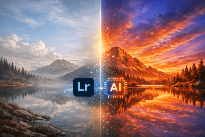
Ultimate Guide to Film Look Emulation in Lightroom
To achieve a film-inspired aesthetic in your digital photography, Lightroom offers powerful tools to replicate the timeless qualities of analog film. This process, known as film look emulation, focuses on three key elements:
- Tone Adjustments: Use the Tone Curve to soften shadows, compress highlights, and create a matte effect.
- Color Grading: Introduce subtle color shifts, like warm skin tones or teal shadows, using the HSL panel and color grading tools.
- Grain Application: Add texture with Lightroom's grain sliders to mimic the organic feel of film.
Lightroom's built-in presets, third-party options, and plugins like Dehancer provide quick ways to emulate classic film stocks such as Kodak Portra 400 or Fuji Velvia 50. For more control, manual editing allows you to fine-tune each detail to match your creative vision. Save your adjustments as custom presets for consistent results across multiple images.
Film emulation combines the nostalgic charm of analog photography with the flexibility of digital tools, making it accessible for photographers of all skill levels.
Edit Digital Photos to look like Film with Lightroom & Dehancer
sbb-itb-b27063b
Tools and Resources for Film Look Emulation
Lightroom provides a variety of tools to help you achieve a film-inspired look, ranging from its built-in features to external resources. Understanding these options and knowing when to use them can elevate your edits from a generic vintage filter to a more authentic film emulation.
Built-in Lightroom Profiles and Presets
Lightroom comes with several free presets under the Creative and Color tabs, which are great starting points. For example, the Vintage Instant preset adds warmth and mutes highlights, creating a nostalgic feel. The Aged Photo preset fades colors for an older appearance, while Matte reduces saturation and boosts contrast for a dramatic effect. If you’re a Creative Cloud subscriber, you also gain access to premium packs like Auto+: Retro, which balances tones and softens highlights, and Style: Vintage, which introduces grit and film-like effects for outdoor scenes.
Creative Profiles offer a distinct advantage over standard presets. As Adam Welch puts it:
Creative Profiles allow us to introduce color grading to our vintage film simulations... they apply themselves without disrupting any of your development settings.
This means you can create a filmic foundation without altering the Basic panel sliders, giving you full control over manual adjustments. The Amount or Density slider lets you adjust the effect’s intensity without impacting other settings. These tools are an excellent foundation for anyone looking to explore more advanced film emulation options.
Using Presets for Quick Results
If Lightroom’s built-in options don’t meet your needs, third-party presets can offer more advanced control and precision. Platforms like Presets.io provide a range of high-quality film look presets, such as "Retro Film" and "Fuji Film", often priced at $12.00 during sales (regularly $27.00). They also offer bundles like the Master Preset Bundle, which includes 721 presets for $49.00. With a 4.8/5-star rating from over 1,400 reviews, users describe these presets as "versatile", "creatively designed", and beginner-friendly.
These presets deliver one-click transformations that are fully adjustable, making them perfect for maintaining visual consistency across large photo sets. This is particularly useful for professional projects like wedding or editorial photography. To get the best results, choose presets that match your shooting environment. For example, "Night & Day" packs work well for low-light or urban scenes, while "Fuji Original" is ideal for bright outdoor settings. A simple workflow involves applying a film emulation preset first, adjusting exposure, and then fine-tuning white balance to perfect the look.
Additional Plugins and Tools
For those seeking even greater precision in film emulation, advanced plugins can expand Lightroom’s capabilities. Tools like Dehancer use proprietary algorithms to replicate effects like halation, bloom, and authentic film grain, all based on extensive lab research. Dehancer integrates seamlessly with Lightroom Classic and offers profiles for over 60 film stocks and 130 camera log profiles.
| Tool Type | Key Features | Best For |
|---|---|---|
| Built-in Presets | Quick, one-click adjustments; sets pre-defined slider values | Fast edits and beginner-friendly adjustments |
| Creative Profiles | Color grading without affecting manual settings | Advanced workflows requiring manual fine-tuning |
| Third-Party Presets | Specific film stock emulations with flexibility | Batch editing and consistent aesthetics |
| Plugins (Dehancer) | Simulates halation, bloom, and film grain effects | High-end film chemistry emulation |
These tools and resources provide a wide range of options, from quick edits to professional-grade film simulations, ensuring there’s something for every level of expertise and creative vision.
Step-by-Step Manual Editing for Film Look
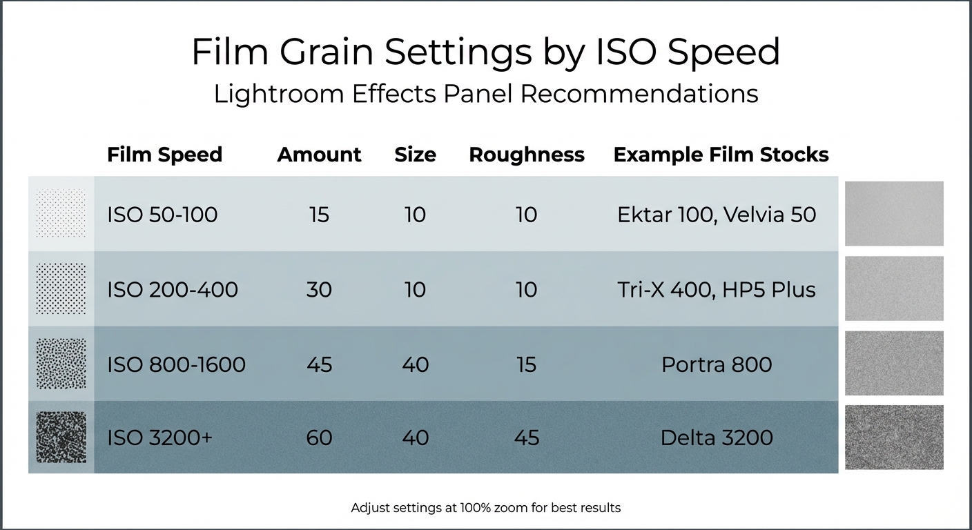
Film Grain Settings Guide for Different ISO Speeds in Lightroom
Digital film presets might save time, but manually editing your photos gives you full control over the final look. By mastering Lightroom's core tools, you can create film emulations that align perfectly with your creative vision. The key areas to focus on are tone curves, color grading, and grain application.
Tone Curve Adjustments
The Tone Curve is your go-to tool for capturing the tonal qualities of film. To gain full control, click the point curve icon in the Tone Curve panel to disable the default sliders. This opens up precise adjustments for every tonal range.
To achieve the classic matte effect, start by lifting the bottom-left point of the curve vertically. This raises black tones to a dark gray, replicating the crushed shadows characteristic of analog film. Photographer Dzvonko Petrovski explains:
The film look in itself is a fairly simple thing to achieve. You need to destroy some of the details in the shadows (mess up the blacks) and compress the highlights a tad.
Next, add a point near the top-right of the curve to lock the midsection and pull the top-right point down slightly. This compresses the highlights, softening bright areas and mimicking film's muted handling of whites.
For contrast, create a subtle S-curve by adjusting the shadow and highlight points in opposite directions. This technique mirrors the bold contrast of certain film stocks like Fuji Provia 400X. These tonal tweaks lay the groundwork for the next step: color grading.
Color Grading Techniques
Once the tonal adjustments are set, move on to color grading to complete the film look. Unlike digital photography, film often has imperfect, nuanced colors, making this step essential. Start by switching your color profile to "Adobe Neutral" in the Profile Browser. This gives you a flatter base to work with by removing excessive contrast and saturation.
For specific film-inspired tints, use the Red, Green, or Blue channels in the Tone Curve. For example, lifting the Blue channel's shadows adds a cool tint, while lowering its midsection brings warmth to skin tones. These adjustments help recreate the complementary color schemes often seen in film, such as teal shadows paired with orange highlights or warm yellow tones for a vintage feel.
The HSL panel is another powerful tool. Lowering vibrance and saturation (up to -75) achieves the faded, aged look of film. This desaturation mimics how physical film loses color intensity over time. Additionally, reducing the Clarity slider by -10 to -20 softens the image, imitating the look of older lenses and film stocks.
Applying Grain and Texture
With tones and colors refined, the final step is adding grain to replicate the texture of film. Unlike digital noise, film grain comes from silver halide crystals, giving it an organic appearance. Before applying grain, increase the Color Noise Reduction slider to eliminate digital artifacts, as these are unique to digital sensors and not part of the film look.
The Effects panel offers three grain sliders: Amount, Size, and Roughness. These work together to shape the grain's visibility, particle size, and texture. For example:
- Amount: Controls how visible the grain is.
- Size: Adjusts the diameter of grain particles (larger sizes mimic high-speed film).
- Roughness: Determines how irregular or gritty the texture appears.
Always zoom to 100% view while adjusting these settings to see the grain's effect clearly.
| Film Speed | Amount | Size | Roughness | Example Stocks |
|---|---|---|---|---|
| ISO 50-100 | 15 | 10 | 10 | Ektar 100, Velvia 50 |
| ISO 200-400 | 30 | 10 | 10 | Tri-X 400, HP5 Plus |
| ISO 800-1600 | 45 | 40 | 15 | Portra 800 |
| ISO 3200+ | 60 | 40 | 45 | Delta 3200 |
These settings provide a solid starting point for emulating different film stocks. As Joshua Dunlop, founder of ExpertPhotography, explains:
The larger grain is more noticeable. This larger grain emphasizes the timeless or gritty effect you may want to achieve. Notice that the sharpness will change with the Size adjustment.
Higher roughness values create the uneven, organic texture of traditional darkroom prints, while lower values result in a cleaner, more digital-like appearance. Adjust the grain settings based on the film stock you're emulating and the mood you want to convey.

The Master Preset Bundle: Volume II

$69.00
$990.00
The Master Preset Bundle Volume II New Looks. More Styles. Even More Creative Control. Get 66 brand-new Presets.io collections in one powerful Volume 2 bundle — crafted to expand your editing range, refresh your workflow, and deliver polished, professional results in… continue reading
Recreating Specific Film Stocks
Once you've got a handle on manual editing techniques, you can take it a step further by emulating specific film stocks. Each film stock has its own personality - characteristics like color tones, contrast, and grain that make it stand out. Two favorites among photographers are Kodak Portra 400 and Fuji Velvia 50, each catering to different photographic styles.
Let’s dive into the soft, warm charm of Kodak Portra 400 first.
Kodak Portra 400
Kodak Portra 400 is celebrated for its luminous, natural skin tones and warm contrast. Its wide dynamic range preserves details beautifully, while its fine grain lends an organic, textured feel.
To mimic this look, start with the Tone Curve. Create a gentle S-curve: lift the shadows (bottom-left point) to soften blacks and lower the highlights (top-right point) to mute whites.
"Portra 400 is famous for how it renders skin. It has a way of making skin look luminous and natural, with warm undertones that are flattering." – Imagen
Next, head to the HSL panel for fine-tuning:
- Shift Green hues toward yellow and reduce their saturation for warm, natural foliage.
- Move Blue hues slightly toward cyan and lower their saturation for soft, airy skies.
- Increase Orange Luminance to make skin tones glow.
In the Calibration panel, bump up the Saturation of the Red Primary to enhance skin warmth. Move the Blue Primary Hue slider toward cyan to mimic Portra's classic color science. For a softer, less digital appearance, lower the Contrast, Clarity, and Texture sliders in the Basic panel. Finally, add fine grain in the Effects panel to replicate Portra's subtle texture.
Here’s a quick breakdown of adjustments to nail the Portra 400 vibe:
| Adjustment | Lightroom Action | Portra 400 Effect |
|---|---|---|
| Tone Curve | Lift shadows, mute highlights | Soft, matte contrast |
| HSL – Green | Shift Hue toward yellow, reduce Saturation | Warm, natural greens |
| HSL – Orange | Boost Luminance | Glowing skin tones |
| Calibration | Adjust Blue Primary Hue toward cyan | Classic, film-like tones |
| Effects | Add fine grain | Organic, textured feel |
| Basics | Lower Clarity and Texture | Soft, dreamy finish |
Now, let’s switch gears to the bold, vibrant world of Fuji Velvia 50.
Fuji Velvia 50
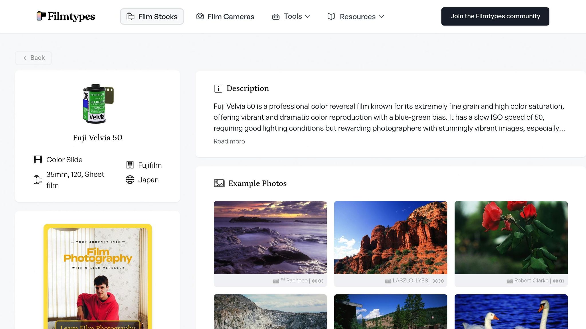
Fuji Velvia 50 is all about bold contrast and saturated colors. It’s a go-to for landscape photographers who love capturing the drama of sunrises, sunsets, and vivid natural scenes.
Start with the Tone Curve. Add a punchy contrast curve with deep blacks and bright highlights to create dramatic visual impact. This adjustment brings out Velvia's signature vibrance.
In the HSL panel, crank up the saturation for blues and greens to achieve that intense, vivid look. Lower the Luminance for blues to deepen skies, while increasing it for greens to make foliage pop with brightness.
Adjust the white balance in the Basic panel to lean slightly cooler, reflecting Velvia’s tendency for cool, vibrant tones. To match its sharp, crisp feel, increase the Sharpness in the Detail panel. Add a touch of fine grain in the Effects panel - just enough to keep the texture subtle and true to Velvia’s character.
Kodak Portra 400 shines with its soft, warm tones, perfect for portraits. On the other hand, Fuji Velvia 50 delivers bold, saturated colors and deep contrast, making it ideal for landscapes. Knowing these differences allows you to choose the right emulation for your creative vision.
Creating and Saving Custom Presets
After fine-tuning your image with manual edits, you can streamline your workflow by saving these settings as custom presets. Once you’ve nailed your film look adjustments, save them as a custom preset to quickly apply the same style across multiple photos. In the Develop module, head to the Presets panel on the left side, click the "+" icon, and choose "Create Preset" to bring up the New Develop Preset dialog box.
When creating your preset, avoid selecting every available option. Instead, focus on the settings that define your unique film aesthetic - such as Tone Curve, Grain, Process Version, and Treatment (Color) Version. Skip Exposure and White Balance, as these are image-specific and can drastically alter your results. Photographer Taya Ivanova explains:
"I don't recommend selecting exposure because it will dramatically alter every image."
Artur Berlin of BeArt Presets adds:
"I suggest leaving only the Tone Curve, Grain, Process, and Treatment (Color) Version boxes checked. This allows you to apply the film style you've saved while still being able individually to adjust other settings such as exposure or light."
By saving only the essential adjustments, you preserve the film aesthetic while keeping the flexibility to fine-tune each image.
How to Create a Preset
To start, click "Check None" in the preset dialog box to deselect all options. Then, select only the adjustments you’ve modified. For a true film-inspired look, focus on settings like Tone Curve, HSL, Calibration, and Grain - these are the key elements that shape your film stock style without overriding basic corrections. Save your preset in a custom folder for easy access and give it a descriptive name, such as "Kodak Warmth Inspired" or "Fuji Vivid Landscape." Once saved, test your preset on images with different lighting conditions to ensure it works consistently.
Tips for Organizing and Naming Presets
Keep your presets organized by grouping them into folders or subfolders based on their style or purpose. For example, you could create categories like "Film Emulation", "Portraits", or "Landscapes." To make your presets even more user-friendly, include intensity indicators in their names, such as "Portra 400 ++" for a stronger effect or "Velvia 50 -" for a subtler one. You can also create modular "toolkit" presets for specific tasks, like adding heavy grain or correcting chromatic aberration.
To back up your custom presets, right-click on any preset in the panel and select "Export". For added convenience, use Adobe Creative Cloud to sync your presets across devices and ensure they’re always at your fingertips. If you're editing on the go, you can also import presets to Lightroom on Android to maintain your film look across all platforms.
Conclusion: Mastering Film Look Emulation in Lightroom
To recreate the timeless charm of film in Lightroom, focus on refining tone, color, and grain. These elements are the foundation for achieving a film-inspired aesthetic. Adjust the Tone Curve to replicate the soft contrast and shadow roll-off characteristic of film, use color grading to infuse highlights and shadows with subtle tints, and apply grain to mimic the natural texture of silver halide crystals. Photographer Lauren Wessel from Archipelago Presets sums it up perfectly:
Film-inspired editing is about more than just mimicking a look; it's about capturing a feeling.
The key to success lies in practice. Start by experimenting manually with the tools in Lightroom. Build an inspiration board featuring your favorite film stocks, study their distinct features, and practice replicating them using tools like the point curve and split toning. When working with grain, always zoom in to 100% to ensure the texture feels natural. This hands-on process not only sharpens your technical skills but also helps you develop a unique visual style.
While manual editing is invaluable for learning, presets can save time and ensure consistency. High-quality presets, like those available on Presets.io, can emulate classic film stocks with just a few clicks. These presets give you a professional starting point, allowing you to focus on fine-tuning exposure or white balance rather than starting from scratch every time.
Whether you prefer to craft every detail manually or rely on presets for efficiency, consistency is the secret to a cohesive film look. Save your favorite manual adjustments as custom presets to streamline your workflow while maintaining flexibility. This balance lets you adapt to the unique qualities of each image while preserving a unified aesthetic.
FAQs
How can I create a custom film look preset in Lightroom?
To craft a custom film look preset in Lightroom, begin by picking a photo that reflects the film style you want to replicate. Start in the Basic Panel by softening the highlights and enhancing shadow details to achieve a balanced, vintage feel. Next, use the Tone Curve to create a gentle "S" shape, which delivers that signature film-like contrast. Move on to the HSL/Color Panel, where you can fine-tune hues, saturation, and luminance to match the film's color palette. Finally, head to the Effects Panel to add some grain, giving your image that classic analog texture.
When you're happy with the adjustments, save your work as a preset by clicking Create Preset in the Presets Panel. Be sure to name it something descriptive so you can easily identify it later. Test the preset on a variety of images, making small tweaks as needed to ensure it works across different scenarios. If you're looking for ideas or want a starting point, check out the high-quality film-look presets on Presets.io - they can help you refine your style and streamline your editing process.
What sets Kodak Portra 400 and Fuji Velvia 50 emulations apart?
Kodak Portra 400 emulations are prized for their fine grain, natural color tones, and forgiving exposure range. These characteristics make them a favorite for portraits, weddings, and everyday photography where capturing a realistic and soft aesthetic is key.
In contrast, Fuji Velvia 50 emulations stand out with their bold, saturated colors and striking contrast. They’re perfect for landscapes, nature shots, or any scene that calls for vivid, dramatic tones. Both styles hold iconic status, but each serves a different artistic vision, offering distinct ways to enhance your images.
How do I create a natural film grain effect in Lightroom?
To create a realistic film grain effect in Lightroom, head to the Effects panel within the Develop module. Use the Grain sliders to fine-tune the texture: adjust the Amount to 20–40 for a light touch, set Size between 25–35 to control the intensity, and tweak Roughness to 40–60 for a natural, organic look. For better precision, try using masking tools to apply the grain selectively - focusing on midtones and highlights while keeping shadows clean. Once you're satisfied, save your adjustments as a custom preset for quick use on future edits.