
Table of Contents
- Dark and Dramatic Edits: Color Palette Checklist
- How to Achieve Perfect Cinematic COLOR GRADING (LUTs + Powergrade)
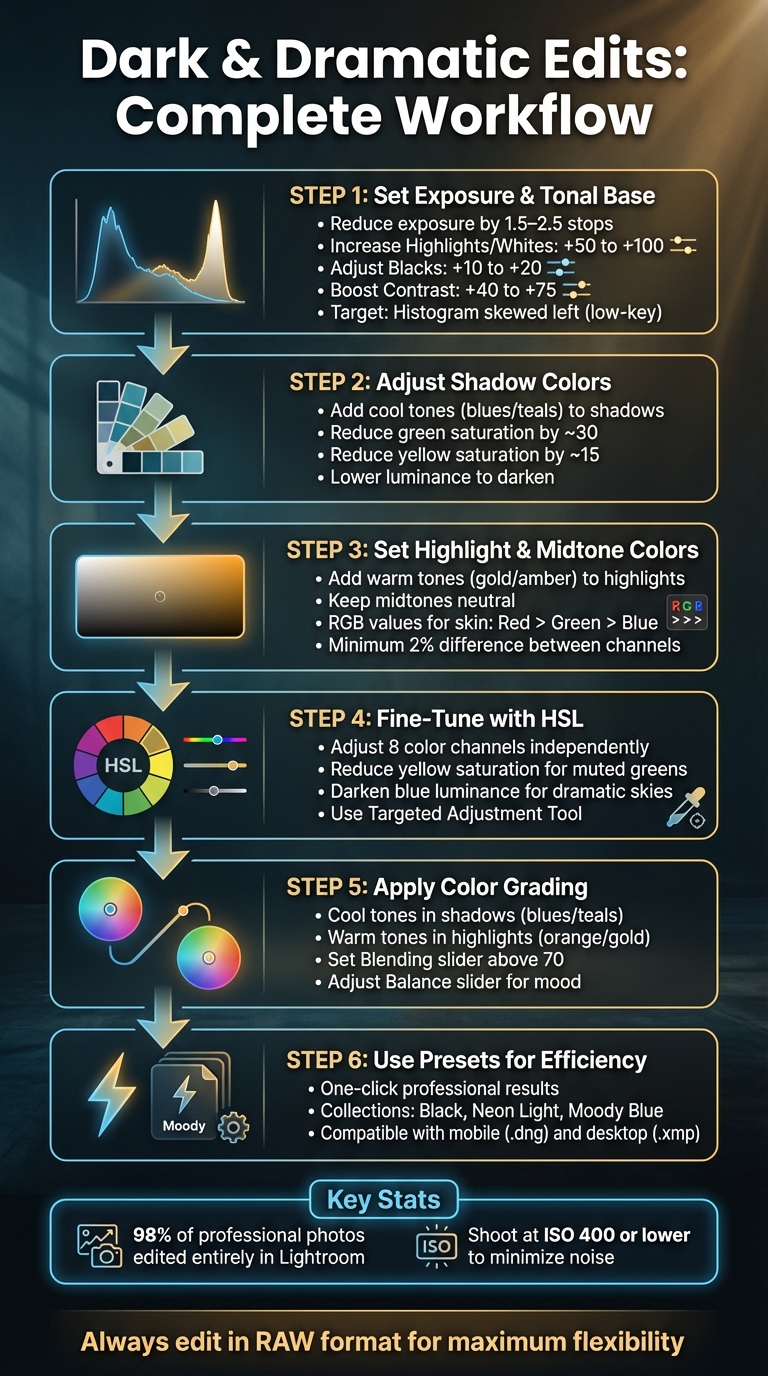
- Step 1: Set Your Exposure and Tonal Base
- Step 2: Choose and Adjust Shadow Colors
- Step 3: Set Highlight and Midtone Colors
- Step 4: Fine-Tune with HSL Adjustments
- Step 5: Apply Color Grading
- Step 6: Use Presets.io for Quick Results
- Conclusion
- FAQs
Dark and Dramatic Edits: Color Palette Checklist
Creating dark and dramatic photo edits isn’t just about making an image darker. It’s about crafting a mood with careful tonal adjustments and deliberate color choices. Here’s how you can achieve this cinematic effect:
- Set Exposure and Shadows: Start with a low-key tonal base by reducing exposure, deepening blacks, and enhancing contrast. Use the histogram to ensure shadows dominate without losing texture.
- Shadow Colors: Add cool tones like blues or teals to shadows for a moody atmosphere. Adjust greens and yellows to avoid clashing tones.
- Highlight and Midtone Colors: Use warm tones like amber or gold in highlights to create striking contrast while ensuring midtones remain neutral.
- Fine-Tune with HSL: Adjust specific color channels to tone down overly vibrant hues and refine brightness.
- Color Grading: Balance cool shadows with warm highlights for depth and tension. Use Lightroom’s tools to blend tones smoothly.
- Presets for Efficiency: Tools like Presets.io offer one-click options for professional results, saving time while maintaining quality.
6-Step Dark and Dramatic Photo Editing Workflow
How to Achieve Perfect Cinematic COLOR GRADING (LUTs + Powergrade)
sbb-itb-b27063b
Step 1: Set Your Exposure and Tonal Base
Start by creating a low-key base with purposeful shadows and minimal midtones. The goal isn’t to make everything pitch black but to craft intentional darkness that retains texture and detail. This foundational tone sets the stage for precise color adjustments later on.
Read the Histogram
The histogram acts as your guide to achieving the right low-key exposure. Unlike the balanced bell curve of a standard image, you’ll want the graph skewed heavily to the left, with sharp spikes in the shadow zones. This indicates that most of the tonal information is concentrated in the darker areas, which is essential for building that dramatic, moody vibe.
"Try to get used to histograms that are pushed to the left, with steep spikes in the shadow zones. This is known as a 'low key' image, an image dominated by shadows, very few midtones, and just a few highlights." - Christopher Lin, Photographer
Allow for slight clipping on the left edge, but ensure you maintain detail in critical areas. A touch of pure black can actually enhance the dramatic effect, but it’s important to preserve textures in areas like clothing or foliage. If you’re using Lightroom, press the 'J' key to highlight clipped areas in blue (shadows) or red (highlights). Minimal shadow clipping is acceptable, but blown-out highlights are much harder to manage, as they leave distracting white patches in your final image.
Deepen Blacks and Shadows
To create a darker tone, reduce the overall exposure by 1.5–2.5 stops. Then, recover important details by increasing Highlights or Whites (+50 to +100). Adjust the Blacks slider to the left (+10 to +20) to anchor the shadows, but if you lose too much texture, balance it out by moving the Shadows slider slightly to the right (+20 to +30). Boost contrast (+40 to +75) to make the subject stand out.
Interestingly, about 98% of professional photos edited by studios like Lin and Jirsa are processed almost entirely in Lightroom using these tonal adjustments, without needing Photoshop.
One key tip: always aim to shoot at ISO 400 or lower. Heavy shadow editing can amplify digital noise, and high-ISO images tend to look grainy and unpolished during post-processing.
Step 2: Choose and Adjust Shadow Colors
After establishing your dark tonal base, the next step is refining shadow colors to enhance the overall mood. Cool tones, such as blues and teals, are excellent for deepening shadows and adding an air of mystery to your image.
To achieve this, reduce the luminance of cool colors in the HSL panel. This adjustment helps them blend naturally into the shadows, amplifying the atmospheric effect. Then, fine-tune these tones with precise HSL tweaks to ensure harmony.
A lesser-known but effective technique is lifting the black point on your RGB Tone Curve. This softens harsh contrasts and integrates your shadow colors seamlessly. Once you’ve set the shadows, it’s time to tackle any hues that might disrupt the mood.
Adjust Greens
Bright greens can be a challenge in dark edits, as vibrant foliage or nature tones often clash with a moody atmosphere. A simple three-step adjustment in the HSL panel can fix this: shift the hue, decrease saturation, and darken the luminance.
Move the Green hue slider toward the right (or adjust the Yellow hue toward green), reduce saturation (greens by about 30 and yellows by 15), and lower the luminance to tone down any distracting vibrancy. As Ryan from Signature Edits explains:
"Desaturation gives a more moody vibe to your image – Where adding saturation adds color, life and energy, taking saturation away gives photos more of a moody, raw feel"
For a more autumn-inspired look, adjust the greens toward yellow or brown using the hue slider. These subtle shifts can make a big difference in achieving the desired mood.
Step 3: Set Highlight and Midtone Colors
Now, let’s focus on creating depth by emphasizing the contrast between highlights and midtones.
Dark midtones serve as the perfect backdrop for bright highlights, drawing attention to your subject. For instance, pairing navy or charcoal with soft off-white or amber can create a dramatic, cinematic "Noir" effect.
"A dark color palette can guide your viewers' eyes, make titles feel bold, and give your scenes a stylish low‐light atmosphere without losing clarity." – Max Wales, Filmora
Stick to neutral-to-warm midtones that work well with your chosen highlights and shadows. This balance ensures your highlights stand out while maintaining harmony across the image.
Add Warm Tones to Highlights
Adding subtle gold or orange tones to your highlights can boost contrast while keeping the details intact. If the highlights start to feel too intense, try using a "highlight soft" tone profile or adjust the luminance slider to restore texture. For a smoother transition, move the Balance slider to the right - this spreads warmth more evenly across the tonal range.
Maintain Natural Skin Tones
Intense edits can easily distort skin tones, but with a few adjustments, you can keep them looking natural. Start by reviewing the RGB values in your histogram. For natural-looking skin, the Red channel should have the highest value, followed by Green, with Blue as the lowest.
"The blue % value should be the lowest value. The green % value should be higher than the blue value by at least one percentage point. The red % value should be the highest value and at least two percentage points over the green." – Gayle Vehar, Lightroom Instructor, Pretty Presets
Fine-tune the orange channel’s luminance to brighten skin without affecting the overall exposure. If the warmth feels excessive, reduce the orange saturation slightly.

The Master Preset Bundle: Volume II

$69.00
$990.00
The Master Preset Bundle Volume II New Looks. More Styles. Even More Creative Control. Get 66 brand-new Presets.io collections in one powerful Volume 2 bundle — crafted to expand your editing range, refresh your workflow, and deliver polished, professional results in… continue reading
Step 4: Fine-Tune with HSL Adjustments
The HSL panel is your go-to tool for tweaking colors with precision. It lets you adjust eight color channels - Red, Orange, Yellow, Green, Aqua, Blue, Purple, and Magenta - without affecting the rest of your image. Here’s how it works: Luminance changes the brightness of a color, Saturation controls its intensity, and Hue shifts it to a different shade.
For creating dark, dramatic edits, targeted desaturation can help tone down distracting, overly vibrant colors. You can also refine bright hues - like yellows or blues - without compromising your subject.
"The HSL/Color tab is without a doubt the most important tool in Lightroom when it comes to selectively working with color adjustments." – CaptureLandscapes
To simplify the process, use the Targeted Adjustment Tool. It automatically identifies and adjusts problematic colors, saving you from tedious trial and error.
Reduce Yellow Saturation
Bright yellows, especially in vegetation, can sometimes look unnaturally "neon", clashing with a darker aesthetic. By lowering the Yellow Saturation slider, you can give greens a more muted, atmospheric tone. Want to go further? Shift the Yellow Hue slider toward orange to create a warm, cinematic autumnal look.
But be cautious - adjusting yellows can also impact skin tones. Overdoing it might leave skin looking unnaturally desaturated or, worse, "like a pumpkin". Subtlety is key here. Avoid extreme slider movements (like -100 or +100), as they can introduce unwanted digital artifacts or noise.
Darken Blues for Depth
Reducing the Blue Luminance slider can turn a bright sky into a deep, dramatic blue, adding contrast and visual impact. Since skies often include both blue and aqua tones, you might need to tweak the Aqua Luminance slider for a seamless effect.
"If you want to make a blue sky darker for more drama, reduce the blue slider." – Jane Allan, The Lens Lounge
Before wrapping up, carefully review your image. Darkening the sky might unintentionally affect blue elements elsewhere, like clothing or shadows. To counterbalance this, slightly increase the Luminance of oranges and reds to brighten skin tones and make your subject pop against the moody background. These HSL adjustments lay the groundwork for more advanced color grading in the next step.
Step 5: Apply Color Grading
Color grading is where your photo truly comes to life, setting the mood and transforming it into a visual story. While your HSL adjustments fine-tune the details, color grading takes it a step further, giving the image a cohesive and intentional atmosphere.
In Lightroom, the Color Grading panel offers precise control over Shadows, Midtones, and Highlights, letting you shape the mood across all tonal ranges. For a dark and dramatic effect, consider balancing cool tones in the shadows with warm tones in the highlights. This classic technique creates visual tension that draws the viewer's eye and adds depth to your image.
"Your goal isn't just to add random colors; it's to create harmony. The most compelling color grades often use complementary colors - like a classic orange/teal combo." – Julia D, Author, Preset Curator
To ensure a smooth transition between tones, set the Blending slider above 70. Then, adjust the Balance slider to lean toward either moody shadows or vivid highlights, depending on your desired effect. This prevents harsh color shifts and keeps the image cohesive.
Add Cool Tones to Shadows
Introduce blues or teals into the shadows to give your photo a cinematic feel. In the Shadows color wheel, move the center dot toward the blue or cyan area. The outer ring lets you adjust the hue and saturation, so keep it subtle - overdoing it might take away from your subject.
For added impact, use the Luminance slider beneath the Shadows wheel to darken these areas without reducing their color intensity. This technique works beautifully for nighttime scenes, urban landscapes, or portraits with a moody, film-inspired vibe.
Add Warm Tones to Highlights
Balance your cool shadows by warming up the highlights with gold or orange tones. Use the Highlights color wheel to shift toward yellow-orange hues, which naturally draw attention to brighter areas of the image. This contrast not only enhances depth but also helps guide the viewer's focus.
If you're working with portraits, consider masking skin tones to preserve their natural look. Use the Midtones wheel sparingly to maintain a clean balance between warm and cool tones.
Step 6: Use Presets.io for Quick Results
Creating a dark, dramatic color palette from scratch can be time-consuming. If you're looking for professional results without spending hours on manual adjustments, Presets.io is a great option. It offers ready-made presets that not only save time but also help you achieve a polished, cinematic look effortlessly. These presets can be integrated after your manual tweaks to elevate your images with minimal effort.
Explore Dark and Dramatic Presets
Presets.io provides curated collections like Black, Neon Light, and Moody Blue, each designed to deliver cinematic color grading. These collections take the tonal adjustments you've already learned and amplify them, giving you a strong starting point for your creative vision. For instance:
- The Neon Light collection enhances contrast and cool tones, perfect for creating atmospheric cityscapes with a cinematic edge.
- Moody Tropical presets add rich greens and dreamy island vibes, ideal for nature shots.
- The Movie Collection offers dramatic, storytelling-inspired grades for a director-style aesthetic.
- Moody Blue introduces icy blues and stark tones, complementing shadow-focused color grading techniques.
Each preset is tailored to specific moods, making it easy to find one that aligns with your creative goals.
Save Time with One-Click Presets
With ready-made presets, you can apply professional-grade color settings in just one click. They provide a solid foundation for your project, allowing you to quickly set the tone before diving into more detailed adjustments using earlier techniques. And the best part? These presets are versatile. Whether you're editing on your phone with Lightroom Mobile (.dng files) or on your desktop with Lightroom Classic (.xmp files), you can use the same preset seamlessly across platforms.
Conclusion
Creating dark and dramatic edits calls for careful tonal adjustments and a thoughtful approach to color. Start by muting highlights, deepening blacks, and fine-tuning exposure using the histogram. As Brendan Williams, Founder of BWill Creative, explains:
"The dark and moody look relies on properly adjusting your photo's whites, blacks, highlights, shadows, and overall exposure".
Once you've established a solid tonal base, use the HSL panel to focus on specific colors while crafting a harmonious palette. Instead of simply lowering overall saturation, adjust individual colors to enhance contrast and mood. Experiment with shifting hues - darkening blues in the sky or toning down distracting yellows can turn a standard photo into something cinematic. Adam Welch highlights the impact of these adjustments:
"Luminance adjustments are especially effective when you're looking to create contrast in your image".
Color grading is the finishing touch that ties everything together. Adding cool tones to shadows and warm tones to highlights can create the classic cinematic split-tone effect. Balance is key - preserve natural skin tones and important details while achieving a polished look. For a head start, tools like Presets.io offer expertly crafted presets that simplify exposure tweaks and advanced color grading. This step ensures your edits feel cohesive and cinematic.
Always edit in RAW for maximum flexibility, and take breaks to avoid over-processing. With consistent practice and a well-structured workflow, you'll sharpen your ability to make the subtle adjustments that define stunning cinematic edits.
FAQs
How can I keep texture intact while creating a dark and dramatic photo edit?
To keep texture intact while creating a dark, dramatic effect, try a selective approach with tools like Clarity and Texture. Slightly increasing the Clarity slider boosts edge contrast without introducing harsh halos, while adjusting the Texture slider enhances details in shadows and mid-tones. Use brushes or masks to apply these changes selectively, avoiding smooth areas like skies or skin. Instead, focus on textured elements such as fabric, foliage, or architectural details.
For deeper shadows and a richer contrast, the Tone Curve is your go-to tool. Lower the shadow points and craft a gentle S-shape in the mid-tones. This adds depth without flattening the image. You can also incorporate a touch of Dehaze or balance the mood by applying cool tones to shadows and warm tones to highlights. If you're using presets for a moody vibe, tweak them by reducing heavy noise reduction and reapplying clarity or texture adjustments to keep details sharp. This approach delivers a dramatic yet natural look, full of texture and depth.
How can I keep skin tones natural in dark and dramatic photo edits?
To keep skin tones looking natural in darker edits, start with a photo that's properly exposed. Make sure the face isn't underexposed, and maintain details in both the highlights and shadows. This gives you the flexibility to darken the background without compromising the subject's skin.
When working in editing software like Lightroom, use tools like the Adjustment Brush or Radial Filter to focus on the skin. Subtly tweak the hue, saturation, and luminance (HSL) settings to preserve the skin's natural appearance. Keep the white balance neutral or matched to the lighting in the scene, and carefully adjust the calibration sliders to avoid any unnatural color shifts. If you're adding split-toning, keep shadow hues minimal and ensure highlights stay close to the skin's original tones.
For a faster, consistent approach, try using presets designed specifically for skin tones. These can help you maintain natural colors while still achieving a dark, dramatic effect. Always check your edits at 100% zoom to confirm that the skin looks realistic and well-balanced.
How can presets make editing dark and dramatic photos faster and easier?
make crafting dark and dramatic photo edits incredibly easy. With just one click, they apply a tailored look to your images by automatically tweaking things like contrast, tones, and color grading. This means you can skip the hassle of making all those adjustments manually.
By speeding up your workflow, presets free you up to concentrate on the creative side of things while ensuring your edits remain consistent. They’re a powerful tool for producing professional-level results without the extra effort.