
Editing photos can feel overwhelming when you're just starting out. But preset settings make it simpler by providing ready-made adjustments for common editing needs. Here are the 5 essential settings every beginner should focus on:
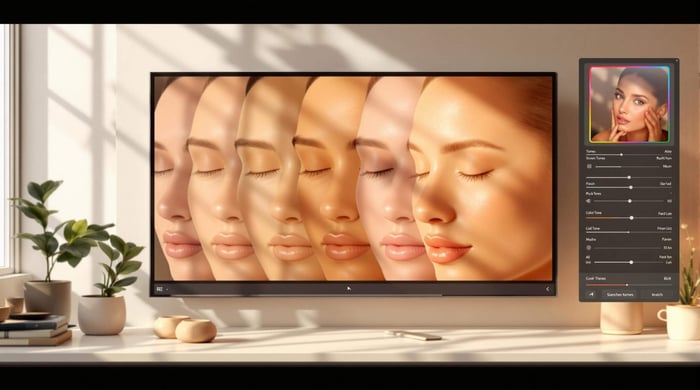
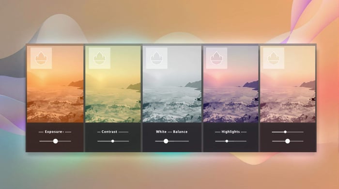
Exposure: Adjust brightness to balance light and dark areas.
- Example: For portraits, use +0.3 to +0.7 for brighter skin tones.
Contrast: Add depth and focus by tweaking light and dark differences.
- Example: Use +10 to +25 for soft, natural portrait tones.
White Balance: Correct color tones for natural-looking photos.
- Example: Use 5500K for daylight or 2700-3000K for indoor lighting.
Highlights & Shadows: Recover details in bright and dark areas.
- Example: Reduce highlights and increase shadows for balanced backlit portraits.
Saturation: Control color intensity for vibrant or natural looks.
- Example: Add +10 to +25 for landscapes without overdoing it.
Quick Reference Table
| Setting | Primary Use | Suggested Range |
|---|---|---|
| Exposure | Brightness adjustment | -0.5 to +1.0 |
| Contrast | Depth and focus | +10 to +40 |
| White Balance | Color tone correction | 2700K to 8000K |
| Highlights/Shadows | Detail recovery | -40 to +35 |
| Saturation | Color intensity | -5 to +30 |
Start with these preset settings to simplify editing and learn how adjustments work together. Over time, you'll refine your skills and create your own editing style.
Complete Lightroom Tutorial for Beginners
1. Adjusting Exposure
Exposure controls how bright or dark your photo appears, making it a key element in photo editing. It influences the light levels in your image and sets the overall tone.
When tweaking exposure, focus on preserving details in both the bright and dark areas. For cinematic looks, slightly darker preset settings can add a dramatic, moody effect.
Here’s a quick reference for adjusting exposure based on the type of photography:
| Photography Type | Suggested Exposure Adjustment |
|---|---|
| Landscape | -0.5 to 0 (Keeps sky details intact) |
| Portrait | +0.3 to +0.7 (Brightens skin tones) |
| Street | 0 to +0.3 (Balances shadows in urban scenes) |
| Indoor | +0.5 to +1.0 (Compensates for dim lighting) |
Keep an eye on the histogram to ensure you're not losing important details in the shadows or highlights. Instead of relying entirely on presets, evaluate your image - does it look too dark, too bright, or lack detail in specific areas? Adjust exposure accordingly.
Presets can serve as a good starting point, but fine-tune the settings to fit your photo. Pair exposure tweaks with adjustments to contrast and highlights to enhance brightness without sacrificing detail.
Once your exposure is just right, you can move on to enhancing depth and clarity with contrast settings.
2. Using Contrast
Contrast highlights the difference between light and dark areas in a photo, giving it depth and focus. When balanced correctly, it prevents your images from appearing flat or overly harsh. For beginners, it’s a simple way to make photos stand out without going overboard.
Here’s how contrast levels can influence different photography styles:
| Photography Style | Suggested Contrast Level | Result |
|---|---|---|
| Portrait | Low to Medium (+10 to +25) | Soft, natural tones |
| Landscape | Medium to High (+25 to +40) | Greater depth and defined clouds |
| Street | Medium (+20 to +30) | Balanced textures in urban scenes |
| Architecture | High (+35 to +50) | Sharp lines and well-defined structures |
When adjusting contrast, keep an eye on how it affects other preset settings. Boosting contrast can unintentionally increase color saturation, so you may need to fine-tune saturation or vibrance afterward.
Pro Tip: Start with a subtle adjustment, like +15 to +20, and tweak further based on your photo's needs.
A common beginner mistake is overusing contrast to make photos "pop", which can lead to unnatural results. Instead, use the tone curve to refine contrast while maintaining details in both shadows and highlights.
Lighting conditions also play a big role. Photos taken in bright sunlight may need less contrast, while overcast shots often benefit from a slight increase to bring out shapes and textures.
For realistic results, follow these tips:
- Check how contrast changes skin tones in portraits.
- Preserve details in both highlights and shadows.
- Make small adjustments (around +/- 5) for fine-tuning.
Once your contrast is set and adds the right depth, move on to adjusting white balance to achieve accurate and lifelike colors.
3. Setting White Balance
White balance adjusts color tones to make your photos look natural under different lighting. By understanding how to tweak white balance preset settings, beginners can maintain consistent tones across their edits.
Here's a quick guide to match white balance with your lighting:
| Light Source | Suggested Temperature | Recommended Setting |
|---|---|---|
| Direct Sunlight | 5500K | Daylight |
| Cloudy Sky | 6500K | Cloudy |
| Indoor Lighting | 2700-3000K | Tungsten |
| Office Lighting | 4000-4500K | Fluorescent |
| Outdoor Shade | 7000-8000K | Shade |
To fine-tune white balance, use the White Balance Tool to select a neutral area in your image, pick a preset that matches your light source, and then adjust the temperature in small steps for precision.
Pro Tip: Always shoot in RAW format when possible. RAW files give you more control over white balance adjustments during editing.
White balance is especially important in situations like mixed lighting, capturing warm tones during sunsets, or ensuring accurate colors in product photos. Tools like Presets.io offer ready-made white balance settings for consistent results.
Keep an eye out for these signs of proper white balance:
- White areas look neutral, without yellow or blue casts.
- Skin tones and other colors appear natural and realistic.
4. Fine-Tuning Highlights and Shadows
Adjusting highlights and shadows is key to creating well-balanced, polished photos. This process helps you bring back details in both bright and dark areas, ensuring your image retains important visual elements.
The secret to getting this right? Subtle tweaks. Different scenarios call for specific adjustments:
| Scenario | Highlights Adjustment | Shadows Adjustment | Expected Result |
|---|---|---|---|
| Backlit Portrait | Reduce (-15 to -30) | Increase (+20 to +35) | Clear facial features while keeping the background intact |
| Landscape with Bright Sky | Reduce (-25 to -40) | Increase (+15 to +25) | Detailed clouds and visible ground features |
| Indoor Mixed Lighting | Moderate (-10 to -20) | Moderate (+10 to +20) | Even exposure across the scene |
Here are some tips to keep in mind when adjusting highlights and shadows:
- Focus on achieving a natural look.
- Use tools like Recovery and Fill Light sliders for better control in tricky lighting.
- Be mindful of how these changes affect your image's overall contrast.
If you're just starting out, many presets come with pre-tuned highlight and shadow preset settings, giving you a great reference point. The 'Auto' option in the Basic panel is another handy starting place, but manual adjustments give you more creative freedom. For beginners, platforms like Presets.io offer collections tailored to specific lighting challenges, such as high-contrast scenes, to help you experiment with balanced edits.
Watch out for these common pitfalls:
- Halos appearing around objects.
- Flat images that lack depth.
- Excessive noise in shadowed areas.
- Overexposed highlights with no detail.
Once you've nailed the balance of highlights and shadows, you're ready to move on to adjusting color intensity with saturation controls.
5. Controlling Saturation
Saturation adjusts how intense or muted the colors in your photo look. Here's a quick guide to how saturation changes can work for different types of images:
| Photo Type | Suggested Saturation Range | What It Achieves |
|---|---|---|
| Landscapes | +10 to +25 | Brings out natural vibrancy without overdoing it. |
| Portraits | -5 to +10 | Maintains natural skin tones with a slight color boost. |
| Product Photos | 0 to +15 | Keeps colors accurate while adding a slight pop. |
| Sunset Scenes | +15 to +30 | Creates warm, rich tones without losing detail. |
Always start with small tweaks (around +/-10) to avoid making the colors look artificial. Over-saturation can lead to unnatural, overly bright areas where important details are lost. To keep your edits on point, take breaks during editing - your eyes can get used to vibrant colors, making it harder to judge properly.
The right saturation level depends on your subject. Landscapes often benefit from stronger saturation to make colors pop, while portraits need a gentler touch to preserve natural skin tones. Use tools like the HSL (Hue, Saturation, Lightness) panel to fine-tune individual colors. For example, you can make the sky more vivid without affecting skin tones in the same image.
Think about the photo's purpose when adjusting saturation. Eye-catching projects might call for bold colors, while documentary-style images usually need a more restrained approach. Many presets already include well-balanced saturation preset settings, which can help beginners see how professionals achieve vibrant but realistic results.
Conclusion
Understanding how exposure, contrast, white balance, highlights and shadows, and saturation interact gives you the tools to consistently elevate your images. Mastering these adjustments allows you to control light, color, and detail with precision.
Start small - subtle tweaks often yield the most natural results. Here's a quick reference for these key preset settings:
| Setting | Primary Impact | Key Consideration |
|---|---|---|
| Exposure | Overall brightness | Use this as your starting point |
| Contrast | Image depth | Shapes the mood and adds dimensionality |
| White Balance | Color accuracy | Crucial for skin tones and overall atmosphere |
| Highlights/Shadows | Detail retention | Maintains details in bright and dark areas |
| Saturation | Color intensity | Adjust based on the subject and context |
For inspiration, check out platforms like Presets.io to see how professionals apply these settings across different styles and genres.
Improvement comes with regular practice and experimentation. Testing these settings helps you understand their impact on your images. Over time, you can create custom presets to streamline your workflow and showcase your personal style. With consistent effort, you'll refine your editing skills and develop a signature approach.