


Table of Contents
- 5 Tone Curve Moves for Bright and Airy Presets
- The Last Tone Curve Tutorial You'll Ever Need To Watch
- What the Tone Curve Should Fix After a Preset
- 1. Lift the Black Point
- 2. Soften the Shadow Region
- 3. Protect Highlights with a Gentle Roll-Off
- 4. Shape Midtones for Luminous Depth
- 5. Keep Contrast Light, Not Flat
- Unlifted Blacks vs. Lifted Blacks: A Quick Comparison
- Aggressive vs. Moderate Shadow Lifting: A Quick Comparison
- Uncontrolled vs. Controlled Highlights: A Quick Comparison
- How to Judge Midtones Without Flattening the Image
- A Repeatable Workflow Order for Consistent Results
- Conclusion
- FAQs
- FAQs
5 Tone Curve Moves for Bright and Airy Presets
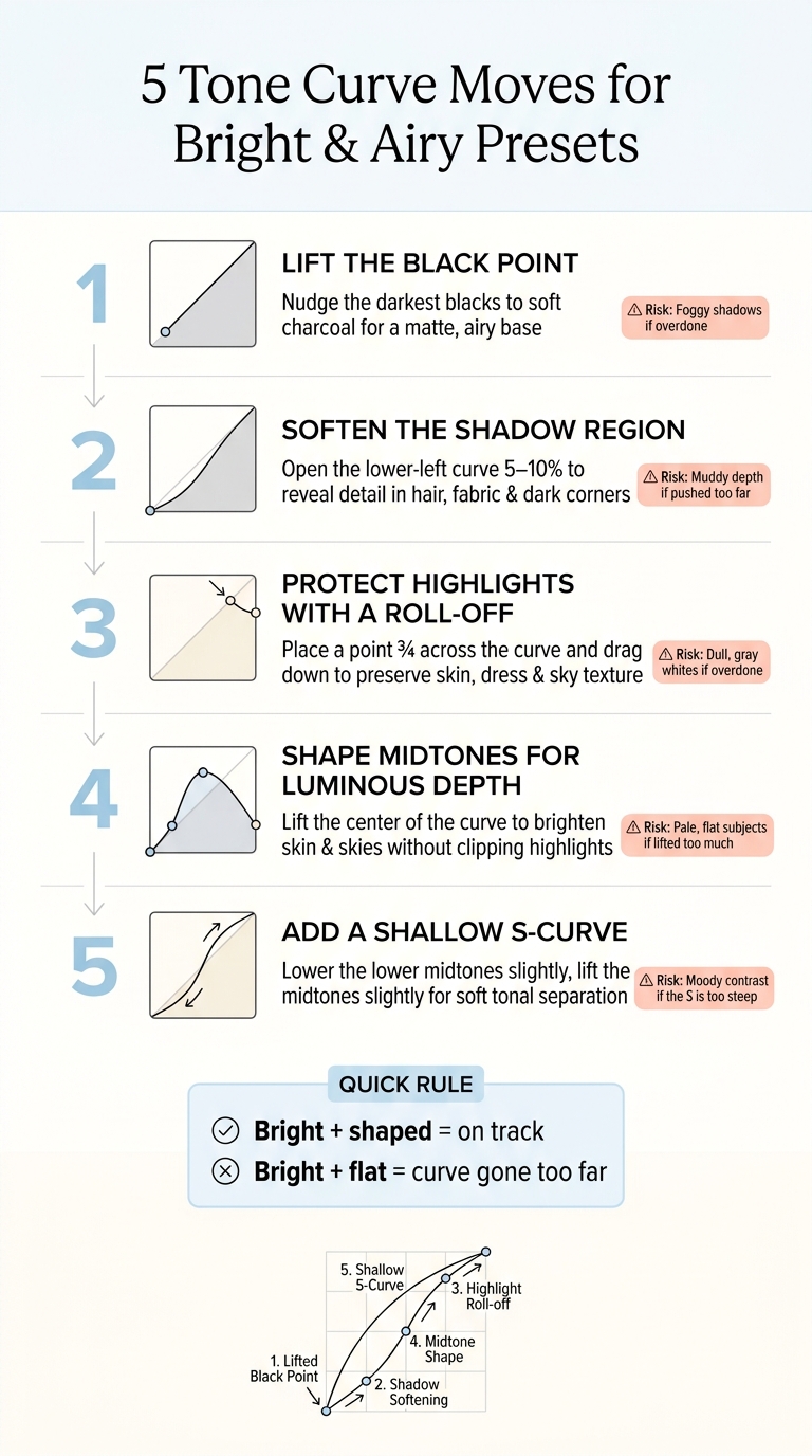
A bright-and-airy edit usually comes down to five small tone curve moves: lift the black point, open the shadows, hold back the brightest highlights, brighten the midtones a touch, and finish with a light S-curve. That’s the short answer.
If I start with new Lightroom presets, the Tone Curve is what helps me stop the photo from looking washed out, too dark, or clipped in bright spots. In plain terms, I’m trying to keep the image light, soft, and still shaped. Even a 5% to 10% shift in the lower curve can change how hair, fabric, skin, and skies look.
Here’s the full idea in one quick list:
- Lift blacks slightly so deep shadows turn soft charcoal, not flat gray
- Open the shadow region to show more detail in dark areas
- Roll off highlights so dresses, skin, and skies keep texture
- Lift midtones carefully to keep the frame bright without pushing exposure too far
- Add a shallow S-curve so the image stays light but not dull
Quick Comparison
| Move | What I’m changing | What I want to see | Main risk |
|---|---|---|---|
| Black point lift | Deepest dark tones | Soft, matte-style blacks | Foggy shadows |
| Shadow lift | Lower-left curve area | More detail in dark regions | Muddy depth |
| Highlight roll-off | Upper-right curve area | Texture in bright areas | Gray whites |
| Midtone lift | Center of curve | Brighter skin and scene detail | Pale, flat subjects |
| Light S-curve | Lower and upper midtones | Soft separation and shape | Moody contrast |
A simple rule helps: if the image looks bright but still has shape, I’m on track. If it looks bright and flat, the curve has gone too far.
5 Tone Curve Moves for Bright & Airy Presets
The Last Tone Curve Tutorial You'll Ever Need To Watch
sbb-itb-b27063b
What the Tone Curve Should Fix After a Preset
Once the preset sets the base look, the curve should clean up what it leaves behind. The preset gives you the style. The curve gives you tonal control.
For example, shadows can feel too heavy on an indoor portrait. Or highlights can clip on a white dress near bright window light. These four adjustments help keep the preset bright without throwing away structure.
Luminous means bright and structured. Hazy means bright, but washed out. If the shadows start bunching toward the middle, the image is slipping into that hazy zone.
| Goal | What It Does | Risk If Overdone |
|---|---|---|
| Lifted blacks | Softens the deepest shadows | Foggy image, less depth |
| Softer shadows | Opens up dark areas | Weaker separation |
| Protected highlights | Keeps bright areas textured instead of blank white | Dull, gray whites |
| Gentle contrast | Holds tonal dimension | Flat midtones |
Make small curve moves, then check the before-and-after after each one. With that baseline in place, start by lifting the black point.
1. Lift the Black Point
In Lightroom’s Point Curve, nudge the bottom-left anchor up a little so the darkest blacks turn into dark gray. Keep it subtle. You still want the shadow area just above that point to hold its shape.
This works differently from the Blacks or Shadows sliders. Instead of brightening part of the image, it changes the floor of the curve. That’s what gives you that airy matte base and sets the darkest tone the photo can reach. The look is softer and lighter, with the deepest shadows moving from inky black to rich charcoal.
If dark parts of the image start to look like mid-gray, you’ve gone too far. The goal is soft blacks, not absent blacks.
| Black Point Level | Shadow Appearance | Best For |
|---|---|---|
| No lift | Deep, solid blacks; strong contrast | Dramatic or high-contrast styles |
| Moderate lift | Charcoal shadows; velvety feel | Portraits, lifestyle, weddings |
| Aggressive lift | Washed, low-contrast shadows; stylized use only | highly stylized film emulation looks |
Make small moves, then toggle the curve on and off after each change. Once the blacks feel soft without looking flat, shift your attention to the shadow area above them.
2. Soften the Shadow Region
Once you've lifted the black point, the next area to fix is the shadow region right above it. A lot of presets leave this part too heavy, which can make the image feel closed-in. A small upward nudge in the lower-left part of the curve helps smooth rough transitions and brings back texture in hair, clothing, and dark corners. The result is a cleaner, lighter look.
Tone Curve shadow lifts give you more control and a more stylized result than the Basic panel's Shadows slider. A good starting point is a subtle 5–10% lift in the lower-left quarter. Keep it subtle. Push too far, and the shadows start to look washed out.
Watch the dark areas closely as you adjust. If jacket folds or hair begin to look flat or muddy, pull the lift back a bit until the image has depth again. Once the shadows look clean, move farther up the curve to protect highlight detail.
3. Protect Highlights with a Gentle Roll-Off
After you soften the shadows, move to the top of the curve. Bright-and-airy presets can blow out skin, dresses, and skies. The fix is a gentle roll-off in the upper-right part of the curve, so bright tones fade into white instead of slamming into it.
In Lightroom’s Point Curve, place a point about three-quarters of the way across and drag it down a touch. That tiny move squeezes the brightest values just enough to bring back texture - pores on a sunlit cheek, lace on a bridal gown, or cloud detail in a pale sky - without making the photo feel dull or gray.
Go too far, though, and the image starts to look flat or washed out. That kills the airy feel you want. Stop as soon as detail comes back and the frame still looks bright.
Use Lightroom’s highlight clipping indicator - the small triangle in the top-right corner of the histogram - as a simple check. If it lights up over skin or sky, lower that highlight curve point a bit more until the warning gets smaller or disappears in those key areas. Tiny clipped spots, like a glint in a window, are fine. What you want is a histogram that tapers into the right edge, not one that smacks into it.
Once the highlights keep their detail, you can shape the midtones so the image stays luminous without going flat.
4. Shape Midtones for Luminous Depth
Once the highlights are protected, move to the midtones. This is where a lot of the image lives - skin, skies, and most of the detail usually sit near the middle of the curve. A small lift here can brighten those areas without pushing the entire image up the way Exposure does, which can clip bright parts fast.
Lift the center of the curve just a bit. Then place a lower anchor point to hold the gap between shadows and midtones. That small move helps the image keep its depth instead of turning flat.
Go too far, though, and the image starts to lose shape. Midtones that are lifted too much squeeze contrast, so skin, skies, and backgrounds begin to blend together. If faces start to look pale and the histogram bunches up in the middle, bring the center point down slightly or add back a touch of contrast. That gives you the setup for the next move: light contrast that still keeps the frame clean and defined.
5. Keep Contrast Light, Not Flat
After lifting the midtones, add a shallow S-curve to bring back some shape without making the image feel dense.
Here’s the basic move: lower the lower midtones a little, then lift the upper midtones a little. That small S-curve adds gentle tonal separation. In plain English, it helps skin, fabric, and background details look separate from each other instead of blending together.
Go too far, though, and the look shifts fast. Shadows get dark, highlights get harsh, and the image starts to feel moody instead of airy.
A good gut check is simple:
- Highlights should still feel open
- Blacks should still look softly lifted
- The whole image should still feel light and airy
If the photo starts to look too contrasty, flatten the curve a bit. Keep the curve shallow, then compare it with the original.

The Ultimate Lightroom Preset Bundle – 1,291 Presets + Video LUTs
$89.00
$1,662.00
The Ultimate Presets.io Bundle combines The Master Preset Bundle Volume I and The Master Preset Bundle Volume II into one complete collection, giving you every editing style you need in a single download. Save $37 vs. Volume I and II… continue reading

Unlifted Blacks vs. Lifted Blacks: A Quick Comparison
Here’s what black-point lifting does in actual use. A small lift at the black point brightens the frame, but it doesn’t wipe out the tonal structure.
| Quality | Unlifted Blacks | Lifted Blacks |
|---|---|---|
| Shadow detail | Deep shadows hide texture in hair, fabric, and corners. | Shadows open and reveal lost detail. |
| Perceived brightness | Image feels denser and more grounded. | Image feels lighter and more open, even at the same exposure. |
| Mood | Richer, more dramatic, more anchored. | Softer, cleaner, more ethereal. |
| Risk of looking washed out | Low - strong tonal separation is preserved. | Moderate - lifting too far creates a flat, grayish result. |
Lifted blacks work well when you want the image to stay airy but still keep enough depth to hold its shape. The trick is simple: soften the shadows without flattening the scene. You still want a few darker areas so the eye has somewhere to land.
Once the black floor feels soft but still structured, move up to the shadow region above it.
Aggressive vs. Moderate Shadow Lifting: A Quick Comparison
After you lift the black point, the next step is deciding how much to open the shadows. That lower part of the curve does a lot of heavy lifting. Push it too far, and the shadows stop feeling dark and start looking gray. Open them just enough, and the image still feels grounded.
| Quality | Aggressive Shadow Lift | Moderate Shadow Lift |
|---|---|---|
| Noise visibility | High - grain, color blotches, and banding become obvious, especially in high-ISO or underexposed shots. | Controlled - noise is still there, but it is less emphasized and easier to manage with subtle noise reduction. |
| Perceived depth | Low - shadows move too close to midtone brightness, flattening the scene and reducing three-dimensionality. | Higher - preserved dark anchors keep the image dimensional while still feeling airy and open. |
| Skin tone softness | Often too flat; facial contour disappears and skin can look washed out. | Soft but believable - facial shadows are gentle yet present, keeping realistic structure intact. |
A heavy lift in the curve remaps dark tones fast, so depth can fall away sooner than you might expect. In most cases, a small move in the lower shadow curve is enough to reveal detail without making the image look pale or flat.
You’ll notice this most in portraits. A soft shadow under the jawline or along the side of the nose helps the face keep its natural shape. Remove too much of that shadow, and skin starts to lose form. The edit can feel processed instead of natural. Once the shadows feel soft but not gray, move to highlight roll-off.
Uncontrolled vs. Controlled Highlights: A Quick Comparison
Once the shadows look soft and settled, highlights usually become the next trouble spot. This quick side-by-side makes it easier to tell when the upper-right part of the curve has been pushed too far.
Blown highlights happen when the curve, whites, or exposure shove bright pixels all the way to pure white, with no detail left to recover. Skin can start to look chalky, clouds lose their shape, and fabric texture fades out.
Soft highlight roll-off means pulling the upper-right curve down a bit so bright areas fade more gently. The photo still looks bright, but you keep detail in skin, clouds, and fabric.
| Aspect | Blown Highlights | Controlled Highlights |
|---|---|---|
| Skin detail | Chalky or plasticky patches on the forehead, nose, and cheeks; pores and fine tonal shifts disappear | Soft glow with visible texture; highlight-to-midtone transitions stay readable |
| Sky texture | Featureless white or gray blocks; cloud shape and gradient are lost | Bright sky with cloud structure and a gentle gradient still visible |
| Clipping risk | High; the histogram spikes at the far right | Low to moderate; the histogram stays bright without piling up at the edge |
How to Judge Midtones Without Flattening the Image
After you lift the midtones, make sure faces, fabric, and foliage still keep their texture. Do this before the final contrast pass.
Start with faces. Check the cheeks, forehead, and the gradient from the cheek to the jaw. If the cheeks and forehead start blending into one tone, the curve has gone too flat. If skin looks chalky, dial back the lift.
If skin still looks natural, move to fabric and walls. Look at linen, dresses, and painted walls for weave, seams, and light falloff. When those details start to disappear, pull down the center point a bit or add a slight S-curve.
Then use foliage as a depth check. Leaves and grass should still show edge definition and subtle shading. If the whole scene starts reading like one flat green field, the midtones need more separation.
A good rule: key midtone subjects should sit in the lower-middle part of the tonal range. They should look bright and easy to read, but still stay well below highlight territory. Once the midtones keep their texture, run these same checks in the same order every time.
A Repeatable Workflow Order for Consistent Results
Once the midtones feel balanced, stick to the same workflow each time. Apply your preset first, set the Basic panel next, and leave the Tone Curve for last. That order matters.
The curve should fine-tune the preset’s bright-and-airy base, not work against it. If you start pushing the curve too early, it can turn into a tug-of-war with the rest of your edits. When the curve looks right, save it so you can use it again instead of rebuilding it from scratch.
Then save the curve as a reusable Point Curve preset. In Lightroom, open the Point Curve dropdown and choose Custom > Save. Give it a clear name, like "Airy Curve." After that, make a separate preset that includes the curve and any tone settings you want to keep using.
Leave out exposure and white balance. Those need to stay specific to each image, since light changes from shot to shot.
If you’re working through preset packs from Presets.io, this setup works well. You can pair one saved airy curve with different bright-and-airy looks across portraits, lifestyle shots, and outdoor scenes. The result is a steady tonal feel without changing each preset’s color character.
Conclusion
After the preset and Basic panel, the tone curve is the last stop for finishing the look. Think of it as the final tonal pass in a bright-and-airy edit.
The goal is simple: lift the blacks a bit, soften shadows, protect highlights, shape the midtones, and keep contrast light.
A small black-point lift and modest contrast can take the edge off harsh tones without making the photo look washed out. When the curve is dialed in, the image keeps its depth and still feels light instead of flat or blown out.
Before you export, do one last visual check. Make sure hair, fabric, and skies still show detail, and that the subject stands apart from the background.
Once the curve is set, the preset tends to stay more steady from one edit to the next. If you use Presets.io presets, use the preset as your base and finish with small tone curve tweaks.
FAQs
FAQs
When should I use the Tone Curve instead of Basic sliders?
Use the Tone Curve when you want tighter control over contrast and brightness than the Basic sliders can give you. The Basic panel is a solid starting point for overall exposure and tone.
Then move to the Tone Curve for small refinements. It’s great for lifting blacks, easing shadows, holding onto highlight detail, or shaping a light, airy look without making contrast feel too harsh or too flat.
How do I know if my bright and airy edit has gone too flat?
Watch for images that feel thin or a bit washed out. Skin tones can start to look dull too, with less color and less life.
If the photo feels too flat, nudge up the whites a little or add a small amount of contrast or Dehaze. It also helps to check the Tone Curve. A soft curve usually works best, but making it slightly deeper can bring some contrast back without losing that gentle look.
Can these tone curve moves work on every type of photo?
No. These tone curve moves won’t fit every photo.
They tend to work best when you want a bright, airy look, especially in portraits, weddings, lifestyle shoots, and natural light images. On the flip side, they’re often a weaker fit for photos that need high contrast, moodier tones, or a more dramatic feel.
The smart move is to treat them as a starting point, then adjust based on the image in front of you.