

Table of Contents
- Ultimate Guide to Dramatic Landscape Presets
- How to Make Skies DRAMATIC and MOODY in Lightroom
- Quick Comparison
- Core Types of Dramatic Landscape Presets
- How to Match a Preset to Your Scene, Light, and Weather
- Refining Color, Contrast, and Local Edits After Applying a Preset
- Common Dark Landscape Processing Mistakes and Final Takeaways
- FAQs
Ultimate Guide to Dramatic Landscape Presets
A dramatic landscape edit should add depth, not just make the photo dark. If I want a strong result, I start by fixing exposure and white balance, then I match the preset to the scene: dark and moody for forests and coastlines, sky/cinematic for storms and sunsets, HDR-style for bright skies with dark ground, and atmospheric haze for fog and mist.
In most cases, the preset is only the first step. I still need to check the histogram, keep Dehaze under control, protect shadow detail, and use sky or foreground masks with small moves like −0.3 to −0.7 stops in the sky or +0.3 to +0.5 stops on a focal point. That helps me avoid the usual problems: blocked shadows, neon blues, crunchy trees, halos, and noisy clouds.
If I had to boil the whole process down, it would be this:
- Fix the file first: set exposure and white balance before any preset
- Match the preset to the weather: clouds can take more contrast; fog and snow cannot
- Use small corrections after the preset: tone curve, HSL, color grading, and masks
- Watch common limits: blue luminance often works best around −20 to −35, and global Dehaze usually stays near +10 to +30
- Treat presets as a base, not the final edit
How to Make Skies DRAMATIC and MOODY in Lightroom
sbb-itb-b27063b
Quick Comparison
| Preset type | Best for | Main controls | Main risk |
|---|---|---|---|
| Dark & moody | Forests, rocky coasts, low-light scenes | Exposure, blacks, shadows, vibrance | Muddy color and blocked shadows |
| Dramatic sky / cinematic | Storms, sunsets, blue hour | Dehaze, contrast, HSL, color grading, masks | Fake-looking skies, halos, banding |
| HDR-style | Bright skies with dark foregrounds | Highlights, shadows, whites, blacks | Flat HDR look and shadow noise |
| Atmospheric haze | Fog, mist, rain, soft dawn light | Dehaze, clarity, contrast | Losing the soft mood |
If you want your edit to feel bold but still clean, the rule is simple: pick the right preset family first, then dial it back until the scene still looks like itself.
Core Types of Dramatic Landscape Presets
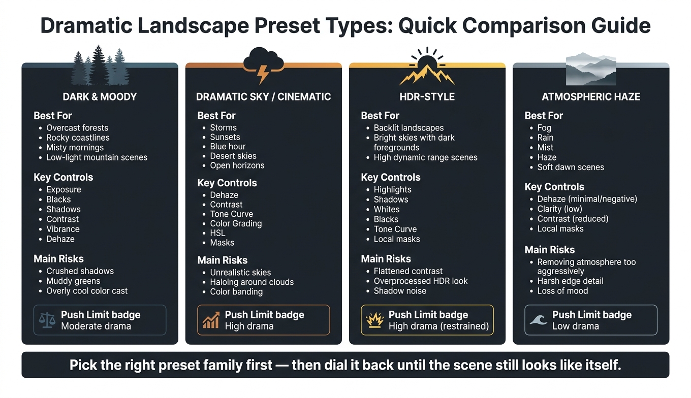
Dramatic Landscape Preset Types: Quick Comparison Guide
Dramatic presets usually fall into a few clear groups. Start by matching the group to the scene. If you skip that step, even a solid preset can end up looking muddy or overdone.
After that, match the preset to the light, weather, and contrast in the frame - not just the preset’s name.
Dark and Moody Presets for Forests, Coastlines, and Low-Light Scenes
These presets pull exposure down, deepen blacks, soften highlights, and keep midtone detail in place. The shadow end of the tone curve is usually lifted a bit so detail doesn’t get crushed. Clarity and Texture also tend to go up slightly to keep fine detail in bark, moss, and wet rock. Vibrance is often reduced, and greens and yellows in the HSL panel are muted for a subdued, atmospheric look.
They tend to work best when the scene already has soft, low-contrast light. Good fits include overcast forests, rocky coastlines under gray skies, and late blue hour images. They usually fall apart in high-noon desert shots or bright snow scenes. In those cases, the darker exposure and muted color can look flat and muddy instead of dramatic.
Dramatic Sky and Cinematic Color Presets for Storms, Sunsets, and Blue Hour
Sky-focused presets lean on Dehaze, Contrast, and targeted sky masks to pull out cloud shape and storm detail. A sky mask lets you add Dehaze and Clarity to the sky without flattening the foreground. That keeps cloud edges sharp while stopping rocks or foliage from looking over-sharpened.
Cinematic color presets push things further by changing the color relationship across the whole frame. They shift blues and greens toward teal in the HSL panel, warm up oranges, and use Color Grading to put cool tones in shadows and warm tones in highlights. These presets usually fit sunsets over canyons, stormy seascapes, and blue hour coastal scenes.
The main risk is going too hard with Dehaze. That can turn skies an unnatural cyan and create banding in smooth gradients. After you apply the preset, compare the sky color to the scene before moving on.
HDR-Style and Atmospheric Haze Presets for High Dynamic Range Scenes and Fog
HDR-style presets are built for scenes with bright skies and dark foregrounds. They lift shadows and pull down highlights. The tone curve usually uses a moderate S-shape to add midtone contrast without clipping either end of the histogram. The goal is a natural HDR look that keeps the full tonal range without drifting into that overprocessed style.
Atmospheric haze presets do the opposite. Instead of cutting through haze, they keep it in the frame. Clarity is lowered, Dehaze stays minimal or may even go negative, and global contrast is reduced so the haze remains part of the composition. These presets work well for mountain valley fog, rainy cityscapes, and coastal sea mist, where that soft air is the point of the photo.
Put an HDR-style preset on a foggy scene, and the image often loses that softness. What replaces it? Harsh edges and more visible noise. That’s why the scene conditions should guide the preset family you pick first.
| Preset Type | Best Scene Match | Main Lightroom Controls Affected | Common Editing Risks |
|---|---|---|---|
| Dark & Moody | Overcast forests, rocky coastlines, misty mornings, low-light mountain scenes | Exposure, Blacks, Shadows, Contrast, Temperature, Vibrance, Dehaze | Crushed shadows, muddy greens, loss of texture, overly cool color cast |
| Dramatic Sky / Cinematic Color | Storms, sunsets, blue hour, desert skies, open horizons | Dehaze, Contrast, Tone Curve, Color Grading, HSL/Color, Masks | Unrealistic skies, oversaturated oranges/blues, haloing around clouds, color banding |
| HDR-Style | Backlit landscapes, bright skies with dark foregrounds, high dynamic range scenes | Highlights, Shadows, Whites, Blacks, Tone Curve, local masks | Flattened contrast, overprocessed HDR look, noise in shadows |
| Atmospheric Haze | Fog, rain, mist, haze, soft dawn scenes | Dehaze, Contrast, Clarity, Shadows, local sky/foreground masks | Removing atmosphere too aggressively, harsh edge detail, loss of mood |
Use this chart as a starting point. Then fine-tune exposure and white balance before moving into local edits. Set exposure and white balance before you apply any preset.
How to Match a Preset to Your Scene, Light, and Weather
Once you’ve picked a preset type, the next job is simple: match it to the light and weather in the scene.
Set Exposure and White Balance Before Applying Any Preset
Start by balancing exposure and white balance. Presets work best on a neutral RAW file, not one that’s already drifting too warm, too cool, too dark, or too bright.
Set exposure so highlights and shadows aren’t clipped. Then use a neutral area like gray rock, clouds, or snow to fix white balance. If the file still feels a little off, make small adjustments to blacks, whites, or global contrast before you apply the preset. That gives the preset room to work instead of forcing it to fix basic problems.
Once the file is balanced, you can choose the preset based on the light and weather.
Choose by Time of Day, Contrast Level, and Scene Structure
Time of day changes the look of the file more than people think.
Sunrise images often have cool shadows and warm highlights. In those cases, it helps to lift exposure enough to show foreground detail while still protecting highlight detail. Sunset shots usually come in warmer and darker, with deeper shadows, so it’s smart to protect the bright areas and keep the warmth from getting out of hand.
Blue hour tends to have lower contrast, which is why cooler cinematic presets often fit well there. Usually, all you need is a small exposure lift. Midday is a different story. Contrast is high, and colors can feel harsh, so restrained dramatic or HDR-style presets usually work better than heavy moody looks.
Scene structure matters just as much.
Open skies with very little foreground can take stronger sky-focused presets. Dense forests usually need softer contrast curves, because heavy Clarity and Dehaze can make leaves and branches look crunchy. Mountain ridgelines often look best with moderate contrast and texture. Water scenes can take cinematic color nicely, as long as reflections still look natural.
After that, weather becomes the tie-breaker. It tells you how far you can push contrast, Dehaze, and color.
Use Weather as the Deciding Factor for Drama Intensity
Weather is often the clearest sign of how hard you can push a preset.
Stormy skies with textured clouds can handle stronger Dehaze and contrast. Fog, mist, and snow are the opposite. They need soft contrast curves and very little Dehaze if you want to keep that sense of depth in the air. Put plainly: strong clouds can handle stronger drama; fog, mist, and snow can’t.
Push Dehaze too far on a foggy valley, and the whole mood disappears. The layers flatten out, and noise starts to show up more than you want.
| Scene Type | Lighting Condition | Weather | Recommended Preset Type |
|---|---|---|---|
| Mountain ridgeline | Sunrise / sunset | Clear or light clouds | Warm moody |
| Stormy coastline | Late afternoon | Storm with textured clouds | Dramatic sky / cinematic color |
| Foggy forest | Mid-morning | Fog or mist | Atmospheric haze / soft HDR-style |
| Snowy mountain valley | Midday | Thin clouds | Cinematic with restrained contrast |
| Open canyon or desert | Sunset | Clear | Cinematic color with warm color grading |
| Blue hour waterfront | Blue hour | Scattered clouds | Cool cinematic |
Use this table as a starting point. Then fine-tune color, contrast, and local masks to fit the file in front of you.

The Ultimate Lightroom Preset Bundle – 1,291 Presets + Video LUTs
$89.00
$1,662.00
The Ultimate Presets.io Bundle combines The Master Preset Bundle Volume I and The Master Preset Bundle Volume II into one complete collection, giving you every editing style you need in a single download. Save $37 vs. Volume I and II… continue reading

Refining Color, Contrast, and Local Edits After Applying a Preset
A preset gets you most of the way there. The next part is the fine-tuning that turns a dramatic landscape from “heavily edited” into polished.
Use the Histogram, Tone Curve, and Color Controls to Keep Detail Intact
Once exposure and white balance are set, shift from broad correction to detail work. Start with the histogram. It gives you a fast read on where detail is getting lost, so you can adjust Blacks, Shadows, Whites, or Highlights with more control and pull back clipped areas without flattening the image.
The Tone Curve is where a lot of the mood comes together. A gentle S-curve adds depth, but you don’t want to crush the shadows. If you lift the far-left point a bit, you get soft, raised blacks instead of pure black. That helps hold texture in dark forest floors and shadowed rock faces.
For color, the HSL panel does most of the heavy lifting if you want the image to stay believable. Dramatic presets often push blues too far. Pulling Blue Luminance down by 20–35 points deepens the sky in a more natural way. Then, if needed, add Blue Saturation by 10–20 points to give it more richness without making it look fake.
In the Color Grading panel, a cool tint in the shadows and a warm tone in the highlights can add that cinematic split-toning look. Keep saturation low on both wheels. That small choice makes a big difference when you want contrast in color without making the edit feel overdone.
Apply Sky, Foreground, and Focal-Point Masks to Direct the Eye
Once color looks right, use masks to decide where the drama should sit. Lightroom’s Select Sky AI mask makes this part simple. Darkening the sky on its own by about −0.3 to −0.7 stops of Exposure, along with lowering Highlights, is often enough to deepen storm clouds or sunset color while leaving the foreground alone. You can also add a bit of Texture and Clarity to bring out cloud shape, but keep it modest so you don’t get halos along the horizon.
For the foreground, a light lift in Exposure or Shadows on masked paths, rocks, or water can pull the viewer into the frame. A Radial mask over the main subject, like a mountain peak, lone tree, or lighthouse, works well too. Add a small Exposure boost and plenty of feathering to create a soft spotlight effect. Try to keep those exposure moves under +0.3 to +0.5 stops so the guidance feels subtle, not staged.
Build a Repeatable Workflow with Preset Packs from Presets.io
Preset packs work best as a starting point, not the whole edit. A simple order helps keep things steady from file to file: global tone, color, masks, then final polish. Presets.io offers Lightroom and mobile preset collections across cinematic, vintage, film look, and aesthetic styles, which gives you different starting points for different landscape moods.
Common Dark Landscape Processing Mistakes and Final Takeaways
Crushed Shadows, Unnatural Color, and Overdone Dehaze
After global refinement and masks, these three issues show up more than anything else. They usually appear when a preset gets pushed past the point where the file can handle it. In most cases, the problem starts with global sliders being driven too hard.
| Mistake | Likely Cause | Corrective Action |
|---|---|---|
| Blocked shadows | Blacks and Contrast pushed too far on an underexposed file | Ease Blacks toward zero, raise Shadows slightly, and check for clipping in the shadows |
| Neon greens or unnatural blue skies | HSL or Saturation pushed too far | Reduce Greens Saturation in HSL, lower global Vibrance by 5–15 points, and correct White Balance first |
| Haloing along ridges or tree lines | Global Clarity, Texture, or Dehaze too high | Lower global Clarity and Texture, and apply Dehaze locally instead of globally |
| Noisy, overprocessed clouds | Dehaze and Sharpening stacked in the sky | Roll back global Dehaze to the +10 to +30 range and add modest Noise Reduction to the sky |
| Overdone Dehaze | Global Dehaze pushed past +30 | Lower global Dehaze, then raise Exposure by 0.1–0.3 stops and lift Shadows slightly |
The fix is usually pretty simple: pull the preset back a bit, then rebuild contrast and color with smaller moves. That slower approach often gives you a cleaner file and a more believable result.
Why Presets Work Best as a Base Rather Than a Final Edit
These fixes work for a simple reason: a preset is a starting point, not the finished image. Every file comes in with its own exposure, white balance, and direction of light. So a preset that looks great on one shot can feel far too heavy on the next.
A good workflow is straightforward. Set exposure and white balance first. Then apply the preset and reduce it if needed. After that, use the histogram and HSL panel to pull color back into a believable range, and finish with local masks for the sky, foreground, and main subjects.
That last step matters more than people think. Presets set the mood, but the final small changes decide whether the photo feels dramatic or just dark.
FAQs
How do I know which dramatic preset fits my scene?
Start by grouping presets by lighting or mood, like Golden Hour, Blue Hour, Overcast, or Stormy Weather. You can also check Lightroom’s Recommended tab for suggestions based on that specific image.
Try a few presets and watch how each one treats the light in the scene. Presets are just a starting point, so choose the one that fits the look you want, then tweak exposure, opacity, and color so everything feels consistent.
Should I adjust exposure and white balance before using a preset?
Yes. Presets work best when you start with a well-exposed photo and accurate white balance.
Lighting changes from scene to scene, so a balanced starting point gives the preset room to shape the mood instead of fighting color casts or exposure problems. After you apply the preset, it also helps to fine-tune the exposure and white balance so the edit fits your image.
How can I make a landscape look dramatic without overediting it?
Use presets as a starting point, not the final edit. Begin with a balanced RAW file, pull back highlights, open up shadows, and then dial down the preset if it starts to feel too strong.
For the sky or foreground, local masking usually works better than pushing global edits too far. Add depth with a gentle S-curve plus selective clarity or texture, and keep the colors in check so the image still looks natural.