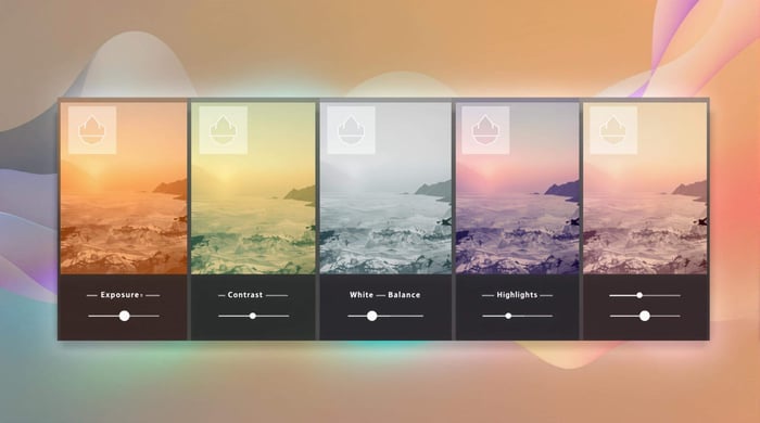

Want to take your photos from good to great? Lightroom's HSL panel is your secret weapon. Here's what you need to know:
- HSL = Hue, Saturation, Luminance
- Controls 8 color ranges: red, orange, yellow, green, aqua, blue, purple, magenta
- Hue: Shifts the actual color
- Saturation: Adjusts color intensity
- Luminance: Changes color brightness
Key benefits:
- Create unique styles
- Enhance specific colors without affecting others
- Set mood and atmosphere
Pro tips:
- Start small - subtle changes often work best
- Use the targeted adjustment tool for precise edits
- Always check at 100% zoom
- Be careful with skin tones
Remember: Hue, Saturation and Luminance is powerful, but don't go overboard. The goal is to enhance, not overpower.
Ready to dive in? Let's explore how to master it in Lightroom and make your photos pop.
Featured Video: How to Use the HSL Colour Panel
These three controls are the backbone of color editing in Lightroom. If you want to up your photo editing game, you need to know more about it.
The Hue, Saturation and Luminance Trio
Let's break it down:
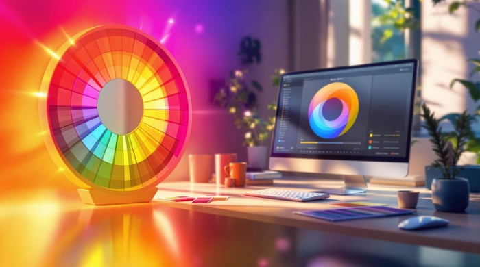
1. Hue
Think of hue as the color itself. It's like picking a specific spot on a color wheel. In Lightroom, you can tweak the hue of eight color ranges:
- Red
- Orange
- Yellow
- Green
- Aqua
- Blue
- Purple
- Magenta
2. Saturation
Saturation is all about color intensity. Crank it up, and you get bold, vivid colors. Tone it down, and you're left with muted, grayish tones.
3. Luminance
This one's about brightness. Boost the luminance, and your color gets lighter. Lower it, and it gets darker.
The Trio in Action
The real magic happens when you mix these three. You can adjust hue, saturation, and luminance for each color range independently. This gives you crazy control over your photos.
Let's say you've got a landscape shot with a "meh" sky. Instead of bumping up the overall saturation (which might make skin tones look weird), you can just boost the blue saturation. Boom! Vibrant sky, natural-looking everything else.
"The HSL/Color tools in Adobe Lightroom give you a lot of control over the colors in your image." - Jerry Courvoisier, Author and Educator
Tricks to learn
Here are some cool things you can do with Hue, Saturation and Luminance:
1. Sky Makeover
Want to turn a boring blue sky into an intense aqua? Slide the blue hue to -80. It's like instant tropical vacation.
2. Grass that Pops
Got a beach scene where the grass looks dull? Bump up the yellow luminance to +80. The grass will stand out against the sand like it's been working out.
3. Skin Tone Magic
Tweaking orange and red hues can make skin tones look more natural. No more orange people in your photos!
4. Mood Setting
Play with the overall color balance, and you can change the whole mood of your photo. Want it warm and cozy? Cool and dramatic? HSL's got your back.
sbb-itb-b27063b
Using the HSL Panel
This panel in Lightroom is a game-changer for color control. Let's break it down.
Finding HSL Controls
In Lightroom Classic's Develop module, look for "HSL/Color" (or "Color Mixer" in version 13.0+). Here's how:
- Open your photo in Develop
- Find "HSL/Color" or "Color Mixer"
- Click to expand
HSL Panel Layout
The panel has three main parts:
- Hue: Tweaks the color itself
- Saturation: Adjusts color intensity
- Luminance: Controls color brightness
Each part has sliders for eight color ranges: red, orange, yellow, green, aqua, blue, purple, and magenta.
Adjusting Specific Colors
This is where things get interesting. You can fine-tune individual colors without messing up the whole image.
Spice Up a Sunset
Got a sunset that's a bit "meh"? Try this:
- Go to Saturation
- Bump up Orange to +20
- Push Red to +15
Boom! Your sunset just got way more interesting.
Green Up That Grass
For lackluster landscapes:
- In Hue, nudge Green towards yellow (-10)
- In Saturation, boost Green to +15
- In Luminance, drop Green by -10
Just like that, your grass looks fresh and alive.
"The HSL/Color tools in Lightroom are like having a color remote control for your photos. They're easy to use and can save you tons of time."
Pro Tip: Use the Target Adjustment Tool (that little circle at the top left). Click and drag right on your image to auto-adjust the right color sliders.
Working with Luminance
Luminance is the unsung hero of color editing in Lightroom. It's about tweaking the brightness of specific colors in your image. This lets you create depth, emphasis, and mood without messing with overall exposure. Let's explore how to use luminance to level up your photos.
Light and Dark Balance
Balancing light and dark areas is key for eye-catching images. The luminance slider in Lightroom's panel gives you fine-tuned control over this balance for each color range.
Take a landscape photo with a bright sky and darker foreground. Here's how you can use luminance to balance it:
- Slide down blue luminance to darken the sky. This adds drama.
- Bump up green and yellow luminance to brighten foreground plants.
This targeted approach creates contrast and depth without affecting the whole image's exposure.
Changing Color Brightness
Luminance adjustment lets you make specific colors pop or fade in your image. Here's how:
To make colors pop: Increase luminance of a specific color. For example, boosting yellow luminance can make flowers or fall leaves shine.
To tone down distractions: Decrease luminance of colors that grab unwanted attention. This works great for muting bright, distracting background objects.
"HSL/Color tools in Adobe Lightroom give you tons of control over image colors. Luminance adjustments can dramatically change your photo's mood and feel." - Jerry Courvoisier, Author and Educator
Using Masks for Luminance
For pinpoint control, combine luminance adjustments with Lightroom's masking tools. This lets you apply luminance changes to specific image areas.
Here's a real-world example:
- Create a radial mask over a subject's face.
- Increase orange and red luminance within the mask.
- This brightens your subject's skin tones without touching the rest of the image.
Remember, go easy with luminance. Small tweaks can pack a punch, so start small and build up slowly.
Pro Tip: Use the targeted adjustment tool (the little circle at the top left of the panel). Click and drag directly on your image. This auto-adjusts the luminance of the color you've picked, making the process more hands-on.
Color Grading with HSL
Hue, Saturation and Luminance in Lightroom is a game-changer for photo editing. It's your secret weapon for creating stunning visuals and setting the perfect mood. Let's dive into how you can use HSL to transform your photos from meh to wow.
Setting Photo Mood
The HSL panel is like a mood ring for your photos. Here's how to use it:
Warm and Cozy: Bump up the reds and oranges. It's like adding a cozy blanket to your sunset shots or indoor scenes.
Cool and Calm: Play with the blues and aquas. Tweak them towards teal, and watch your landscapes turn into zen gardens.
Vibrant and Energetic: Crank up the yellows and greens. Your nature and street shots will practically jump off the screen.
Moody and Dramatic: Dial down the blues and purples' brightness, but amp up their intensity. Suddenly, that cloudy day looks like a scene from a noir film.
Remember, less is often more. As Jerry Courvoisier, a big name in photo education, puts it:
"The HSL/Color tools in Adobe Lightroom give you tons of control over image colors. Luminance adjustments can dramatically change your photo's mood and feel."
Common Mistakes
Even pros can slip up with Hue, Saturation and Luminance. Here are some no-nos to watch out for:
Going overboard with saturation: It's tempting to crank it up to 11, but your photos will look like they're on steroids. Try boosting luminance instead for a more natural pop.
Forgetting colors play nice (or not): Colors are like people at a party. Change one, and it affects the whole vibe. Always step back and look at the big picture.
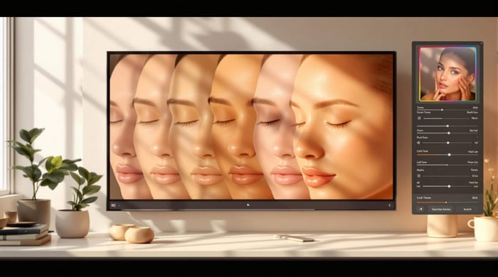
Messing up skin tones: Be gentle with oranges and reds in portraits. You don't want your subject looking like they just got back from Mars.
Ignoring luminance: Don't be that person who only plays with hue and saturation. Luminance is the unsung hero of mood-setting.
Inconsistent editing: If you're working on a bunch of photos, keep your HSL game consistent. Use presets or copy settings to keep your collection looking tight.
Dodge these bullets, and you'll be on your way to Lightroom mastery. The goal? Make your photos pop, not look like they were edited by a color-blind alien.
As the pros say:
"It takes trial and error with different parameters to achieve the desired outcome."
Translation: Play around. Make mistakes. Learn from them. That's how you get good at this stuff.
Want a shortcut? Check out Presets.io. They've got a ton of Lightroom presets that can jumpstart your photo editing journey. It's like having a pro photographer in your pocket.
Tools and Workflow
Let's dive into how you can use Hue, Saturation and Luminance adjustments in Lightroom to level up your photo editing game.
Using Presets.io
Presets.io is a goldmine for Lightroom presets that can kickstart your photo editing adventure. Here's how to make the most of it:
Browse Collections: Presets.io has tons of preset collections. From aesthetic to cinematic, vintage to film looks - they've got it all.
Learn by Doing: Apply these presets and see how the pros use Hue, Saturation and Luminance. It's like peeking over their shoulder while they work.
Make It Your Own: Start with a preset, then tweak the Hue, Saturation and Luminance settings. It's a great way to develop your style without starting from scratch.
Stay Fresh: Presets.io drops new presets every week. Perfect for trying out new Hue, Saturation and Luminance combos and keeping up with the latest trends.
Jerry Courvoisier, a big name in photography education, puts it this way:
"Presets can be a great starting point for understanding how Hue, Saturation and Luminance adjustments work together to create a cohesive look."
Safe Editing Methods
When you're playing with it, you want to keep your original image safe. Here's how:
Virtual Copies: Before you start tweaking, make a virtual copy in Lightroom. Now you can go wild without worrying about messing up your original.
Non-Destructive Editing: Lightroom's got your back with non-destructive editing. Your original file stays untouched, so feel free to experiment.
History Panel: This panel is your time machine. Don't like an HSL change? Just hop back to a previous version.
Targeted Adjustments: Instead of changing the whole image, use the targeted adjustment tool. It helps keep things looking natural.
Zoom In: Always check your HSL adjustments at 100% zoom. You don't want any weird color banding sneaking in.
Watch Those Skin Tones: When editing portraits, be careful with the orange and red channels. They can make or break how natural skin looks.
Remember, subtle is the name of the game with Hue, Saturation and Luminance editing. As Pat Kay, a big shot in the photography world, says:
"Colour is essential in our images, and the HSL sliders are where the bulk of the editing action takes place."
So go ahead, dive in, and start playing with those HSL sliders. Your photos will thank you for it!
Summary
HSL in Lightroom? It's a game-changer. Let's break it down:
It gives you control over 8 color ranges: red, orange, yellow, green, aqua, blue, purple, and magenta.
Here's what each does:
- Hue: Shifts the actual color. Want that blue sky more teal? Hue's got you covered.
- Saturation: Controls color intensity. Pump it up for pop, dial it back for subtlety.
- Luminance: The secret weapon. Darken blues for moody skies, brighten yellows for that sun-kissed glow.
Check out this real-world example:
"I boosted the yellows in the photo to make the bridges more saturated. It would have been a time-consuming masking adjustment, but it took less than 30 seconds in HSL/Color."
That's the power of HSL - quick, targeted edits that pack a punch.
Some pro tips:
- Start with basic adjustments, then fine-tune with HSL.
- Use the targeted adjustment tool for on-image tweaks.
- Always check at 100% zoom to catch any weirdness.
- Remember: Adjusting one color can affect others.
Want a shortcut? Presets.io has Lightroom presets that can jumpstart your HSL game. They're great for learning how the pros use HSL for different looks.
The golden rule of HSL? Enhance, don't overpower. As you play around, you'll get a feel for what works best. Whether you're fixing color issues, setting a mood, or crafting your signature style, HSL is your secret weapon.
FAQs
What does HSL stand for in Lightroom?
HSL means Hue, Saturation, and Luminance. These three elements are the building blocks of color in digital photos and editing. Every color you see has specific Hue, Saturation and Luminance values. In Lightroom, the HSL panel (now called Color Mixer in version 13.0) lets you tweak these properties for eight color ranges. This gives you pinpoint control over your image's colors.
How do I use it in Lightroom?
Using HSL in Lightroom is pretty simple:
- Go to the Develop module and find the HSL/Color panel (or Color Mixer in newer versions).
- Look for a small circle icon in the top left of each option panel (Hue, Saturation, Luminance).
- Click this circle to turn on the targeted adjustment tool.
- Your cursor will change to a double-ended arrow.
- Move it over the color in your image you want to adjust.
- Click and drag up or down to increase or decrease the selected property.
This method lets you make adjustments right on the image. No need to guess which slider affects your target area.
What is HSL in photography?
In photography, it breaks down color into three key parts:
- Hue: The actual color (like red, blue, green)
- Saturation: How intense or pure the color is
- Luminance: How bright or dark the color is
Knowing how to use these elements gives photographers powerful tools. You can fix colors, get creative, and set the mood in your images. For example:
- Make a sunset pop by boosting the saturation of oranges and reds
- Create a moody vibe by darkening the blues in a landscape
- Fix skin tones by tweaking the hue of oranges and reds
"HSL stands for Hue, Saturation, and Luminance. These three values are the basis of colour. Every colour you can imagine has a value of hue, a value of saturation, and a value of luminance." - Jen Bilodeau, Photographer