
Table of Contents
- How to Use Color Grading for Better Contrast in Lightroom
- Preparing Your Photo for Color Grading
- Step-by-Step Guide to Using the Color Grading Panel
- Advanced Techniques for Better Contrast
- Streamlining Your Workflow with Lightroom Presets
- Conclusion and Key Takeaways
- How to Use COLOR CONTRAST in Lightroom for DRAMATIC Edits!
- FAQs
How to Use Color Grading for Better Contrast in Lightroom
Color grading in Lightroom lets you adjust colors in highlights, midtones, and shadows to enhance contrast and depth in your photos. By using the Color Grading panel, you can refine tones, create mood, and make your images stand out. Here's a quick overview of the process:
- Why it matters: Contrast helps guide focus and adds dimension to photos, whether it's a warm subject against cool shadows or a dramatic sunset.
- Tools in Lightroom: Use intuitive color wheels for tonal adjustments, blending, and balance. The global wheel applies overall color changes.
- Before you start: Edit RAW files for better quality and fix exposure, contrast, and white balance in the Basic panel.
- How to do it: Adjust each tonal range (shadows, midtones, highlights) to refine contrast and use the global wheel for consistency.
- Advanced tips: Fine-tune with HSL sliders and presets to save time and maintain a consistent look.
Start subtle, focus on details like skin tones, and use presets to simplify your workflow. Whether editing portraits or landscapes, these steps will help you achieve polished results.
Preparing Your Photo for Color Grading
Importing and Setting Up Your Photo
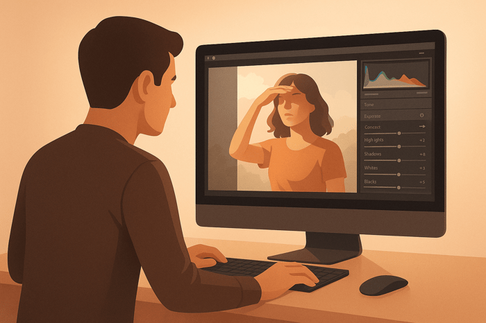
Start by importing your photo into Lightroom. Open the Develop panel and select your image from the filmstrip to access all adjustment options. Kicking things off in the Basic panel lays the groundwork for effective color treatment.
Why Edit RAW Files
Working with RAW files gives you sharper details, cleaner edges, and more accurate colors. Lightroom’s Raw Details feature is a prime example - it enhances fine details and improves color accuracy. However, keep in mind this feature only works with raw mosaic files from cameras using Bayer or X-Trans sensors. It’s not compatible with formats like JPEG, TIFF, or HEIC.
Basic Adjustments Before Color Grading
Before diving into color correction, use the Basic panel to fix exposure, contrast, and white balance issues. This step helps remove color casts and ensures your image doesn’t have blown-out highlights or shadows that color enhancement can’t recover. Adobe experts also suggest following a top-down workflow - starting with these foundational adjustments before moving to color correction enhances both efficiency and results. Once these corrections are done, you’re ready to move on to the Color Grading panel for creative finishing touches.
Step-by-Step Guide to Using the Color Grading Panel
Finding the Color Grading Panel
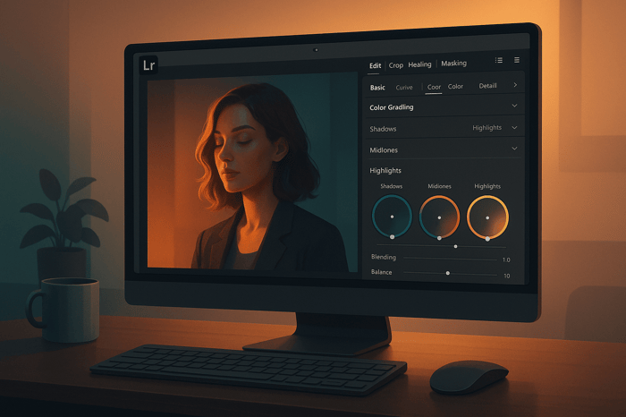
To get started, head to the Develop Module and look for the Color Grading panel on the right-hand side of your screen. Click on the Color Grading header to expand it, and you'll see the adjustment tools.
At the top of the panel, there are five icons. The first icon shows the default layout with three separate color wheels for Shadows, Midtones, and Highlights. This layout is perfect for fine-tuning the color balance in specific tonal ranges of your image, giving you the control needed to create striking contrast through color adjustments.
Adjusting Highlights, Midtones, and Shadows
Once the Color Grading panel is open, you can start working on the tonal ranges to refine your image's contrast. The three color wheels - dedicated to Shadows, Midtones, and Highlights - are your main tools. Each wheel lets you adjust the color balance for a specific luminance range: the darkest, medium, and lightest areas of your photo. The small gray circle inside each wheel is your adjustment handle.
To make changes, drag the gray circle toward your desired hue. For example:
- Midtones Wheel: Adjusting this impacts the middle gray tones, creating a clear distinction between highlights and shadows, which enhances overall contrast.
- Highlights Wheel: This affects the brightest parts of the image. It’s especially effective for sunset shots or portraits where you want to emphasize warm, glowing tones.
- Shadows Wheel: Use this to tweak the darkest areas. Moving it toward blue or teal can create cooler shadows, which pair beautifully with warm highlights.
For more precision, drag the inner part of the circle to adjust saturation or the outer edge to shift the hue. You can also click the circle icon to enlarge the wheel or input numeric values directly for exact adjustments.
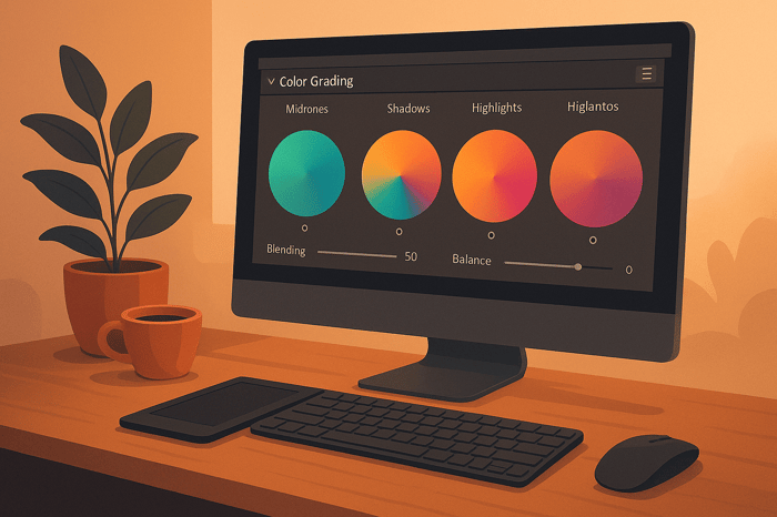
Additionally, the Luminance, Blending, and Balance sliders allow you to fine-tune brightness, control how colors overlap, and define tonal range transitions.
Using the Global Wheel for Overall Adjustments
To make overall adjustments, click the last icon at the top of the Color Grading panel - it looks like a contrast symbol. This Global wheel lets you apply a uniform color tint to your entire image, offering a different way to adjust tones compared to white balance.
Want to warm up your photo? Drag the circle toward orange. Looking for a cooler, dramatic feel? Move it toward blue. This tool is great for setting a consistent mood across your image.
The Global wheel also allows you to adjust the overall luminance, functioning like a brightness control. Increasing luminance brightens the entire image, while decreasing it creates a darker, moodier atmosphere. This adjustment can subtly shift the perceived contrast by altering the relationship between highlights and shadows.
Another handy feature of the Global wheel is its ability to fix overall color casts. If your photo suffers from mixed lighting that creates unwanted color tones, use the Global wheel to neutralize these issues before diving into more detailed adjustments with the individual wheels.
If you need to reset any changes, hover over the name of the specific wheel (like "Reset Midtones") and click. This will clear those adjustments without affecting the rest of your work.
From here, you can dive into more advanced techniques to refine your edits even further.
Advanced Techniques for Better Contrast
Fine-Tuning with the Color Mixer
Once you've mastered basic adjustments, diving into advanced color mixing can take your contrast game to the next level. Tools like the HSL (Hue, Saturation, Luminance) and Color panels in Lightroom allow you to fine-tune specific color ranges with precision. For instance, increasing saturation can make colors more vibrant, while tweaking luminance can enhance tonal contrasts for a more dynamic look.
A particularly handy feature here is the Targeted Adjustment tool. Found in the upper-left corner of the HSL panel, this tool lets you interact directly with your photo. Simply drag upward on a specific area to boost its values or downward to reduce them. It’s a straightforward way to make localized changes without guesswork.
For example, in portrait photography, you could darken cooler tones in the background to add depth, while brightening warmer tones to make skin tones more vivid. This method creates a striking sense of dimension by tailoring contrast to the unique elements of your image.

The Master Preset Bundle
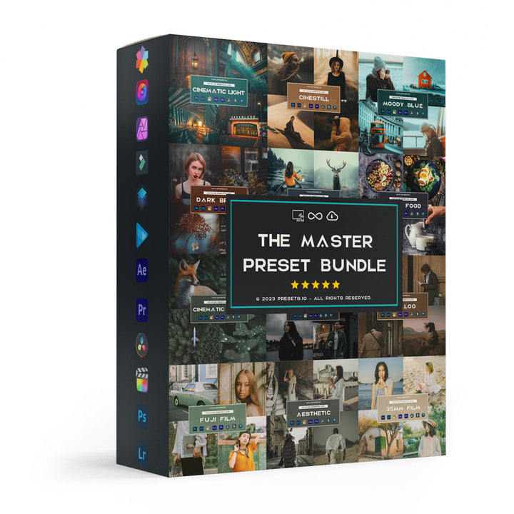
$57.00
$672.00
The Master Preset Bundle Every Style. Every Platform. One Download Get 56 high-quality Presets.io collections in one complete bundle — designed to help you edit faster, stay consistent, and get professional-looking results in seconds. Get All High-Quality Preset Collections For… continue reading
Streamlining Your Workflow with Lightroom Presets
How Presets Help with Color Grading
Lightroom presets are essentially pre-configured settings that tweak exposure, contrast, saturation, and other aspects of color enhancement. With just one click, you can apply professional-grade adjustments to your photos.
When you use a preset, you're loading a complete set of finely-tuned adjustments crafted for specific effects. For example, presets can handle intricate color improvement tasks like balancing highlights and shadows - similar to the techniques discussed earlier. And with the Amount slider, you can control the intensity of these effects, ranging from 0 to 200.
Presets are especially useful for maintaining a cohesive look across a photo series. Whether you’re editing wedding photos or a travel album, applying the same preset ensures a consistent, polished aesthetic, while still allowing room for individual tweaks.
This consistency makes presets a powerful tool, and exploring curated collections can take your edits to the next level.
Explore Custom Presets at Presets.io
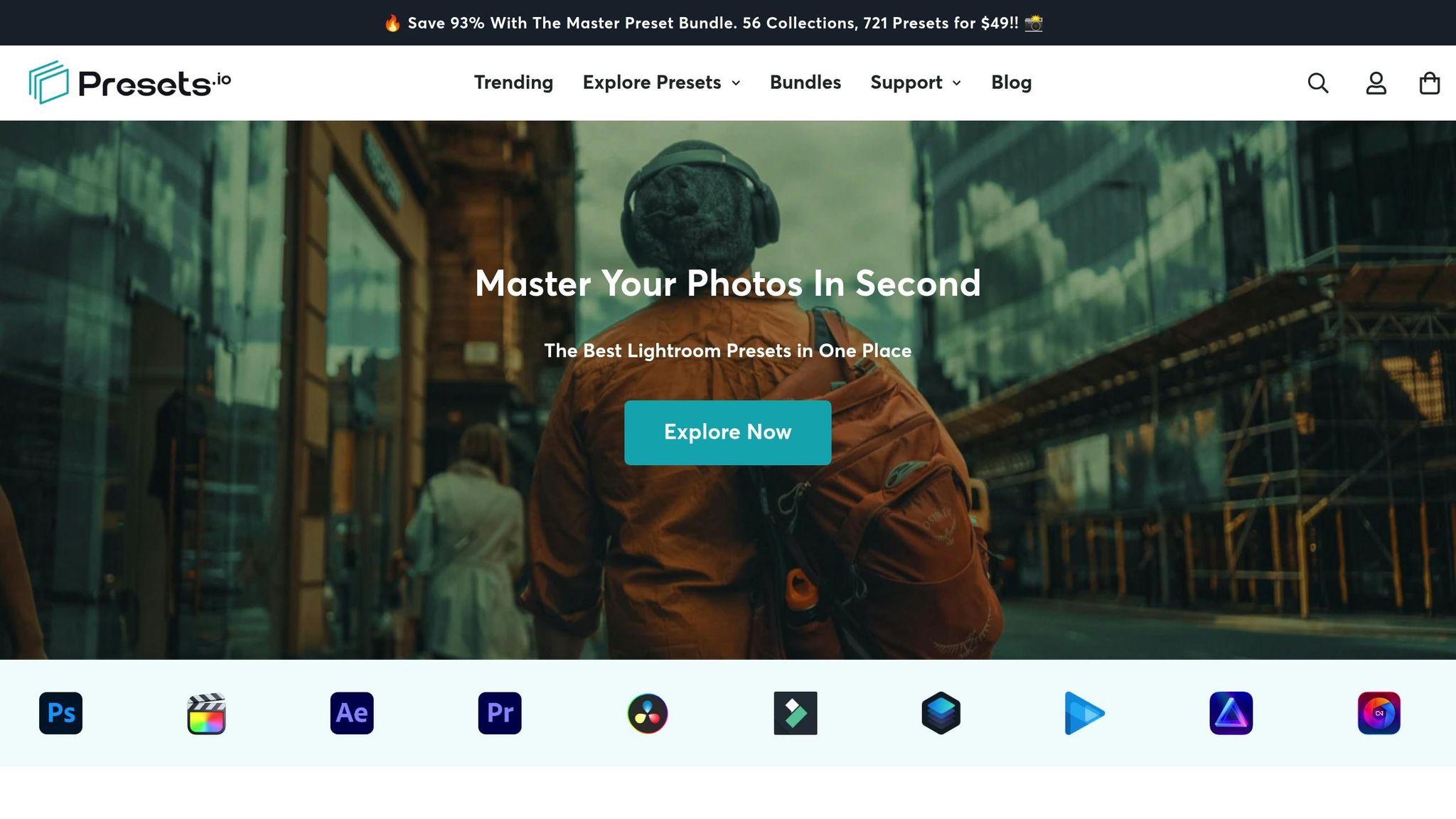
Presets.io offers a curated selection of high-quality presets designed to elevate your edits. Their library includes options like aesthetic, cinematic, vintage, and film-look presets, all tailored to enhance color contrast.
What makes these presets stand out is their emphasis on color contrast. For instance, many cinematic presets are designed to boost contrast in highlights while deepening shadows, creating that polished, movie-like effect. Meanwhile, vintage presets often incorporate split-toning techniques, adding warm tones to highlights and cooler tones to shadows, giving your images a rich, layered feel.
Beyond Lightroom, Presets.io also provides styles for Capture One and Luminar NEO, making it a versatile resource no matter which software you prefer.
Easy Installation and Weekly Updates
Integrating presets from Presets.io into your workflow is a breeze. To install, follow Lightroom’s standard process: go to File > Import Profiles & Presets, locate your downloaded files, and click Import. Once installed, your new presets will appear under the "Yours" category in the Presets panel.
One standout feature of Presets.io is their weekly updates. They consistently add new presets, giving you access to fresh styles that align with current photography trends. Whether you’re after moody cinematic tones or light and airy aesthetics, you’ll always have something new to try.
The installation process is straightforward, even for beginners. Plus, if you're using Lightroom desktop version 1.4 or later, your presets will automatically sync to your mobile app. This means you can apply the same professional edits while on the go.
For batch editing, Lightroom makes it easy to apply presets to multiple photos at once. Simply select your images in Grid view and apply your chosen preset to all of them simultaneously. This is a huge time-saver when working on shoots with consistent lighting, allowing you to achieve a uniform look across your collection in seconds.
Conclusion and Key Takeaways
Color Grading Process Summary
Color grading plays a key role in enhancing the contrast and depth of your photos by making targeted adjustments to colors. Start with a well-prepared image, then dive into the Color Grading panel, which features separate wheels for highlights, midtones, and shadows. These tools help you create depth and dimension in your images. The global wheel ties everything together, ensuring your adjustments work cohesively across the entire photo.
If you're aiming for a polished, professional look, advanced techniques allow you to fine-tune contrast by targeting specific tonal ranges with precision. The best approach? Start with broad corrections and gradually refine the details.
For those looking to save time, Lightroom presets are a game-changer. These pre-designed settings can instantly transform your images. Presets.io offers curated collections that boost color contrast, ranging from cinematic styles that emphasize highlight-shadow separation to vintage-inspired looks with rich split-toning effects.
These steps lay the groundwork for elevating your edits, with some final tips to perfect your color enhancement process.
Final Tips for Effective Color Grading
Here are some practical strategies to keep in mind as you refine your color refinement skills:
- Start subtle and build gradually. Over-the-top adjustments can make your photos look unnatural. Begin with small tweaks to highlights and shadows, then step back and assess how these changes affect the overall mood before moving forward.
- Focus on skin tones for portraits. Even minor shifts in the midtones can significantly alter skin tones. Always zoom in to check faces after making adjustments, particularly when working with warmer or cooler color grades.
- Watch your histogram. A good color grade enhances contrast without losing detail in the highlights or shadows. Keep an eye on the histogram to avoid clipping bright areas or crushing dark ones.
- Experiment to find your style. Play around with different combinations of highlight and shadow adjustments to discover what resonates with you. For example, some photographers love warm highlights paired with cool shadows, while others lean toward monochromatic palettes with varying saturation levels.
- Adapt to your output medium. Images meant for social media might need bolder contrast than those intended for print. What looks great on a calibrated monitor could seem flat on a phone screen, so adjust accordingly based on where your photos will be displayed.
Consistency is key. A cohesive editing style not only helps you develop your photographic voice but also keeps your audience engaged and coming back for more.
How to Use COLOR CONTRAST in Lightroom for DRAMATIC Edits!
FAQs
Why should I use RAW files instead of JPEG for color grading in Lightroom?
When it comes to color grading in Lightroom, working with RAW files gives you a distinct edge over JPEGs. RAW files store a wealth of color and tonal information, allowing for precise edits without compromising image quality. This extra data is particularly useful when fine-tuning exposure, contrast, and colors, as RAW files offer a broader dynamic range.
On the other hand, JPEGs are heavily compressed and discard much of the original image data, leaving less room for adjustments. Starting with RAW ensures you can produce richer, more detailed images that truly stand out after color grading.
How can I use color grading in Lightroom to enhance contrast without losing details in highlights or shadows?
To bring out contrast while keeping the details in both highlights and shadows intact, start with the Tone Curve in Lightroom. Make slight tweaks here to ensure you don't introduce extreme changes that could lead to clipping. Next, head over to the Color Grading panel and adjust the hue, saturation, and luminance with care. This will add depth without losing any fine details. You can also refine the Highlight and Shadow sliders to enhance contrast subtly. The key is to make small, deliberate adjustments for a polished and natural result without overdoing it.
How can I ensure consistent color grading across multiple photos in Lightroom?
To keep the color grading consistent across a batch of photos in Lightroom, start by using the same preset for all the images. Presets set a unified starting point, making it easier to establish a cohesive look. Once the preset is applied, you can fine-tune elements like hue, saturation, and luminance to align with the unique tones and lighting of each photo.
For added precision, take advantage of Lightroom's Sync Settings tool. This feature lets you apply adjustments - like exposure or white balance corrections - across multiple photos in one go. Following these steps ensures your entire series maintains a polished and harmonious appearance.