
Table of Contents
- How to Tint Shadows and Highlights in Lightroom
- HOW TO USE COLOR GRADING in Lightroom
- How Lightroom's Color Grading Tool Works
- Getting Your Photo Ready for Color Grading
- How to Tint Shadows and Highlights Step by Step
- Advanced Color Grading Methods
- Speed Up Your Workflow with Presets.io
- Summary: Main Points for Tinting Shadows and Highlights
- FAQs
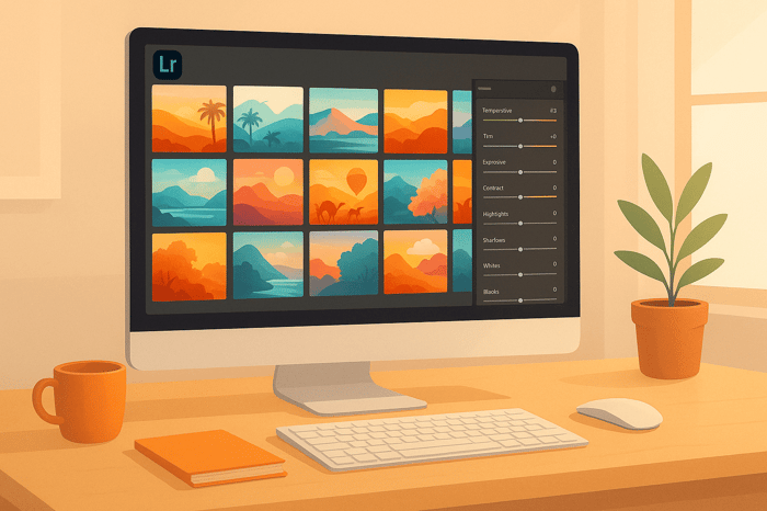
How to Tint Shadows and Highlights in Lightroom
Tinting shadows and highlights in Lightroom is a simple way to enhance your photos and set a specific mood. This technique allows you to add subtle color tones to darker and brighter areas, creating depth and atmosphere. Here’s a quick overview of the process:
- Why Tint Shadows and Highlights: Cooler tones in shadows (e.g., blues) add mystery, while warmer tones in highlights (e.g., oranges) bring energy. This balance can mimic effects like golden-hour lighting or create complementary color schemes.
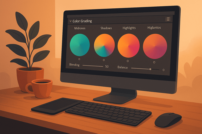
- Lightroom’s Color Grading Tools: The Color Grading panel includes wheels for shadows, midtones, highlights, and global adjustments, offering precise control over hues, saturation, and brightness.
- Step-by-Step Process:
- Prep your photo by correcting white balance and exposure.
- Use the Shadows and Highlights wheels to apply complementary hues (e.g., blue shadows with orange highlights).
- Adjust saturation and luminance for subtle effects.
- Fine-tune transitions using the Balance slider.
- Advanced Techniques: Use luminosity masks for targeted edits or channel curves for more refined adjustments.
For consistent results, start with RAW files and consider saving your settings as presets for future use. This method works well for portraits, landscapes, and more.
HOW TO USE COLOR GRADING in Lightroom

How Lightroom's Color Grading Tool Works
Lightroom's Color Grading panel is a game-changer when it comes to fine-tuning the colors in your photos. It allows you to adjust the hues in specific tonal ranges - shadows, midtones, highlights, and even the entire image - giving you much more control than basic color adjustment tools.
The Layout of the Color Grading Panel
At the heart of the Color Grading panel are four color wheels, each serving a unique purpose: shadows, highlights, midtones, and global adjustments. These wheels let you focus on different parts of your image. Shadows deal with the darker areas, highlights target the brightest parts, midtones handle everything in between, and the global wheel affects the image as a whole. This level of separation makes it easier to create intricate color effects that basic tools can’t achieve.
For instance, while the HSL panel might make all red tones lean orange, the Color Grading panel allows you to add a sunset-like orange glow to just the brightest areas of your image. This level of precision opens up endless creative possibilities.
How Hue, Saturation, and Luminance Work Together
Each color wheel comes with three key controls: Hue, Saturation, and Luminance. Here’s how they work:
- Hue: This sets the specific color you want to add.
- Saturation: Adjusts how vivid or muted the color appears.
- Luminance: Alters how bright or subtle the effect looks.
To pick a hue, simply rotate the outer circle of a color wheel. The inner circle adjusts Saturation - pulling it inward makes the color softer. Beneath each wheel, you'll find a Luminance slider that lets you tweak the brightness of the effect. Sliding it to the right makes the color stand out more, while moving it left softens its impact. For even more precision, you can use modifier keys during adjustments.
What the Global Wheel Brings to the Table
The Global wheel is where all these controls come together. It applies a uniform color tint across the entire image, acting as a complement to the individual adjustments for shadows, midtones, and highlights. This feature is especially useful for creating harmony in your edits, as it ties all the tonal adjustments together.
Unlike the older Split Toning tool, which only allowed changes to shadows and highlights, the Color Grading panel offers four separate wheels. This means you can build more complex color contrasts - like pairing cool blue tones in the shadows with warm orange highlights - while still adding an overall tint with the Global wheel. It’s a powerful way to create depth and mood in your photos.
Getting Your Photo Ready for Color Grading
Before diving into creative tints, it's crucial to address any technical flaws in your photo. Color correction always comes first - it ensures your image has a solid base before you add stylistic effects.
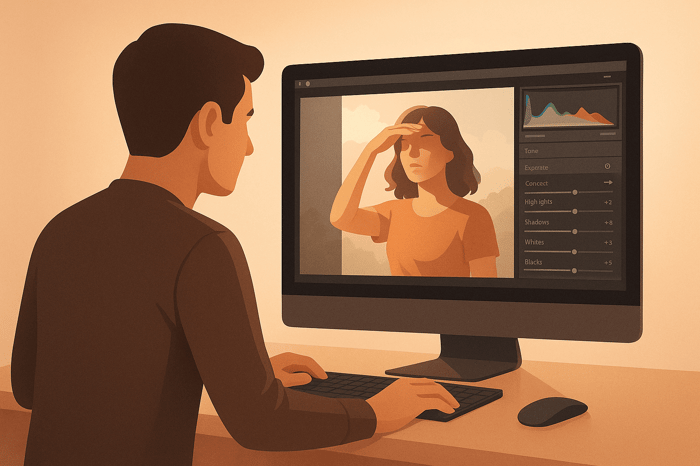
Start with Basic Adjustments
Color correction is all about making your image look natural and true to life, while color grading is where you add creative flair to set the mood. Begin by fixing issues like incorrect white balance, overexposure or underexposure, and unwanted color casts.
Once you've tackled those, head over to Lightroom's Basic panel. Adjust the exposure for balance, recover details in the highlights and shadows, and fine-tune the white balance to reflect the actual lighting conditions. This sets up a clean, balanced foundation for further edits. If you're working with RAW files, you'll have even more flexibility to perfect these adjustments.
The Advantage of RAW Files
For serious editing - especially when tinting shadows and highlights - RAW files are the way to go. They capture more detail and offer a broader dynamic range, which means smoother color transitions and more precise tonal tweaks without degrading the image quality.
RAW files also let you recover details in both overexposed highlights and underexposed shadows with ease. Unlike JPEGs, which compress and discard some image data, RAW files use lossless compression to preserve all the original sensor information. Plus, their higher bit depth allows for more accurate tonal adjustments, giving you the control you need for professional-grade results.
How to Tint Shadows and Highlights Step by Step
With your photo prepped and ready, it’s time to add tints to the shadows and highlights. This step can give your image a cinematic vibe. Let’s break down how to do this effectively.
Apply Shadow and Highlight Tints
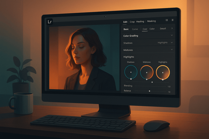
Head to the Color Grading panel and focus on the Shadows and Highlights sections. You’ll notice three color wheels: Shadows, Midtones, and Highlights. For this technique, concentrate specifically on the Shadows and Highlights wheels.
- In the Shadows wheel, drag toward orange-red for warmer tones or blue-cyan for cooler tones. Adjust the distance from the center to control intensity.
- For the Highlights wheel, pick a complementary hue to balance the image. For example, pair cool blues with warm shadows.
- Use the Saturation slider (start around 10–30) to control how vivid the tint appears. The Luminance slider lets you tweak brightness.
Experiment with different combinations by adjusting the wheels. Popular pairings include orange shadows with teal highlights for a modern, dynamic look or purple shadows with yellow highlights for a vintage film feel.
Fine-Tune Your Tonal Ranges
Once your tints are in place, refine the tonal balance. Use the Balance slider at the bottom of the Color Grading panel to control the boundary between shadows and highlights. Moving it left emphasizes shadows, while moving it right gives more weight to highlights.
Adjust the Balance slider to ensure smooth transitions between tones. If the colors feel abrupt or unnatural, reduce saturation or tweak the slider until the effect blends seamlessly.
Pay close attention to skin tones when working with portraits. Heavy green or magenta tints can distort natural skin colors. Warm tones in shadows and cooler tones in highlights often complement skin tones better.
Compare Before and After Results
Use the before/after toggle (press \) to see how your adjustments have transformed the image. This comparison ensures you’re enhancing the photo without overdoing it.
Keep an eye on the histogram to prevent clipping, which can cause loss of detail. Subtle tinting often looks more polished than heavy-handed edits.
Zoom in to 100% to check for smooth tonal transitions. Areas like skies or smooth surfaces may show color banding if adjustments are too intense. If this happens, dial back the changes for a cleaner result.
The key to successful tinting is subtlety. The goal is to enhance the mood of the photo without overpowering the subject. Keep the intensity balanced to maintain focus on what matters most.

The Master Preset Bundle

$57.00
$672.00
The Master Preset Bundle Every Style. Every Platform. One Download Get 56 high-quality Presets.io collections in one complete bundle — designed to help you edit faster, stay consistent, and get professional-looking results in seconds. Get All High-Quality Preset Collections For… continue reading
Advanced Color Grading Methods
Once you’ve nailed the basics of shadow and highlight tinting, Lightroom offers tools that can take your color grading to the next level. These advanced methods give you greater control over specific tonal areas and allow for creative effects that go far beyond the standard Color Grading panel. By building on your foundational skills, you’ll be able to refine your edits with precision and artistry.
Targeting Specific Areas with Luminosity Masks
After mastering basic tinting techniques, you can focus on specific brightness ranges using luminosity masks. Lightroom’s Masking tool includes a Luminance Range option, which functions much like traditional luminosity masks.
To get started, head to the Develop module and click on the Masking icon (a circle with a dashed outline). Choose Luminance Range, and Lightroom will automatically detect brightness levels in your photo. You can then drag the range selector to isolate shadows, midtones, or highlights.
For example, if you want to tint only the darkest areas of your image, set the luminance range to target shadows. Once the mask is active, use the Color Grading adjustments within that mask to apply your chosen tones without spilling into other parts of the image. The Refine slider is handy here - it smooths the edges of the mask, ensuring seamless transitions. A range between 50-70 works well for most situations, but you can tweak it to suit your specific image. Need to reverse your selection? Use the Invert option to flip the mask.
This technique is especially useful in landscape photography, where you might want to add warmth to shadowed foregrounds while keeping bright skies neutral. Portrait photographers can also use luminosity masks to subtly tint background shadows without affecting skin tones.
Custom Color Effects with Channel Curves
The Tone Curve panel is another powerful tool for advanced color grading. By switching from the default RGB curve to individual Red, Green, or Blue channels, you can fine-tune the intensity of each color across different tonal ranges.
For instance, lifting the red curve in the shadows adds warmth, while lowering it introduces cooler, cyan tones. The green channel adjusts the balance between magenta and green, and the blue channel lets you control the interplay between yellow and blue. Unlike the visual interface of color wheels, channel curves require a bit of color theory knowledge but deliver unparalleled precision.
Channel curves are particularly effective for creating film emulation effects. Many classic film stocks had unique color profiles that you can replicate by tweaking individual channels. For example, slightly lifting the blue curve in the highlights while lowering it in the shadows can mimic the look of certain Kodak films.
Here’s a quick comparison between the Color Grading panel and Channel Curves for shadow and highlight tinting:
| Feature | Color Grading Panel | Channel Curves |
|---|---|---|
| Ease of Use | Visual interface with color wheels | Requires knowledge of color theory |
| Precision Control | Great for general adjustments | Ideal for fine-tuned corrections |
| Creative Flexibility | Excellent for mood and atmosphere | Best for detailed color shifts |
| Learning Curve | Beginner-friendly | For intermediate to advanced users |
| Visual Feedback | Instant color preview | Requires interpreting curve changes |
The real strength of channel curves lies in their non-destructive nature and ability to create intricate color relationships. For example, you can use S-curves within individual channels to boost contrast while simultaneously adjusting color balance. This approach is especially powerful when paired with the Color Grading panel for layered effects.
For a polished workflow, start with channel curves to establish your image’s overall color tone. Then, use the Color Grading panel to fine-tune the mood and atmosphere. Combining these tools gives you the precision of technical adjustments with the freedom to experiment creatively.
Speed Up Your Workflow with Presets.io
After honing your tinting techniques, using presets can take your editing process to the next level. Presets are a game-changer when it comes to saving time and achieving professional-level color grading. Instead of tweaking multiple settings manually - like the Color Grading, Tone Curve, or exposure panels - presets let you apply a polished look instantly. Think of them as a starting point that you can easily tweak to suit your style.
Save Time with Presets.io Collections
Presets.io offers a variety of curated collections that cater to different styles, including aesthetic, cinematic, vintage, and film-inspired looks. These presets act as non-destructive tools, allowing you to quickly add balanced shadow and highlight tints while still giving you the freedom to fine-tune details like saturation and luminance. They’re particularly useful when editing a series of similar photos, helping you maintain a consistent look across your work without spending hours on manual adjustments.
Easy Installation and Regular Updates
Getting started with Presets.io is simple, whether you're working on a desktop or mobile device. Once downloaded, you can import the presets into Lightroom, where they sync automatically through Adobe Creative Cloud. This seamless syncing ensures that any adjustments made on your desktop will carry over to your mobile device, keeping your edits consistent no matter where you’re working.
Presets.io also keeps your editing toolkit fresh by releasing new styles regularly. To apply a preset, just open your photo in Lightroom Mobile, head to the Presets panel, and select the group where your downloaded presets are stored. From there, pick the one that fits your vision and make any additional tweaks to fine-tune your final look. It’s that easy to keep your workflow smooth and efficient.
Summary: Main Points for Tinting Shadows and Highlights
Review of Key Points
To achieve polished results, start with solid preparation and basic adjustments. Using RAW files is a must - they preserve image detail, making your editing smoother and more flexible.
The Color Grading panel is your go-to tool for setting the mood and atmosphere in your photos. By understanding how the shadow, midtone, and highlight wheels interact, you can create refined and cohesive color schemes. Subtlety is key here - begin with low saturation levels and gradually build up until you reach the look you're aiming for.
For more precise adjustments, tools like luminosity masks and channel curves allow you to fine-tune specific tonal ranges. These advanced techniques give you control that surpasses the standard Color Grading panel. When combined with foundational methods, they help you refine your edits and develop a distinct editing style.
If you're working on multiple images or need consistency, Presets.io can save you time. These pre-configured settings serve as a great starting point and can be synced across devices via Adobe Creative Cloud, ensuring a seamless workflow whether you're on your desktop or mobile.
Take these insights and apply them directly to your photo editing process.
Practice These Techniques on Your Photos
The best way to master these techniques is through hands-on practice with a variety of photo subjects. Start with images that feature distinct shadow and highlight areas. For example, portraits with dramatic lighting, landscapes captured during golden hour, or architectural shots with strong contrast are ideal for experimenting with tinting.
Try recreating popular color schemes, like warm orange highlights paired with cool blue shadows, to see how they transform your image. Different genres of photography will respond differently to these techniques - street photography might benefit from soft, vintage hues, while portraits could shine with warmer shadow tones that enhance skin tones.
Don’t shy away from experimenting, even if the results feel overdone at first. Pushing the limits helps you understand how each adjustment impacts your photo. Once you've explored the possibilities, you can always tone down the intensity for a more balanced look.
As you refine your edits, save settings that work well to build your own preset library. This personalized collection will be a valuable resource as you establish your style and maintain consistency across your projects.
FAQs
What should I avoid when tinting shadows and highlights in Lightroom?
When working with shadows and highlights in Lightroom, it’s important to approach adjustments with a light touch. Going too far can lead to an unnatural or overly dramatic appearance, which might detract from the photo’s overall impact. Aim for subtle changes that keep the image looking balanced and true to life.
Pay close attention to clipping in both highlights and shadows. Clipping can result in a loss of detail in the brightest and darkest parts of your image. To avoid this, use Lightroom’s histogram or enable the clipping indicators to monitor your edits and ensure you’re preserving important details across the tonal range.
While auto adjustments can be helpful as a starting point, don’t rely on them entirely. They often don’t account for the unique qualities of each image. Instead, take the time to manually refine the settings to align with your creative goals. This hands-on approach ensures your edits enhance the photo naturally, without introducing unwanted issues like color shifts or artifacts.
How can I keep skin tones looking natural when color grading portraits in Lightroom?
To keep skin tones looking natural while color grading portraits in Lightroom, start by adjusting the white balance. Getting the color temperature right is key to ensuring the skin tones look balanced and flattering.
Next, use the Tone Curve for subtle adjustments. Be cautious here - drastic changes can easily throw off the hues and make the image look unnatural.
The Calibration panel is another powerful tool. It allows you to fine-tune individual color channels, helping you maintain lifelike skin tones while enhancing other areas of the photo. For even more control, turn to the Color Grading tool. This lets you adjust the shadows, midtones, and highlights separately, so you can add creative flair without affecting the skin tones.
Finally, tweak the saturation and hue sliders with care. Small adjustments can help refine the overall look, but going overboard can quickly ruin the natural feel of the portrait.
Why is using RAW files better for tinting shadows and highlights in Lightroom?
When working in Lightroom, using RAW files is the best choice for tinting shadows and highlights. Why? RAW files hold much more detail and dynamic range than JPEGs. This extra data lets you tweak both shadows and highlights with precision, without worrying about losing quality or causing clipping.
With this added flexibility, color grading becomes a breeze. You can create smoother, more natural tints and adjust tones effortlessly, making it easier to achieve polished, professional results - even when tackling more intricate edits.