
Table of Contents
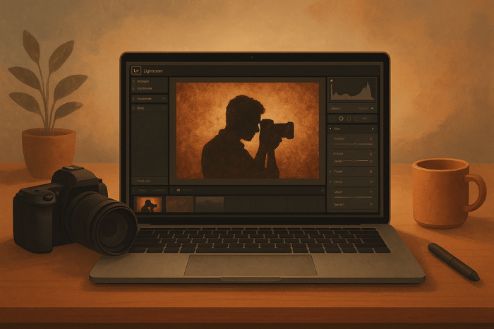
How to Create Custom Pastel Presets in Lightroom
Pastel presets in Lightroom help you achieve soft, muted tones that create a dreamy, romantic vibe in your photos. These presets are perfect for portraits, nature shots, or lifestyle photography, offering a consistent, polished look across your images. To create your own pastel presets, you’ll need to adjust key Lightroom tools like the Tone Curve, HSL/Color, and Color Grading panels. Here’s a quick breakdown:
- Basic Adjustments: Brighten exposure, reduce contrast, and lift shadows for a soft, airy base.
- Tone Curve: Soften contrast by raising the blacks and creating a matte effect.
- HSL/Color Panel: Shift hues (e.g., oranges to pinks, blues to cyan), reduce saturation, and adjust luminance for balanced tones.
- Color Grading: Add subtle tints (e.g., pink shadows, blue highlights) for depth and mood.
- Final Touches: Slightly reduce clarity and dehaze for a smooth, dreamy finish.
Save your preset for easy reuse and test it on various photos to refine the look. Alternatively, pre-made presets from platforms like Presets.io can save time and provide professional results. Both options ensure your images maintain a soft, pastel aesthetic that stands out.
What Makes Pastel Photography Work
Defining Pastel Tones
Pastel tones are created by mixing white with a base color, resulting in soft, muted shades often referred to as "tints". These colors are known for their light, gentle appearance, making them less intense than more saturated hues. With their low saturation and high brightness, pastel tones give photos a delicate, airy feel that straddles the line between dreamlike and realistic. They evoke emotions tied to optimism and tranquility, often bringing to mind images of spring blooms or carefree childhood moments. As Libée Lune beautifully puts it:
"Pastel colors offer a particularly enchanting palette, whispering dreams, innocence, and surreal calm." – Libée Lune
When pastel colors are combined, they create a visually harmonious effect, avoiding the jarring contrasts that can occur with bolder tones. These qualities make pastel tones a versatile choice for a variety of photographic styles.
Where to Use Pastel Photography
The gentle nature of pastel tones makes them a perfect fit for many types of photography. Their calming effect enhances genres like portrait, lifestyle, food, and nature photography. For instance, pastel backdrops in portraits or lifestyle shots add a sense of balance and timelessness. In food photography, these hues work beautifully to highlight delicate desserts when paired with soft, diffused lighting. Nature photography, on the other hand, takes on an almost magical quality when pastel tones are used to capture moments like sunrises or sunsets. Even urban photography can benefit, as pastel-colored buildings, murals, or signage provide charming, understated backdrops.
This growing appreciation for pastel tones mirrors their increasing use in branding and packaging design. Sarah Lee captures the essence of this style perfectly:
"Pastel photography is a unique and captivating genre that leverages the soft, calming qualities of pastel colors to create visually stunning and emotionally resonant images." – Sarah Lee
Understanding the essence of pastel tones and their applications is a crucial step toward creating Lightroom presets tailored to this aesthetic.
Key Lightroom Tools for Pastel Editing
Main Lightroom Panels You'll Need
To craft stunning pastel presets, you’ll need to get comfortable with a few key Lightroom panels. Start with the Basic panel to adjust exposure and establish a bright, airy foundation. The Tone Curve is your go-to for achieving that soft, matte finish that pastel photography is known for. For precise color control, the HSL/Color panel lets you tweak individual hues, perfect for dialing in just the right amount of brightness and desaturation. Finally, the Color Grading panel (previously known as Split Toning) helps you add subtle tints that bring the entire look together.
How Each Tool Creates Pastel Effects
The Tone Curve is essential for softening contrast and creating that dreamy pastel vibe. It works by redefining the black and white points in your image. As one photography expert puts it:
"The tone curve helps you to redefine what is considered pure black and pure white, meaning you can change the different light and dark tones within your photo".
To achieve a pastel effect, slightly raise the left endpoint on the RGB curve. This fades the blacks and gives your image that soft, matte appearance. Adding delicate blue and red tones to the shadows can further enhance the ethereal, pastel feel.
The HSL panel allows for detailed color adjustments. In the Hue section, shift reds, oranges, yellows, and greens toward warmer yellow-orange tones, while nudging aquas and blues toward cooler cyan-teal shades. Desaturating dominant colors - especially yellow - helps avoid overly bold tones. Adjusting luminance is also key: brighten warm colors while slightly dimming cool colors to maintain a balanced, soft look.
The Color Grading panel is where the magic of subtle tints happens. This tool lets you add color tones to shadows, mid-tones, and highlights independently, creating depth and mood. As photography expert Katrin Eismann describes:
"The color of an image is the emotion of the image, with the emotions ranging from bright, warm, summer pastels to somber, muted, cooler tones and everywhere in-between".
Lastly, the Basic panel is where you’ll fine-tune exposure. Brightening your image here ensures it has the light, airy quality that pastel photography demands, setting the perfect stage for those soft, gentle tones.
With these tools in hand, you’re ready to move on to creating your custom pastel preset.
How to Create Your Pastel Preset
Setting Up Your Base Image
Start by choosing a photo with good natural lighting and strong composition. Open it in Lightroom's Develop module. Natural light works best for pastel edits because it gives you that soft, airy quality you're aiming for.
Begin with the Basic panel. Adjust the exposure to make the image brighter, lift the shadows, and reduce the contrast to create a soft matte foundation - this is key for achieving the pastel look. Warm up the image by increasing the temperature, especially for sunrise or sunset shots. Add a touch of magenta in the tint slider to infuse a gentle pink tone. If there are any areas that appear too bright, recover them by lowering the highlights and slightly lifting the blacks to avoid harsh, pure black tones.
Once your base image feels balanced and soft, you're ready to move on to the detailed pastel adjustments.
Making the Main Pastel Adjustments
Now it's time to refine the image and bring out the pastel aesthetic. Head to the Tone Curve panel and create a soft matte effect by lifting the left endpoint of the RGB curve. This fades the blacks and softens the shadows.
Next, fine-tune the colors in the HSL (Hue, Saturation, Luminance) and Color Grading panels. In the HSL Hue section, shift the oranges toward pink and move the blues closer to cyan. In the Saturation section, reduce the intensity of most colors - especially yellow - to maintain a muted pastel palette. Lower the green saturation as well to emphasize warmer tones . For Luminance, brighten warmer colors like orange and pink while slightly dimming cooler ones to create a balanced, dreamy effect.
In the Color Grading panel, add subtle color tones for a polished look. Apply soft blue highlights (hue 220, saturation 8) and gentle pink shadows (hue 323, saturation 8) to enhance the matte, ethereal vibe. To finish, reduce clarity and texture slightly (values between –10 and –20 work well) to give the image a softer feel. Use the dehaze slider at around –5 to introduce a light, dreamy haze.
Saving Your Preset
Once you've perfected your adjustments, save your pastel preset for easy reuse. In Lightroom Classic, click the "+" icon in the Presets panel on the left side of the Develop module, then choose "Create Preset" from the dropdown menu.
A dialog box will open, allowing you to select which settings to include. Make sure to check all the adjustments you made - Basic panel tweaks, Tone Curve edits, HSL changes, and Color Grading adjustments - so your preset captures the full pastel effect. Give your preset a descriptive name, like "Soft Pastel Portrait" or "Dreamy Sunset Pastel", so you can quickly identify its style and purpose. Organize it by adding it to an existing folder or creating a new one, such as "My Pastel Presets."
Click "Create", and your preset will now appear in the Presets panel. With just one click, you can apply your custom pastel style to any photo, ensuring consistent and stunning results every time.
Fine-Tuning Your Preset
Testing Your Preset on Different Images
Creating a pastel preset is just the first step. To refine it, test it across various types of images - portraits, landscapes, still life - and under different lighting conditions. Start by applying your preset to a single image, then sync the settings to others with similar exposure and lighting. This helps you figure out which adjustments work consistently and which ones need a bit more tweaking.
Different lighting conditions can impact how your preset looks. Natural light often complements pastel tones, but artificial lighting may require extra adjustments, like fine-tuning the white balance.
Once you've applied your preset, make individual adjustments to suit each image. For example, if a landscape looks overly vibrant, reduce the saturation and adjust the white balance to achieve the mood you're aiming for. For architectural or street photography, you might need to tweak exposure and sharpness to highlight important details.
Lightroom's color mix tool is a great resource for precise adjustments. For instance, reducing yellows can give you cleaner whites, while carefully modifying orange tones ensures skin tones stay natural. You can also use the brush tool to brighten specific darker areas, but go easy - overdoing it can make the image look unnatural.
When you're done testing, take a step back and evaluate your edits to make sure your preset stays true to the soft, balanced pastel aesthetic.
Common Mistakes to Avoid
Over-editing is one of the quickest ways to lose the subtle charm of pastel tones. Start with basic adjustments like exposure, contrast, and white balance to build a solid foundation. For natural light photography, a daylight white balance setting around 5,500K is often a good starting point.
Be cautious with saturation and vibrance. Instead of applying heavy global adjustments, use the HSL sliders to adjust individual color channels. This gives you more control and prevents colors from looking overly intense or unnatural.
Don't overlook technical details. Sharpness, clarity, and noise reduction all play a role in the final image. Adjust sharpness carefully to avoid artifacts, and keep brightness levels in check to minimize noise.
Consistency is key, especially with white balance. If you're editing a series of photos, make sure the white balance is uniform to maintain a cohesive look.
Lastly, avoid overexposing your shots during capture. Blown-out highlights can't be recovered, so aim for a slightly brighter exposure while preserving essential highlight details. This gives you more flexibility during editing and ensures your pastel aesthetic shines through.

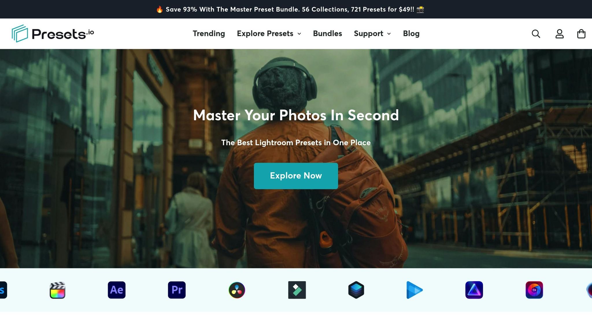
The Master Preset Bundle

$57.00
$672.00
The Master Preset Bundle Every Style. Every Platform. One Download Get 56 high-quality Presets.io collections in one complete bundle — designed to help you edit faster, stay consistent, and get professional-looking results in seconds. Get All High-Quality Preset Collections For… continue reading
Ready-Made Pastel Preset Options
Why Use Pre-Made Presets
Creating custom pastel presets can be a time-consuming process, often requiring a lot of trial and error. Pre-made presets, on the other hand, save time and provide professional-quality results almost instantly. They're especially helpful if you're working under tight deadlines or need to maintain a consistent look across multiple projects. These presets are designed and tested by professionals to perform well in various lighting conditions and with different types of images, making your editing workflow much smoother.
Using a pre-made preset as a starting point allows you to make small tweaks to fit each specific photo. This method is particularly useful for photographers editing large batches of images or those who want to maintain a cohesive aesthetic across their portfolio or brand.
Another benefit of pre-made presets is the opportunity to learn. By analyzing how these presets are built - from tone curve adjustments to HSL tweaks - you can gain insights into professional editing techniques. This knowledge can help you fine-tune your own custom presets and elevate your editing skills to the next level.
Consistency is much easier to achieve with curated preset collections. Instead of manually recreating the same look for dozens of images, you can apply a base preset and make minor adjustments as needed. This approach not only saves time but also ensures a polished and unified style across your work.
Finding Pastel Presets on Presets.io
If you’re looking for high-quality pre-made options, Presets.io offers a variety of Lightroom presets that work with both desktop and mobile platforms. Their collections include presets specifically designed for soft, muted pastel tones, making them ideal for photographers aiming for that dreamy aesthetic.
One standout offering is the Master Preset Bundle, priced at $49. This bundle includes 56 collections with a total of 721 presets, providing an extensive range of options for different photography styles and subjects. Whether you’re shooting portraits, landscapes, or anything in between, this bundle has you covered.
Presets.io also incorporates advanced color grading systems, allowing you to achieve creative pastel and cinematic effects. These presets are versatile tools, enhancing your pastel aesthetic across various genres while giving you room to experiment and refine your style.
Installation is simple, thanks to detailed guides included with the presets. Once installed, you can easily customize any preset to suit your preferences. Adjust settings like saturation, luminance, or color balance to create a look that’s uniquely yours. You’re not locked into a single style - each preset serves as a flexible foundation for your editing process.
For those working in both photography and videography, Presets.io offers video LUTs alongside their photo presets. This feature ensures a cohesive visual style across different media formats, so your pastel aesthetic remains consistent whether you're editing still images or video footage.
Presets.io frequently updates its collections with new options, giving you access to fresh styles and trending looks. This continuous expansion ensures that your preset library stays up to date, offering more creative possibilities as your photography evolves.
How To Create Soft Pastel Tones In Lightroom
Conclusion
Using custom pastel presets in Lightroom gives you the ability to transform colors with precision, leveraging the subtle influence of white to create images that evoke feelings of calmness, romance, and serenity.
To master pastel editing in Lightroom, focus on reducing contrast, keeping saturation moderate, and adding selective bold highlights for a soft, muted effect. However, balance is key - overdoing pastel tones can dilute the overall impact.
As Christian Möhrle from The Phlog Photography explains:
"Pastel color grading is a subtle yet powerful way to make your photos stand out, and you can achieve it easily with some simple tweaks in Lightroom. If you've ever wanted to experiment with color grading but felt overwhelmed, this method offers an approachable way to elevate your work."
Whether you create your presets from scratch or explore professional options from Presets.io, the goal remains the same: building an aesthetic that aligns with your artistic vision. Custom presets give you full creative control, while ready-made options provide a reliable starting point you can refine to suit your style.
FAQs
How can I make sure my custom pastel preset works well for both portraits and landscapes?
To craft a pastel preset that works effortlessly for both portraits and landscapes, start by zeroing in on settings that strike a harmonious balance. Adjust key elements such as exposure, color balance, and split toning to create that dreamy, soft pastel vibe that suits a wide range of images.
Make sure to test your preset across various photos - mixing skin tones with natural landscapes - to confirm it highlights details without overshadowing the subject. For a unified effect, try subtle tweaks like lowering the contrast and adding a touch of softness. With careful fine-tuning, you can design a preset that delivers a consistent pastel look, perfect for different photography styles.
What mistakes should I avoid when creating pastel presets in Lightroom?
When crafting pastel presets in Lightroom, it's important to avoid over-saturating colors or cranking up the vibrance too much. Doing so can overpower the soft, muted vibe that pastel tones are known for. Instead, focus on making subtle tweaks that bring out the natural hues in your image without overwhelming them.
Another pitfall to watch out for is applying presets without accounting for the lighting and tonal variations unique to each photo. Every image is different, so presets often need some fine-tuning to look just right. Adjust elements like split toning, luminance, and exposure to create a harmonious and natural outcome.
Lastly, remember that presets are just a starting point. They can give you a solid foundation, but the real magic happens when you fine-tune the settings to match the specific qualities of your photo. Taking the time to refine your edits will ensure a polished and professional result.
How can I adjust pastel presets in Lightroom to better match my style or project goals?
To craft pastel presets in Lightroom that match your personal style or project needs, start by fine-tuning key settings such as exposure, contrast, highlights, and shadows. These adjustments shape the overall mood and balance of the preset. You can also tweak vibrance and saturation to manage how intense or muted the pastel tones appear.
For a softer, more ethereal vibe, try working with the tone curve or delve into color grading to emphasize specific pastel hues. Subtle adjustments in these areas can help you achieve a look that's both unique to you and harmonious with the pastel aesthetic.