
Table of Contents
- 10 Tips for Using Color Contrast in Lightroom
- How to Use COLOR CONTRAST in Lightroom for DRAMATIC Edits!
- 1. Learn Color Contrast Basics
- 2. Use the Tone Curve for Better Contrast Control
- 3. Apply the Color Grading Panel for Split Toning
- 4. Target Specific Colors with the Color Mixer
- 5. Adjust Whites, Blacks, and Exposure Carefully
- 6. Use Range Masks for Selective Color Contrast
- 7. Combine Dehaze, Clarity, and Texture for More Depth
- 8. Balance Contrast and Saturation for Natural Results
- 9. Use Presets for Consistent Color Contrast Styles
- 10. Compare Before and After Edits to Improve Results
- Conclusion
- FAQs
10 Tips for Using Color Contrast in Lightroom
Color contrast is a powerful tool to make your photos stand out. By pairing complementary colors like red and green or blue and orange, you can create striking visuals that draw attention to your subject. Lightroom provides several tools to help you control and refine color contrast, from basic sliders to advanced features like the Tone Curve and Range Masks.
Here’s a quick summary of the tips covered:
- Learn the basics of color and tonal contrast: Understand how complementary colors and tonal differences affect your image.
- Use the Tone Curve: Create precise contrast adjustments for highlights, midtones, and shadows.
- Apply the Color Grading panel: Add split toning with complementary colors to enhance mood.
- Target specific colors with the Color Mixer: Adjust hue, saturation, and luminance for individual color ranges.
- Adjust whites, blacks, and exposure carefully: Balance tonal range without losing details.
- Use Range Masks: Make selective edits based on color or brightness for more control.
- Combine Dehaze, Clarity, and Texture: Add depth and detail to your images.
- Balance contrast and saturation: Avoid oversaturated or unnatural results.
- Use presets for efficiency: Save time and maintain consistency with pre-designed or custom presets.
- Compare before and after edits: Ensure edits enhance the image without over-processing.
How to Use COLOR CONTRAST in Lightroom for DRAMATIC Edits!
1. Learn Color Contrast Basics
Understanding the fundamentals of color and tonal contrast can transform your photography. Color contrast is all about the difference between hues, while tonal contrast focuses on the range between the lightest and darkest parts of an image. Together, these elements can create photos that are both balanced and eye-catching.
"Contrast in photography refers to the difference between the light and dark areas of a photo." – Kyle Wilson
A good starting point is to explore how colors interact on the color wheel. Complementary colors - those opposite each other - can make your images pop, adding vibrancy and helping your subject stand out.
When it comes to tonal contrast, high contrast creates bold, dramatic images by emphasizing extremes of light and dark. On the other hand, low contrast offers a softer, more subtle vibe, encouraging viewers to linger and take in the finer details. Both approaches have their place, depending on the mood or story you want your photo to convey.
In editing software like Lightroom, you can experiment with these concepts using a variety of tools. Start with the contrast slider to see how adjusting it impacts your photo. Then, explore the color mixer to tweak specific hues, and use the tone curve for more precise control over tonal contrast. These tools allow you to refine your images and bring your creative vision to life.
Grasping the interplay between color and tonal contrast is essential before diving into more advanced techniques. Once you understand how these elements work together, you'll open the door to endless creative possibilities in both shooting and editing.
2. Use the Tone Curve for Better Contrast Control
The Tone Curve is a powerful tool in Lightroom that allows for precise control over tonal adjustments, offering a level of detail that the basic contrast slider simply can't match. While the contrast slider applies changes uniformly across the image, the Tone Curve lets you fine-tune specific tonal ranges, like shadows, midtones, and highlights, giving you much more targeted control.
One popular technique is creating an S-curve by lifting the highlights and deepening the shadows. For instance, when working on a sunset landscape photo, this adjustment can make the sky appear more vibrant while adding depth and richness to the darker foreground areas.
To get started, open the Tone Curve panel and add anchor points at the shadows, midtones, and highlights. Drag the shadow point downward to deepen the dark areas and pull the highlight point upward to brighten the light areas. This approach works particularly well for landscapes, as it enhances tonal separation, making details like mountain ranges and dramatic skies more pronounced.
However, keep in mind that increasing contrast with the Tone Curve often boosts color saturation as well, which can sometimes lead to overly intense hues. Lightroom provides a Refine Saturation slider in the Tone Curve panel to help with this. Use it to gently reduce saturation and maintain a natural, balanced look.
As you make adjustments, keep an eye on the histogram to ensure you're not losing important details in the highlights or shadows. Start with subtle changes and build gradually to avoid harsh transitions in your image.
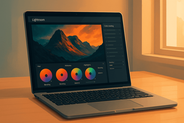
3. Apply the Color Grading Panel for Split Toning
Once you've fine-tuned tonal adjustments, it's time to enhance the overall mood and depth of your image with split toning. The Color Grading panel is your go-to tool for adding specific hues to highlights, midtones, and shadows, allowing you to create a more dynamic and visually engaging photo.
Unlike simple sliders, the Color Grading panel offers separate color wheels for shadows, midtones, highlights, and even global adjustments. This setup gives you precise control over how colors interact across various tonal ranges.
Using complementary colors - like pairing orange with blue or purple with yellow - is an effective way to boost contrast. As professional photographer Katrin Eismann puts it:
"In most cases, I prefer to work with complementary colors to create a visual dialogue between the light and dark values in an image."
For a cinematic look, try warming up your highlights with orange tones and cooling down your shadows with blue. This combination can give your image a dramatic, film-like quality. Photographer Nikk La shares his approach to color grading:
"My approach to toning/grading is playing off the supporting colors that's already in the photo, and from there I use the color wheel to enhance those specific colors while adding in complementary colors."
The Balance slider is another key feature. It lets you adjust the emphasis between your highlights and shadows - drag it toward highlights for brighter tones or toward shadows for deeper, more dramatic hues.
Keep in mind that split toning doesn’t affect pure white or pure black areas, so it works best on images rich in midtones. To achieve the most natural results, make your basic exposure and white balance adjustments first before diving into color grading. This ensures that the colors blend seamlessly with the rest of your edits.
Think about the mood you want to evoke: blue tones can add a sense of coolness and mystery, orange tones bring warmth and vibrancy, brown offers a nostalgic, vintage feel, and teal creates a cinematic edge. Often, focusing on just the highlights and shadows is enough to produce a striking effect without overcomplicating the process.
4. Target Specific Colors with the Color Mixer
Lightroom's Color Mixer lets you fine-tune the Hue, Saturation, and Luminance (HSL) of eight distinct color ranges: Red, Orange, Yellow, Green, Aqua, Blue, Purple, and Magenta. This tool allows you to adjust specific tones in your image without affecting others, giving you precise control over your edits.
To access the Color Mixer, go to Edit > Color > Color Mixer icon. From there, you can tweak each color's Hue, Saturation, and Luminance sliders individually. If you're looking for even more precision, the Targeted Adjustment tool can help.
Simply tap the Targeted Adjustment icon within the Color Mix panel, choose the property you want to modify (Hue, Saturation, or Luminance), and then click on the color in your image. Drag your cursor to make real-time adjustments directly on the photo, making it easy to perfect your edits.
5. Adjust Whites, Blacks, and Exposure Carefully
The Whites, Blacks, and Exposure sliders are the backbone of your image's tonal range. Together, they determine the brightest highlights, the deepest shadows, and the overall brightness, setting the tone for your photo.
Begin with the Exposure slider to establish the right baseline. This step lays the groundwork for all your contrast adjustments. Once the exposure feels balanced, move on to the Whites slider to define the brightest areas, and then use the Blacks slider to anchor the darkest points in your image.
Keep an eye on the histogram as you work. If you see the edges of the histogram bunching up, it’s a sign that details may be clipping - meaning highlights or shadows are losing detail.
Here’s a helpful tip: while adjusting the Whites or Blacks sliders, press Alt (or Option on Mac). This temporarily turns your image into a clipping mask, showing exactly where detail loss begins. White areas indicate clipped highlights, and black areas show clipped shadows. This visual guide helps you push contrast to its limits without losing essential details.
Be cautious, though - boosting contrast too much can make colors look overly saturated or unnatural. If this happens, use Lightroom’s saturation controls to dial back the intensity and restore a more natural look. Small, gradual adjustments often work best, preserving the image’s authenticity while enhancing its impact.
For photographers managing large batches of photos, Presets.io offers pre-designed presets with expertly balanced Whites, Blacks, and Exposure settings. These presets provide a consistent starting point, saving time while ensuring professional-quality results across your entire shoot.

The Master Preset Bundle
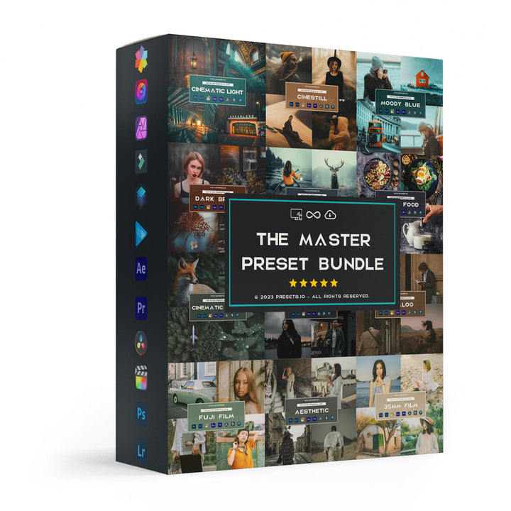
$57.00
$672.00
The Master Preset Bundle Every Style. Every Platform. One Download Get 56 high-quality Presets.io collections in one complete bundle — designed to help you edit faster, stay consistent, and get professional-looking results in seconds. Get All High-Quality Preset Collections For… continue reading
6. Use Range Masks for Selective Color Contrast
Range Masks are a game-changer when it comes to making precise, selective adjustments in your photos. Unlike global adjustments that affect the entire image, Range Masks let you zero in on specific areas based on color or brightness, giving you the ability to fine-tune contrast and depth with pinpoint accuracy.
Think of Range Masks as intelligent tools that "read" your image. Want to make a sunset sky more vivid without altering the foreground? Or maybe you’re looking to bring out the greens in foliage without touching skin tones? Range Masks allow you to make these adjustments effortlessly. Here’s how to choose between Color and Luminance masks to get the results you want.
Start by selecting a local adjustment tool - this could be the Brush, Linear Gradient, or Radial Gradient. At the bottom of the adjustment panel, you’ll find the Range Mask option. From here, you can pick Color to target specific hues (using an eyedropper tool) or Luminance to focus on brightness levels using sliders.
Color Range Masks
Color Range Masks let you isolate particular hues within your selection. For example, if you want to enhance the blue tones of a sky or the warm oranges of autumn leaves, this is your go-to tool. Lightroom will automatically identify and mask similar colors within your selected area, making it easy to apply adjustments without affecting unrelated tones.
Luminance Range Masks
Luminance Range Masks, on the other hand, target brightness levels instead of colors. You can use the sliders to define which parts of the image - highlights, midtones, or shadows - you want to adjust. This is especially useful for adding contrast to bright clouds while leaving darker elements, like mountains, untouched.
Example Workflow
Let’s say you’re editing a landscape photo with a dramatic sky. Start by applying a Linear Gradient to the sky area. Then, use a Color Range Mask to focus only on the blue tones. From there, increase the contrast and vibrance to make the sky pop while keeping the foreground and other elements unaffected. To ensure accuracy, use the "Show Mask" overlay, which highlights the targeted areas in white, so you can see exactly where your adjustments will apply.
Combining Range Masks with Other Tools
For even more impact, combine Range Masks with other tools like Clarity for enhancing midtones, Dehaze for adding depth, or Texture for fine details. These layered adjustments can create natural, professional-looking results. Just remember to make subtle, incremental changes to avoid harsh transitions or unnatural halos, which can give away heavy editing.
For photographers working on multiple images with similar lighting or scenes, tools like Presets.io offer pre-made presets that incorporate advanced masking and color grading techniques. While Range Masks often need to be tailored to individual images, these presets can serve as a solid starting point, helping you maintain a consistent look across your portfolio.
7. Combine Dehaze, Clarity, and Texture for More Depth
If you're looking to add depth and dimension to your photos, combining Dehaze, Clarity, and Texture can deliver striking results. Each tool has a unique role in enhancing specific elements of your image, and together, they can create a polished, professional look.
"Clarity, Texture, and Dehaze are contrast adjustments that selectively affect areas of your photo. Clarity affects mid-tones. Texture affects only the details. Dehaze targets low-contrast areas."
– Jenn Mishra, Fine Art Travel and Landscape Photographer
Clarity focuses on mid-tones, giving your image an extra boost in contrast. Texture sharpens fine details, bringing out intricate patterns like tree bark or fabric without affecting the broader tonal range. Meanwhile, Dehaze tackles flat, low-contrast areas, restoring life to hazy skies or distant landscapes.
How These Tools Differ
While all three tools enhance contrast, they work in distinct ways. Clarity adjusts midtone contrast across the image, creating a bold and dramatic effect. Texture, on the other hand, hones in on fine details, enhancing them without darkening or oversaturating the image. Dehaze is your go-to for reviving areas that feel washed out, like misty mornings or foggy horizons.
Applying the Tools Strategically
Start with Dehaze to clear up atmospheric haze or flat areas. A positive value can restore clarity to dull sections, while a negative value can add a dreamy, ethereal quality to your photo.
Next, use Clarity to emphasize textures and enhance the overall contrast. This step is particularly useful in landscape photography, where elements like rocks, water, and vegetation can benefit from added definition. Be cautious, though - too much Clarity can make your image look harsh or artificial. If that happens, balancing it with adjustments like Sharpening or Noise Reduction can help.
Finally, apply Texture to refine small details without altering the image's tonal balance. This adjustment is ideal for highlighting intricate patterns that might otherwise go unnoticed, such as the veins in leaves or the grain of wood. Once these edits are in place, fine-tune your adjustments to keep the overall look natural.
Targeted Adjustments for Precision
Lightroom's masking tools - such as the Brush, Graduated Filter, or Radial Filter - allow you to apply these adjustments selectively. For example, you could use Dehaze to restore clarity to a misty mountain range, Clarity to enhance the rugged textures of a rocky foreground, and Texture to bring out the fine details in nearby foliage. This targeted approach ensures each adjustment enhances the right part of your image.
As you refine your edits, you might notice that these combined adjustments reveal so much detail that you need to tweak other settings like exposure, highlights, or shadows to maintain a natural balance.
For photographers working on multiple images or aiming for a cohesive style, Presets.io offers a range of professionally designed presets. These presets incorporate carefully balanced combinations of Dehaze, Clarity, and Texture, providing a solid starting point for consistent and impactful edits across your portfolio.
8. Balance Contrast and Saturation for Natural Results
When you increase contrast, it often boosts color saturation as well. While this can make your images pop, it can also push them into looking overly processed or unnatural. Finding the right balance between contrast and color intensity is key to creating edits that feel authentic and visually appealing.
Using Lightroom's Refine Saturation Slider
Once you've adjusted the contrast, fine-tuning the saturation becomes crucial to maintaining a natural feel. Lightroom's Refine Saturation slider, found in the tone curve, is a powerful tool for this. It helps tone down any excessive saturation that might result from contrast adjustments, making it especially useful for portrait photography. Keeping skin tones realistic is often a top priority in portraits, and this slider can help you achieve just that.
The Smart Approach: Vibrance vs. Saturation
When it comes to enhancing colors, the Vibrance slider is your best friend. Unlike the Saturation slider, which boosts all colors equally (sometimes leading to over-saturation), Vibrance works selectively. It enhances muted colors while leaving already vibrant areas and skin tones untouched. This selective approach ensures your image gains richness without crossing into unnatural territory.
Finding the Sweet Spot
For the best results, start by adjusting contrast to your liking. Then, use the Refine Saturation slider to control any unwanted color intensity. Finally, apply Vibrance sparingly to bring life to muted tones while keeping sensitive areas, like skin, looking natural. This thoughtful approach ensures your photos maintain their natural beauty without feeling over-edited.
9. Use Presets for Consistent Color Contrast Styles
Presets can save you a ton of time by applying consistent color contrast to your photos with just a click, skipping the need for repetitive manual adjustments. Crafted by professional photographers, presets are tailored for various styles and goals - whether you're after dramatic, moody tones or bright, vibrant landscapes. These presets combine elements like tone curves, color grading, and saturation adjustments to deliver polished results that would otherwise take hours to achieve.
Building Your Visual Brand
Using presets is a game-changer, especially for large projects where maintaining a cohesive look is essential. A consistent color contrast style not only elevates your portfolio but also strengthens your brand identity. However, it’s important to treat presets as a foundation rather than the final touch. Once applied, fine-tune individual settings to match the unique characteristics of each photo. This ensures every image gets the attention it needs while still aligning with your overall aesthetic. To streamline your process even further, experiment with managing and customizing your own preset adjustments.
Smart Preset Management
When designing your own presets, skip settings like exposure and cropping, as these tend to vary from one shot to the next. Instead, focus on elements like tone curves, color grading, and saturation - these are the building blocks of a reliable contrast preset. Test your creations on a variety of images to ensure they work well across different lighting conditions and subjects. By tweaking each preset for individual photos, you can maintain your signature style without sacrificing flexibility.
If you're looking for inspiration or a starting point, check out Presets.io. They offer curated collections for styles like cinematic, vintage, and film-inspired looks. These professional-grade presets can serve as a springboard for developing your own unique approach to color contrast, helping you create stunning and cohesive visuals every time.
10. Compare Before and After Edits to Improve Results
The before-and-after comparison is the final step to ensure your color contrast adjustments enhance the image without introducing unwanted editing flaws. It's your chance to spot over-editing, detect color shifts, and maintain the delicate balance between enhancement and realism - something that sets professional edits apart from amateur ones.
Lightroom simplifies this process with its built-in comparison tools. Press the \ key to toggle between the original and edited versions, or use the Y key (or the Before/After button) to view side-by-side comparisons. These options can help you catch even the smallest discrepancies.
What to Look For During Comparisons
Pay close attention to highlights and shadows, ensuring they maintain depth without losing critical details. Check that colors - especially skin tones, skies, and foliage - stay natural and avoid looking overly saturated or artificial. This step helps prevent issues like clipping or over-processing.
If you notice excessive saturation, color banding, or abrupt tone transitions, it’s time to scale back. Tools like the saturation sliders or tone curve can help refine your adjustments. Remember, the goal is to enhance the image while keeping it realistic and intentional.
Taking a short break after significant edits can also make a big difference. Coming back with fresh eyes often reveals issues you might have missed during the initial editing session.
Lastly, if you're using presets from sources like Presets.io, always compare the before-and-after versions to ensure the preset complements your image without introducing unwanted color casts or exaggerated contrast. This simple habit can save you from making common editing mistakes.
Conclusion
Mastering color contrast in Lightroom can turn your photos into powerful visual narratives. By understanding how contrast works, you can create images that not only catch the eye but also evoke emotion. Whether you’re going for a bold, high-contrast effect or a softer, more subdued look, knowing how to use contrast effectively can elevate your photography.
From basic color theory to advanced tools like range masks and the color grading panel, Lightroom offers everything you need to fine-tune your images. These tools allow you to set the mood, highlight important details, and convey the story you want your photos to tell - whether it’s the striking drama of a high-contrast street shot or the gentle calm of a low-contrast landscape.
Contrast doesn’t just affect the technical quality of an image; it also directs the viewer’s attention and shapes their emotional experience. The right approach to contrast can make all the difference, no matter the subject of your photography.
For a more efficient workflow, consider using presets from Presets.io. These presets provide professional-grade edits with just one click, helping you achieve a consistent aesthetic while saving time. Plus, they’re fully customizable, so you can adapt each edit to suit the unique lighting and composition of your shot - keeping your personal style intact while making advanced contrast techniques accessible to photographers of all skill levels.
FAQs
How can I use the Tone Curve in Lightroom to enhance contrast and color without making my images look oversaturated?
To adjust contrast and color using the Tone Curve in Lightroom without pushing your images into oversaturation, start by crafting a gentle S-curve. This technique enhances contrast by brightening the highlights and deepening the shadows, all while preserving a natural appearance.
For more precise color tweaks, dive into the individual Red, Green, and Blue channels within the Tone Curve. These let you refine color tones with precision, avoiding the risk of overly saturated results. Keep in mind that boosting contrast can naturally amplify saturation, so you might need to tweak the Vibrance or Saturation sliders to maintain a balanced look.
Work patiently, making small adjustments and frequently previewing your edits to ensure your image remains polished and true to life.
How can I use Range Masks in Lightroom to enhance color contrast in specific parts of a photo?
To adjust color contrast in specific parts of a photo using Range Masks in Lightroom, begin with the eyedropper tool to pinpoint the colors or brightness levels you want to tweak. This approach lets you make precise edits without altering the entire image. You can also fine-tune by selecting luminance or color ranges, which is especially useful for targeting areas like skies, shadows, or highlights. This method keeps your adjustments precise, resulting in a more refined and professional-looking image.
How can I use Dehaze, Clarity, and Texture in Lightroom to add depth without over-editing my photos?
When aiming to add depth to your photos without overdoing it, the Dehaze, Clarity, and Texture sliders in Lightroom can be your best friends - if used sparingly. Each slider has its own job: Clarity enhances mid-tone contrast for a punchier look, Texture emphasizes fine details, and Dehaze cuts through atmospheric haze to bring out clarity in foggy or hazy shots. When combined subtly, these tools can elevate your images while keeping them natural.
The key is moderation. Start with small tweaks and check the results as you go. For a more polished finish, try applying these tools selectively using adjustment brushes or masks. This approach lets you enhance specific parts of your photo, ensuring the edits feel balanced and authentic, making your images pop without looking over-processed.