
Table of Contents
- 10 Tips for Moody Interior Edits in Lightroom
- Moody Cafe Photo Edit | Lightroom Preset Walkthrough
- 1. Lower Exposure for Dark Atmosphere
- 2. Increase Contrast with Tone Curve
- 3. Balance Shadows and Highlights
- 4. Adjust White Balance and Color Temperature
- 5. Desaturate Specific Colors
- 6. Apply Split Toning for Film Look
- 7. Add Texture and Clarity
- 8. Apply Vignetting Effects
- 9. Use Presets for Quick Results
- 10. Make Local Adjustments
- Settings Comparison Table
- Conclusion
- FAQs
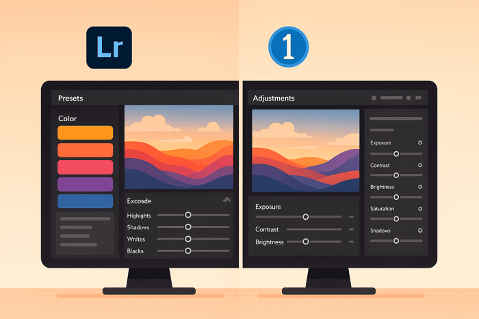
10 Tips for Moody Interior Edits in Lightroom
Want to create dramatic, atmospheric interior photos? Moody edits rely on deep shadows, soft lighting, and muted tones to evoke emotion. This guide covers 10 Lightroom techniques to achieve this look, from lowering exposure to using presets for quick results.
Key Takeaways:
- Lower Exposure: Create depth by darkening shadows without losing key details.
- Tone Curve Adjustments: Use an S-curve for precise contrast control.
- Balance Shadows & Highlights: Recover details in bright windows or dark corners.
- White Balance Tweaks: Adjust temperature for cooler or warmer tones.
- Selective Desaturation: Tone down distracting colors for a focused look.
- Split Toning: Add cinematic color grading with cool shadows and warm highlights.
- Texture & Clarity: Highlight details like wood grain or fabric patterns.
- Vignetting: Darken edges to draw attention to your subject.
- Presets: Save time with pre-made settings, then fine-tune for a personal touch.
- Local Adjustments: Refine specific areas for a polished finish.
These techniques work together to transform your interior photos into rich, moody compositions. Experiment with each to develop your style.
Moody Cafe Photo Edit | Lightroom Preset Walkthrough
1. Lower Exposure for Dark Atmosphere
Deliberately underexposing your images can create a dark, moody vibe that draws viewers in. This technique emphasizes shadows, adding a sense of mystery and drama to your shots.
By reducing exposure, shadows become richer, and contrasts are heightened - perfect for interiors where natural or accentuated shadows play a key role. Architectural details like crown molding or built-in shelves stand out more prominently as shadows define their shapes and textures. As Anthony Morganti puts it:
"An underexposed frame can feel mysterious and dramatic. Deep shadows make a viewer wonder what's hiding in them."
- Anthony Morganti
In settings lit by candles, underexposure amplifies the drama, showcasing the warm, flickering light against deep, enveloping shadows. Mike Butler explains:
"By candlelight, your subjects will cast gorgeous long shadows that stretch across walls and floors alike!"
- Mike Butler
To achieve this effect, it’s essential to balance mood with clarity. Start by lowering exposure in Lightroom’s Basic panel until the desired atmosphere takes shape. Then, adjust carefully to ensure key details remain visible. The goal is to enhance the scene’s character and mystery without losing important elements.
2. Increase Contrast with Tone Curve
The Tone Curve is one of the most effective tools for adding dramatic contrast to moody interior photos. Unlike the basic contrast slider, this feature gives you precise control over shadows, midtones, and highlights individually, letting you shape the atmosphere exactly how you envision it. To get started, use the Tone Curve to fine-tune the balance between shadows and highlights.
To create a dramatic effect, craft an S-curve: lift the lower-left part of the curve to brighten shadows and pull down the upper-right section to deepen highlights. This subtle adjustment adds dimensionality and depth to your image. Open Lightroom's Tone Curve panel and adjust the curve directly to achieve this classic S-shape that enhances your interiors with a sense of richness and texture.
For moody interiors, Lightroom's interactive feedback is incredibly helpful. While using the Tone Curve, you can click directly on specific areas of your photo - like window light or shadowy corners - and Lightroom will pinpoint where those tones land on the curve. This makes it easier to refine your adjustments with precision.
Even a slight S-curve can add a cinematic feel to your interiors, pulling viewers into the scene. Start small - tiny tweaks can have a big impact on the overall mood. Gradually adjust the steepness of the curve to find the right balance between dramatic contrast and preserving important details.
This technique pairs beautifully with the lowered exposure adjustments from the previous tip. Together, they create a tonal separation that makes moody interior shots so captivating.
3. Balance Shadows and Highlights
Once you've fine-tuned the Tone Curve, the next step is balancing shadows and highlights to bring out the best in your image. This is especially important for interior photography, where exposure challenges are common. Think about those blown-out windows or overly dark corners - these issues can make your photos look flat and lifeless, stripping them of depth and dimension.
Start by tackling overexposed windows. Use the Highlights slider to reduce brightness, typically in the range of -30 to -50. This adjustment can work wonders, restoring textures and architectural details that might otherwise be lost. Suddenly, those windows go from glaring white voids to visually interesting features in your shot.
Next, turn your attention to the Shadows slider. This tool is all about setting the mood. If you want a natural, balanced feel, lift the shadows (+30 to +50) to reveal hidden details. On the other hand, if you're aiming for a dramatic, moody vibe, darken the shadows slightly (-10 to -30) to create depth and intrigue. The choice here depends on the story you want your image to tell.
For added contrast, tweak the Blacks slider. A small reduction (-5 to -15) can deepen the darkest tones, adding richness without losing detail. Similarly, fine-tune the Whites slider to brighten key areas, ensuring they pop without risking overexposure.
Here’s a quick guide to help you balance these adjustments:
| Adjustment | Natural Look | Dramatic Look | Suggested Range |
|---|---|---|---|
| Highlights | Decrease to recover bright areas | Same approach | -30 to -50 |
| Shadows | Increase to reveal dark details | Decrease to add depth | +30 to +50 / -10 to -30 |
| Blacks | Minimal adjustment | Decrease for deeper contrast | -5 to -15 |
This approach ensures you have precise control over the image's tonal range. It prevents shadows from becoming murky black voids and keeps highlights from washing out important details.
For even more accuracy, hold down the Alt/Option key while adjusting. This activates clipping warnings, helping you avoid losing critical details in the darkest or brightest parts of your image.
4. Adjust White Balance and Color Temperature
Once you've tackled exposure and contrast, it's time to refine the mood of your image by tweaking the white balance. The white balance and color temperature are key tools for setting the overall tone and feel of your photo. In the Basic panel, you'll find a temperature slider that allows you to make these changes.
For a more dramatic effect, try cooling the white balance by sliding it toward blue. Keep adjusting until the atmosphere feels just right for your vision. This small change can make a big difference in how your image is perceived.
5. Desaturate Specific Colors
Once you've adjusted the color temperature, it's time to fine-tune the hues by selectively desaturating colors that might be pulling attention away from your subject. This step helps set the stage for precise color control in the next phases of editing.
To do this, open the HSL panel (or the Color Mixer if you're using Lightroom 13.0+) and tweak the hue, saturation, and luminance of eight key color ranges: red, orange, yellow, green, aqua, blue, purple, and magenta.
For moody interior photography, consider desaturating brown and green tones. These colors often dominate in furniture, wood finishes, and plants, which can create unnecessary clutter in your composition. Dialing down their saturation helps darken the background and shifts the viewer's attention to your subject.
Similarly, reducing the saturation of blue tones can work wonders for neutralizing unwanted color casts on white surfaces like walls and ceilings. This subtle adjustment ensures these areas don't distract from the overall aesthetic.
The trick here is to be selective, not heavy-handed. Avoid desaturating the entire image, as this can make your photo feel flat and unnatural. Instead, focus on muting colors that don't contribute to your story or subject. Targeted desaturation makes background hues fade into the backdrop, while your main elements stand out more vividly. When combined with earlier tweaks to exposure and contrast, this approach enhances the cohesive, moody vibe you're aiming for.
Start small - adjust the saturation sliders in increments of 10 to 20 points. Even minor changes can dramatically shift the mood and balance of your interior shots, giving them a polished, professional look.
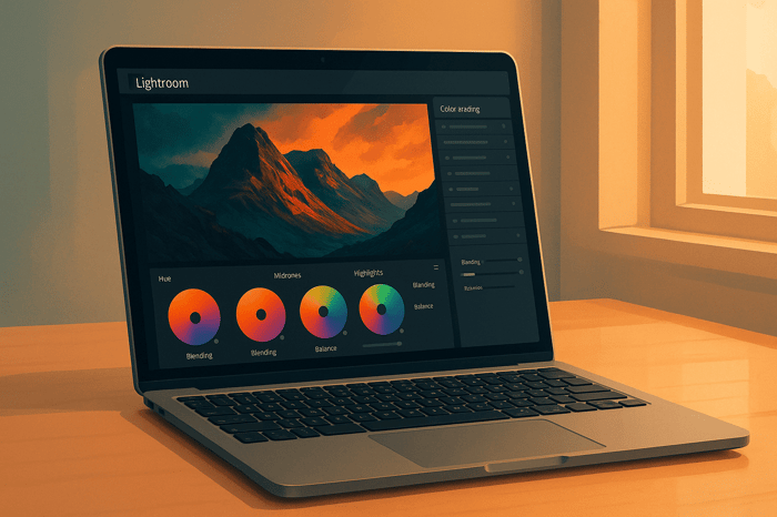
6. Apply Split Toning for Film Look
Once you've adjusted exposure and tone curves, split toning is the next step to give your interior shots that cinematic feel. This technique involves adding distinct colors to the shadows and highlights, mimicking the color grading used in films. It builds on your earlier adjustments by introducing color separation, enhancing the depth and mood of your image.
With shadows and highlights already balanced, split toning adds another layer of refinement by applying subtle color shifts. For creating a moody, cinematic look in interiors, follow this tried-and-true formula: use cooler tones for shadows and warmer hues for highlights. This contrast adds depth and draws the viewer into the scene. To start, head to the Split Toning panel in Lightroom's Develop module.
For shadows, opt for deep blues or teals (hue range: 200–220). For highlights, go with soft, warm tones like golden yellows (hue range: 40–60). These cooler shadows create a calm, moody base, while the warm highlights mimic the inviting glow of light sources like lamps or candles. Together, they form a balanced look that feels natural yet cinematic.
The warm tones in the highlights also enhance skin tones, making them appear more flattering, while adding a cozy ambiance around light sources. This technique can even replicate the golden-hour glow indoors, giving your images a warm, welcoming vibe.
To maintain a polished look, keep saturation levels below 30 for both shadows and highlights. Start with subtle adjustments and fine-tune as needed.
"Teal shadows and orange highlights flatter most skin tones - no wonder it's a film industry favorite." - Stephen Walton, iPhotography
This teal-and-orange combination has become a Hollywood go-to for good reason. It not only complements skin tones but also creates a distinct separation between subjects and their backgrounds. In interior photography, this pairing ensures your subjects stand out while maintaining a cohesive, cinematic atmosphere.
One final tip: watch out for overly orange skin tones. If this happens, dial back the highlight saturation or nudge the hue slightly toward yellow for a more natural look.

The Master Preset Bundle
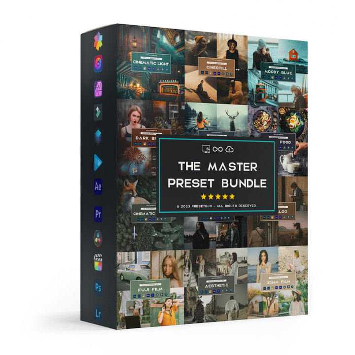
$57.00
$672.00
The Master Preset Bundle Every Style. Every Platform. One Download Get 56 high-quality Presets.io collections in one complete bundle — designed to help you edit faster, stay consistent, and get professional-looking results in seconds. Get All High-Quality Preset Collections For… continue reading
7. Add Texture and Clarity
Bringing out textures in your photos can set the mood and emphasize unique details. In Lightroom, the Texture and Clarity sliders are your go-to tools for enhancing surface details and defining architectural features.
The Texture slider works wonders on fine details like fabric patterns, wood grain, or brickwork, adding depth and a sense of touch to your images. On the other hand, Clarity adjustments boost mid-tone contrast, making structural elements pop while keeping the overall feel soft and welcoming. These tools are perfect for preparing your image for more detailed, localized edits.
To take it a step further, use Lightroom's masking tools to apply these adjustments to specific parts of your image. This selective approach ensures that the enhancements feel natural and balanced.
For even sharper results, head to the Detail tab and set Sharpening to 5. This subtle sharpening complements your texture and clarity tweaks, adding crispness to fine details without introducing unwanted noise or artifacts.
These thoughtful adjustments can transform your photos, highlighting the property's unique features and creating images that truly stand out.
8. Apply Vignetting Effects
Using vignetting effectively can draw the viewer's eye to the center of your photo, enhancing the overall mood. This technique involves darkening or lightening the edges of an image to shift focus away from distractions and toward the main subject. Here’s how you can apply this effect in Lightroom.
Vignetting can set different tones for your photos depending on how it’s used. Darkened edges create a warm, intimate vibe, perfect for cozy or classic spaces. On the other hand, lightened edges give a bright, airy feel, making them ideal for modern interiors.
To get started in Lightroom, go to the Develop module and open the Effects panel. From there, adjust the vignette amount and feathering sliders. Keep it subtle - overdoing the effect can make your photo look unnatural.
Different vignette styles can complement specific interior designs. For instance, a vintage vignette adds a nostalgic touch to rustic spaces, while a soft-focus vignette creates a dreamy, blurred edge that works well for ethereal or romantic settings.
Dynamic vignetting takes it a step further by darkening the edges and brightening the center. This approach helps balance light and shadow, adding depth and contrast to highlight architectural details.
When applied with care, vignetting subtly enhances focus without distracting from the image’s details. It’s a finishing touch that pairs beautifully with earlier adjustments in exposure and tone, helping you achieve a polished, cinematic look.
9. Use Presets for Quick Results
Presets are a fantastic way to speed up your editing process while maintaining a polished, professional look. Instead of manually tweaking every setting for each photo, presets apply a set of coordinated adjustments in seconds, giving you a consistent starting point for your moody interior edits.
Take the Interior Preset Collection from Presets.io as an example. This package includes 16 Desktop & Mobile Presets along with 16 LUTs for video editing, all designed to enhance indoor photography. It’s compatible with popular platforms like Lightroom, Adobe Premiere, Final Cut X, DaVinci Resolve, Photoshop, Luminar, and Filmora, making it a versatile choice for various editing workflows. At $12.00 (discounted from $27.00), it’s an affordable way to achieve professional-grade results while leaving room for your personal touch.
Customization is where the magic happens. Presets typically handle about 90% of the work, but the final 10% - adjusting exposure, white balance, or fine-tuning specific tones - is what makes your edits truly unique. Whether you’re using pre-made collections or crafting your own presets tailored to your style, this approach saves time while keeping you in control of the creative process.
For those looking for even more variety, the Master Preset Bundle offers 56 collections and a whopping 721 presets for $49. This bundle covers a wide range of moody interior styles, from dramatic natural light to cozy lamp-lit settings or spaces with mixed lighting. It’s a treasure trove for photographers who want to quickly establish the right mood for each shot.
To get the most out of presets, it’s important to understand Lightroom’s built-in tools. This knowledge lets you refine your edits after applying a preset, ensuring each photo gets the precise adjustments it needs to achieve that perfect moody vibe.
10. Make Local Adjustments
After setting the stage with global edits, local adjustments help you fine-tune specific areas of your photo. These edits let you add depth and focus to your image, giving you control over its mood and atmosphere without altering the entire composition. Think of it as adding the final brushstrokes to your masterpiece.
Lightroom's Adjustment Brush is a great tool for this. Use it to brighten key elements like your subject or architectural features. To keep the adjustments seamless, feather the edges for smooth transitions. You can tweak highlights, exposure, and saturation to enhance contrast - for example, increasing highlights while toning down pure whites can create a striking effect.
The Radial Filter is another handy tool for creating a natural light effect or subtly spotlighting important areas. Since Lightroom's edits are non-destructive, you can experiment as much as you want without worrying about losing image quality.
For even more precision, combine the Adjustment Brush with Color Range sub-masks (using the "Intersect" option). This lets you isolate and adjust specific colors, like desaturating only the blues in one corner of the image.
You can also tweak the local white balance to correct color casts. For example, warm up areas near lamps for a cozy glow while keeping window-lit sections cooler for a natural contrast.
These local adjustments not only guide the viewer's eye but also maintain the authentic atmosphere of your interior shots.
Settings Comparison Table
The way you adjust shadows, highlights, and color grading can completely transform the mood and impact of your interior shots. Whether you're aiming for a bold, dramatic vibe or a softer, more inviting feel, the right settings make all the difference. Below is a table summarizing key adjustments and their effects, building on earlier tips to show how these choices shape the final atmosphere of your images.
When it comes to shadows, the approach you choose significantly influences the mood. Lowering shadows and blacks enhances contrast, adding drama and emphasizing architectural details. This method works well for creating a "Dynamic and Dramatic" look, where bold contrasts make structures and textures pop.
Alternatively, lifting shadows brightens darker areas, uncovering subtle details and softening the overall tone. This adjustment is perfect for a natural or romantic feel, as it recovers details in underexposed areas without altering the overall exposure too much.
| Adjustment Type | Dramatic Approach | Soft Approach | Best For |
|---|---|---|---|
| Shadows | Lower shadows and blacks to deepen mood | Lift shadows to reveal hidden details | Dramatic: Highlighting architecture; Soft: Creating a cozy feel |
| Highlights | Reduce significantly for bold contrast | Slightly reduce to maintain natural lighting | Dramatic: High-contrast scenes; Soft: Gentle, natural interiors |
| Color Temperature | Cool tones for a modern, crisp atmosphere | Warm tones for a welcoming, cozy vibe | Cool: Minimalist, modern spaces; Warm: Rustic or traditional settings |
| Split Toning | Add blue/teal in shadows with orange highlights | Use golden hues for a balanced, warm look | Blue/Teal: Cinematic effects; Warm: Classic film-like aesthetics |
Color temperature also plays a key role. Cool tones give a sleek, modern feel, while warm tones make spaces feel inviting and homey. Similarly, how you handle highlights can either boost contrast for a striking effect or preserve soft, natural light for a more organic look.
Conclusion
After diving into these techniques, it's clear how they work together to craft striking moody edits. The ten tips - from adjusting exposure to fine-tuning local details - provide a practical roadmap for creating a moody atmosphere in your interior photography.
Instead of simply mimicking settings, take the time to experiment with adjustments and understand how each tool shapes your image. As one photographer wisely puts it:
"The most important thing is not the specific +/- settings themselves, but the patterns you see for each setting... It takes time to learn so don't be afraid to play around until you feel like you're starting to understand how manipulating each setting works!"
Every photo is unique, shaped by its natural lighting conditions. For instance, a bright, sunlit living room demands a completely different approach than a dimly lit bedroom. This is why hands-on practice is crucial for developing your personal editing style.
Use Lightroom's History panel to save and compare multiple versions of your edits. This can help you track your progress and refine your adjustments. As another photographer emphasizes:
"The journey to mastering dark photo edits is about practice, patience, and exploring different adjustments until you create something that resonates with your vision."
Start small - choose one or two techniques that resonate with you and build from there. Whether you lean toward bold shadows and high contrast or prefer softer, warm tones, consistent practice will help you develop a signature style. Keep revisiting these techniques as you refine your workflow, and you'll soon be creating interior photos with a cinematic, moody vibe.
FAQs
How can I create a moody look in Lightroom without losing important details in shadows and highlights?
To achieve a moody aesthetic in Lightroom while keeping the details intact, start with the Tone Curve. Use it to gently boost contrast, being careful not to overly darken the shadows or blow out the highlights. This ensures your image retains depth and texture.
Next, head to the Shadows slider and slightly lift the darker areas. This adjustment adds dimension without losing the subtle details in the shadowed parts of the image.
For fine-tuning colors, the HSL panel is your best friend. Reduce the saturation of certain colors to tone down the overall vibrancy, and selectively enhance others to introduce a touch of richness. This creates a harmonious balance in the color palette.
Wrap it up with Split Toning (or the Color Grading tool). Use this to introduce soft, complementary color contrasts, keeping the mood dramatic but not overwhelming. With these steps, you’ll craft a striking edit that’s both dramatic and detailed.
How can I use split toning in Lightroom to create a cinematic mood in interior photos?
To give your interior photography a cinematic touch using split toning, start by working with cool tones like teal or blue (hue range: 200–220) for the shadows. For the highlights, opt for warm tones such as orange or amber (hue range: 40–60). Keep the saturation levels low - typically under 30 - to achieve a moody, natural look without going overboard.
Next, use the blending and balance sliders to control how these tones interact across your image. This step helps you create a smooth, cohesive mix of colors, enhancing that film-inspired aesthetic. Don’t be afraid to experiment with these settings until you strike the perfect harmony for your personal style.
How can I use Lightroom presets to edit faster while keeping my photos unique?
Lightroom presets can significantly streamline your editing process while allowing you to maintain a personal flair in your photos. Begin by applying a preset to set a consistent base style for your images. From there, tweak settings like exposure, color balance, and shadows to align with the specific mood or lighting in each shot.
If you want to take it a step further, you can modify the strength of certain effects or even layer multiple presets to craft a look that's entirely your own. This approach keeps your workflow efficient while ensuring your final edits stand out with a polished, professional touch.