
Table of Contents
- How To Adjust Sepia Tone In Lightroom
- What Is Sepia Tone and Why Use It
- 𝐌𝐚𝐬𝐭𝐞𝐫 𝐓𝐡𝐞 𝐀𝐫𝐭 𝐨𝐟 𝐒𝐞𝐩𝐢𝐚 𝐓𝐨𝐧𝐞 𝐢𝐧 𝐋𝐢𝐠𝐡𝐭𝐫𝐨𝐨𝐦 #lightroomediting #lightroomtutorial #colorgrading
- Preparing Your Image for Sepia Effects
- How to Apply Sepia Tone in Lightroom
- Advanced Sepia Adjustments
- Using Lightroom Presets for Sepia Effects
- Tips for Better Vintage Photo Effects
- Conclusion
- FAQs
How To Adjust Sepia Tone In Lightroom
Want to give your photos a nostalgic, timeless feel? Sepia tone is the answer. Using Lightroom, you can easily create warm, brown-hued images that evoke a sense of history and emotion. Here's how:
- Start with Black & White Conversion: Strip away color to create a clean base for sepia tones.
- Use the Color Grading Panel: Adjust warmth, shadows, and highlights to achieve the desired sepia effect.
- Fine-Tune Contrast & Texture: Balance details and depth for a polished look.
- Add Film Grain & Vignettes: Mimic the texture of old photographs for a more authentic feel.
- Leverage Presets: Speed up the process with professional presets, then customize them to fit your style.
Whether you're editing portraits, landscapes, or street photography, sepia tones can transform your images into classic works of art. Read on for step-by-step instructions and advanced tips to master this technique.
What Is Sepia Tone and Why Use It
What Is Sepia Tone?
Sepia tone is a photographic effect that gives images a warm brown hue, transforming them into monochrome visuals with a nostalgic charm. This technique dates back to the 19th century, when sepia toning was achieved by chemically altering the silver in photographic prints to produce those signature brown tones.
"Sepia photography is similar to black-and-white photography in that it's monochromatic, meaning one tone or one color. But it's more brown or tan." - Ellen Fisch, Photographer
The effect can range from soft cream shades to rich, chocolate-like browns, offering photographers flexibility in creating different levels of warmth and depth. Unlike the stark contrasts of black-and-white photography, sepia provides a softer, more organic feel. Its warm tones create smoother transitions between highlights and shadows, making it ideal for images that benefit from a more inviting and timeless atmosphere. This unique quality has made sepia a go-to choice for evoking nostalgia and enhancing storytelling through visuals.
Why Use Sepia Tone in Photography?
Sepia tone brings more to the table than just aesthetic appeal. Its warm brown tint can instantly give photos a classic, vintage look, transporting viewers to a different era. Even modern images can take on a sense of historical importance when presented in sepia.
One of sepia's original advantages was its durability. Historically, sepia-toned photographs lasted much longer than traditional silver-based prints, as the chemical process used to create them helped slow down fading and deterioration. This connection to longevity adds an extra layer of meaning to modern digital images edited with sepia tones.
This effect also enhances certain types of photography, such as architectural, landscape, and urban imagery. The warm tones emphasize form and texture, giving these photos a sense of history and depth. By focusing on composition and lighting, sepia can transform cityscapes and natural scenes into timeless works of art.
Another strength of sepia is its ability to strip away the distractions of color, directing attention to the composition, texture, and form of the subject. This makes it particularly effective for portraits, where the warm tones complement skin tones beautifully, and for nature photography, where the play of light and shadow takes center stage.
Sepia also offers versatility. Its adjustable warmth allows photographers to create moods that range from serene and tranquil to bold and vibrant, all while maintaining that classic, vintage appeal.
𝐌𝐚𝐬𝐭𝐞𝐫 𝐓𝐡𝐞 𝐀𝐫𝐭 𝐨𝐟 𝐒𝐞𝐩𝐢𝐚 𝐓𝐨𝐧𝐞 𝐢𝐧 𝐋𝐢𝐠𝐡𝐭𝐫𝐨𝐨𝐦 #lightroomediting #lightroomtutorial #colorgrading
Preparing Your Image for Sepia Effects
Getting your image ready is the first step to achieving rich, striking sepia tones. The effort you put into preparation will directly impact the depth and charm of your final photo. Skipping this step often results in dull, lifeless images that miss the timeless appeal of sepia photography.
Basic Image Adjustments
Before diving into sepia toning, make sure your image's core settings are in good shape. Exposure, contrast, and white balance are the foundation for any stylistic edits, including sepia effects. These adjustments set the stage for a polished final result.
Start by fine-tuning the exposure to balance the brightness of your image. Then, focus on the highlights and shadows sliders to preserve details and enhance contrast.
Be cautious about clipping, where parts of your image turn completely white or black, losing important details. Use Lightroom's highlight and shadow warnings (toggle them on with the "J" key) to check for this. Adjust the exposure, whites, and blacks to maximize your dynamic range and retain as much information as possible.
Next, adjust the white balance to ensure the colors are neutral before applying sepia tones. This step ensures the sepia effect looks natural and cohesive.
Boost the contrast slider to make your image pop. A moderate increase usually works well, adding depth without overwhelming the photo. For images where texture is key, consider adding some clarity to enhance local contrast and bring out fine details.
Cropping and Spot Removal
Once your exposure and contrast are set, turn your attention to composition and cleanliness. Both are crucial for creating a refined sepia image. Start by cropping your photo to improve its framing and remove any unnecessary elements that might distract from the subject.
Cropping can transform your composition. Sepia photography often pairs well with classic compositional techniques like the rule of thirds, leading lines, or symmetrical arrangements that complement the timeless vibe of sepia tones.
Next, tackle distractions using Lightroom's Spot Removal tool. Dust spots, sensor dirt, or other small flaws can become more noticeable in sepia images, where the focus often shifts to texture and composition due to the absence of color.
For a truly vintage feel, remove modern elements that clash with the nostalgic mood you're aiming for. Power lines, modern signs, or other contemporary details can break the illusion. Use the Spot Removal tool for minor distractions, and for larger elements, consider advanced masking techniques to clean up your image.
With these adjustments complete, your image is primed and ready for sepia toning, ensuring a polished and captivating final product.
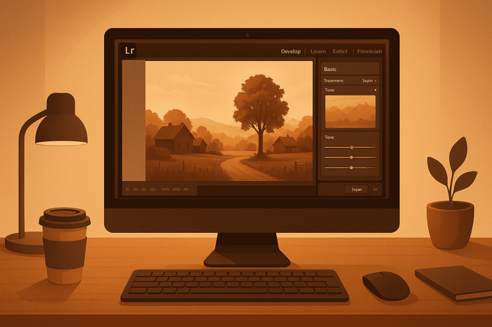
How to Apply Sepia Tone in Lightroom
Creating a sepia tone effect in Lightroom starts with converting your image to black and white. This step lays the groundwork for that vintage, warm-toned aesthetic you're aiming for. By removing color, you create a clean slate, making it easier to add the sepia tones later.
Convert Your Image to Black and White
The first thing you'll need to do is strip your image of all color. If you're using Lightroom Classic, head to the Develop module, and click on the "Black & White" option located on the right side, just above the Profile menu. For Lightroom CC users, open your photo, go to the Edit panel, and select "B&W".
For more control over how different colors translate to grayscale, use the HSL/Color/B&W Panel and select "B&W". This gives you access to the Black & White Mix sliders, which let you fine-tune how individual colors are rendered in black and white.
Prefer a quicker approach? Try applying a black-and-white preset from the Presets section on the left panel. Options like the B&W High Contrast preset can give your image a bold, dramatic look right away. Once you've converted the image, adjust its exposure and contrast to prepare it for the sepia tones.
Black-and-white images often benefit from a boost in contrast to make them pop . If you're editing architectural or street photography, increasing the Clarity slider can add crispness and depth. For portraits, though, softer adjustments might work better to maintain a natural look. This step ensures your image is ready to take on the warm sepia tones that will complete the effect.

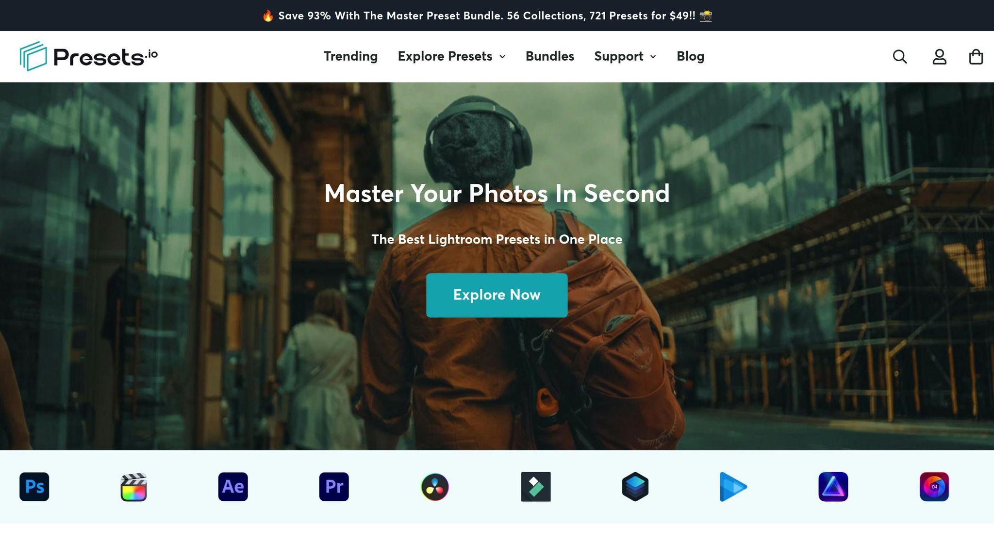
The Master Preset Bundle

$57.00
$672.00
The Master Preset Bundle Every Style. Every Platform. One Download Get 56 high-quality Presets.io collections in one complete bundle — designed to help you edit faster, stay consistent, and get professional-looking results in seconds. Get All High-Quality Preset Collections For… continue reading
Advanced Sepia Adjustments
After applying a basic sepia effect, fine-tuning takes your image to the next level. These advanced tweaks let you shape the mood, depth, and overall feel of your sepia-toned photo.
Adjust Contrast, Clarity, and Texture
The Contrast slider is your go-to tool for adding drama. Boosting contrast deepens shadows and brightens highlights, giving your sepia image more impact. For a subtle enhancement, adjust clarity to +10 to +20; for a bolder, textured look - ideal for subjects like architecture or street scenes - go as high as +40.
The Texture slider is perfect for bringing out fine details without altering the image's overall structure. Use positive values between +15 to +30 to highlight elements like fabric textures, weathered surfaces, or the grain of old photos. This adds an authentic vintage touch.
If you’re aiming for a softer, more romantic vibe, reduce clarity to -10 to -20 while keeping the texture slider neutral. This combination works wonders for nostalgic family portraits or dreamy, aged effects, giving your image a gentle and timeless feel.
Use Local Adjustment Tools
Once you’ve nailed the global adjustments, local tools help refine specific areas of your image. The Radial Filter is great for creating vintage-style spotlights. Draw a circular selection around your subject, invert the mask, and apply stronger sepia tones to the outer areas for a natural vignette effect.
The Linear Gradient tool is another powerful option. Use it to create smooth sepia transitions, such as warming up the sky while keeping the foreground cooler. This technique can add depth and dimension to your photo.
For even more precision, turn to masking brushes. These let you paint sepia effects onto specific parts of your image, such as clothing, backgrounds, or architectural details, while leaving skin tones or focal points lighter. Adjusting the Feather setting is key here. Start with a feather value between 50-70 for smooth transitions and tweak as needed to maintain a realistic look.
Don’t overlook the Color Range masking feature. This tool automatically selects similar tones across your image, making it easy to apply sepia effects to highlights or shadows. It’s an excellent way to replicate the nuanced tonal changes of traditional sepia processing, giving your image a polished, vintage aesthetic.
Using Lightroom Presets for Sepia Effects
While manually adjusting settings provides complete control, using presets can save time and deliver professional-looking sepia effects with ease. Presets simplify your workflow and ensure a consistent vintage aesthetic across your projects. They’re especially useful for maintaining uniformity in a series of images or experimenting with various sepia styles without spending hours fine-tuning every slider. Here’s how presets can make sepia editing quicker and more efficient.
Benefits of Using Sepia Presets
Presets streamline your editing process by applying multiple adjustments at once. Instead of tweaking each setting individually, a well-designed sepia preset handles essential controls in a single click.
This approach is a game-changer for batch editing. Whether you’re working on a wedding album or a large portrait session, presets ensure a cohesive look across all images while drastically cutting down editing time.
Presets also double as learning tools. They allow you to see how specific vintage effects are achieved, helping you understand concepts like color theory, contrast adjustments, and tonal balance. By reverse-engineering a preset, you can uncover the techniques behind its look and expand your editing knowledge.
With Lightroom’s Amount slider, you can adjust the preset’s intensity to match your vision. Use a lighter touch for a subtle warmth or crank it up for a bold, dramatic vintage feel.
Another advantage is creative flexibility. After applying a sepia preset, you can tweak settings like temperature, vibrance, and clarity to align with your artistic goals.
"While using both Lightroom and Photoshop, you are able to achieve better results that personally suit your taste." - Alina Liu, Author, Kate Backdrop
Vintage Presets from Presets.io
For photographers who want expertly crafted options, Presets.io offers a standout collection of vintage presets. Their curated selection delivers authentic sepia effects while seamlessly integrating with Lightroom’s editing tools.
Presets.io regularly updates its library with fresh vintage styles, keeping you in sync with modern trends while maintaining the timeless appeal of sepia tones. This ensures your preset collection stays relevant and versatile.
These presets work hand-in-hand with the customization techniques discussed earlier. For example, after applying a Presets.io sepia preset, you can refine the look by creating an S-curve in the tone curve panel for a film-like effect, fine-tuning highlights and shadows in the color grading panel, or adjusting the calibration panel to emphasize your preferred sepia warmth.
Additionally, Presets.io presets complement local adjustments. Apply a preset globally, then use radial filters or masking brushes to fine-tune specific areas. If you’ve made custom tweaks you want to save, simply right-click the preset and select "Update With Current Settings" to preserve your personalized version. These presets are designed to enhance efficiency while giving you the freedom to add your own creative touches.
Tips for Better Vintage Photo Effects
Once you've adjusted your sepia settings, you can take your image to the next level with some finishing touches. Creating vintage sepia photos isn't just about tweaking color tones - it’s about adding elements that make your photos feel like they’ve stepped out of a bygone era.
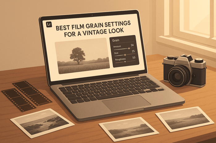
Add Film Grain and Vignettes
Film grain is essential for recreating the texture of old-school film, giving your photos that authentic vintage vibe. Head over to Lightroom's Effects panel and use the Grain section to add texture. Try these settings: Amount: 15–25, Size: 25–35, Roughness: ~50. For vignettes, adjust the Post-Crop Vignetting settings: Amount: –15 to –25, Midpoint: 50, Feather: 80–90, and tweak the Roundness to your liking.
For the best results, stick with the Post-Crop Vignetting tool in the Effects panel rather than the vignette option in Lens Corrections. The grain adds a tactile feel to your image, while the vignette darkens the edges, mimicking the natural light falloff seen in older lenses. Together, these effects help draw the viewer's eye to the center of your photo, enhancing focus on your subject.
Match Sepia Strength to Your Subject
The intensity of the sepia effect should align with your photo's mood and the story you want to tell. A one-size-fits-all approach won't work here. For example, portraits usually benefit from a softer sepia tone - too much can wash out skin tones and obscure facial details. On the other hand, landscapes or architectural shots can handle stronger sepia effects, especially when you're aiming for a historic or timeless feel.
Simple, uncluttered subjects tend to showcase sepia effects best. The sepia tone can evoke feelings of nostalgia, memory, and tradition, giving a modern photo a classic twist. It also works well for creating a cohesive look across a series of images.
Be careful not to overdo it - too much sepia can overwhelm your image and erase subtle details. Aim for a gentle warmth that complements your photo without overpowering it. Once you’ve made your adjustments, take a moment to review and fine-tune for balance.
Compare Before and After Results
Lightroom's Before/After view is a great tool for evaluating your edits. Press Y or click the Before/After button to see how your sepia adjustments hold up. Check that the highlights, shadows, and overall tone still look natural.
If anything feels off, use the History panel to retrace your steps and adjust as needed. Pay extra attention to areas where you've applied local adjustments - make sure they still blend seamlessly with the rest of the image. A little fine-tuning can make all the difference in achieving a polished vintage look.
Conclusion
Transforming modern photos into timeless vintage pieces with sepia tones in Lightroom is all about following a thoughtful, step-by-step process. Start by nailing the basics - adjust exposure, contrast, and white balance to set a solid foundation. Then, use the color grading panel to carefully tweak warmth and tone for that classic sepia feel. Finish it off with subtle touches like adding film grain and vignetting to give your image an authentic vintage charm.
As you work, make use of Lightroom's Y key to toggle between before-and-after views. This helps ensure your highlights, shadows, and overall tone stay natural. It’s a great way to strike the right balance without letting the sepia effect overshadow the essence of your original photo.
For those looking to save time, professionally designed presets can be a game-changer. Presets.io, for example, offers vintage presets that provide a solid starting point. You can then refine these presets using the techniques outlined here to suit your specific photo. Whether you're enhancing a portrait with a soft touch or giving a landscape a bold sepia transformation, experimenting with different intensities is key to finding what works best for your subject.
Dive in and start practicing on various images. Over time, you’ll develop a keen sense of what enhances each photo and create a vintage style that feels uniquely yours.
FAQs
How do I create a balanced sepia tone with highlights and shadows in Lightroom?
To create a balanced sepia tone in Lightroom, begin by tweaking the Hue and Saturation sliders in the Split Toning (or Color Grading) panel. These controls let you shape the warmth and depth of the sepia effect for both highlights and shadows.
Once you've set the tones, move to the Balance slider. This tool fine-tunes how highlights and shadows interact, ensuring one doesn't dominate the other. It's all about subtle adjustments here - play around with the settings until your image achieves that cohesive, vintage vibe.
How can I use Lightroom presets to create a consistent sepia tone for my photos?
To create a consistent sepia tone across multiple photos in Lightroom, begin by using a quality sepia preset as your base. After applying the preset, fine-tune settings like exposure, contrast, and warmth to ensure the tone matches perfectly across all images. If you want to streamline future edits, consider saving your adjustments as a custom preset. This makes it easy to apply the same vintage aesthetic to other photos later. When working with images captured in different lighting conditions, take time to review your edits to ensure the sepia tone stays uniform throughout your collection.
How can I adjust the intensity of sepia tones in Lightroom for portraits or landscapes?
To tweak the sepia tone intensity in Lightroom, start by using the Temp and Tone sliders to warm up your image. Next, head to the Color Grading panel and adjust the highlights, midtones, and shadows until you achieve the sepia effect you're aiming for. If you want even more control, the Amount slider in the Presets panel lets you fine-tune the overall intensity of the effect.
For portraits, a softer sepia tone works well to subtly enhance the mood while keeping the subject in focus. On the other hand, landscapes can handle a stronger sepia tone, adding a dramatic, vintage feel. Play around with these settings to strike the right balance for your specific image.