
Table of Contents
- Best Film Grain Settings for a Vintage Look
- Film Grain Basics and Lightroom Controls
- Checklist: Film Grain Settings for Vintage Photos
- How to Add Realistic Film Grain in Lightroom
- Grain Settings for Different Vintage Eras
- Using Lightroom Presets for Quick Vintage Edits
- Conclusion: Mastering the Vintage Film Look
- FAQs
Best Film Grain Settings for a Vintage Look
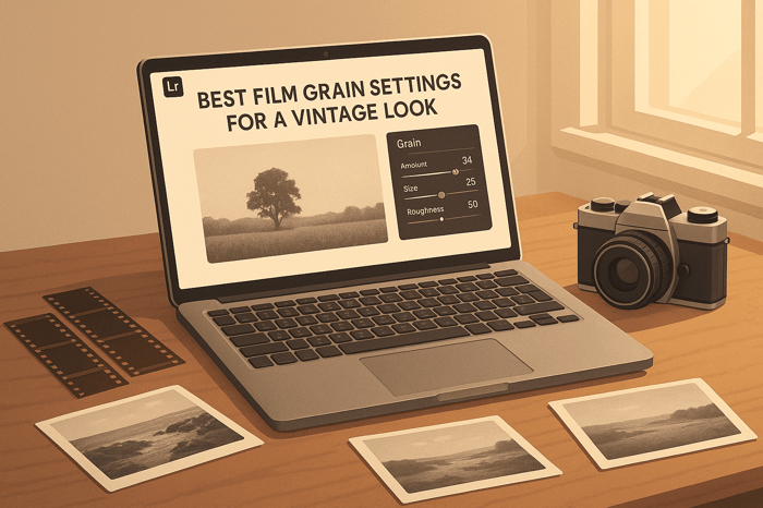
Film grain can add a timeless, vintage texture to your photos, mimicking the charm of analog photography. Lightroom's Grain Settings - Amount, Size, and Roughness - allow you to recreate this effect digitally. Here's a quick guide:
- Amount: Controls visibility of the grain. Start low for subtle effects or increase for a bolder look.
- Size: Adjusts particle size. Smaller values create finer textures, while larger values give a chunkier, retro feel.
- Roughness: Determines smoothness. Higher values make the grain look more random and natural.
For specific styles:
- 1950s: Fine grain, high contrast.
- 1970s: Coarse grain, warm tones.
- 1990s: Moderate grain, muted colors.
Save your settings as presets to streamline edits, or explore pre-made options from tools like Presets.io. Combine grain with tone tweaks, vignettes, and color grading for a polished vintage aesthetic.
Film Grain Basics and Lightroom Controls
What is Film Grain?
Film grain comes from silver halide crystals reacting to light, giving analog photos their signature textured look. This natural imperfection adds a sense of character and warmth, softening overly sharp digital details while preserving the image's core structure. Unlike digital noise, which can feel harsh and distracting, film grain has a more organic and pleasing quality.
Different types of film stock produce unique grain patterns, making it essential to understand these characteristics when aiming to recreate a vintage aesthetic. With Lightroom, you can replicate this analog charm using its grain adjustment tools.
Lightroom Grain Controls Explained
Lightroom's Effects panel includes three sliders - Amount, Size, and Roughness - designed to help you emulate the texture of film grain digitally.
- Amount: This slider adjusts how visible the grain effect is. Sliding it to the right increases the intensity, while setting it to zero removes the grain entirely. Higher amounts can soften image details, so subtlety is key.
- Size: This controls the actual size of the grain particles. Small values create fine, delicate textures similar to high-quality film stocks, while larger values result in chunkier, bold grain reminiscent of older film or pushed processing. For black-and-white images, slightly larger grain sizes can add depth and drama, but going above 25% might blur finer details.
- Roughness: This slider determines how smooth or irregular the grain appears. Lower values produce uniform, polished particles, while higher settings introduce a more uneven, organic texture. To achieve a natural look, aim to keep Roughness at or above the Size value.
The key to crafting distinct grain effects lies in how these sliders interact. For a subtle, refined grain that mirrors premium film stocks, keep the Size and Roughness sliders close and adjust the Amount to taste. If you're going for a bold, gritty look - great for documentary or street photography - try increasing the gap between Size and Roughness for a more pronounced effect.
Always check your adjustments at different zoom levels. What looks great at 100% magnification might feel overdone when viewed at full size.
"There is no standard setting for film grain – different things go with different types of images – and so it is better to experiment with what stays true to your photography style." - ShootDotEdit
"Start small and build up. You don't want to overdo it and end up with a crunchy mess." - Cienna So
Checklist: Film Grain Settings for Vintage Photos
Film Grain Settings
To add that nostalgic film grain effect, start by heading over to Lightroom's Effects panel. Here’s how to fine-tune the grain settings:
- Amount: This slider controls how visible the grain is. Start with a moderate level for a subtle vintage vibe. If you want a bolder look, increase it gradually. Just remember, higher grain levels can blur fine details, so it's a good idea to check your image at 100% zoom.
- Size: This adjusts the grain’s texture. For a natural look, match or slightly exceed the Size with the Roughness setting. This ensures the grain feels organic and not overly artificial.
- Always review your edits at both close-up and full-image views to make sure the grain looks good at every scale.
Additional Adjustments
Once you’ve nailed the grain, you can enhance the vintage feel with a few extra tweaks:
- Vignette: Use the Post-Crop Vignetting feature to subtly darken the edges of your photo. This mimics the charm of old lenses without drawing attention away from your subject.
- Tone Curve: Lift the shadows in the Tone Curve panel to create that classic faded-black effect - a signature of aged film.
- Color Grading: In the Color Grading panel, try adding warm tones to highlights and cooler tones to shadows. This adds depth and variation, reinforcing the retro aesthetic without going overboard with saturation.
- Saturation: Dial it back slightly for that muted, timeless look. A restrained color palette often feels more authentic to vintage photography.
Keep things subtle and review your adjustments often by zooming in and out. Don’t hesitate to experiment until the overall look feels just right.
Saving Grain Settings as Presets
If you’ve perfected your settings, save them as a custom preset to streamline future edits.
- In the Develop module, click the plus icon in the Presets panel and choose Create Preset. Give it a clear name like "Vintage Grain" or "Classic Film Look."
- Select Effects and any other relevant settings like tone curve or color grading, but leave options like Exposure unchecked to keep the preset versatile.
- Organize your preset into a custom folder, such as "My Vintage Presets" or "Film Grain Collection", so it’s easy to find later.
If you’d rather skip the trial-and-error process, check out Presets.io. They offer professionally designed vintage and film-look presets that combine balanced grain settings with era-appropriate tones and colors. It’s a quick and easy way to achieve that retro aesthetic without the guesswork.
How to Add Realistic Film Grain in Lightroom

The Master Preset Bundle

$57.00
$672.00
The Master Preset Bundle Every Style. Every Platform. One Download Get 56 high-quality Presets.io collections in one complete bundle — designed to help you edit faster, stay consistent, and get professional-looking results in seconds. Get All High-Quality Preset Collections For… continue reading
Grain Settings for Different Vintage Eras
When working with film grain adjustments, you can fine-tune your settings to capture the essence of different vintage eras. Each decade has its own photographic signature, and tweaking grain settings can help you recreate those distinct styles.
1950s: Fine Grain and High Contrast
The 1950s are known for their polished, clean photographic look, often featuring minimal grain and bold contrast. This was the golden age of film stocks like Kodak Plus-X and Tri-X, which delivered sharp black-and-white images. To mirror this era:
- Apply subtle grain for a refined texture.
- Use a steep S-curve in the Tone Curve to deepen the blacks and brighten the whites, achieving that classic high-contrast black-and-white style.
1970s: Coarse Grain and Warm Fades
The 1970s embraced a grittier aesthetic, characterized by noticeable grain and warm, faded tones. To capture this vibe:
- Set Grain to around +25 for a subtle textured look, or push it to +40 for a bolder effect.
- Adjust Temperature to +10 and Tint to +3 for a warm hue.
- In Color Grading, set:
- Shadows: Hue 30, Saturation 15
- Midtones: Hue 45, Saturation 20
- Highlights: Hue 50, Saturation 10
- Tweak contrast and tones:
- Reduce Contrast to -10 and Highlights to -20.
- Increase Shadows to +25.
- Lower Whites to -5 and Blacks to -15.
- Tone down colors by setting Vibrance to -5 and Saturation to -10.
1990s: Moderate Grain and Muted Tones
The 1990s introduced a more balanced aesthetic, combining moderate grain with soft, washed-out colors. To bring this style to life:
- Apply moderate grain, adjusting based on the image.
- Create muted tones by lowering:
- Vibrance to -10 to -20.
- Saturation to -5 to -15.
- For a more dramatic look, drop Vibrance to -75 while keeping Saturation at -5.
- Soften blacks by lifting the bottom-left point of the RGB Tone Curve.
- Reduce Contrast, raise Shadows, and lower Highlights to achieve a matte finish.
- Use the HSL panel to desaturate blues and greens, adding a nostalgic, off-color feel.
Each of these adjustments helps evoke the timeless charm of these decades, giving your photos a genuine vintage atmosphere.
Using Lightroom Presets for Quick Vintage Edits
If manual adjustments feel time-consuming, Lightroom presets offer a faster, more consistent way to achieve vintage-inspired edits. These presets are pre-configured bundles of settings, including grain, color grading, and tone adjustments, designed to transform your photos with just a click. They’re especially useful for creating a cohesive, professional look without the need for extensive tweaking.
Why Use Presets for Vintage Film Grain?
Presets take the trial-and-error out of editing by providing pre-calibrated settings that work seamlessly together. Applying a preset instantly brings a polished, vintage look to your photos, saving time while ensuring consistency across your collection. This is especially helpful when working with large batches of photos, such as wedding albums, portraits, or travel photography. Once you find a preset that aligns with your creative vision, you can apply it across multiple images and make small adjustments as needed.
Another advantage of presets is their educational value. By examining the settings within a professional-grade vintage preset, you can learn how experts balance grain, color grading, contrast, and highlight/shadow recovery to recreate the look of classic film photography.
Discover Vintage and Film Presets on Presets.io

For a curated selection of vintage-inspired presets, check out Presets.io. This platform specializes in high-quality Lightroom presets, including collections designed to emulate analog photography styles. Their vintage and film bundles feature carefully crafted grain settings and color profiles that mirror the characteristics of classic film stocks. With collections ranging from aesthetic and cinematic looks to vintage and retro styles, new options are added weekly to keep things fresh.
The Vintage Film Bundle, for example, has earned a 4.45/5 rating from 22 reviews, reflecting strong user satisfaction with its quality and ease of use. Detailed installation guides are also available for both the desktop and mobile versions of Lightroom.
What sets premium preset providers apart is their focus on authentic film emulation. Rather than applying generic effects, these presets replicate the unique traits of iconic film stocks like Kodak Portra, Fuji Pro 400H, and Ilford HP5. They account for how each film handles color, grain texture, and dynamic range, giving your photos an authentic vintage feel.
When choosing vintage presets, look for collections that include decade-specific options. The best bundles offer styles like high-contrast black and white from the 1950s, warm and grainy tones from the 1970s, and muted, softer looks from the 1990s. This variety ensures you’ll have the perfect preset to match any vintage aesthetic you’re aiming for.
Presets.io makes these collections affordable with competitive pricing and bundles that are compatible with mobile Lightroom, allowing for quick edits and easy sharing on social media.
Conclusion: Mastering the Vintage Film Look
To achieve that timeless vintage film look, start by getting familiar with grain settings and refining your personal editing style. For a general film aesthetic, aim for a grain amount between 20 and 40. If you're after the classic Kodak vibe, bump the grain amount to 40, set the size between 40–60 for a softer film stock feel, and adjust the roughness to 75 to create a naturally coarse texture.
But here’s the thing - grain alone won’t do the trick. The most convincing vintage looks come from blending grain with thoughtful tweaks to tone curves, contrast, clarity, and color grading. Each decade, from the 1950s to the 1990s, has its own distinct grain and tonal characteristics. Capturing these subtle differences is what makes your edits stand out. By combining these elements, you can create an efficient workflow and save time by using custom presets.
Don’t underestimate the power of presets. Save your custom settings to streamline your editing process. As Alexa Starr from Flourish Presets puts it:
"Building your collection of go-to presets will save you time in the future and ensure consistency in your editing process".
Once you’ve nailed down your settings, keep experimenting to refine your unique style. While the guidelines in this guide provide a great starting point, the best vintage looks often come from those who understand the basics and aren’t afraid to push creative boundaries. Try mixing different grain settings, explore era-specific tones, and build a library of presets that capture your creative vision.
"What's great is that vintage presets provide consistency, allowing you to achieve a cohesive look across your entire photo collection." - Flourish Presets
Whether you prefer to fine-tune every setting manually or rely on professionally crafted presets from platforms like Presets.io, the goal is the same: to create images that exude the timeless charm and authentic character of vintage film photography. Keep practicing to perfect the balance between grain and other adjustments, and you’ll master the nostalgic aesthetic that so many photographers strive for.
FAQs
What’s the best way to make film grain look natural at different zoom levels in Lightroom?
When working with film grain in Lightroom, it's important to check your image at its full size rather than zooming in too much. Zooming in can make the grain look exaggerated or uneven, which might lead to adjustments that don’t work well when viewing the entire photo.
Pay close attention to the Amount, Size, and Roughness sliders to create a natural, balanced effect. Take a moment to see how the grain interacts with different parts of the image, ensuring it enhances the vintage feel without overwhelming the finer details. This method helps your image maintain a cohesive and polished appearance, no matter how it's displayed.
How can I use film grain and other Lightroom adjustments to create a vintage look?
To give your photos a vintage feel in Lightroom, start by heading over to the Grain settings in the Effects panel. Play around with the Amount, Size, and Roughness sliders to create a film grain effect that matches your vision. For a more authentic touch, consider adding more grain to highlights and midtones while keeping shadows smoother. You can use selective masking to achieve this balance.
Pair the grain effect with adjustments like lowering Clarity, Vibrance, and Saturation. This softens the image and lends it that nostalgic, old-school charm. Don’t forget to fine-tune Contrast and Exposure to tie it all together for a polished vintage aesthetic. Remember, small adjustments can go a long way, so take your time to perfect the details!
What are the best film grain settings to recreate the vintage look of different decades, like the 1950s or 1970s?
To capture the vintage vibe of specific decades, tweak the film grain settings to mirror the texture and style typical of that time. For a 1950s-inspired look, go with finer grain and keep the intensity low. This reflects the smoother, softer film stocks that were widely used during that era. On the other hand, if you're aiming for a 1970s aesthetic, choose larger, more noticeable grain with higher roughness and intensity to replicate the bold, gritty textures seen in films of the time.
Play around with grain size, intensity, and roughness while comparing your edits to actual photos from the decade. Small, precise changes can make all the difference in recreating the distinctive feel of each era.