
Table of Contents
5 Common Cross-Processing Mistakes to Avoid
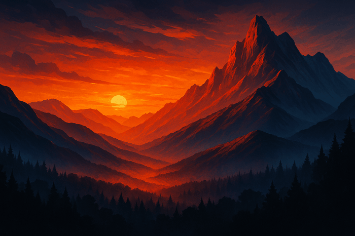
Cross-processing creates bold, dramatic visuals by altering film chemicals or using digital presets. But mistakes can ruin the effect. Here are five errors to avoid:
- WrongFilm Preset: Using mismatched presets causes unnatural results. Research film stock traits - like Ektachrome's cool tones or Velvia's bold reds - and test presets for accuracy.
- Skipping Exposure Adjustments: Cross-processing alters light sensitivity, often blowing out highlights or darkening shadows. Adjust exposure accordingly - underexpose slide film or boost negative film.
- Overcorrecting Color Shifts: Extreme color casts are part of the style. Avoid neutralizing them completely; instead, make subtle adjustments to maintain the image's character.
- Using Auto Color Correction: Auto tools erase the dramatic tones of cross-processing. Disable auto-correction and make manual tweaks for better control.
- Ignoring Grain and Texture: Grain adds depth to cross-processed images. Apply it carefully to avoid overly smooth or noisy results.
Presets.io offers presets tailored to specific film styles, helping you refine your edits while avoiding these pitfalls. Mastering these steps ensures your work remains polished and visually striking.
Cross Process your Film - How and Why?
1. Picking the Wrong Film Preset
Choosing the wrong film preset can quickly ruin a cross-processed image. Each type of film stock has unique color shifts, contrast levels, and grain patterns when cross-processed. If your preset doesn’t align with these characteristics, the result can feel off, disrupting the vintage aesthetic you’re aiming for.
Take some well-known cross-processing films as examples. Ektachrome 100VS creates cyan or deep green tones with purplish shadows, Fujifilm Provia 400X leans towards an underexposed look with heavy orange tints, and Velvia delivers high contrast with bold greens and reds. Ektachrome 100VS, in particular, can produce a striking neon effect. Now, imagine applying a Velvia preset to mimic Kodak Ektachrome’s softer tones - what you’d get instead are overly saturated colors and harsh contrasts that look unnatural. This kind of mismatch can make your work seem less polished and intentional.
The key to avoiding this is understanding the film stock you’re trying to emulate. Before diving into presets, take some time to research the specific color tones, contrast, and grain patterns of your chosen film. For example, Fuji Provia presets are known for vibrant, saturated colors with moderate contrast, while Kodak Ektachrome presets offer cooler tones and softer contrasts. Lomography presets are more experimental, delivering unpredictable color shifts that suit artistic cross-processing styles. Knowing these details ensures you’ll pick a preset that aligns with your creative vision.
Platforms like Presets.io can simplify this process. They offer curated collections tailored to different film types, such as the Kodak Collection, Fuji Film Preset Collection, and Vintage Film Bundle. These collections are organized to help you find presets that closely replicate the authentic characteristics of specific film stocks.
To get the best results, test various presets on sample images and compare them to reference photos of actual cross-processed film. Pay attention to color accuracy, contrast, and grain patterns to ensure they match the film’s known traits. Keeping notes on which presets work best for specific scenarios can save you time on future projects and help maintain a consistent look across your portfolio.
2. Skipping Exposure Adjustments
When it comes to cross-processing, exposure adjustments are just as important as choosing the right preset. A common mistake is applying a preset and considering the job done. Cross-processing, by its nature, alters a film's sensitivity and dynamic range. This often results in images with overexposed highlights or shadows that are too dark to distinguish details. These issues arise because the chemical process itself creates unpredictable outcomes - like running slide film through color negative chemicals.
The type of film you’re using plays a big role in how these issues manifest. For example, cross-processing slide film tends to increase contrast and blow out highlights. On the other hand, color negative film often produces muted tones and deep, underexposed shadows. Without adjusting exposure, your photos might end up looking unpolished rather than purposefully stylized.
To get it right, you need to understand the quirks of each film type. With slide film presets, try underexposing by one stop - for instance, treat ASA/ISO 100 film as if it’s ASA/ISO 200. For color negative film, push exposure by 2–3 stops to enhance contrast and bring out shadow details.
In post-processing, tools like Lightroom can help you fine-tune your images. Use the highlight and shadow sliders to bring back lost details without making the image look flat. Keep an eye on your histogram to ensure neither highlights nor shadows are clipped. For more precise edits, consider using brushes or masks instead of making global adjustments. This approach allows you to target problem areas while preserving the overall cross-processed look.
Digital presets, such as those from Presets.io, can be a great starting point. Their film and cross-processing collections lay a solid foundation, but you’ll still need to tweak exposure, highlights, and shadows to suit your specific photo. These adjustments are key to achieving a polished, professional result.
3. Mishandling Color Shifts
Color shifts are the essence of cross-processing. These dramatic transformations - ranging from vibrant greens and yellows to deep magentas and blues - happen when film is deliberately developed in the "wrong" chemicals. Let’s explore how to refine these shifts while preserving the distinctiveness of cross-processing.
One of the most common missteps is overcorrecting color shifts during editing. For instance, when a strong green cast appears, it might seem like a good idea to neutralize it entirely using white balance adjustments. But doing so can strip away the unique personality of cross-processed images, leaving them dull and lifeless.
On the other hand, ignoring extreme color shifts altogether can lead to overly harsh, unpolished results. Take the example of a photographer who cross-processed Fuji Provia slide film. The scans came out with a pronounced blue-green cast. Initially, they tried to completely neutralize the colors, but this drained the image of its vibrancy. By reintroducing a subtle blue-green tint and carefully adjusting contrast, they managed to retain the vintage aesthetic while maintaining natural skin tones.
Different film stocks react differently to cross-processing, producing unique color effects. For example, Agfa RSX II slide film processed in C-41 chemicals often results in yellow and green tones with high contrast.
When editing, aim for subtle tweaks. If an image has a strong green cast, gently shift the tint toward magenta using Lightroom's temperature and tint sliders. Similarly, for red-heavy images, a slight adjustment toward green can help balance things out. The goal isn’t to erase the color cast but to soften its intensity while keeping its character intact. Think of it like seasoning a dish - reduce the overpowering elements without losing the essence.
It’s also important to steer clear of auto color correction tools. These features are designed to neutralize color casts, which completely undermines the artistic intent of cross-processing. Disabling auto correction ensures that the desired color effects remain untouched.
For those working digitally, tools like Presets.io offer film-inspired presets that replicate authentic cross-processed looks. These presets provide a solid foundation, preserving the signature color casts while allowing room for local adjustments. With tools like Lightroom's adjustment brush, you can address specific areas of an image without flattening its overall character. This approach lets you fine-tune your photos while keeping their unique charm intact.

Luminar Neo Cross-Device Perpetual Desktop Software

$129.50
$159.00
Luminar Neo Cross Device Perpetual Desktop Software Luminar Neo is a visionary AI-powered photo editor that redefines creativity with cutting-edge technology. Effortlessly achieve studio-quality results with next-gen tools designed to empower and inspire. Harness the power of GenAI to erase… continue reading
sbb-itb-b27063b
4. Using Auto Color Correction
Auto color correction can work against the unique appeal of cross-processing by neutralizing its signature color shifts. This issue isn’t limited to digital edits - it also affects film scans, where automated adjustments can strip away the artistic intent behind the process.
Cross-processing is all about bold, unexpected color effects, like dramatic green, magenta, or blue tones. However, when auto color correction is applied, these striking shifts are treated as flaws. The software's algorithms aim to "fix" them by balancing the colors, effectively erasing the dramatic tonal changes that make cross-processing so distinctive. This automated adjustment undermines the creative vision behind the technique.
Even professional labs often apply automatic corrections to film scans, turning vibrant, cross-processed images into balanced but ordinary photos that lose their character. For photographers who rely on cross-processing to achieve a specific look, this can be incredibly frustrating.
To avoid this, turn off auto-correction features in tools like Lightroom and adjust the temperature and tint settings manually. If you're working with a lab, make sure to communicate clearly - request that no color correction is applied during the scanning process. Many photographers have been disappointed when their cross-processed film was unintentionally "corrected" during scanning.
When editing, use the temperature and tint sliders to refine the color shifts without completely eliminating them. For instance, if an image has an overly strong green cast, you can gently adjust the tint toward magenta to balance it slightly. The idea isn’t to neutralize the effect but to enhance it in a way that stays true to the cross-processed aesthetic.
For digital workflows, consider using presets specifically designed for cross-processing, like those available from Presets.io. These presets are tailored to amplify the unique look of cross-processed images while giving you more control over the final outcome. By skipping auto corrections and focusing on manual adjustments, you can preserve the film-like quality and creative edge that define your work.
5. Ignoring Grain and Texture Settings
Once you've fine-tuned the color shifts, it's time to focus on grain and texture - two elements that are essential for achieving a truly authentic cross-processed look. While many photographers zero in on adjusting colors and exposure, they often neglect the grain and texture, which are just as important. Skipping these details can leave your images with accurate colors but lacking the organic, film-like quality that defines cross-processing.
Traditional cross-processing not only alters colors but also enhances contrast and introduces a gritty grain structure. This grainy texture is a hallmark of the style, giving images their distinct character. Without it, photos can end up looking overly smooth and sterile - more like digital edits than the experimental, retro aesthetic that cross-processing is known for.
That said, too much grain can be just as problematic, making images appear overly noisy and obscuring fine details. On the other hand, using no grain at all results in images that feel too clean and artificial, missing the nostalgic charm of film photography.
To get it right, aim to replicate the unique grain patterns of specific film stocks. For instance, Agfa RSX II produces high contrast with gritty grain and yellow-green color shifts when cross-processed. Meanwhile, Fuji Provia and Velvia deliver more predictable results with moderate grain and vibrant colors. If you're trying to emulate a particular film stock digitally, make sure to match not only the colors but also the grain texture.
When applying grain, start with subtle adjustments and work your way up while previewing at 100% zoom. Pay close attention to the grain's size, amount, and roughness - each of these factors contributes to the overall texture. Keep in mind that uniform grain across an entire image can feel artificial. Instead, use tools like adjustment brushes to apply grain selectively, enhancing specific areas without overwhelming the whole image.
Texture overlays should work in harmony with your color shifts and contrast adjustments. Their role is to enhance the cross-processed feel, not compete with or overpower it. Experiment with different settings across various types of images. For example, high-contrast portraits might benefit from more pronounced grain, while subtle landscapes may require a lighter touch.
If you're looking for a starting point, specialized presets can be incredibly helpful. Platforms like Presets.io offer film emulation presets that include calibrated grain and texture settings tailored to specific cross-processed film stocks. These presets can be customized further to align with your creative vision.
Grain and texture are not just finishing touches - they're integral to the cross-processing aesthetic. The best results strike a balance where the grain adds depth and authenticity without overwhelming the subject or sacrificing clarity. By mastering these elements, you can elevate your cross-processed images and bring your creative vision to life.
Film Stock Comparison Table
Understanding the unique traits of film stocks can help you pick the right digital emulation for your needs. It's important to recognize how digital presets differ from real film, especially in areas like color shifts, contrast, and grain. This comparison table highlights key differences to guide your selection and adjustment of film presets.
Film Stock vs. Digital Version
| Film Stock Name | Color Shift (Film) | Contrast (Film) | Grain/Texture (Film) | Color Shift (Digital) | Contrast (Digital) | Grain/Texture (Digital) |
|---|---|---|---|---|---|---|
| Kodak Ektachrome 100VS | Cyan/dark green, purply shadows | High | Fine, visible in shadows | Cyan/green tint | High (adjustable) | Fine grain overlay |
| Fujifilm Velvia 100F | Yellow/red, sepia effect | Very high | Fine, smooth | Warm/yellow-red shift | High (adjustable) | Smooth, customizable |
| Fujifilm Velvia 100 | Extreme yellow/red, bold blues | Very high | Fine, slightly visible | Strong warm shift | High (adjustable) | Fine grain simulation |
| Fujifilm Provia 400X | Orangey, underexposed look | Moderate to high | Fine, subtle | Orange tint | Moderate | Subtle grain overlay |
| Konica Centuria100 | Yellow/neon green, subtle | Low to moderate | Fine, less pronounced | Subtle yellow/green | Low (adjustable) | Fine grain simulation |
| Lomography Slide Films | Unpredictable, vibrant | High | Grainy, artistic | Vibrant color shifts | High (adjustable) | Pronounced grain overlay |
Real film introduces organic variations that digital presets can't perfectly replicate. Each film frame reacts uniquely to lighting and processing conditions, creating a character that's hard to imitate. For instance, film naturally clips highlights and shadows for dramatic effects, while digital tone curves offer flexibility - but over-adjusting can lead to images that stray from the authentic film look. Film grain also appears randomly across frames, whereas digital overlays tend to be uniform. Tools like Presets.io offer customizable grain settings that mimic the random texture of film.
When deciding between film and digital, consider your workflow. Film delivers one-of-a-kind results but requires patience and comes with higher costs. Digital presets, on the other hand, provide instant feedback and consistency, making them ideal for quicker projects.
Lighting and exposure also impact film and digital versions differently. Overexposing film often amplifies color shifts, while underexposure mutes colors. Digital emulations are less sensitive in this regard, as exposure can be adjusted during post-processing. However, starting with a well-exposed image still produces the best results.
For those new to this process, Fuji Provia or Velvia presets are great starting points. They offer more predictable results compared to Ektachrome's intense color shifts or Lomography's unpredictable nature. These moderate options help you learn the basics before diving into more dramatic effects. Grasping these nuances will set you on the path to mastering cross-processing techniques.
Conclusion
To truly excel at cross-processing, it’s essential to understand and sidestep common mistakes that can dilute the unique charm of this technique. These errors can compromise the distinctive aesthetic that makes cross-processing so visually striking.
Consistency is key - it not only defines your signature style but also builds trust with your clients. By identifying and avoiding these pitfalls, you’ll gain greater control over your final images and sidestep the frustration of inconsistent results. Photographers who approach cross-processing with discipline often find that they save time during editing and develop portfolios that stand out in a crowded market. This level of precision fortifies your artistic identity and fosters long-term client relationships.
When you combine technical accuracy with creative vision, you elevate routine edits into standout pieces. For example, understanding how exposure impacts color shifts, why manual adjustments often surpass auto-corrections, and how grain adds a sense of character can transform your work from experimental to professional-grade.
Incorporating high-quality tools into your workflow can also make a significant difference. Using expertly designed presets, like those offered by Presets.io, allows photographers to streamline their process without sacrificing creative control. With a 4.8 out of 5-star rating from 1,410 reviews, their cross-processing collections provide reliable, polished results while reducing trial-and-error.
Cross-processing is a powerful artistic tool when handled with care and precision. By steering clear of these common missteps and leveraging professional resources, you can consistently produce polished, impactful work that reflects your unique style.
FAQs
How do I pick the best film preset for cross-processing to create authentic-looking photos?
Choosing the right film preset for cross-processing starts with understanding the mood and style you want your photo to convey. Are you aiming for bold, vibrant colors, a nostalgic vintage aesthetic, or something with a cinematic flair? The key is to select presets that complement your image's natural qualities while enhancing them subtly, rather than overpowering the original feel.
Don't be afraid to experiment. Try out a few presets on your photo, and tweak settings like contrast, saturation, and highlights to get the perfect balance. If you're not sure where to start, consider exploring preset collections specifically designed for cross-processing or film-inspired looks. These collections often provide a solid foundation for achieving a polished, authentic effect.
How can I adjust exposure effectively when cross-processing different types of film?
When working with cross-processing, getting the exposure right is key to achieving a striking final image. A good starting point is to slightly underexpose your shots. Why? Because cross-processing tends to amplify highlights and colors, which can quickly lead to overexposed results.
If you're editing digitally, tools like Lightroom presets can be a game-changer. They allow you to fine-tune exposure and balance tones while keeping the distinct aesthetic of cross-processing intact.
Keep in mind that different types of film respond uniquely to cross-processing. Testing with a few shots or edits can help you discover the perfect balance for the look you're aiming for. Even small tweaks can make a big difference in creating bold yet well-controlled visuals.
Why should you manually fine-tune color shifts and grain instead of relying solely on auto-correction tools?
When you manually tweak color shifts and grain, you gain a level of creative control that automatic tools just can't match. Auto-correction features tend to apply broad, one-size-fits-all adjustments, which might not align with the specific vibe or aesthetic you're going for - especially when you're working with cross-processing effects. By making these adjustments yourself, you can craft a look that's more tailored and refined.
Cross-processing styles, in particular, often rely on distinct color palettes and textures that automatic tools might not handle well. By taking the time to adjust these details manually, you can ensure your edits reflect your artistic vision while keeping the image balanced and cohesive.