
Table of Contents
Color Grading Workflow for Dramatic Landscapes
Color grading can transform ordinary landscape photos into visually striking images. By adjusting colors, tones, and contrasts, you create depth, mood, and a cinematic feel. This guide details how to use tools like Adobe Lightroom’s Color Grading panel, HSL adjustments, and masking to refine your photos. Key steps include:
- Start with RAW files: Preserve maximum detail for precise edits.
- Balance exposure: Adjust highlights and shadows for a clean base.
- Choose acamera profile: Options like Adobe Landscape enhance greens and blues.
- Adjust white balance: Use warmer tones for sunsets or cooler tones for dawn.
- Targeted edits: Masking tools refine specific areas like skies or foregrounds.
- Add depth: Use contrast selectively across layers (foreground, midground, background).
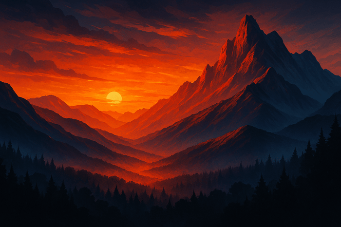
- Cinematic techniques: Split toning and HSL adjustments enhance colors like blues and oranges for a dramatic effect.
- Presets: Tools like Presets.io offer time-saving base settings for consistent results.
These techniques, paired with Lightroom’s features, help create landscapes that feel immersive and visually impactful.
COLOR GRADE Landscape Photos LIKE A PRO in Lightroom Classic!
Preparing Your Landscape Image for Editing
Getting your image ready for editing is key to making sure your dramatic edits look polished and natural - not overdone or artificial.
Start with RAW File Preparation
Shooting in RAW is a must for preserving all the data your camera sensor captures, which is essential for detailed and precise editing. A 2021 PetaPixel guide revealed that over 90% of professional landscape photographers shoot in RAW to keep their options open during post-processing and maintain the highest image quality. RAW files hold the full range of light and detail, giving you the flexibility to make significant adjustments without losing quality.
Once you've imported your RAW file, start by balancing the exposure. Use the highlights slider to recover details in bright skies and lift the shadows to bring out foreground elements. This step evens out the exposure across your scene, providing a clean slate for color grading later. Fixing any clipped highlights or shadows early ensures smoother colors and avoids harsh transitions in your final edits.
With the exposure balanced and the dynamic range intact, move on to selecting a camera profile that aligns with your creative goals.
Select an Appropriate Camera Profile
Camera profiles set the stage for how your image's colors and contrast will appear right from the start. In Lightroom, the Adobe Landscape profile is a popular choice as it enhances greens and blues, giving landscapes an immediate vibrancy. If you prefer a more neutral starting point for greater control, Adobe Standard offers a flatter look. Picking the right profile ensures your edits will build on a solid tonal foundation, making it easier to achieve the dramatic effect you’re aiming for.
Make Basic Corrections
White balance is one of the first - and most important - adjustments to tackle in post-processing. According to a CaptureLandscapes survey, 78% of landscape photographers rank it as their top initial adjustment. Use the eyedropper tool on a neutral area like rocks or clouds, or manually tweak the temperature and tint sliders to set the mood you want.
White balance isn’t just about technical accuracy - it’s a creative tool. Warmer tones can evoke the glow of a sunset, while cooler tones can enhance the crispness of dawn or winter scenes. Thoughtful white balance adjustments lay the emotional groundwork for the rest of your color grading.
Next, apply lens corrections and refine the composition. Use profile corrections to fix distortion, chromatic aberration, and vignetting. Then, crop the image to eliminate distractions and improve the overall framing. These steps ensure your edits enhance the scene itself rather than drawing attention to any optical flaws.
For a better sense of your color direction, temporarily increase vibrance and saturation. Once you’ve gauged the tones, dial them back for a more natural look.
If you’re working with a large batch of landscape photos, tools like Presets.io can save time. Their Lightroom presets are designed for landscapes and can automate tasks like exposure adjustments, white balance, and lens corrections. These presets provide a consistent starting point while leaving room for fine-tuning to match your creative style.
Scene-Specific Adjustments for Depth and Mood
Once you've nailed the basic corrections, it's time to dive deeper into scene-specific tweaks. These targeted adjustments are what elevate an image from good to unforgettable. By carefully refining different parts of the photo, you can create depth and mood that feel natural yet impactful. Let’s look at how masking tools, contrast adjustments, and other techniques can bring your landscapes to life.
Use Masking Tools for Targeted Edits
Lightroom's masking tools are a powerhouse for landscape photography. They let you focus on specific areas of your image to fine-tune lighting, color, and texture. For instance, linear gradients are perfect for adjusting skies - darkening overexposed areas or shifting the color temperature near the horizon. Radial gradients can highlight key features like sunlit peaks or add a soft glow to specific areas, while brush masks allow for precise edits in detailed parts of the foreground.
Here’s a workflow to try:
- Apply a linear gradient to darken the sky and enhance blue tones.
- Use a radial gradient to warm up sunlit areas, creating a natural glow.
- Use a brush mask to refine texture and clarity in the foreground, like rocks or grass.
Start with subtle, low-opacity adjustments and check your progress by zooming out regularly.
Pro tip: Want to simulate fog or mist? Lower the dehaze value within a radial gradient. Keep in mind that this may reduce saturation and brighten the area, so tweak the white balance within the mask to maintain harmony.
Add Depth with Selective Contrast
To give your photo a three-dimensional feel, think in layers: foreground, midground, and background. Adjusting the contrast differently for each layer can create a sense of depth. For example, boosting contrast in the foreground while slightly reducing it in the background helps separate the layers visually.
A practical approach: Use a graduated filter to darken the sky while brightening the foreground. This balances the dynamic range and adds dimension to your image. Many photographers lean toward subtle, mood-driven color grading to enhance the emotional impact of their landscapes without over-editing.
Adjust Texture, Clarity, and Dehaze
Fine-tuning with these sliders can dramatically change the atmosphere of your photo:
| Tool | Best For | Key Benefit | Usage Tips |
|---|---|---|---|
| Texture | Rocks, foliage, water | Enhances fine detail without harshness | Increase in the foreground for added detail |
| Clarity | Midtone contrast, depth | Adds punch and dimension | Use sparingly to avoid a harsh appearance |
| Dehaze | Haze control or mood | Adjusts atmospheric effects | Reduce for a dreamy, soft background |
For instance, use Texture to emphasize intricate patterns in rocks or leaves without making the image look over-processed. Clarity can boost midtone contrast for more impact but should be applied lightly to avoid an unnatural look. Dehaze is versatile - turning it up clears haze for a sharper image, while lowering it creates a soft, ethereal effect that enhances the background.
Always check your adjustments at full zoom (100%) to ensure they look natural and avoid unwanted artifacts like halos.
To speed up your workflow, consider starting with presets. Tools like Presets.io offer dramatic base settings that you can build upon. After applying a preset, use these targeted techniques to refine your edits and ensure every part of the image contributes to the overall mood. With these adjustments in place, you’ll be ready to explore even more advanced techniques like cinematic color grading.

Luminar Neo Cross-Device Perpetual Desktop Software

$129.50
$159.00
Luminar Neo Cross Device Perpetual Desktop Software Luminar Neo is a visionary AI-powered photo editor that redefines creativity with cutting-edge technology. Effortlessly achieve studio-quality results with next-gen tools designed to empower and inspire. Harness the power of GenAI to erase… continue reading
sbb-itb-b27063b
Cinematic Color Grading Techniques
Once you've added depth and mood to your landscape photography, it's time to elevate your work into the cinematic realm. These advanced techniques can turn ordinary shots into dramatic, movie-like visuals that grab attention and tell a story.
Target Colors with the Color Mixer
The HSL panel is your go-to tool for refining colors by adjusting Hue, Saturation, and Luminance. It allows you to work with eight key color ranges: reds, oranges, yellows, greens, aquas, blues, purples, and magentas. For a cinematic feel, try enhancing orange and blue saturation while shifting blue toward cyan - this creates a striking contrast, especially during golden hour. For instance, boosting orange luminance can make warm tones in the sky or landscape pop.
You can also use the HSL targeted tool for even more precision. Click directly on the colors in your image to fine-tune them. Afterward, refine the overall atmosphere with split toning.
Split Toning with the Color Grading Panel
Split toning is a powerful way to add distinct color tints to highlights, midtones, and shadows, helping you maintain a cohesive cinematic mood. For sunrise or sunset landscapes, this technique is especially effective. Use the tone curve to warm up highlights by increasing red, and lower blue tones to bring out golden hues.
Here are some split toning ideas to experiment with:
- Warm and vibrant: Add orange or yellow tones to highlights, balanced with subtle cool tones in the shadows.
- Cool and moody: Introduce cyan into the highlights and deepen the shadows with blue.
- Vintage film aesthetic: Pair soft yellow highlights with a touch of magenta in the shadows.
The key is subtlety - overdoing it can make the image feel unnatural. Use the balance slider to fine-tune the relationship between highlights and shadows for a polished look.
Global Adjustments with Calibration
After perfecting targeted adjustments, the Calibration panel helps unify your image with global color shifts. For instance, enhancing blue primaries can make skies more dynamic, while boosting red primaries enriches earthy tones. These changes apply across the entire image, tying everything together for a cohesive, film-inspired effect.
Think of the Calibration panel as your finishing touch. Make small tweaks and see how they enhance the adjustments you've already made. This step ensures your landscape maintains a dramatic, cinematic quality from start to finish.
For faster results, you might explore cinematic presets from platforms like Presets.io. Their collections provide a solid foundation for professional color grading, which you can further refine using these techniques.
Streamlining Your Workflow with Presets
Once you've honed your cinematic color grading skills, incorporating presets into your workflow can help you save time and maintain a consistent look across your dramatic landscape photography. In fact, a 2023 survey by a top photography software provider revealed that 78% of professional photographers rely on presets to enhance efficiency and uniformity in their work.
Save Custom Presets in Lightroom
Creating your own presets allows you to turn your best color grading techniques into reusable templates. Start by applying your full editing workflow, then save it as a preset by clicking the '+' in the Develop module. Be sure to give it a descriptive name and include global adjustments like exposure, contrast, tone curve, HSL, color grading, and calibration. Avoid saving image-specific settings, such as cropping, to keep your presets versatile.
To stay organized, group your presets into folders based on lighting conditions or mood. Categories like "Golden Hour", "Blue Hour", "Overcast", or "Stormy Weather" make it easy to find the right preset for any scene. Many professionals suggest keeping your active preset collection between 15 and 25 to avoid decision fatigue while maintaining an efficient editing process.
Explore High-Quality Presets from Presets.io
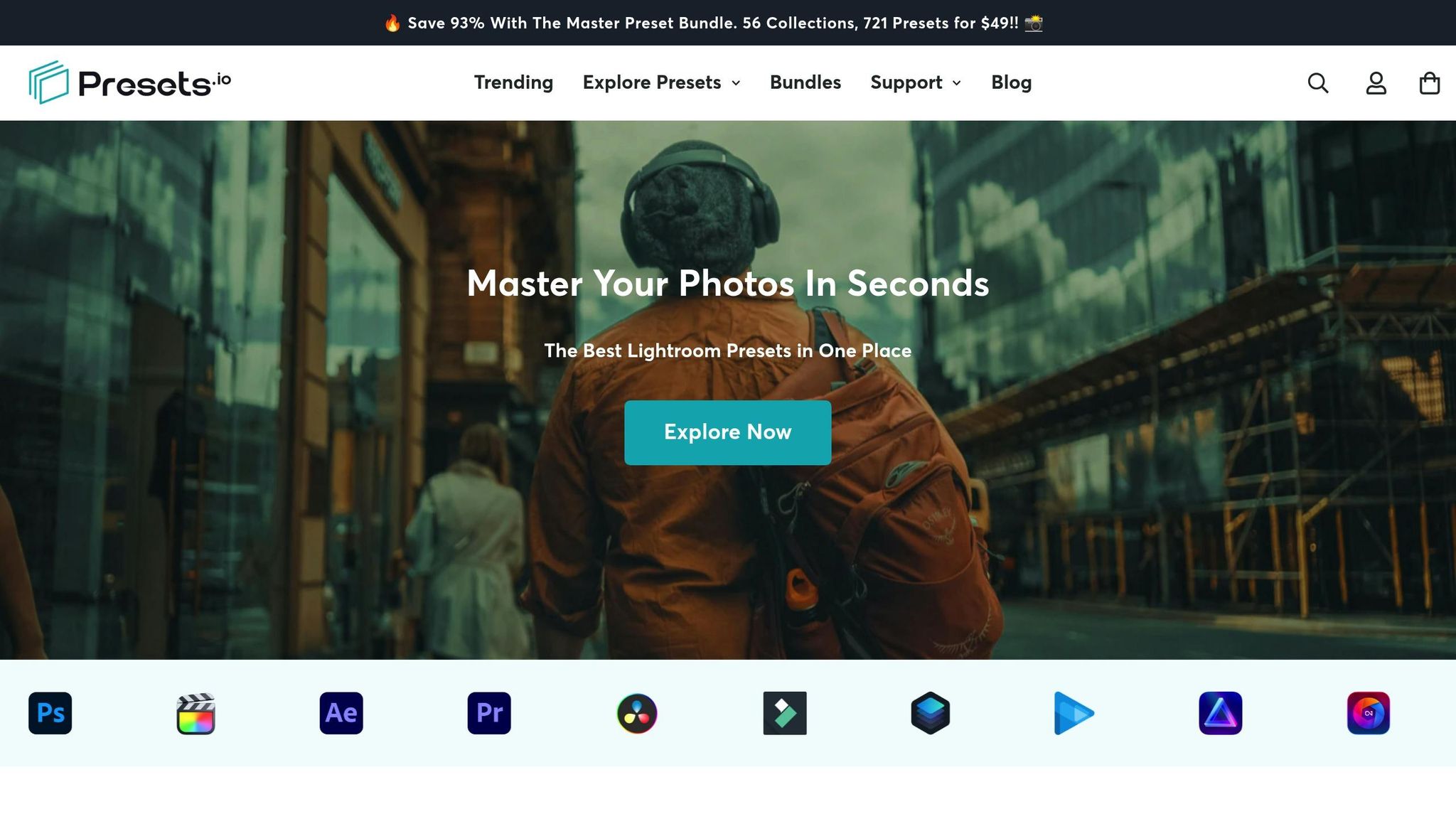
While custom presets are tailored to your style, exploring curated collections can spark creativity and save you time. Presets.io offers an extensive library of over 1,000 Lightroom and mobile editing presets, with new additions every week. With a stellar 4.8 out of 5-star rating from 1,410 reviews, the platform has earned its reputation for quality.
"Our presets are creatively designed to help you achieve a unique and stunning style in your photos. We take pride in the quality of our presets and offer only the best, premium products to our customers." - Presets.io
For dramatic landscapes, Presets.io features collections specifically crafted for cinematic effects. Their Cinematic Collections provide a professional foundation that complements the techniques you've learned. The Moody Blue Preset Collection, for example, is ideal for travel and landscape photography, enhancing the atmospheric qualities essential for creating striking, dramatic images. These presets are particularly effective when paired with the split toning and color grading methods you've already mastered.
Best Practices for Preset Application
Presets are best used as starting points, especially for dramatic landscapes where lighting and atmosphere can vary greatly from scene to scene. After applying a preset, fine-tune elements like opacity, vibrance, and saturation to fit the specific image.
Test your presets on a variety of photos to see how they perform under different lighting and color profiles. High-quality presets should require only minor adjustments, not a complete overhaul. If you're using presets from platforms like Presets.io, check whether they specify a camera profile, as this can impact how colors render across different devices.
"Our presets are incredibly easy to use, even for beginners, so you can quickly edit your photos like a pro." - Presets.io
Keep in mind that dramatic edits should still feel natural. The goal is to enhance the existing mood and emotion of your landscape, not to create something that looks artificial. Use local adjustments and masking to apply presets selectively - such as warming up the sky while leaving the foreground neutral. This approach ensures your images retain their cinematic quality without appearing over-processed.
Finally, document which presets you use for specific scenes to maintain consistency across your portfolio. By combining these streamlined techniques with your earlier adjustments, you'll achieve a cohesive, dramatic look that truly elevates your landscape photography.
Conclusion
In this guide, we've walked through a structured approach to crafting dramatic landscape edits, blending preparation, technical precision, and creative finesse. The process begins with RAW image preparation and selecting the right camera profile, laying a solid foundation. From there, techniques like selective masking and contrast adjustments help bring depth and character to your scenes.
Global adjustments set the overall tone, while local edits add that extra layer of dimensional drama. Balancing warm and cool tones creates a natural harmony, giving your landscapes a polished, cohesive look. When working with HSL adjustments, focus on enhancing only the colors that align with your vision. Pair these with split toning and calibration to achieve a cinematic quality that elevates your work.
The choices you make are rooted in color theory. Warm highlights naturally draw the eye, while cool shadows recede, creating a sense of depth and balance. This interplay of tones is key to achieving a visually authentic and emotionally compelling landscape.
Presets can be a game-changer in speeding up your workflow without compromising quality. Platforms like Presets.io offer a range of cinematic collections that serve as a solid starting point. These presets are designed to save time while maintaining consistency across your portfolio.
"Our presets are creatively designed to help you achieve a unique and stunning style in your photos. We take pride in the quality of our presets and offer only the best, premium products to our customers." - Presets.io
After applying presets, refine each image by adjusting opacity, vibrance, and saturation to suit the specific lighting and atmosphere. Keep track of which presets resonate with your style to build a personalized aesthetic over time.
FAQs
Why should I shoot in RAW format for landscape photography, and how does it improve the color grading process?
Shooting in RAW format is a game-changer for landscape photography. Why? Because it preserves every bit of detail and dynamic range that your camera’s sensor captures. Unlike JPEGs, which compress and discard some of the data, RAW files keep everything intact. This means you have much more control and flexibility when editing your photos later.
When it’s time to fine-tune your image, RAW files shine. They let you adjust exposure, tweak white balance, and refine colors with precision - all without sacrificing image quality. This is especially crucial for dramatic landscapes, where subtle shifts in depth, mood, or tonal contrast can elevate your photo to the next level. Shooting in RAW gives you the perfect starting point to create a truly stunning final image.
How can I use Lightroom's masking tools to enhance specific parts of a landscape photo without it looking unnatural?
Lightroom's masking tools are a fantastic way to fine-tune specific parts of a landscape photo, adding depth and drama while keeping the edits subtle and natural.
Start with the Brush Tool to zero in on areas like the sky or foreground. Here, you can gently tweak settings like exposure, contrast, and clarity to enhance these elements without making them look artificial.
For even more control, experiment with the Radial Gradient or Linear Gradient tools. These are especially useful for emphasizing details like the warm glow of a sunset or the soft haze of a distant valley. To keep your edits looking seamless, avoid pushing adjustments too far. And remember to zoom out regularly to see how your changes impact the entire image - this helps ensure everything stays cohesive and visually pleasing.
What are the best practices for creating and using custom Lightroom presets to ensure a cohesive style in your landscape photography portfolio?
Creating your own custom Lightroom presets can be a game-changer for your landscape photography. They allow you to keep a consistent look throughout your portfolio while also cutting down on editing time. The key is to design presets that enhance the mood and depth of your landscapes. Focus on adjustments like contrast, color tones, and clarity to highlight the dramatic elements in your shots.
As you develop presets, test them on a range of images to make sure they perform well under different lighting and composition scenarios. Once you're happy with the results, organize your presets into clearly labeled folders so you can find them quickly. By using these custom presets regularly, you'll not only speed up your editing process but also create a signature style that sets your work apart.