
Want to make your photos look like they're straight out of a movie? Here's how to use Lightroom's clarity tools to create that cinematic magic:
- Start with basic light and color adjustments
- Use the tone curve for depth
- Apply clarity selectively with local adjustment tools
- Combine clarity with texture for best results
- Avoid overdoing it - subtle changes often work best
Key clarity settings to try:
- Portraits: -10 to +10
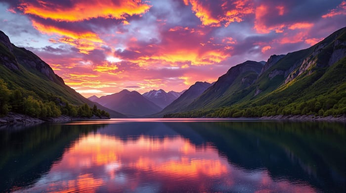
- Landscapes: +10 to +30
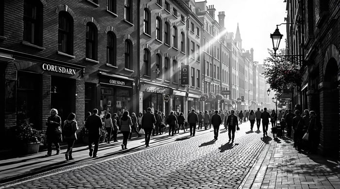
- Architecture: +15 to +25
Pro tip: For skin, use negative clarity (-44) with the Adjustment Brush tool.
Related video from YouTube
How to Use Lightroom's Clarity Tools
Clarity in Lightroom isn't just another slider. It's a mid-tone contrast enhancer that can give your photos that sought-after cinematic look. Unlike regular contrast, clarity boosts edge contrast where light meets dark. This adds depth without crushing shadows or blowing out highlights.
Whole Photo vs. Specific Areas
Start with the Basic Panel for global clarity adjustments. Want that cinematic feel? Try this:
- Set clarity to +60
- Reduce vibrance to -5
- Lower saturation to -20
This combo creates a film-like quality while keeping colors natural.
For pinpoint control, use Lightroom's local adjustment tools:
- Adjustment Brush: Great for enhancing specific areas. In portraits, use negative clarity (-15) on skin to smooth it out.
- Radial Filter: Perfect for subtle vignettes or highlighting focal points. Use "Invert Mask" to affect only the inside of your selection.
"The Clarity slider increases the contrast in your photo, but in the mid-tones only." - Hue & Hatchet
Mixing Clarity with Texture
The real magic happens when you combine clarity with texture. Scott Kelby, a top photographer and author, says:
"The big takeaway here is how much Clarity affects the overall tone of the image (great when you want to get a gritty effect, or make metal, glass, and water shinier), while Texture doesn't tend to mess with the tone nearly as much, but does a great job bringing out detail."
Try this approach:
- Start with texture (try +50)
- Add clarity at about half that value (+25)
- Adjust based on your subject:
- Portraits: Keep clarity low (+12) to avoid highlighting skin flaws
- Landscapes: Push clarity higher for dramatic skies and textures
- Architecture: Use both to emphasize structural details
Clarity can change your image's overall tone, while texture focuses on fine details. Used together, they create that perfect mix of cinematic drama and natural look.
Step-by-Step Clarity Editing
Want to nail that cinematic look in your photos? Let's walk through the key steps to transform your images in Lightroom.
Setting Up Basic Light and Color
First things first: get your exposure and color right. Head to the Light section in Lightroom's Edit tab. For that movie-like feel, try these settings:
- Contrast: -15
- Highlights: -40
- Shadows: +30
- Whites: +12
- Blacks: +30
Now, let's talk color. Pro photographer Anton Gorlin has a tip for you:
"Auto white balance may not always be effective for sunrise shots. Adjust temperature to increase yellow tones and shift tint toward magenta to eliminate unwanted green hues in the background."
Working with Tone Curves
The tone curve is your secret weapon for that cinematic look. Landscape photographer Jan Erik Waider puts it this way:
"The Tone Curve is a tool that you can use to enhance any landscape photo. It's meant to add depth to your pictures."
Here's how to create that classic S-curve:
- Open the Tone Curve tab and Point sub-tab
- Lift the lower bottom end to soften shadows
- Drop the upper right end for muted highlights
- Tweak the middle points for balanced midtones
Using Basic Adjustment Sliders
Now, let's fine-tune with some slider magic. Try these settings:
| Slider | Value | What it does |
|---|---|---|
| Clarity | +60 | Boosts midtone contrast |
| Vibrance | -5 | Subtly separates colors |
| Saturation | -20 | Creates a muted palette |
| Texture | +50 | Enhances fine details |
Want a shortcut? Start with Presets.io's cinematic presets, then tweak to fit your image.
sbb-itb-b27063b
Pro Tips for Better Clarity
Want to level up your clarity editing? Let's dive into some advanced techniques that'll give your photos that cinematic edge while keeping things natural.
Highlighting Specific Areas
The pros know: it's all about selective clarity adjustments. Ditch the global approach and get cozy with Lightroom's local adjustment tools.
For landscapes and architecture, grab the Brush tool with Auto Mask. It's perfect for zeroing in on textures and details. Try a clarity value of +35 to make those architectural elements pop without going overboard.
Portraits? The Radial Filter is your new BFF. As Light Stalking puts it:
"Clarity is an amazing tool to enhance details or to smoothen textures if used wisely when retouching portraits."
Here's a quick cheat sheet for clarity values:
| Subject Type | Clarity Range | What It Does |
|---|---|---|
| Landscapes | +60 to +100 | Pumps up texture in rocks and foliage |
| Architecture | +35 to +50 | Brings out structural details |
| Wildlife | +25 to +100 | Makes fur/feather details sing |
| Portraits (Features) | +12 to +25 | Enhances eyes and facial features |
Making Skin Look Natural
Portraits are tricky. You want to enhance, not fake. Fstoppers nails it:
"Perfecting skin in portraits is one of the hardest edits to do well, as it involves an interplay between removing unwanted blemishes and retaining skin texture."
For skin that looks real, not plastic, try these Adjustment Brush settings:
- Clarity: -44
- Texture: +15
- Sharpness: +10
- Exposure: +0.11
Pro tip: Don't brush over eyes, eyebrows, lips, or hairline. Keep these sharp to create that cinematic contrast against the softer skin.
Want to take it up a notch? Mix local and global adjustments. Start with a tiny global clarity boost (+12) for overall oomph. Then use the Adjustment Brush to dial back clarity on skin to -40. This creates depth while keeping skin looking like, well, skin.
Common Problems and Solutions
Let's look at the main clarity editing issues and how to fix them for that cinematic look you want.
Don't Overdo It
Max Bridge, a portrait photographer, says:
"Excessive use of clarity looks cheap, ugly, unflattering, and is often used in a vain attempt to make a substandard photo look good."
For most photos, stick to clarity adjustments between -10 and +10. This keeps things natural while adding depth. For portraits, try negative clarity - it's often better for skin.
| Image Type | Clarity Range | Signs You've Gone Too Far |
|---|---|---|
| Portraits | -10 to +10 | Gray skin, rough textures |
| Landscapes | +10 to +30 | Halos around edges |
| Architecture | +15 to +25 | Weird edge glow |
Fixing Noise and Other Issues
Too much clarity can cause noise and edge problems. Laura Shoe, who teaches Lightroom, advises:
"If in doubt, be conservative… a little is usually better than none, and too much is a disaster!"
If you see noise:
- Add 20 luminance noise reduction
- Boost shadows by +20 to +50
- Use local adjustments for specific areas
Greg Benz suggests using an adjustment brush for clarity on smooth areas like water or sky, where noise shows up most.
Using Clarity Presets
Many photographers use presets to save time. Presets.io offers clarity settings that keep image quality high and look cinematic. They're great for editing lots of photos consistently.
Always compare your edit to the original. If you see bright halos or washed-out colors, you've probably gone too far. The Flourish Presets Team says:
"When editing, remember that 'less is more' with clarity adjustments to maintain a natural appearance in your photos."
For best results, start with a preset and then tweak the clarity based on your photo and the look you're after.
Wrap-Up
Creating cinematic photos in Lightroom isn't just about cranking up the clarity. It's about finding the sweet spot between enhancing mid-tones and keeping your image looking natural.
Want that pro cinematic look? Start here:
- Contrast: -15
- Highlights: -40
- Shadows: +30
- Whites: +12
- Blacks: +30
These settings lay the groundwork for your cinematic masterpiece.
Now, about clarity. Greg Benz, a pro photographer, says:
"Clarity is one of the most used (and over-used) tools in Lightroom, yet also one of the least understood."
He's onto something. Clarity can make or break your photo. Here's a quick guide:
| Photo Type | Clarity Setting | Extra Tweaks |
|---|---|---|
| Dreamy Portraits | -10 to -20 | Texture down by -10 to -20 |
| Street/Architecture | +60 | Vibrance -5, Saturation -20 |
| Landscapes | +30 | Add medium contrast tone curve |
But remember, cinematic editing isn't just about clarity. Eren Sarigul, a photographer and editor, puts it this way:
"Cinema has perhaps the most thoughtful post-processing workflow of any visual medium, and so there is a lot that can be learned from it."
And Trent Ogilvie, another pro in the field, adds:
"Transforming basic images into dreamy cinematic photos using Lightroom may seem daunting, but it's actually a fairly straightforward process."
If clarity adjustments are causing issues, try this: Apply 20 luminance noise reduction and bump up shadows by +20 to +50. This helps keep your image quality high while still nailing that cinematic vibe.
The key? Experiment. Play around with these settings. See what works for your specific photo. And most importantly, trust your eye. After all, you're the director of this cinematic masterpiece.
FAQs
What is the clarity function in Lightroom?
Lightroom's clarity function is a game-changer for enhancing image mid-tones. It doesn't mess with your highlights or shadows much, but it does wonders for the middle ground.
Adam Welch, a photo maker and author, puts it like this:
"The clarity slider is a great tool. It helps us to increase contrast in the midtone luminosity range while avoiding blown out highlights and burnt out shadows."
You can slide it from -100 to +100. It mainly tweaks edge contrast and texture in your image's middle tones. Landscape and portrait photographers have been all over this tool since it showed up in Adobe Lightroom 1.1.
How to edit photos in Lightroom to look cinematic?
Want that movie-like vibe in your photos? Here's the lowdown:
1. Light
Start with the basics. Tweak exposure, contrast, highlights, and shadows. This sets the tone for everything else.
2. Color
Now, fine-tune the temperature and tint. This is where you start creating the mood.
3. Effects
Add a touch of grain and vignette. It's like adding that film-like quality to your digital image.
4. HSL
Last but not least, adjust hue, saturation, and luminance. This is how you get that cohesive color grading that screams "cinematic".
How to create cinematic photos in Lightroom?
Creating cinematic photos is all about smart post-processing. Eren Sarigul, a photographer, nails it:
"Cinema has perhaps the most thoughtful post-processing workflow of any visual medium, and so there is a lot that can be learned from it."
Start by getting your exposure just right. Then dive into color grading - that's where the magic happens. For portraits, try bumping up clarity on eyes and lips, but dial it back on skin. You want to keep that natural texture.
How to make cinematic photos in Lightroom?
Making cinematic photos is a bit like cooking - it's all about balancing flavors. Or in this case, tools.
Kick things off with the Light panel. Get those basic adjustments down pat. Then, level up with more advanced techniques.
The Tone Curve is your secret weapon for adding that creative contrast. And don't forget a sprinkle of grain at the end - it's like the finishing salt of photo editing, giving that film-like texture.
But here's the kicker: cinematic editing isn't just about pushing buttons and sliding sliders. It's about creating a mood, telling a story through your images. So while you're tweaking those technical bits, keep the big picture in mind. What story are you trying to tell?