
Table of Contents
- Cinematic Color Grading: Contrast and Saturation Tips
- COLOR GRADE in Lightroom Like a PRO // Cinematic Color Grading
- Step 1: Adjust Contrast with the Tone Curve Tool
- Step 2: Balance Saturation with the HSL Panel
- Step 3: Add Drama with Split Toning
- Step 4: Final Adjustments and Using Presets.io
- Conclusion
- FAQs
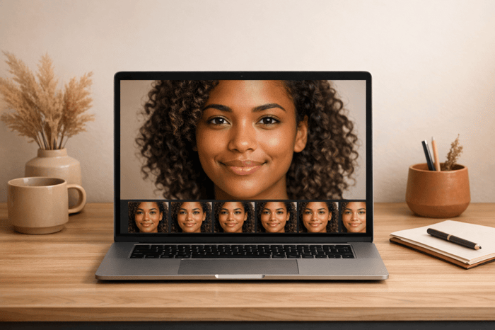
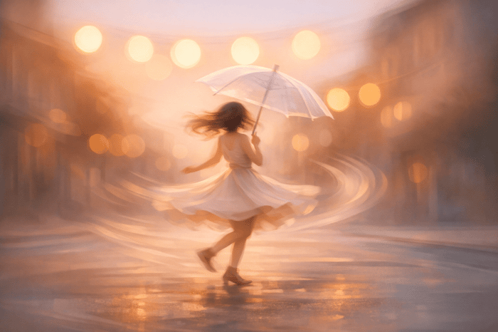
Cinematic Color Grading: Contrast and Saturation Tips
Cinematic color grading transforms flat digital images into film-like visuals by carefully controlling contrast and saturation. The goal is to create depth, mood, and subtle tones that align with the story being told. Here's how you can achieve this look:
- Contrast: Use the Tone Curve tool to create smooth highlight roll-offs and softer shadows. Avoid harsh blacks by slightly lifting the shadow floor for a matte effect.
- Saturation: Lower vibrance significantly while making minor adjustments to saturation for a balanced palette. Focus on desaturating greens and blues to avoid an artificial feel.
- Split Toning: Add cool tones to shadows and warm hues to highlights for cinematic depth. Use the balance slider to ensure seamless transitions.
- Final Touches: Add grain for texture, keep clarity adjustments minimal, and refine color tones with calibration tools.
For faster results, presets like those from Presets.io can simplify the process, offering a solid base for cinematic edits.
This approach ensures your images have depth and atmosphere without distracting from the story.
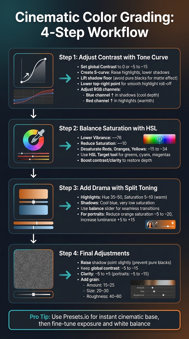
4-Step Cinematic Color Grading Workflow for Lightroom
COLOR GRADE in Lightroom Like a PRO // Cinematic Color Grading

sbb-itb-b27063b
Step 1: Adjust Contrast with the Tone Curve Tool
To achieve that cinematic contrast in Lightroom, start by working with the Tone Curve panel. Unlike the standard Contrast slider, which applies a broad adjustment across the image, the Tone Curve allows for more nuanced control. It lets you create layered contrast that mimics the way film emulsion reacts to light. Joey Kamphuis from The Editing Studio explains:
"The cinematic natural look uses one primary contrast source, which is the Tone Curve, and keeps all others at or near 0."
To begin, set the global Contrast slider to 0 or slightly negative (around –5 to –15). This prevents tonal adjustments from becoming too aggressive and leaves room to rebuild contrast exclusively through the Tone Curve. This approach gives you precise control over highlights and shadows.
Create the S-Curve
Start by applying an S-curve in the Point Curve section. Here's how:
- Raise a point in the Highlights and lower one in the Shadows. This deepens the shadows and brightens the highlights, adding depth and dimension without causing harsh clipping.
- Avoid setting blacks to pure zero. Instead, lift the shadow floor slightly by raising the bottom-left point of the curve. This softens pure blacks into a gentle gray, giving the image a matte, atmospheric feel.
- For highlights, lower the top-right point of the curve just a touch. This creates a smooth roll-off in the brightest areas, preventing harsh clipping and adding a creamy, luminous quality.
Modify RGB Channels for Color Mood
Once the S-curve is in place, refine the image's color mood by adjusting the individual RGB channels. Each channel affects complementary colors:
- Raising the Red channel increases reds while reducing cyan.
- Raising the Green channel adds green while reducing magenta.
- Raising the Blue channel enhances blues while reducing yellow.
To achieve a cinematic feel, try these subtle tweaks:
- Lift the Blue channel in the shadows to create cool, moody depth.
- Raise the Red channel in the highlights to introduce a touch of warmth.
These adjustments should remain subtle - balance is key to maintaining a natural yet cinematic look.
With these changes, you’ve laid the foundation for further enhancements, like fine-tuning saturation and experimenting with split toning.
Step 2: Balance Saturation with the HSL Panel
Once you've set your contrast foundation using the Tone Curve, the next step is refining color intensity with Lightroom's HSL (Hue, Saturation, Luminance) panel. This tool lets you focus on specific colors, which is key for achieving a cinematic color grade. A hallmark of this style is selective desaturation - toning down certain hues while keeping key colors bold and vibrant.
To start, open the HSL/Color panel and head to the Saturation section. A typical cinematic technique involves significantly lowering Vibrance (around –76) while making only a slight reduction in overall Saturation (around –10). This creates a neutral base that retains a touch of color richness. From here, you can refine the saturation of individual hues to add depth and focus.
Reduce Saturation for Depth
Cinematic imagery often relies on muted background colors to draw the viewer's eye to the main subject. To achieve this, reduce the saturation of dominant hues like Reds, Oranges, and Yellows - dialing these sliders down by approximately –15 to –34 can work well.
However, desaturating colors too much can leave an image feeling lifeless. To avoid this, boost contrast and clarity to restore depth and texture. Lightroom instructor Jon Phillips emphasizes this point:
"The real magic comes in when you start working with the Presence section."
Additionally, fine-tuning the Highlights, Whites, and Blacks sliders can help maintain a strong dynamic range, ensuring the image retains visual interest.
Prevent Overly Bright Colors
As you work on desaturation, keep an eye out for colors that are too bright and disrupt the dramatic vibe. Hues like greens, cyans, and magentas can sometimes stand out excessively. Use the HSL Target tool (the small dot icon in the panel) to pinpoint and reduce saturation in these areas. For example, lowering both the saturation and luminance of greens can create more natural-looking foliage.
If skies look dull, selectively enhancing the cyan and blue channels can add drama. Decrease their luminance slightly while boosting saturation to make the skies pop without overwhelming the entire image.
The Seasons Bundle

$39.00
$135.00
The Seasonal Bundle brings together a versatile range of Lightroom presets inspired by the shifting tones and textures of the year — from cool, muted winter scenes to rich, golden autumn light. Inside, you’ll find collections like Winter, Gingerbread, Old… continue reading

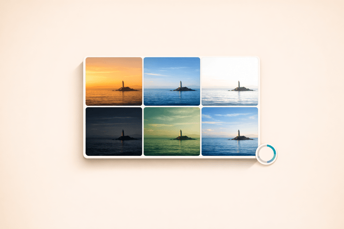
Step 3: Add Drama with Split Toning
Once you've nailed contrast and saturation, split toning is where the filmlike magic happens. This technique allows you to add distinct colors to highlights and shadows independently, creating depth and enhancing the mood. When done right, split toning can give your images that classic warm-and-cool film vibe.
The key is to use the highlight and shadow hue controls, along with their saturation levels, and adjust the balance slider to fine-tune the transition between tones. The goal? To complement your edits without overpowering the story you're trying to tell.
Apply Cool Shadows and Warm Highlights
To achieve a balanced dramatic effect, aim for warm, natural tones in the highlights. Set the hue to somewhere between 35–50 and keep saturation at a subtle 5–10. For shadows, stick to neutral tones or introduce a touch of cool blue - but keep the saturation very low to maintain subtlety.
The balance slider is your best friend here. Use it to control how the colors transition through the midtones. If the highlights feel too dominant, nudge the balance toward the shadows. The trick is to make the toning feel seamless - viewers should feel the mood, not notice the technique.
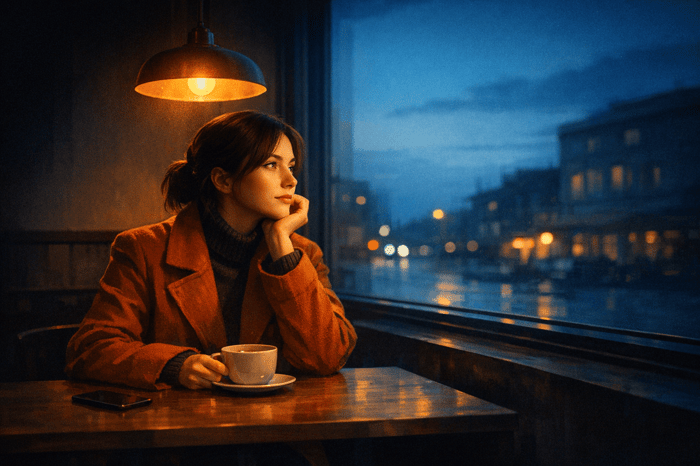
Preserve Natural Skin Tones
When working on portraits, pay extra attention to skin tones. Warm highlights can sometimes overwhelm natural skin colors, so reduce orange saturation by –5 to –20 and increase its luminance by +5 to +15 for a more natural look.
Additionally, avoid stacking too many contrast-heavy adjustments. If you've already used clarity, dehaze, or strong split toning—perhaps by applying Luminar Neo presets—consider lowering the global contrast slider by –5 to –15 and instead rely on a gentle tone curve. This ensures smooth tonal transitions and prevents skin textures from looking unnatural or overly processed.
Step 4: Final Adjustments and Using Presets.io

Fine-Tune with Levels and Calibration
Once you've completed split toning, it's time to refine your filmlike edits. Start by slightly raising the shadow point - this prevents areas of pure black, adding depth without sacrificing detail. To maintain a smooth tonal balance, keep global contrast adjustments subtle, ideally between –5 and –15.
For Clarity, aim for a range of –5 to +5. If you're working on portraits, consider dialing it back further to –5 to –15 to soften the digital sharpness. Be cautious about combining Clarity, Dehaze, and Tone Curve adjustments - layering these can lead to unnatural transitions in your image.
Finally, add grain to tie everything together. Set the Amount between 15–25, Size to 20–30, and Roughness to 40–60. This step enhances the film-like aesthetic without overwhelming the photograph. As Joey Kamphuis from The Editing Studio advises:
If someone notices the grain before they notice the photograph, it is too strong.
These adjustments ensure your image is polished and ready for the next step: applying cinematic presets.
Get Instant Results with Presets.io
For a quicker path to a dramatic look, Presets.io offers a range of expertly crafted Lightroom presets. Building a filmlike style from scratch can be time-consuming and requires technical expertise. These presets simplify the process, providing a well-calibrated tonal foundation with features like soft highlight roll-off and layered contrast baked in. They also create a cohesive aesthetic across your entire gallery, ensuring your edits feel harmonious and intentional.
Once you've applied a preset, all that's left is fine-tuning the Exposure and White Balance to suit your specific lighting conditions. This approach saves you hours of manual tweaks while delivering professional-quality results at the click of a button.
Conclusion
Creating a dramatic look in Lightroom involves a combination of precise tone curve adjustments, targeted HSL tweaks, and split toning to achieve subtle color separation. Final touches like adding grain and adjusting calibration bring the image together.
The process thrives on experimentation. As Joey Kamphuis points out, filmlike grading should always remain subtle and aligned with the story. While the specifics depend on your subject, the overarching goal is clear: enhance depth without pulling attention away from the image itself. Maintaining a consistent tonal approach is key to unifying your work and building your visual identity. Kamphuis explains it best: "A gallery of consistently well-edited photographs is an identity."
If the process feels overwhelming, presets can simplify your workflow. Platforms like Presets.io offer dramatic presets designed to handle the technical aspects - like soft highlight roll-offs, layered contrast, and balanced saturation. These presets give you a solid starting point, allowing you to focus on storytelling. Just apply the preset and adjust exposure and white balance to suit your scene.
Cinematic grading isn’t just about slapping on a filter. It’s a deliberate, step-by-step process that enhances your photos while keeping the viewer’s attention on the story each image tells.
FAQs
Why use the Tone Curve instead of the Contrast slider?
The Tone Curve provides more precise control over light and color balance than the Contrast slider. It allows you to adjust luminance with precision and craft cinematic effects, such as a gentle S-curve. This technique boosts contrast while maintaining details in both shadows and highlights, making it perfect for creating polished, professional-looking images.
How do I mute colors without making my photo look dull?
To tone down colors in your photo without losing its vibrancy, try reducing saturation selectively while keeping contrast and brightness intact. Use the HSL (Hue, Saturation, Luminance) sliders to desaturate certain colors without making the image look flat. Pair this with tweaks to contrast and tone curves to preserve depth and dimension. This method helps create a cinematic look that’s visually appealing, even with muted tones.
How can I split tone without ruining skin tones?
When working to split tones without disrupting skin tones, focus on making subtle adjustments in the midtones and areas where skin tones dominate. Selective color grading is key here - this helps maintain the natural look of skin while avoiding any dramatic or unnatural shifts. Pay close attention to balancing contrast and saturation. Use tools like the hue, saturation, and luminance sliders thoughtfully to achieve a cinematic feel while ensuring the skin tones remain intact.