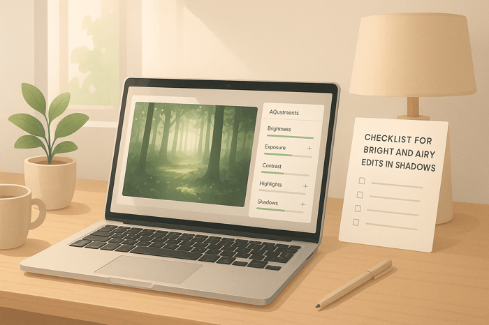

Checklist for Bright and Airy Edits in Shadows
Creating bright and airy photos from shadowy images is all about balance. The goal is to lift shadows while preserving details, maintain natural colors, and create a soft, inviting aesthetic. Here's a quick summary of how to achieve this look:
- Brighten Shadows: Use tools like the shadows and blacks sliders in Lightroom to reveal hidden details without overdoing it.
- Preserve Highlights: Adjust highlights and whites to maintain texture in bright areas.
- Natural Colors: Focus on clean whites, realistic skin tones, and soft greens or yellows by tweaking white balance and HSL settings.
- Even Exposure: Aim for a smooth tonal range, avoiding harsh contrasts.
- Use Presets: Start with a preset for consistency, then fine-tune for each photo.
How to Make Photos Look BRIGHT & AIRY in Lightroom
What Is the Bright and Airy Style
The bright and airy style is all about creating photos that feel soft, light, and inviting. This editing technique focuses on clean whites, subtle shadows, and natural tones, resulting in images that radiate warmth and optimism. It's a favorite among social media users and wedding photographers because of its dreamy, uplifting aesthetic.
At its core, bright and airy editing involves increasing overall exposure while preserving details in both highlights and shadows. Unlike high-contrast photography, this style avoids harsh transitions, achieving a smooth and balanced tone throughout the image.
This approach works particularly well for portraits, lifestyle photography, and interior shots - any scenario where you want to evoke a sense of openness and comfort. However, it can be tricky to achieve in scenes with deep shadows or strong contrasts, as the style depends on balanced lighting across the frame.
When working with shadowy photos, carefully brighten the darker areas without losing detail, while keeping the lighter parts luminous. Achieving this balance requires a thoughtful approach to editing, ensuring every adjustment complements the overall look. Let’s break down the key elements that define the bright and airy aesthetic.
Main Elements of Bright and Airy Photos
- Soft highlights: Highlights should glow gently, enhancing the subject without overpowering the image. The goal is to maintain detail in the brightest areas while giving them a light, inviting feel.
- Lifted shadows: Shadows play a supportive role, adding depth without becoming too dark or distracting. This doesn’t mean eliminating shadows entirely - just ensuring they blend harmoniously with the lighter tones.
- Natural color tones: Colors should feel real but slightly refined. Skin tones, in particular, should remain healthy and natural, avoiding oversaturation that could clash with the overall softness.
- Even exposure distribution: The hallmark of this style is a smooth tonal range. Light and dark areas transition gradually, creating a cohesive look where no single part of the image steals the spotlight.
- Creamy white balance: A slight warmth in the white balance gives these photos their signature glow. The trick is warming the image just enough to feel cozy without introducing unwanted yellow or orange tones.
Getting Your Photo Ready to Edit
To nail the bright and airy look, start with a photo that sets you up for success. A well-exposed RAW file is ideal, as it preserves maximum detail in both shadows and highlights, giving you the flexibility to make significant edits without losing quality.
- Shoot slightly underexposed: Underexposing your shot helps retain detail in bright areas, which is crucial for this style. You can always brighten shadows during editing, but lost highlight details are much harder to recover.
- Use ISO settings between 400 and 1600: In shadowy conditions, this range strikes a balance between capturing enough light and keeping noise manageable. Modern cameras handle this level of ISO well, and a touch of grain can even add character to your final image.
- Set your aperture around f/2.8 to f/4: This range lets in plenty of light while maintaining enough depth of field for most subjects. Wider apertures like f/1.4 can work but may make focusing tricky, while narrower apertures might force you to increase ISO too much.
- Choose daylight or auto white balance: Starting with a neutral white balance helps streamline the editing process. While you can tweak it later in post-processing, getting it close in-camera saves time and gives you a clearer preview of the final result.
- Avoid extreme contrast during capture: To make editing easier, aim for even lighting. Use tools like reflectors or diffusers to soften harsh light, or position your subject where the light is more uniform. These small adjustments during the shoot can save you hours in post-production and enhance the impact of any presets you apply.
Lightroom Adjustments for Shadowy Photos
Transform shadowy photos into bright, airy masterpieces by following a Lightroom workflow that brings out hidden details while keeping textures natural. These steps complement the earlier discussion on setting up your photo properly.
Edit Shadows, Highlights, Blacks, and Whites
Start with the Shadows slider to pull out details from darker areas, and use the Highlights slider to tone down overly bright spots. Next, tweak the Blacks slider to soften intense dark tones and the Whites slider to maintain clarity in brighter sections. These adjustments work together to balance your image without overwhelming it.
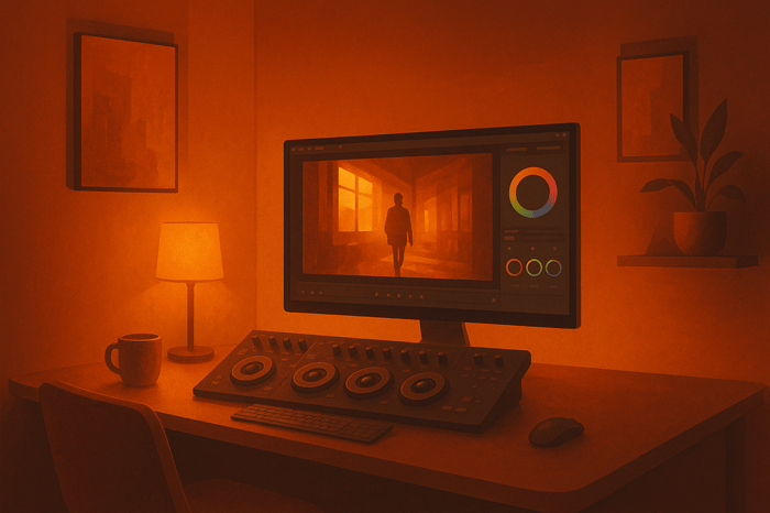
Adding Depth with the Tone Curve
The Tone Curve is your go-to tool for fine-tuning brightness and contrast. Create a gentle S-curve by lowering shadows, lifting midtones, and boosting highlights. This technique adds depth and dimension while keeping details intact. For photos with heavy shadows, try lifting the black point (the bottom-left corner of the curve) by 5–15 units. This subtle adjustment gives your image a soft, faded effect while retaining texture.
Setting Exposure and Contrast Levels
Fine-tuning exposure and contrast ensures your photo feels balanced and natural. These adjustments can bring the final touch to your shadowy photos, giving them a polished and airy finish.
Fixing Colors and White Balance
Getting colors right is essential when aiming for that bright and airy vibe. Shadowy photos often carry unwanted color casts, but with proper white balance and color adjustments, you can turn muddy tones into soft, luminous ones that truly shine.
Setting White Balance for Clean Colors
White balance is the foundation of natural, clean colors. Start by adjusting the Temperature and Tint sliders in Lightroom to remove any color casts. For the bright and airy aesthetic, lean toward warmer tones, but keep it balanced to avoid overpowering the image.
"Photos that are light and airy typically have a brilliant white background, a neutral tone, and a warmer hue." - Orion Photo Group
Make sure white elements in your image actually appear white - this neutral base is key to achieving the desired look. Photographer Jenna Bechtholt highlights the importance of this step:
"I almost always adjust the temperature and tint a little bit, but because I shoot using Kelvin in camera, my white balance is never too far off. Ultimately I want to keep the whites in an image looking white, which serves as a great way to check if your white balance is where it should be."
Neutral whites act as your editing anchor, helping you maintain consistency and clarity throughout the process.
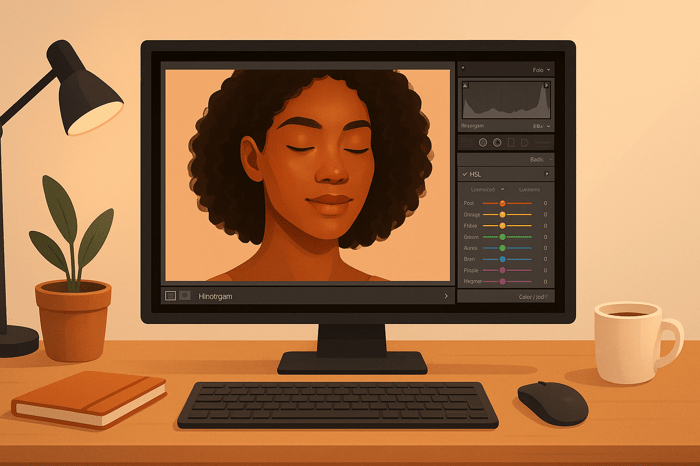
Adjusting HSL Settings
Once your white balance is dialed in, the HSL panel (Hue, Saturation, Luminance) becomes your go-to tool for fine-tuning individual colors. Shadowy photos often have tricky greens and yellows that can appear muddy or overly saturated when brightened.
For yellow tones, subtle adjustments are key. Shift the yellow hue slightly toward green, increase luminance to brighten it, and lower saturation to avoid that harsh neon look. Samantha Shannon, a Portland-based family photographer, shared her method in August 2022:
"I adjust yellow hue slightly to the green side, bump yellow luminance up, and bring yellow saturation down to manage green tones and remove neon yellow."
When dealing with greens, focus on reducing the neon yellow undertones. Move the green hue slider slightly toward blue to create more natural-looking foliage and backgrounds. This approach keeps the greens vibrant yet soft, without desaturating them completely.
Adding Subtle Color Grading
After perfecting white balance and HSL adjustments, subtle color grading can tie everything together. This step adds warmth and depth, especially if your image feels too flat after brightening shadows.
Focus on enhancing the midtones and highlights. A gentle warmth in the highlights enhances the luminous quality, while a slight warm tone in the midtones brings life back to skin tones and other key elements. Keep it light - if your HSL adjustments were effective, only minimal grading will be needed to achieve that cohesive, polished look.

The Master Preset Bundle

$57.00
$672.00
The Master Preset Bundle Every Style. Every Platform. One Download Get 56 high-quality Presets.io collections in one complete bundle — designed to help you edit faster, stay consistent, and get professional-looking results in seconds. Get All High-Quality Preset Collections For… continue reading
sbb-itb-b27063b
Using Presets for Faster Bright and Airy Edits
After carefully making manual adjustments, presets can simplify the editing process - especially when dealing with tricky lighting. Presets are essentially pre-configured settings that apply a consistent look to your photos with just one click. For images with heavy shadows, they can save time while delivering impressive results.
Presets are particularly helpful for batch editing. Instead of tweaking exposure, shadows, highlights, and colors for each individual photo, you can apply a preset to hundreds of images at once. This creates a consistent base for your edits, speeding up the process and ensuring uniformity across your collection.
Benefits of Using Presets
The biggest perk? Time savings. What might take 10–15 minutes of manual editing per photo can be cut down to just a few minutes of fine-tuning after applying a preset. This is especially valuable when working with large batches of shadow-heavy photos that need brightening.
Once you’ve found a combination of settings that works for your bright and airy style, saving it as a preset allows you to replicate that look across future projects. This not only ensures cohesive galleries but also helps you establish a recognizable signature style.
Professional presets, like those from Presets.io, offer tailored options for different lighting scenarios. Their collections include styles designed to handle dramatic contrasts and atmospheric effects, making them especially handy for transforming shadowy photos into light, airy masterpieces.
Presets also offer a learning opportunity. By studying how they adjust settings like exposure, shadows, highlights, tone curves, and color grading, you can better understand how these elements interact. Over time, this can improve your manual editing skills.
Adjusting Presets for Each Photo
While presets provide a great starting point, each photo will still need some fine-tuning. After applying a preset, start by adjusting the exposure and shadows. If the preset makes the image overly bright or leaves shadows too dark, tweak these sliders first. For particularly shadowy photos, you may need to increase the shadow slider further or slightly lower the exposure to avoid losing detail in the highlights.
Pay close attention to skin tones and overall color balance. Shadow-heavy images often have unique color casts that the preset wasn’t designed for, so you might need to adjust the temperature, tint, or individual colors in the HSL panel to achieve natural-looking results.
You’ll also want to revisit the highlights and whites sliders. Presets made for evenly lit photos may not account for the stark contrasts in shadowy scenes. Adjusting these settings can help recover detail in brighter areas while keeping the light, airy vibe intact.
Finally, don’t forget about local adjustments. Even the most well-crafted preset can’t address every detail. Use tools like masks to brighten faces, tweak specific color ranges, or enhance key elements that contribute to the overall aesthetic.
Presets are a fantastic way to kickstart the editing process, but the magic happens when you tailor them to each photo’s unique needs.
Fixing Common Problems in Shadow Edits
When fine-tuning a bright and airy aesthetic, shadow editing can introduce unexpected challenges. These issues can turn a light, ethereal image into something unnatural or lacking in detail. By addressing these common pitfalls, you can refine your editing process and achieve the desired look.
Keeping Detail in Dark Areas
One of the biggest challenges in brightening shadowy photos is avoiding over-lifting shadows. This can lead to a loss of critical detail, added noise, and unwanted color shifts.
To prevent this, keep an eye on your histogram during adjustments. If shadow information starts piling up on the left edge or gaps appear, it’s a sign you’ve gone too far. The goal is to brighten dark areas just enough to reveal detail without making them look unnaturally bright or flat.
Targeted tools like the adjustment brush or radial filters can help you brighten specific areas without affecting the entire image. For particularly stubborn shadows, try a two-step approach: lift global shadows moderately, then use localized adjustments to fine-tune specific regions. This method avoids the flat, over-processed look that can result from overusing the shadows slider.
Avoiding Washed-Out Colors
A bright and airy look doesn’t mean sacrificing vibrant, natural colors. One common mistake is losing color richness when increasing exposure or lifting shadows, which can make photos appear dull and lifeless.
To maintain color depth, lean on contrast. After brightening your image, revisit the contrast slider and add back some punch - 10 to 20 points is often enough to restore vibrancy. Pay close attention to skin tones, foliage, and skies. If faces start looking gray or plants seem lifeless, it’s a sign to scale back shadow adjustments or selectively boost vibrance using the HSL panel.
The whites and highlights sliders are also key tools. Pulling back highlights while lifting shadows creates a balanced tonal range, helping preserve color information. This approach keeps the image bright without washing out its colors.
Once your colors are balanced, fine-tune your workflow to suit the specific needs of your edits.
Manual vs. Preset Editing Methods
After addressing shadows and colors, consider the best approach for your workflow - manual adjustments or presets.
Manual editing offers complete control over every detail and is ideal for tackling complex lighting scenarios, like mixed indoor and outdoor light or dramatic backlighting. It allows you to adjust each element individually for precision.
Presets, on the other hand, are great for maintaining consistency across multiple images and providing a solid starting point. However, they work best when your photos share similar lighting and exposure conditions. For example, a preset designed for golden hour may not translate well to images shot under harsh midday sun or indoors.
The most effective strategy often combines both methods. Start with a preset that aligns closely with your desired look, then refine it with manual adjustments to address the unique needs of each image. This hybrid approach gives you the efficiency of presets while preserving the precision of manual edits where it matters most.
Conclusion: Getting Better at Bright and Airy Edits
To master bright and airy edits, focus on refining your skills in exposure adjustments, shadow lifting, and color grading. These techniques are the building blocks for establishing strong editing fundamentals.
Photographer Christina Greve highlights the importance of editing by stating:
"Image editing is almost 50% of the process to achieving a signature style."
This underscores the critical role editing plays in creating a cohesive visual identity for photographers.
Start by getting comfortable with essential tools like the tone curve, white balance, and shadow/highlight sliders. These basics form the backbone of your editing process and can help reduce your reliance on costly presets. Shooting in RAW format is also a game-changer, as it gives you the flexibility to handle tricky lighting scenarios with ease.
Don’t be afraid to experiment. Trial and error is an excellent way to sharpen your creative instincts. Platforms like Pinterest or Instagram can serve as valuable sources of inspiration - use reference images to guide your approach and fine-tune your techniques.
Christina Greve offers encouragement for those honing their editing skills:
"With patience and practice, you'll be creating beautiful images in a matter of minutes."
However, remember that editing should enhance your photos, not rescue them. Photographer Steve Grimm offers a crucial piece of advice:
"My biggest tip is, learn to take photos that don't need saving and then learn how to edit to enhance those images."
This means focusing on capturing well-exposed images straight from the camera, making the editing process more seamless and natural.
If you’re looking to streamline your workflow, consider using presets as a jumping-off point. Tools like those from Presets.io are specifically tailored for bright and airy aesthetics, offering a variety of Lightroom presets you can tweak to suit the unique qualities of each image. These presets can save time while still allowing room for customization.
FAQs
How can I brighten shadows in my photos without losing details or making colors look unnatural?
To lighten shadows while keeping details intact and colors looking natural, opt for targeted adjustments like the Curves tool or Shadow/Highlight sliders in your editing software. Make small, gradual changes to maintain a balanced and realistic appearance.
For even greater precision, consider non-destructive editing methods such as adjustment layers and layer masks. These techniques allow you to tweak your edits without permanently changing the original image. Additionally, working with RAW files and using a calibrated monitor can ensure that colors and details remain accurate throughout the process.
How can I create a bright and airy look in photos with heavy shadows using Lightroom?
To create that bright and airy vibe in photos with heavy shadows, start by tweaking the Shadows slider to bring out details in the darker areas. At the same time, lower the Highlights slider to tone down any overly bright spots. If the image still feels off, you can fine-tune the Exposure to get the overall brightness just right.
For a softer, dreamier feel, try dialing back the Clarity. You can also use the Tone Curve to craft a gentle S-curve. Lifting the shadow point a bit adds a soft fade to the blacks, giving your photo that light and airy charm. Want to take it a step further? Experiment with Split Toning to introduce warm, pastel hues that tie everything together beautifully.
These tweaks work together to create a balanced, soft, and visually appealing image with a bright and airy aesthetic.
How can presets help create a bright and airy look, and how do I fine-tune them for specific photos?
Presets make it easy to create that bright and airy look by applying pre-made adjustments. These adjustments boost brightness, soften shadows, and give your photos a clean, polished feel. They’re a huge time-saver and help keep your edits consistent.
To make presets work perfectly for each photo, tweak essential settings like exposure, contrast, and white balance. These small adjustments help match the preset to the unique lighting and tones of your image, ensuring the final edit keeps that light and airy vibe while highlighting the photo’s natural details.