

Table of Contents
How to Use Before/After Photos for Social Media Engagement
Before/after posts can get 2–3x more engagement than standard posts. I’d use them when I want people to stop scrolling, see the change at a glance, and react with comments, saves, or shares.
Here’s the short version:
- I start with a photo that has a clear problem: low light, flat color, noise, or clutter
- I keep the before and after framed the same so the change is easy to see
- I use one preset style at a time so my after images have a steady look
- I post the result as a side-by-side, carousel, short video, or slider
- I add a short caption that says what changed and ends with a simple question
- I track saves, shares, comments, profile clicks, and swipe behavior to see what works
A few numbers stand out:
- 2–3x more engagement for before/after posts
- 45% higher engagement for transformation-style Reels than standard video posts
- 33% higher viewer retention and 6x more profile visits for posts with interactive elements like sliders
If I wanted the simplest plan, I’d do this: pick one strong photo, edit it in Lightroom, keep the crop the same, post it as a 4:5 carousel at 1,080 × 1,350 px, label each image Before and After, and end the caption with a question like “Which version do you like better?”
Here’s the fast format check:
| Format | Best for | Work level | Main upside |
|---|---|---|---|
| Side-by-side | Fast comparison | Low | Change is instant |
| Carousel | Saves and swipes | Medium | Tells a step-by-step story |
| Short video/Reel | Reach and shares | Medium to high | Motion makes the edit stand out |
| Interactive slider | Time on post | Medium | Viewer controls the reveal |
The main idea is simple: make the edit easy to compare, easy to understand, and easy to react to.
Step 1: Prepare Before and After Images in Lightroom
Choose Photos With Clear Editing Potential
Not every photo works for a before/after post. The best ones have an obvious issue: low light, blur, noise, clutter, or dull color. The change should be easy to spot on a phone screen.
Skip photos that already look polished. If the “before” is already clean and well lit, the edit may not feel big enough to matter. Instead, pick shots where the main fix is obvious at a glance. Sharp, high-resolution files matter too. If the original is too soft or low quality, the edited version can end up looking fake instead of believable.
Once you’ve picked a strong original, make sure the crop and framing match before you start editing.
Create Matched Before and After Versions
In Lightroom, make a virtual copy before editing. Keep the same crop on both versions. If the framing changes, it can look like you’re trying to hide problems in the “before” image. Clean alignment also makes the comparison much easier to read in a social feed.
After editing, zoom in and check for halos or warped edges. That small check goes a long way when you turn the images into social content.
Use Presets for a Consistent After Look
A preset gives your “after” image a repeatable style, whether that’s cinematic, vintage, film look, or aesthetic. Presets.io has Lightroom and mobile preset collections that help keep that look steady from post to post.
After you apply a preset, adjust exposure or contrast as needed so the edit still feels natural next to the original. The goal is simple: make the “after” look polished, not forced.
Once the pair is lined up, format it for the platform. Next, turn the matched pair into a side-by-side, carousel, or short video.
sbb-itb-b27063b
Step 2: Format Before/After Posts for Social Media
Pick the format that makes the edit easiest to read on a phone. Then write a caption that makes the change easy to get - and easy to react to.
Make Side-by-Side Posts and Swipeable Carousels
A side-by-side graphic puts both images in one frame. It works well in fast-scrolling feeds because people can see the change right away. The preset’s impact should land in a single glance.
Carousels slow things down a bit. Instead of showing everything at once, they guide the viewer from one step to the next.
For Instagram and LinkedIn, a 6-slide carousel gives you enough room to build a clear story: Hook → Before → Process → Detail → After → CTA. Export each slide at 1,080 × 1,350 px in a 4:5 ratio so it takes up more vertical space on mobile. Put “Before” and “After” right on the image so no one has to guess. On LinkedIn, you can export the design as a PDF to turn it into a swipeable document carousel.
No matter which format you use, the rule stays the same: make the change obvious and label it clearly.
The Ultimate Presets.IO Bundle
$89.00
$1,662.00
The Ultimate Presets.io Bundle combines The Master Preset Bundle Volume I and The Master Preset Bundle Volume II into one complete collection, giving you every editing style you need in a single download. Save $37 vs. Volume I and II… continue reading

Create Short Before/After Videos or Story Frames
Short videos are great when you want the change to do the talking. A simple wipe or jump cut between the before and after exports makes the difference easy to spot. For Instagram Reels, TikTok, and Stories, use a 9:16 aspect ratio at 1,080 × 1,920 px so the post fills the screen.
Reels that show authentic transformations get a 45% higher engagement rate than standard video posts. That makes Reels a strong option for reaching new people. Carousels, on the other hand, tend to get more saves and shares. If you want a fast way to add movement, use native story tools for reveal effects. You can also add an interactive sticker - like a poll, reaction slider, or question box - to encourage taps and keep people watching longer.
Once the visual format is locked in, the caption does the next job: turning that comparison into comments, saves, and shares.
Use Interactive Sliders for Viewer-Controlled Comparisons
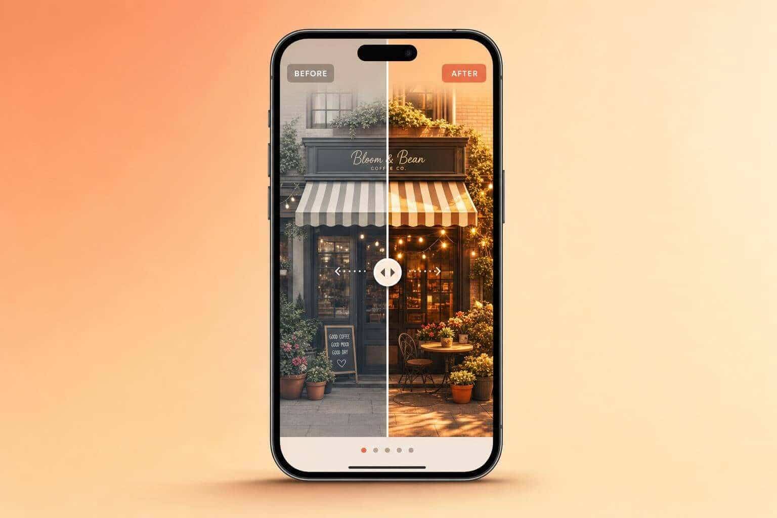
A then-and-now slider lets the viewer drag between the two versions and control the reveal. That only works when the viewer can see the shift directly.
Posts with interactive elements like sliders can get 33% higher viewer retention and six times as many profile visits than static posts. But this format only works when the framing, angle, and lighting match exactly. That depends on the matched exports prepared in Lightroom.
Step 3: Write Captions That Get Comments, Saves, and Shares
Once your before/after pair is set, the next job is the caption. The image gets people to stop. The caption gives them a reason to comment, save the post, or send it to someone else.
Describe What Changed in One or Two Sentences
Be clear about the edit so people can spot the difference right away. Instead of saying, "I love how this turned out", say what you actually did: "Applied a film look preset, pulled the highlights down, and warmed the tones for a softer, more natural feel." That gives the viewer a clear lens for reading the after image.
A simple flow works well: edit → reason → result → call to action. Start with the outcome, then add a short note on why you made the change. Keep it short. If people have to dig for the point, you've lost them.
Use Post Structures That Invite Interaction
If you want comments, ask an easy question tied to the edit. Something like "Which version fits the mood better - A or B?" or "Would you use this cinematic grade on a portrait?" works because it's specific and low pressure. It doesn't feel like homework.
Before/after posts already have a built-in payoff: the viewer sees the move from problem to solution. A short question at the end keeps that momentum going and nudges people to join in instead of just scrolling past. If one caption angle or preset style keeps doing well, turn it into a named series and use it again.
Turn Preset Styles Into a Recurring Content Series
Using the same edit theme week after week helps people recognize your posts faster. Names like "Cinematic Sundays" or "Vintage Vibes" give followers a simple hook and make planning easier on your end too.
Stick with one category for a run of before/after posts, and your feed starts to feel more consistent. Each post also gets a clearer identity, which helps when someone lands on your profile and scans a few thumbnails.
Presets.io organizes its preset collections by style - cinematic, vintage, film look, and aesthetic - which maps directly onto this kind of named series.
Compare Formats, Track Results, and Repeat What Works
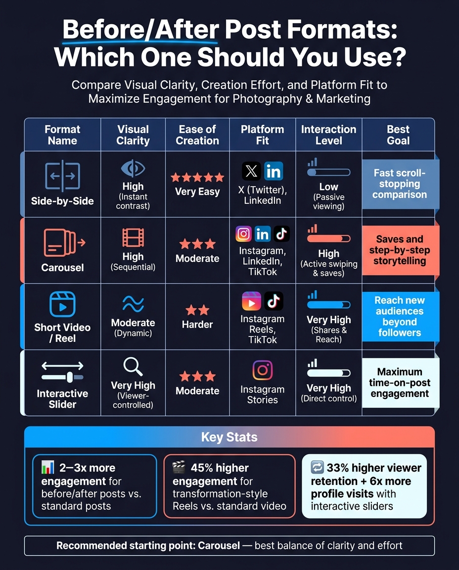
Before/After Post Formats Compared: Engagement, Effort & Platform Fit
Once your post is live, let the data guide the next one.
Compare Before/After Post Formats
Pick the format that matches your goal, whether that's speed, saves, or reach.
| Format | Visual Clarity | Ease of Creation | Platform Fit | Interaction Level |
|---|---|---|---|---|
| Side-by-Side | High (Instant contrast) | Very Easy | X, LinkedIn | Low (Passive viewing) |
| Carousel | High (Sequential) | Moderate | Instagram, LinkedIn, TikTok | High (Active swiping/saves) |
| Short Video | Moderate (Dynamic) | Harder | Instagram Reels, TikTok | Very High (Shares/Reach) |
| Interactive Slider | Very High | Moderate | Instagram Stories | Very High (Direct control) |
If you're not sure where to start, go with carousels. They give you a good mix of clarity and effort. Short videos take more time to make, but they can travel far beyond your current followers.
Once you've tested format, move to style.
Compare Preset Styles for Before/After Posts
Preset style shapes how dramatic the before/after feels. Cinematic presets usually create the biggest visual jump because the lighting and contrast shift is easy to spot. Vintage and Film Look presets can set a strong mood, but the change often feels softer.
| Style | Mood | Best-Use Photo Types | Before/After Clarity |
|---|---|---|---|
| Aesthetic | Soft, airy, clean | Lifestyle, fashion, interiors | High (Brightens shadows and colors) |
| Cinematic | Moody, high contrast | Street, travel, architecture | Very High (Dramatic lighting shift) |
| Vintage | Nostalgic, warm | Portraits, film-style shots | Moderate (Adds grain and texture) |
| Film Look | Timeless, organic | Wedding, documentary | Moderate (Subtle tonal shifts) |
Test one style at a time. Then compare saves, shares, and comments to see what people respond to.
Conclusion: Keep the Edit Clear and the Post Easy to Compare
Use the format and preset style that perform best as the starting point for future posts.
The process stays the same no matter which format you use: pick a photo with clear editing potential, apply high-quality preset collections that create an easy-to-see visual change, choose a format that reads well on a phone screen, and finish with a caption that gives people a reason to react. Then track saves, shares, profile clicks, and where viewers stop swiping to see which format and preset style are pulling the most weight for you.
When you find a format and preset style that keep performing, build a simple template around them and run with it. The point isn't to reinvent the post every week. It's to make the transformation obvious and the comparison easy.
FAQs
What makes a good before/after photo?
A good before-and-after photo comes down to consistency and credibility. If the setup changes too much, the result can feel staged instead of earned.
Use the same camera, lens, settings, lighting, angle, and background in both shots. That way, the difference stands out for the right reason: the transformation itself.
When you edit, line the images up and make the change easy to spot. Tools like Presets.io can help give both photos a polished look, and a swipeable carousel lets people compare them fast without squinting or guessing.
Which social format should I test first?
Start with a multi-slide social carousel. It gives you control over the sequence, so you can show the starting point, the process, and the final result.
Compared with a static side-by-side image, a carousel turns the comparison into a swipeable story that's easier to scan on mobile. To get more engagement, use a clear hook on the first slide and make the transformation obvious at a glance.
How can I make before/after posts feel authentic?
Keep your photography setup consistent. Use the same camera, lens, lighting, angle, and framing so the comparison feels believable.
Also, go easy on editing. Skip heavy, overprocessed changes and stick with subtle Lightroom presets that keep the image looking natural. If you used any major AI edits, say so clearly. It also helps to share a bit of context about what changed and how the transformation happened.