
Table of Contents
Checklist for Editing Autumn Landscape Photos
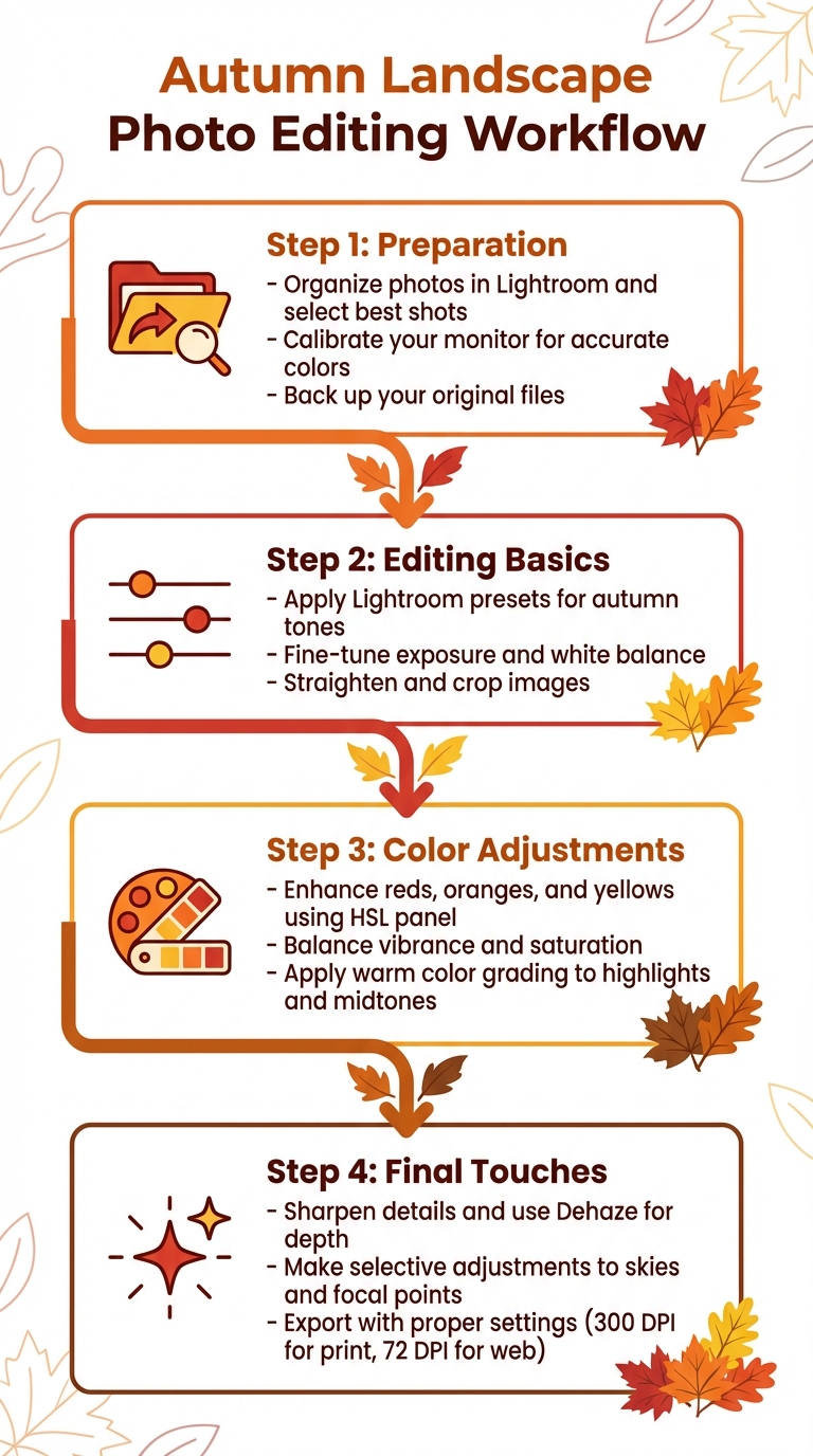
Editing autumn landscape photos can transform dull, raw images into warm, vibrant scenes. To get the best results, follow a structured workflow:
- Preparation:
- Organize photos in Lightroom and select the best shots.
- Calibrate your monitor for accurate colors.
- Back up your original files to avoid losing your work.
- Editing Basics:
- Use Lightroom presets to quickly apply adjustments tailored for autumn tones.
- Fine-tune exposure and white balance to highlight the season’s golden hues.
- Straighten and crop images to improve composition.
- Color Adjustments:
- Enhance reds, oranges, and yellows using the HSL panel.
- Balance vibrance and saturation to avoid oversaturated or flat colors.
- Apply warm color grading for highlights and midtones.
- Final Touches:
- Sharpen details and use tools like Dehaze for depth.
- Make selective adjustments to skies and focal points.
- Export with proper settings for digital or print use.
4-Step Workflow for Editing Autumn Landscape Photos in Lightroom
Editing Fall Photography in Lightroom Classic - FULL Walkthrough

sbb-itb-b27063b
Pre-Editing Preparation
Getting ready for photo editing is all about setting up a smooth workflow. This means avoiding common pitfalls like color inaccuracies, misplaced files, or wasted time. Start by organizing your photos, calibrating your monitor, and backing up your files to create a solid foundation for your editing process.
Organize and Select Your Best Photos
Begin by importing your autumn photos into Lightroom and sorting them into collections. This makes navigating through your images much easier. Use the culling process to pick out your best shots - look for the ones with great composition, lighting, and sharpness. Lightroom's "Grid" view (shortcut: press "G") is a handy tool for comparing photos side by side.
To keep things efficient, flag your top images with labels and stack similar shots together. Professional wedding photographer Paul Waring shares his approach:
"Before I even open Lightroom, Aftershoot AI helps me cull and pre-edit my galleries. It learns my style, applies initial edits, and reduces the time spent tweaking every shot".
Choose one standout photo that captures the mood and lighting of your autumn session. This "target" image will act as a benchmark for editing the rest of your collection.
Calibrate Your Monitor
If your monitor isn’t calibrated, those vibrant autumn colors might not look the same on other screens. Calibration ensures that your edits reflect the true colors of fall foliage.
Lightroom's Soft Proofing feature in the Develop module can help you preview how your edits will appear across different devices or print formats. Adobe offers this advice:
"Use the gamut warning icons in the upper corners of the histogram to see which colors are out of gamut for the monitor and which colors are out of gamut for the selected printing conditions".
This step ensures your photos look consistent, no matter how they’re viewed.
Back Up Your Original Files
Backing up your raw files is a must to avoid losing any work. In Lightroom, use the "Copy" or "Move" options to save your photos to an external drive. For Adobe Camera Raw users, you can manually back up the "Defaults" folder. Here’s where to find it:
- Windows:
C:\Users\<username>\AppData\Roaming\Adobe\CameraRaw\Defaults\ - macOS:
/Users/<username>/Library/Application Support/Adobe/CameraRaw/Defaults.
This simple step protects your files from accidental deletion or unwanted changes, giving you peace of mind as you edit.
Core Editing Steps for Autumn Landscapes
Once you've organized and backed up your photos, it's time to dive into editing. This stage is all about building a strong visual foundation for your autumn shots by using presets, fine-tuning exposure, and refining composition.
Apply Lightroom Presets
Start your editing process by applying a preset to create a cohesive look across your collection. Autumn-specific presets can enhance warm tones like reds, oranges, and yellows, giving your photos that signature fall vibe.
Photography coach Angela Andrieux says:
"Presets - one-click editing recipes - are a great way to speed up your post processing workflow."
Modern presets can even target specific areas, like the sky or foreground, for precise adjustments in seconds. If you're looking for high-quality options, check out Presets.io, where fall-themed packs typically cost between $6 and $12. These presets are designed to enhance autumn colors while keeping the overall feel natural.
After applying a preset, use the HSL (Hue, Saturation, Luminance) panel to fine-tune specific details. For example, you might need to adjust skin tones to keep them looking realistic or tweak water reflections for a balanced look. With the preset as your starting point, focus on perfecting the light and color balance.
The Travel Bundle

$39.00
$120.00
The Travel Bundle is a curated collection of Lightroom presets designed to enhance the beauty of destinations around the world — from lush forests and dramatic landscapes to tropical coastlines and icy Nordic scenery. Featuring presets from Evergreen, Iceland, Landscape, Sea… continue reading

Adjust Exposure and White Balance
To bring out autumn's golden glow, warm up the white balance slightly. Photographer Lauren Wessel shares:
"Slightly warming your image can enhance golden tones naturally, giving your photos a cozy, autumn glow without looking over-edited."
Begin with Lightroom's Auto Tone tool to establish a solid starting point, then make manual adjustments to avoid overexposure. Pay close attention to the histogram to ensure you're not losing detail in bright areas, like yellow leaves catching direct sunlight. If your photo was taken on a cloudy day, you might need to correct a bluish tint to restore the warm, rich tones of the foliage.
Crop and Straighten Your Image
After nailing the tone and color, it's time to refine the composition. A tilted horizon can make even the most stunning landscape feel off-balance, so use Lightroom's straightening tool to level it out. This simple adjustment can make a huge difference in how polished your photo looks.
Cropping can help eliminate distractions and draw attention to the vibrant autumn colors. If the edges of your image haven't fully transitioned to fall hues, consider cropping inward to emphasize the peak colors at the center.
When cropping, keep the rule of thirds in mind. Position standout elements - like a fiery red maple tree - at one of the grid's intersection points. This creates a dynamic composition that naturally draws the viewer's eye through the scene.
Enhance Fall Colors and Texture
After applying your preset and fine-tuning the basics, it’s time to make those autumn hues pop. By tweaking individual color channels, you can amplify the preset’s effect, ensuring your fall scene looks vibrant yet natural. Focus on enhancing reds, oranges, and yellows while keeping the overall look balanced.
Boost Reds, Oranges, and Yellows
The HSL panel is your go-to tool for precise color adjustments. Start by shifting the red hue slightly toward orange - this prevents magenta tones from creeping in. Lower the red luminance to create deeper, richer tones. For oranges, increasing both saturation and luminance can replicate that warm, golden-hour glow. With yellows, boosting saturation and luminance brings out a brilliant, glowing effect. If the yellows lean too green, adjust their hue toward orange for a more cohesive autumn palette.
Got lingering summer greens in your photo? Desaturate them and shift their hue toward yellow. This subtle change can make your image feel like peak fall rather than early September.
| Color Channel | Hue Adjustment | Saturation Adjustment | Luminance Adjustment |
|---|---|---|---|
| Reds | Shift toward Orange | Increase for vibrancy | Decrease for depth |
| Oranges | Keep natural tone | Increase for warmth | Increase for glowing effect |
| Yellows | Shift toward Orange | Increase for brilliance | Increase for brightness |
| Greens | Shift toward Yellow | Decrease (desaturate) | Decrease for added depth |
Once these tweaks are in place, refine the overall look by balancing vibrance and saturation.
Balance Saturation and Vibrance
Begin with Vibrance instead of Saturation. Vibrance selectively enhances muted tones without overloading already saturated areas or affecting skin tones. As Nick Minore, a photo and video expert, explains:
"Vibrance adds selective saturation to the areas that need it most".
Try increasing vibrance by +10 to +20 to bring life to muted tones. Then, use the Brush tool for selective saturation in focal areas to add intensity without oversaturating the entire image. This keeps the scene dynamic and prevents it from looking flat or overdone.
Add Warm Color Grading
After refining individual colors, bring overall warmth to your photo with Color Grading. This feature, which replaced Split Toning in October 2020, lets you add warm tones to highlights and midtones while introducing a subtle teal tint to shadows for contrast. Adjust the Blending slider above 50 to ensure smooth transitions between color tones.
Lauren Wessel, a writer for Archipelago Presets, sums it up perfectly:
"The key when you edit fall colors is to enhance the vibrancy without oversaturating, while still keeping that cozy, timeless atmosphere".
Final Touches and Export
With the main edits done, it’s time to fine-tune your image and get it ready for export. These last steps ensure your photo looks polished and professional, whether it’s shared online or printed.
Sharpen Details and Texture
Once colors and composition are set, focus on refining the finer details. Use light adjustments with the Texture and Clarity sliders to enhance details without making them look unnatural. As Lauren Wessel from Archipelago Presets puts it:
"Use Texture & Clarity sliders lightly to bring out leaf detail without making it harsh".
The Dehaze tool can be a game-changer, especially in foggy or backlit scenes. It adds depth and contrast, helping to define layers of trees or bring out the mood of a misty autumn morning. For more precise sharpening, use AI masking to isolate specific areas like foliage, leaving softer elements - such as clouds - untouched. To subtly guide the viewer’s eye, consider adding a vignette to darken the edges and emphasize the vibrant fall colors in the center.
Next, shift your attention to the sky and key focal points for a well-rounded finish.
Make Selective Adjustments to Sky and Focal Points
Use linear gradients for the sky and radial gradients for focal points to direct attention where it matters most. AI-powered masking tools simplify isolating specific areas, like the sky or main subject, for precise edits. For example, apply the Dehaze slider selectively to boost contrast and create separation between layers in the landscape. Local brushes can also help fine-tune specific areas - slightly increasing the white balance in targeted spots can add a soft, golden glow without oversaturating the image.
Once these selective tweaks are done, it’s time to prepare your image for export.
Export with Proper Settings
Before exporting, check the histogram to ensure balanced exposure and confirm that highlights aren’t blown out and shadows aren’t overly dark. For digital sharing, export as a JPEG for universal compatibility, or consider newer formats like AVIF or JPEG XL for better compression and higher quality. For prints or further editing, use TIFF or PSD to retain the best quality. If you’ve worked in HDR mode, don’t forget to enable the "HDR Output" option in the export settings to preserve the enhanced dynamic range. Finally, apply output sharpening based on your intended use, setting the resolution to 300 DPI for prints and 72 DPI for web display.
These final steps ensure your image is ready to shine, no matter where it’s displayed.
Conclusion
Editing autumn landscape photos becomes much simpler when you follow a step-by-step process. From organizing your files and calibrating your monitor to adjusting colors and exporting with the correct settings, each step helps you achieve consistent and polished results.
A key part of this workflow is using Lightroom presets. As Asanka, the creator of AAAPresets, puts it: "Presets are essentially pre-made editing recipes". The team at Presets.io adds: "Presets save you a ton of time by making lots of edits with a single click, so that you can skip straight to fine-tuning."
This approach helps photographers - whether beginners or seasoned pros - create a cohesive, professional look across their work. With over 10,000 creators relying on professional Lightroom presets, and preset collections being downloaded more than 500,000 times, the impact is clear. Combining Presets.io presets with thoughtful manual adjustments will ensure your autumn landscapes capture the season's warm, vibrant beauty.
FAQs
What’s the fastest Lightroom workflow for fall landscapes?
When it comes to editing fall landscapes, using autumn-specific presets can save you a ton of time while delivering stunning results. These presets are designed to enhance the vibrant colors and warm tones that define the season, making your edits pop with just one click.
Platforms like Presets.io provide collections that are tailored specifically for autumn photography. By using these ready-made tools, you can achieve professional and consistent edits without spending hours on manual adjustments. It’s an efficient way to ensure your fall photos reflect the depth and beauty of the season effortlessly.
How do I boost fall colors without oversaturating?
To bring out the beauty of fall colors without making them look overly intense, carefully tweak settings like warmth, vibrance, and saturation. The goal is to emphasize reds, oranges, and golds while steering clear of unnatural hues. You can start with an autumn preset or basic adjustments, then fine-tune the vibrance slider - great for enhancing muted tones - and make subtle changes to saturation. Fall-specific presets can also be a great tool, adding depth and warmth to your images while keeping the colors looking natural.
What export settings should I use for web vs. prints?
When preparing images for the web, aim for smaller file sizes. Use a resolution of 72-150 DPI, save in JPEG format with a quality setting between 80-100, and resize your images to fit platform-specific dimensions - like 1080px for Instagram. Additionally, make sure to embed the sRGB color profile for accurate color display.
For print purposes, prioritize high-quality results. Save your images in JPEG or TIFF format at maximum quality, match the dimensions to the intended print size, and set the resolution to 300 DPI. This ensures sharp and detailed prints.