
How Colors Influence Viewer Perception: The Psychology Behind Photo Editing
Color is a powerful tool in photography and photo editing. It affects emotions, storytelling, and how viewers connect with an image. Here's how you can use color psychology to elevate your photo editing:
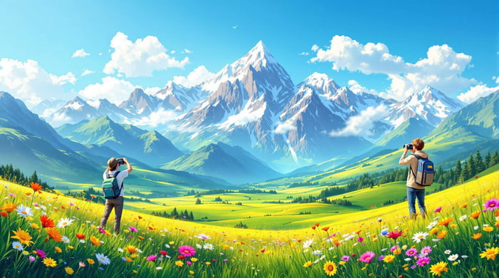
- Warm Colors (Red, Orange, Yellow): Evoke energy, passion, and joy. Great for sunsets, portraits, and lifestyle photos.
- Cool Colors (Blue, Green): Create calmness and trust. Ideal for landscapes and corporate visuals.
- Neutral Tones: Add elegance and timelessness. Perfect for fashion and fine art.
Quick Tips for Editing:
- Hue Adjustments: Shift colors to set the mood (e.g., teal for modern, purple for mystery).
- Saturation Control: Highlight key areas without overwhelming the scene.
- Tonal Adjustments: Use brightness and contrast to add drama or positivity.
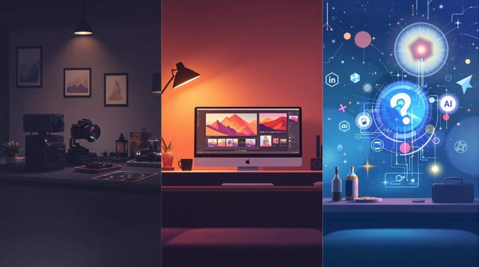
Tools like Lightroom make it easy to apply these concepts using the HSL panel, color grading, and presets. Whether you're editing landscapes, portraits, or commercial projects, understanding color psychology helps you craft images that resonate emotionally.
Color Theory that Photographers Need to Know
How Color Psychology Works in Photo Editing
Color psychology plays a key role in photo editing, allowing photographers to evoke emotions and connect with their audience. By carefully adjusting colors, photographers can craft images that support their story and message.
What Different Colors Represent
Colors in photo editing aren't just for aesthetics - they're tools for storytelling. Here's how some colors are commonly used:
| Color | Common Uses |
|---|---|
| Red | Highlights action in sports, adds vibrancy to food shots |
| Blue | Brings depth to landscapes, conveys trust in corporate imagery |
| Green | Enhances nature scenes, balances environmental portraits |
| Yellow | Brightens lifestyle photos, emphasizes sunny, cheerful vibes |
| Purple | Adds elegance to fashion, deepens artistic portraits |
| Orange | Energizes sports shots, intensifies sunsets |
Photographer Steve McCurry is a great example of this in action. His bold use of reds and greens adds depth and meaning to cultural stories in his images [3]. Now, let’s dive into how editing tools can help you apply these concepts.
Using Hue, Saturation, and Tone to Set the Mood
Mastering hue, saturation, and tone adjustments can help photographers shape emotions and enhance storytelling.
Hue Adjustments
Tweaking hues can create entirely new moods. For instance, shifting blues toward teal gives a modern feel, while purple tones add a sense of mystery [1]. This is especially effective in landscapes and portraits, where subtle color changes can transform the image’s impact.
Saturation Control
Saturation adjustments can guide the viewer’s eye. Boosting saturation in key areas draws attention, while reducing it elsewhere keeps the image balanced and natural [2]. This technique is perfect for focusing attention without overwhelming the scene.
Tonal Adjustments
Brightness and contrast work together to set the mood. Lighter tones often evoke positivity, while darker tones add drama [2]. A popular example is the "teal and orange" look, which uses complementary colors to separate subjects from the background while maintaining a polished, cinematic feel.
Wedding photography is a great case study for these techniques. Warm hues amplify feelings of joy, subtle saturation keeps skin tones natural, and lighter tones create a soft, romantic vibe. Even small adjustments in these areas can dramatically influence how viewers perceive an image.
Using Editing Tools to Apply Color Theory
Now that we’ve covered the basics of color psychology, let’s dive into how Lightroom’s tools can transform these concepts into practical editing techniques.
Adjusting Colors in Lightroom
Lightroom’s HSL controls and color wheels let you fine-tune highlights, midtones, and shadows, giving you the power to adjust tonal ranges with precision. Here’s a quick breakdown:
| Tonal Range | Purpose | Best Used For |
|---|---|---|
| Highlights | Adjusts bright areas | Enhancing skies, bright objects |
| Midtones | Affects mid-level tones | Perfecting skin tones, main subjects |
| Shadows | Refines darker areas | Adding depth, creating mood |
The HSL panel, paired with the Range Mask feature, makes it easy to target specific colors. For instance, you can boost the blue tones in a sky without affecting other blue elements in your photo [4].
Examples of Color Editing for Different Styles
Different photography styles call for unique approaches to color:
Landscape Photography: Adding warm tones to highlights can make sunsets more vibrant, while cooler shadows deepen the atmosphere in night scenes [2]. Reducing green saturation can also help keep foliage from dominating the frame.
Portrait Photography: The HSL panel is great for controlling individual colors, helping you separate your subject from the background while keeping skin tones natural [5]. This balance enhances the emotional connection in your images while staying true to the subject.
How Presets.io Can Help
Presets.io offers ready-to-use collections for cinematic, aesthetic, and classic film looks. These presets give you a strong starting point for color grading, helping you maintain a consistent style across your portfolio while leaving room for personal tweaks.
Examples of Color Choices in Action
Examples from Professional Photographers
Professional photographers often use color to shape how viewers connect with their work. For instance, Steve McCurry's bold and vibrant colors heighten the drama and storytelling in his images. On the other hand, Annie Leibovitz uses carefully controlled tones to guide the viewer's eye and add emotional depth to her portraits. These examples highlight how deliberate color use can influence perception, especially when paired with specific palettes.
Comparing Different Color Palettes
Different color palettes serve various purposes in photography, each bringing a unique mood or style to the image:
| Color Palette | Effects and Best Uses |
|---|---|
| Warm Tones (Red/Orange) | Adds energy and a sense of closeness, ideal for portraits or sunsets |
| Cool Tones (Blue/Green) | Evokes calmness and works well for nature or water scenes |
| Teal and Orange | Creates strong subject-background contrast, popular in cinematic shots |
| Monochromatic | Highlights shapes and textures, perfect for fine art or minimalistic photography |
The way colors interact is what makes a palette work. Complementary colors can create bold, eye-catching images, while analogous colors result in a more unified and soothing effect. The trick is to match your color choices with the mood and story you want your image to tell.
Adding Color Psychology to Your Editing Process
Step-by-Step Guide to Editing with Colors
Using color psychology in photo editing blends technical know-how with a creative touch. Lightroom's HSL (Hue, Saturation, Luminance) panel is a powerful tool to shape emotions in your images.
1. Set the Mood
Start by fine-tuning white balance and exposure. Then, decide on the emotional tone you want - warm tones like orange and yellow can evoke happiness, while cooler tones like blue suggest calmness or introspection.
2. Fine-Tune with Color Grading
Leverage Lightroom's color grading tools to adjust specific hues. For example, in sunset portraits, boosting orange tones can enhance warmth, while reducing saturation in other colors prevents distractions. These tweaks not only improve the visual appeal but also strengthen the emotional impact of your image, aligning it with your storytelling.
Tips for Experimenting with Color
Once your image has a solid foundation, experimenting with color can open up new creative possibilities. Understanding tone relationships - like complementary or analogous color schemes - can help you make thoughtful adjustments.
When working on specific parts of an image, Lightroom's brush tool is your best friend. It allows you to selectively adjust colors, keeping the overall image natural while drawing attention to key areas.
Here are some advanced tips to try:
- Use complementary colors for contrast and drama, analogous colors for harmony, or stick to a single hue for a clean, minimalist look.
- Apply Split-Toning to add depth, especially in landscapes or portraits.
- Save effective color combinations as custom presets to streamline your workflow and create a consistent style.
For more challenging edits, consult color theory wheels or reference images for guidance. Many photographers maintain a library of inspiring images specifically for color grading ideas.
Start with subtle changes and gradually increase the intensity as you gain confidence. The key to mastering color psychology is practice and observing how each adjustment influences the viewer's emotional response.
Armed with these techniques, you’re ready to shape emotions through color. Next, we’ll dive into refining your style with real-world examples.
Conclusion: Using Color to Improve Your Photos
Key Takeaways
Color plays a crucial role in storytelling and evoking emotions in photography. Knowing how different color/s affect perception allows you to create images that resonate more deeply with viewers. The secret to effective color editing is achieving balance - steering clear of oversaturation while keeping tones realistic. Use complementary color/s for striking contrasts or analogous colors for a softer, cohesive look.
Skilled photographers demonstrate how intentional color choices can turn everyday scenes into captivating visual stories [3]. Their work underscores how deliberate color adjustments can influence both viewer engagement and emotional impact.
Useful Resources for Learning More
Ready to take your color editing skills further? Here are some resources to help you grow:
| Resource Type | What It Offers |
|---|---|
| Online Platforms | Access to tools like Presets.io for presets and color grading options |
| Learning Communities | Tutorials, creative ideas, and feedback from peers |
| Industry Resources | Insights into current trends and advanced editing methods |
Start with basic adjustments like white balance and exposure, then move on to more advanced techniques like color grading. Engage with photography communities and follow experts to keep up with new methods and trends.