
Table of Contents
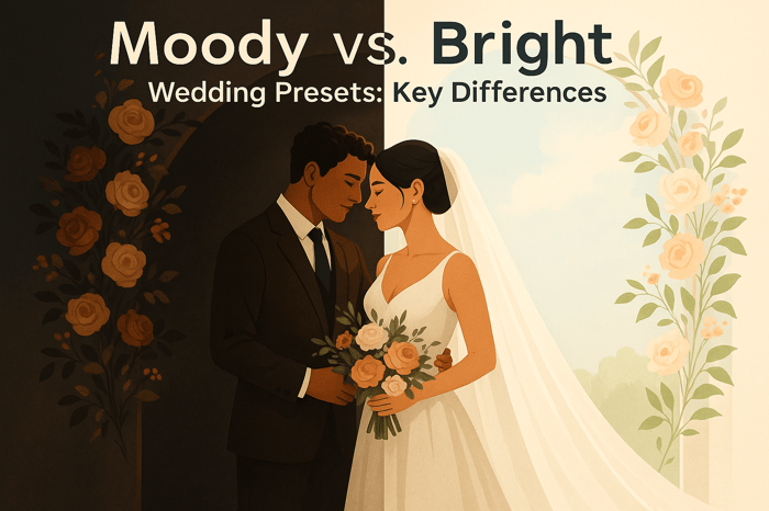
- Moody vs. Bright Wedding Presets: Key Differences
- Mastering Light & Airy, Moody, and Black & White Editing With ONE Lightroom Preset Collection!
- What Are Moody Wedding Presets?
- What Are Bright Wedding Presets?
- Moody vs. Bright Presets: Side-by-Side Comparison
- How to Customize Wedding Presets
- Conclusion
- FAQs
Moody vs. Bright Wedding Presets: Key Differences
When it comes to wedding photography, the editing style can completely transform how the day is remembered. The two most popular styles - moody and bright - offer distinct looks and emotional tones:
- Moody presets: Darker, dramatic, and cinematic. They emphasize deep shadows, rich tones, and muted colors, making them perfect for intimate settings like candlelit receptions or overcast outdoor shoots.
- Bright presets: Light, airy, and cheerful. They focus on soft highlights, lifted shadows, and vibrant colors, ideal for outdoor ceremonies, garden weddings, or venues with abundant natural light.
Quick Comparison
| Feature | Moody Presets | Bright Presets |
|---|---|---|
| Contrast | Bold, deep shadows | Soft, lifted shadows |
| Color Palette | Muted, earthy tones | Pastel, cool tones |
| Lighting | Dark, dramatic | Light, open |
| Emotional Tone | Intimate, cinematic | Joyful, romantic |
| Best Settings | Overcast, dim venues | Outdoor, natural light |
Choosing between these styles depends on the venue, lighting, and the couple's vision. Moody presets thrive in atmospheric settings, while bright presets shine in sunny, open spaces. Both can be customized using tools like Lightroom to match specific conditions and create a polished, consistent gallery.
Mastering Light & Airy, Moody, and Black & White Editing With ONE Lightroom Preset Collection!
What Are Moody Wedding Presets?
Moody wedding presets are designed to turn wedding photos into striking, dramatic images. They emphasize deep shadows and rich tones, creating a look that feels cinematic and full of emotion. Unlike the bright and airy editing styles, these presets lean into darker tones, giving photos a more intense and artistic vibe. Photographers often use this style to draw attention to key details in a scene by carefully controlling light and color. Instead of brightening everything evenly, moody presets maintain deep shadows and subtle highlights, naturally guiding the viewer’s eye to the most meaningful parts of the image. Let’s break down what makes this style so distinctive.
Visual Style
The hallmark of moody presets lies in their use of deep shadows, bold contrast, and muted colors. They create a darker, more dramatic aesthetic that feels both unique and intentional. Some preset collections even include cool, desaturated blues to add a distinctive edge.
Emotional Tone
This editing style goes beyond just visuals - it’s about creating a mood. Moody presets bring a sense of intimacy and timelessness to photos. Their subtle color choices and carefully balanced contrast give each image a sense of depth and artistry, making every captured moment feel significant and full of storytelling potential.
What Are Bright Wedding Presets?
Bright wedding presets are designed to give photos a light, airy, and inviting feel. They achieve this by increasing overall exposure, lifting shadows to retain detail, and applying soft contrast to reduce the heaviness in darker areas. The result? A photo that feels open and cheerful, perfect for capturing the timeless joy of a wedding day. This style is especially popular among photographers who work with natural light or outdoor settings, as it complements the brightness of the environment beautifully.
The key is in the balance. These presets ensure skin tones stay natural while creating a spacious and airy background. Whites and highlights are carefully adjusted to avoid losing important details - like the intricate patterns of a wedding dress or the subtle gradients of a bright sky.
Visual Style
The hallmark of bright presets lies in their use of lifted shadows and crisp whites. Whites are brightened just enough to enhance the image without losing texture, while the overall color palette leans toward pastel or slightly cool tones. Bold colors, like those in bouquets or décor, are softened to maintain a cohesive and elegant look. Greens - think grass or foliage - are often desaturated or adjusted to gentler hues, keeping the gallery visually harmonious.
Skin tones are handled with care to avoid unnatural color casts, ensuring subjects look their best. The contrast is moderate and soft, preserving details while adding depth and interest to the image. For example, Presets.io offers a Light & Airy Preset Collection, which is specifically crafted to enhance natural light with soft tones and professional color balance.
This clarity and balance create a visual style that feels fresh and timeless, perfectly suited for capturing wedding memories.
Emotional Tone
Bright presets are all about creating a joyful and optimistic mood. They highlight the warmth and happiness of the day, drawing attention to smiles, laughter, and heartfelt moments. This aesthetic is ideal for couples looking for images that feel classic and full of life.
The style shines in outdoor settings like garden ceremonies, beach weddings, or any venue with abundant natural light. It also works well in sunlit indoor spaces with large windows or white walls, as these environments enhance the clean, airy look. However, in darker settings - like candlelit receptions or venues with dramatic lighting - bright presets can sometimes struggle. They may introduce noise or flatten the atmosphere, making it harder to capture the intimacy of such moments effectively.
Still, when used in the right conditions, bright wedding presets deliver stunning results that beautifully reflect the joy and connection of the big day.

Luminar Neo Cross-Device Perpetual Desktop Software

$129.50
$159.00
Luminar Neo Cross Device Perpetual Desktop Software Luminar Neo is a visionary AI-powered photo editor that redefines creativity with cutting-edge technology. Effortlessly achieve studio-quality results with next-gen tools designed to empower and inspire. Harness the power of GenAI to erase… continue reading
sbb-itb-b27063b
Moody vs. Bright Presets: Side-by-Side Comparison
Take a closer look at how moody and bright presets differ to decide which style fits each wedding setting best.
Visual and Technical Differences
The choice between moody and bright presets comes down to the technical adjustments that shape the image's overall vibe and tell its story. These tweaks determine the emotional tone and aesthetic direction of the photos.
Moody presets lean into drama with bold contrast and rich shadows. They intentionally deepen the dark areas, creating a cinematic and dimensional feel. Typically, these presets favor slightly underexposed images, preserving highlights and enhancing the overall intensity. The color palette is grounded in muted, earthy tones like deep browns, olive greens, and warm oranges. A touch of grain often adds a film-inspired texture, while the white balance skews warm or neutral, giving the photos a cozy, intimate quality.
Bright presets, on the other hand, focus on softness and light. Shadows are lifted to retain detail, and exposure is pushed higher, resulting in a glowing, open atmosphere. These presets favor pastel hues, cool tones, and crisp whites, with minimal grain for a clean, polished aesthetic. Whites are brightened without losing texture, creating a sense of clarity and spaciousness. The overall look is fresh and light, emphasizing brightness over depth.
Here’s a quick comparison of how these choices impact the final image:
| Aspect | Moody Presets | Bright Presets |
|---|---|---|
| Contrast | Bold with deep shadows | Soft with lifted shadows |
| Color Palette | Muted and earthy | Pastel and cool |
| Lighting | Dark and dramatic | Light and airy |
| Emotional Impact | Intimate and cinematic | Cheerful and romantic |
| Skin Tones | Warm and muted | Fresh and luminous |
| Greenery | Deep olive or forest greens | Gentle, desaturated hues |
| Florals | Rich, saturated colors | Soft, harmonious tones |
These technical choices not only define the photo's appearance but also influence the emotions they evoke, aligning perfectly with the couple's vision for their wedding day.
When to Use Each Style
Deciding between moody and bright presets depends on the lighting, venue, and the overall tone the couple wants to capture. Knowing the strengths of each style helps photographers choose the right approach for different scenarios.
Moody presets excel in settings like overcast skies, golden hour, and dimly lit venues - think rustic barns, forest elopements, or candlelit receptions. They thrive in environments with directional light, such as through windows or dappled forest light, where shadows and rich tones can become part of the storytelling. For couples seeking photos that feel cinematic, edgy, or atmospheric, moody presets are the ideal choice.
Bright presets are perfect for outdoor ceremonies, beach weddings, or venues flooded with natural light. This style enhances the joy and openness of garden weddings, spaces with large windows, or daytime celebrations with soft, even lighting. However, in harsh midday sun or mixed lighting, photographers need to carefully manage highlights and white balance to avoid washed-out skin tones. Couples who want cheerful, romantic, and timeless photos that pop on social media and in albums will appreciate the airy, polished look of bright presets.
For example, at a candlelit reception or rustic barn, moody presets highlight the warmth of string lights and candles, while bright presets may struggle to capture the same ambiance. Conversely, at a midday outdoor ceremony, bright presets handle harsh shadows and maintain a soft, glowing feel, whereas moody presets might require extra care to avoid overly dense shadows. In an overcast forest elopement, moody presets complement the earthy tones and subdued light, while bright presets can add a whimsical touch.
Ultimately, the best choice depends on the couple's personality, wedding theme, and the story they want their photos to tell. With social media trends showing that couples often hire photographers based on consistent color grading, defining your style - and knowing when to use it - can help you attract the right clients and deliver galleries that resonate with their vision.
How to Customize Wedding Presets
Even the best presets need adjustments to match the unique lighting, colors, and mood of each wedding. Tweaking moody or bright presets ensures they align with your specific images while maintaining a consistent editing style throughout the entire gallery.
Using Lightroom Adjustment Tools
The Basic panel in Lightroom is your go-to for most customizations. Tools like Exposure, Contrast, Highlights, Shadows, Whites, and Blacks let you control the tonal range and brightness of your photos. For moody presets, you might lower the exposure, deepen the blacks, and boost contrast to create that cinematic, dramatic vibe. On the other hand, bright presets often benefit from lifted shadows, reduced contrast, and careful highlight adjustments to preserve details in areas like dresses or skies.
White Balance is key for keeping skin tones realistic. Moody presets often add warmth and earthy tones, which can sometimes make skin look overly orange or muddy. You can counter this by slightly cooling the temperature or adding a hint of magenta until the skin looks natural. For bright presets, which may lean cooler or pastel, increasing the temperature and subtly shifting toward green or magenta can restore balance and prevent washed-out or bluish tones.
Many photographers keep "skin-safe" preset variations on hand for quick adjustments to different lighting conditions.
The Presence controls - Texture, Clarity, and Dehaze - offer another layer of refinement. Moody presets often use a touch of Dehaze to add depth and atmosphere, while bright presets keep these settings minimal for a soft, clean look. The Tone Curve is especially useful for moody edits, as an S-curve can add depth without making the image look underexposed. For bright presets, a gentler curve helps maintain a light and airy feel.
The HSL/Color panel allows you to tweak individual color channels. This is particularly useful when greenery looks too intense with a moody preset or when floral colors appear too muted with a bright one. Many experienced photographers follow a consistent workflow with these tools, applying adjustments in the same order for every session. This helps maintain a cohesive style, even when blending moody and bright looks in a single gallery.
Adjusting Presets for Different Lighting Conditions
Once you’ve mastered basic adjustments, you’ll need to adapt your presets for various lighting scenarios. A moody preset that works beautifully during golden hour might need tweaks for a bright outdoor ceremony or a dim reception. Adapting presets to different lighting keeps your edits efficient and consistent.
Bright daylight often requires reducing contrast and lifting shadows in moody presets to avoid overly dark suits, hair, or foliage. Slightly reducing warmth can also prevent the image from feeling too heavy under strong sunlight. Many photographers save versions like "Moody – Outdoor Sun" to quickly match different parts of a wedding day while maintaining a cohesive look.
Dim indoor receptions allow moody presets to remain more contrast-heavy, with added warmth and a bit of Dehaze to enhance the glow of candles or string lights. A preset labeled "Moody – Indoor Tungsten" can handle these conditions without starting from scratch.
Bright presets excel in venues with natural light - think garden weddings, airy spaces with large windows, or daytime celebrations with soft, even lighting. For harsh midday sun or mixed lighting, reduce highlights, lift shadows, and adjust the temperature toward neutral or warm to retain detail while keeping the image light and open.
Open shade, which often introduces cool, bluish tones, can make bright presets look overly sterile. Warming the temperature and adding a hint of magenta can restore a natural, glowing feel. Mixed indoor lighting, with both tungsten and window light, may require selective white balance adjustments, sometimes using local tools to correct specific areas of the frame.
Controlling Preset Intensity
Fine-tuning a preset’s strength ensures consistency across a variety of images. Lightroom’s Amount slider lets you adjust a preset’s intensity, making it easier to adapt moody or bright looks to different lighting conditions. For moody presets, starting with a lower intensity - around 60–80% - is often safer. You can then manually add contrast or warmth to avoid overly dark shadows or extreme color shifts. Bright presets might start closer to 80–100% and can be scaled back if highlights or skin tones appear overdone.
The Amount slider acts as a global intensity control, but local adjustments can refine specific areas. Use a Brush to brighten faces, reduce clarity on skin, or bring back details in a dress that looks too dark or soft. Radial and Graduated filters can help subtly vignette a moody image or tone down a bright sky without affecting the overall preset intensity. These tools allow you to emphasize the subject while ensuring the surrounding scene supports the intended mood.
Combining global preset adjustments with targeted local edits helps you maintain your style while highlighting important details. Platforms like Presets.io offer curated collections across styles such as cinematic, vintage, and film-inspired looks. These collections provide a solid starting point for both moody and bright wedding aesthetics, which can then be tailored in Lightroom. This approach not only saves time but also allows for personal artistic expression and consistent results across entire wedding galleries.
Conclusion
Select preset styles based on how they shape the emotional tone of a wedding. Moody presets bring lower brightness, stronger contrast, earthy or muted color palettes, and prominent shadows that add depth and atmosphere. They evoke a cinematic, intimate, and reflective feel, perfect for capturing quiet moments, meaningful looks, and the sense of being in a world of your own. These presets shine in settings like autumn landscapes, forests, warehouses, or candlelit venues - places where shadows and textures enhance the mood.
On the other hand, bright presets emphasize higher exposure, soft contrasts, and pastel tones for an airy, glowing effect. They radiate joy, lightness, and optimism, showcasing big smiles, lively celebrations, and a sense of openness. This style works wonderfully for summer beach weddings, garden ceremonies under the midday sun, grand ballrooms with large windows, or backyard events filled with soft florals and pastel accents.
When choosing a preset style, consider the venue and overall mood: Is the space dark or sunlit? Does the vibe lean dramatic or lighthearted? Are the colors rich and deep or soft and pastel? If the answers point toward drama and shadows, moody presets are likely the best fit. For light, airy vibes and clean whites, bright presets are the way to go.
Photographers can combine both styles in a single gallery by designating one as the primary aesthetic and using the other selectively. For example, use bright presets for outdoor ceremonies and portraits, then switch to a moodier approach for candlelit receptions. The key is maintaining consistency within each scene so the gallery feels unified. This balance allows you to blend both approaches seamlessly while tailoring the overall look.
Keep in mind that presets are tools, not strict rules. Experiment with both moody and bright versions on a small batch of images before committing to one direction for the entire gallery. Create virtual copies or test collections to see how each style complements the couple’s story. Then refine the chosen look - adjust tone curves, HSL sliders, and color grading to make it uniquely yours. For example, you might keep richer greens in a moody preset or tone down overly warm highlights in a bright one, ensuring the final result feels personal rather than generic.
For photographers looking for a starting point, Presets.io offers curated collections like Wedding, Moody Blue, and Light & Airy, all priced around $12.00 per pack. These collections provide a solid foundation while leaving room for customization.
Before each shoot, evaluate the venue, lighting, and couple’s preferences. Define the desired tone in a single phrase, such as "intimate and cinematic" or "light and joyful." Choose or tweak presets to align with that vision from start to finish. By taking this thoughtful approach, you transform the choice between moody and bright into a deliberate creative decision, ensuring the final gallery feels cohesive, intentional, and true to the couple’s story.
FAQs
What’s the difference between moody and bright presets for wedding photos, and how do I choose the right one?
When it comes to wedding photos, the vibe you want to capture plays a big role in choosing between moody and bright presets. Each style tells a different story. Moody presets bring depth and drama with rich tones, deep shadows, and earthy hues, giving your photos an artistic and intimate feel. On the other hand, bright presets focus on light, airy tones, soft highlights, and vibrant colors, creating a cheerful and timeless look.
To make the best choice, think about the mood of your wedding day, the lighting at your venue, and your personal preferences. Moody presets work beautifully for outdoor or rustic weddings, enhancing natural textures and raw emotions. Bright presets, however, are great for sunny, lively celebrations, emphasizing the joy and warmth of the occasion. If you’re not sure which to go with, try experimenting with a few options to see which style best aligns with your vision.
Is it possible to use both moody and bright presets in the same wedding gallery, and how can I create a cohesive look?
Yes, you can absolutely mix moody and bright presets in a single wedding gallery, but the key is to keep the overall look consistent. One way to do this is by organizing the photos based on their theme, setting, or mood. For instance, bright presets work beautifully for outdoor daytime shots, while moody presets can add depth to those intimate evening moments.
To tie everything together, make sure adjustments like white balance and exposure are consistent across all images, no matter which preset you’re using. This approach helps create a unified gallery while letting each preset’s unique style shine. Take your time to experiment and fine-tune until everything feels just right for your storytelling vision.
How can I adjust wedding presets to suit different lighting conditions at the venue?
To tailor wedding presets for different lighting scenarios, begin by adjusting the exposure and white balance to align with the ambient light. For darker or moodier settings, consider brightening the shadows slightly or refining the highlights to create a balanced contrast. In well-lit environments, tone down the highlights and fine-tune the temperature to achieve a harmonious balance between warm and cool tones.
Dive into the tone curve for more detailed refinements, and use selective edits to address specific parts of the image that need extra attention. Always test your adjustments on a handful of sample photos to ensure the final look remains consistent throughout the entire gallery.