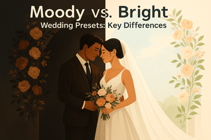

Table of Contents
Common Issues with Portra Presets
Portra presets aim to replicate the soft, warm aesthetic of Kodak Portra film, but they often require adjustments to work well with different lighting conditions, cameras, or shooting styles. Common problems include:
- Overexposed highlights: Bright areas like skies or skin tones may lose detail.
- Inconsistent skin tones: Colors can shift to orange, magenta, or green in mixed or harsh lighting.
- Crushed shadows: Shadow details may disappear, making images look overly dark or flat.
These issues arise because presets are designed with specific assumptions about lighting and color. To fix them, adjust exposure, white balance, and shadow settings in editing software like Lightroom. Start with well-lit, evenly exposed photos for better results, and tweak the preset settings to suit your style. Using RAW files instead of JPEGs also provides more flexibility.
For better consistency, choose presets designed for your camera and lighting conditions, such as those from platforms like Presets.io. While presets are a helpful starting point, small manual adjustments can make all the difference in achieving a polished, film-like look.
How to Fix Lightroom Presets that DON'T Work!

Common Problems with Portra Presets
Portra presets are popular for their ability to emulate the classic film aesthetic, but they often come with challenges that can disrupt the intended look. Understanding these common issues - and how they affect your photos - can help you make the necessary adjustments for consistent results.
Overexposure and Washed-Out Highlights
One of the biggest hurdles with Portra presets is handling brightness in scenes with a wide range of light and dark areas. These presets are designed to brighten images to mimic Kodak Portra's soft, airy feel, but in bright settings, this can lead to overexposure.
Take a wedding portrait shot in bright sunlight, for example. Highlights can blow out, turning skies into flat white patches and stripping lighter skin tones of their natural texture and depth. Specular highlights - like sunlight reflecting off a surface - become harsh white blobs, with no details left to recover. This isn't just a stylistic issue; it's a technical one. Once highlights are blown, the lost information can't be restored, no matter how much editing you do. Skin, fabric, and cloud textures disappear, leaving portraits looking artificial and landscapes lifeless.
The problem gets worse if you're already shooting slightly overexposed in-camera, which many photographers do to achieve a film-like look. Combine that with a preset that lifts brightness even further, and what seemed balanced on your camera's screen can turn into an overexposed disaster once the preset is applied.
Color Mismatches and Inconsistent Tones
Portra presets are celebrated for their ability to add warmth and shift colors subtly, recreating the signature tones of film. They typically enhance greens, blues, and skin tones to produce that sought-after "Portra glow." While this works beautifully in soft, natural daylight - the lighting these presets are typically designed for - it can fall apart in more complex lighting situations.
Imagine an indoor scene with a mix of warm tungsten lights and cooler window light. The preset's warmth can push skin tones into unnatural orange or magenta shades, while shadows may pick up muddy or greenish tones that feel out of place. Even within the same session, applying the same preset can result in noticeable differences in color casts across images, disrupting the cohesive look that professional photographers aim for.
This inconsistency is especially problematic in portrait, beauty, and wedding photography, where accurate skin tones are non-negotiable. Clients will notice if their skin looks too orange in one photo and too gray in another, which can undermine confidence in your work. The issue stems from the fixed color and white-balance settings baked into many presets. They assume you're starting with daylight-balanced RAW files that have neutral or slightly warm tones. But when your actual lighting conditions deviate - whether it's neon signs, fluorescent lights, golden-hour backlight, or overcast skies - the preset's adjustments can produce unnatural results.
Loss of Detail in Shadows
Another common issue with Portra presets is the loss of detail in shadows. These presets often deepen shadows through curves and black-level adjustments, which can crush intricate textures into solid black areas. This is particularly frustrating when you've exposed your RAW files carefully to retain shadow detail, only to see it vanish after applying the preset.
When shadow details are lost, it can strip an image of its storytelling elements and emotional depth. Details near the black point can disappear entirely, turning important parts of the composition into featureless dark blobs. This can make prints feel overly heavy or muddy and, in some cases, render photos unsuitable for clients or publication - especially when shadow detail is critical to the story or mood of the image.
This issue can vary depending on your camera brand and sensor profile. For instance, the same Portra preset might handle shadows differently on a Canon file compared to a Sony or Nikon file, as each brand's RAW profile interprets shadow tones uniquely. If a preset was primarily designed and tested on one camera system, it might crush shadows more aggressively when used on another.
If you notice recurring problems like blown highlights, unnatural skin tones, or crushed shadows across multiple shoots, the preset settings may simply be too aggressive for your style or equipment. To address this, consider presets from professional sources like Presets.io, which offer more balanced adjustments and detailed guidance for tweaking settings based on your shooting conditions. These resources provide a better starting point, helping you avoid extreme issues and achieve more polished results right from the start.
How to Fix Portra Preset Problems
After spotting issues with your Portra preset - whether it's blown highlights, unnatural color casts, or crushed shadows - the next step is making precise adjustments in Lightroom. These tweaks help retain the soft, film-like quality and natural skin tones that define the Portra look. Here’s how to tackle common problems with practical, repeatable steps.
Adjusting Exposure Levels
If your Portra preset results in overexposed images, resist the urge to drastically lower the Exposure slider. Big adjustments can flatten your image and strip away the preset’s airy, delicate feel. Instead, take a more measured approach.
Start by checking the Lightroom Histogram for spikes on the right side, which indicate blown highlights. Turn on the highlight clipping warning (the triangle icon in the Histogram) to pinpoint areas with no recoverable detail.
- Lower the Exposure slider in small steps, between -0.10 to -0.30 stops, until midtones look natural without becoming muddy.
- Adjust the Highlights and Whites sliders to recover details in bright areas like skies, wedding dresses, or sunlit skin. Lower the Whites slider more than the Highlights slider to bring back detail without losing the soft, elevated brightness that Portra presets are known for.
After balancing the exposure, check the Tone Curve panel. Portra presets often include a gentle S-curve that lifts blacks and softens highlights to create a low-contrast, film-like effect. If your image looks too flat after adjusting exposure, slightly deepen the curve to restore some contrast while keeping the overall softness intact.
Avoid using global Contrast or Clarity adjustments during this process, as they can make your image look harsh and overly digital. Instead, let the Tone Curve handle subtle refinements.
Fixing White Balance and Color Grading
Once exposure is sorted, the next step is correcting color tones. Portra presets can sometimes produce inconsistent skin tones or color casts, especially if your lighting conditions don’t match the preset’s assumptions.
Start with the White Balance selector (eyedropper tool) to neutralize color casts. Click on a neutral gray or white area in your image to establish a clean baseline. Then, fine-tune the Temperature and Tint sliders in small increments until skin tones look natural and believable.
If needed, you can reintroduce some of the preset's warmth or coolness by slightly adjusting the Temperature slider. Be cautious - your goal is to maintain the Portra aesthetic without reintroducing the problems you just fixed.
For targeted color corrections, use the HSL/Color panel. Focus on the Orange, Yellow, and Red channels, as these control most skin tone information. Adjust the Hue, Saturation, and Luminance sliders carefully to fix any unwanted color shifts while keeping saturation levels moderate. Portra presets are known for their muted, pastel-like tones, so over-saturating can make your edits look unnatural.
If shadows or highlights have unwanted tints (e.g., green shadows or magenta highlights), use the Color Grading panel to subtly reduce or shift those tones. The key here is subtlety - small adjustments go a long way in preserving the preset’s cohesive palette.
For consistent results, consider setting a custom white balance during your shoot using a gray card or a specific Kelvin value. Different cameras interpret colors and shadows differently, so also ensure you’ve selected the correct camera profile or calibration setting in Lightroom before applying the preset.
In mixed lighting scenarios, create separate virtual copies for each lighting condition. Adjust White Balance and HSL settings individually for each copy, then sync those tailored corrections across similar images. This approach is far more effective than trying to force a single preset to work across an entire shoot.
Recovering Shadow Details
If the preset crushes your shadows into pure black, it’s time to recover those details. Deep shadows can add emotional depth, but losing all detail sacrifices storytelling.
Check the left side of the Histogram for shadow clipping (indicated by a spike or the shadow clipping warning triangle). To fix this:
- Start by raising the Shadows slider to reveal mid-dark details without over-brightening the deepest tones.
- If the darkest areas are still too black, adjust the Blacks slider incrementally. Watch the Histogram to avoid overcorrecting and making the shadows too bright.
If the image starts looking flat after these adjustments, add a small amount of Dehaze or slightly increase Contrast to restore depth. These tweaks help maintain the soft shadow rolloff that’s characteristic of the Portra aesthetic.
For specific problem areas - like a face in shadow or a dark corner - use local adjustment tools like the Radial Filter, Graduated Filter, or Adjustment Brush. These allow you to brighten specific regions without affecting the rest of the image.
| Problem After Applying Portra Preset | Likely Cause | Practical Fix in Lightroom |
|---|---|---|
| Greenish shadows or muddy dark areas | Underexposure combined with preset color shifts or camera profile behavior | Increase Exposure and Shadows, adjust Tint toward magenta, tweak Green channel in HSL/Calibration, and refine Tone Curve shadows |
To maintain consistency across a shoot, start by correcting a representative "anchor" image. Refine the exposure, white balance, and shadow details on this photo first, then sync those adjustments to similar images. You can even save a customized version of the preset for future use, ensuring your edits remain consistent and efficient.
For photographers who want to minimize corrective work, consider using Portra presets from trusted sources like Presets.io. Their film-inspired packs are designed for both Lightroom desktop and mobile, with clear installation guides and examples across different lighting conditions. Look for presets that are marketed as flexible starting points rather than one-click fixes. This way, only minor adjustments to exposure, white balance, and shadows will be needed, saving you time while keeping your edits true to the Portra aesthetic.

Luminar Neo Cross-Device Perpetual Desktop Software

$129.50
$159.00
Luminar Neo Cross Device Perpetual Desktop Software Luminar Neo is a visionary AI-powered photo editor that redefines creativity with cutting-edge technology. Effortlessly achieve studio-quality results with next-gen tools designed to empower and inspire. Harness the power of GenAI to erase… continue reading
sbb-itb-b27063b
Best Practices for Using Portra Presets
Getting the most out of Portra presets isn’t just about applying them; it’s about using smart shooting and editing techniques to avoid common pitfalls. By following these strategies, you can reduce the need for heavy corrections later.
Choosing the Right Photos for Portra Presets
Portra presets are designed to mimic the soft, pastel tones and gentle contrast of Kodak Portra film. To get the best results, start with photos that share these qualities - balanced exposure and consistent, soft lighting.
Soft, even lighting is your best friend here. Scenarios like open shade, overcast skies, or golden hour provide the gentle illumination that complements the Portra aesthetic. On the other hand, harsh midday sunlight can create extreme highlights and deep shadows, which might lead to blown-out whites or crushed blacks when the preset is applied. For portraits, try using window light or diffused outdoor lighting to maintain the natural skin tones that Portra is known for.
It’s also important to keep your lighting consistent. Mixed lighting - like a room lit by both daylight and tungsten bulbs - can result in odd color casts when the preset adjusts hues. Stick to scenes with a single light source, and avoid heavily underexposed images, as these can exaggerate unwanted artifacts when edited with Portra presets.
Another tip: set a neutral white balance before you start editing. This gives you a clean slate and prevents extreme color shifts when the preset’s tone adjustments kick in. Many preset packs now include variations tailored to specific conditions, such as "Portra Soft Light" or "Portra Indoor", so you can match the preset to your shooting environment. Once you’ve selected your photos, small custom tweaks will help you make the most of the preset.
Customizing Presets for Your Style
Think of presets as a starting point, not the final edit. After applying a Portra preset, fine-tune settings like exposure, contrast, and white balance to suit each image. This is especially important when working with different lighting conditions or camera sensors, as relying solely on the preset can lead to uneven results.
For natural skin tones, adjust white balance and HSL (hue, saturation, luminance) sliders as needed. Since Portra presets favor muted, pastel tones, make subtle changes rather than cranking up the saturation.
To streamline your workflow, create custom variations of the preset. For example, save a slightly brighter version for high-key images, a darker one for moodier shots, and warmer or cooler versions for indoor and outdoor lighting. This approach gives you a flexible toolkit, reducing the need for extensive edits on every photo.
For consistency across a shoot - like a wedding or portrait session - sync your edits across similar images. Start by perfecting one “anchor” image, then apply those settings to photos with comparable lighting and composition. This ensures your gallery has a cohesive look without requiring you to edit each photo from scratch. For extra convenience, check out professionally crafted presets at Presets.io.
Using Presets.io for High-Quality Options

If you’re searching for professionally designed Portra-inspired presets, Presets.io has you covered. Their Kodak Portra Preset Collection is tailored to work with various lighting conditions and camera brands, giving you the flexibility to adapt to different scenarios.
Presets.io’s collections are designed as adaptable starting points rather than one-size-fits-all solutions. They come with clear installation guides and regular updates, making them easy to integrate into your workflow. Whether you’re aiming for an aesthetic, cinematic, or vintage look, you can browse their options to find presets that align with your editing style.
Using reliable, high-quality presets from a trusted source like Presets.io can help you avoid common issues like overexposure, color mismatches, and shadow clipping. Plus, they’re designed to seamlessly blend into your editing process, giving you polished results with minimal effort.
Conclusion
Portra presets offer a soft, film-inspired aesthetic, but they often need some fine-tuning to truly shine. A reliable workflow can make all the difference: start by adjusting exposure, then move on to white balance and color, and finally recover shadows. This sequence works well in Lightroom Classic or any mobile editing app, giving you a consistent process to turn Portra presets into a dependable foundation for your edits.
While presets handle most of the stylistic work - about 90% - it's that remaining 10% of personal tweaks, such as brightness, temperature, and contrast, that make the final edit uniquely yours. Experimenting is key. Try editing photos taken in different lighting conditions, like harsh sunlight, mixed indoor lighting, or golden hour. Use virtual copies of the same image to test small changes in exposure, warmth, and shadow recovery. This hands-on practice helps you understand how the preset reacts in various scenarios and reveals the adjustments that work best for your style.
Improvement comes with time and repetition. Even high-quality Portra presets, like those from Presets.io, which are designed to work across different cameras and lighting conditions, may require adjustments to suit your specific setup. These presets are often based on photos taken in controlled environments, so tweaking exposure and color is a normal part of the process. Consistently applying the same preset pack across multiple shoots is the best way to refine your editing skills and achieve polished, professional results.
The secret to standout Portra edits lies in combining the preset with your own subtle, repeatable adjustments - whether it's your favorite contrast level, a slight warmth adjustment, or a specific grain intensity. Save these tweaks as custom presets or default settings to create a personalized, branded look over time. Whether you're editing on a desktop or a mobile device, the approach remains the same: zoom in on skin tones and key details to ensure your edits look great on high-resolution displays.
Portra presets work best with images that are well-exposed, feature soft or even lighting, and have natural skin tones - think shaded portraits or overcast outdoor scenes. If a preset doesn't work well with a particular photo due to mixed lighting, strong color casts, or extreme underexposure, start by adjusting the base edit or switch to a preset better suited for the scene. Mastering Portra presets is an ongoing process, not a one-time setup. With each edit, you'll gain more control, transforming your work into a signature Portra style that reflects your unique vision. Apply these steps to elevate your next shoot and bring your edits to life.
FAQs
How do I avoid overexposed highlights when using Portra presets in bright lighting?
To prevent highlights from appearing too bright, start by tweaking the Exposure and Highlights sliders in your editing software after applying the Portra preset. You can also lower the Whites slider to recover details in areas that seem overly bright.
If the photo still looks too bright, try reducing the overall exposure slightly before applying the preset. This is especially helpful for images shot in harsh sunlight. These adjustments ensure the natural, balanced aesthetic that Portra presets are loved for.
How can I adjust Portra presets to ensure consistent skin tones in photos with mixed lighting?
Achieving consistent skin tones in mixed lighting with Portra presets often takes a bit of tweaking. Start by adjusting the white balance to counter any color shifts caused by varying light sources. Use the temperature and tint sliders to bring skin tones to a natural and balanced look.
If the tones still seem off, head to the HSL (Hue, Saturation, Luminance) panel. Pay close attention to the orange and red tones, as these are the primary colors affecting skin. A slight decrease in saturation or a small tweak to luminance can help smooth out inconsistencies and create a more cohesive appearance.
Finally, don’t forget to check the exposure levels. Overexposure can bleach out skin tones, while underexposure can leave them looking flat or lifeless. Make subtle adjustments to the exposure and contrast sliders to achieve a polished, natural finish.
Why do Portra presets sometimes cause shadows to lose detail, and how can I fix this?
Portra presets aim to replicate the gentle, film-like qualities of Portra film. However, this can sometimes result in shadow areas appearing overly dark or losing detail. This effect often stems from contrast or tone curve adjustments that emphasize a specific aesthetic.
To bring back shadow details, tweak the Shadows or Blacks sliders in Lightroom or your preferred editing software. Increasing these sliders can restore hidden details without disrupting the preset's overall vibe. You can also adjust the Exposure or Contrast settings to achieve a balanced image while keeping the film-inspired look intact. Remember, subtle changes are key to preserving the preset’s signature style.