

Table of Contents
Lightroom Preset Stacking Order Guide
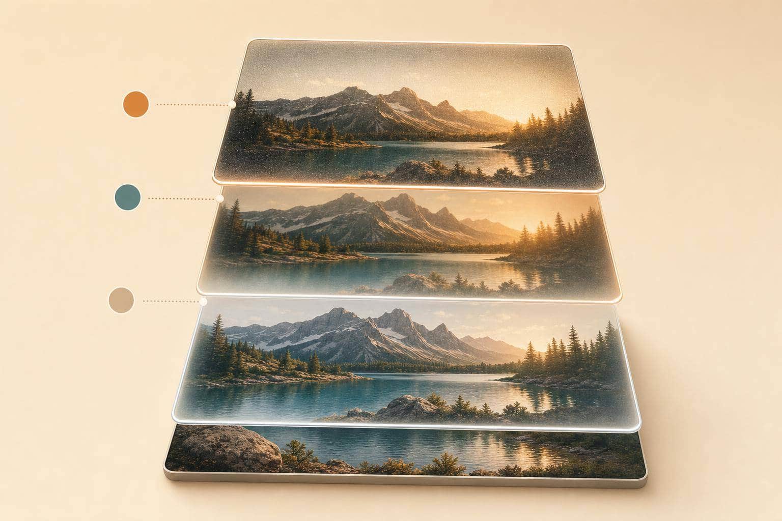
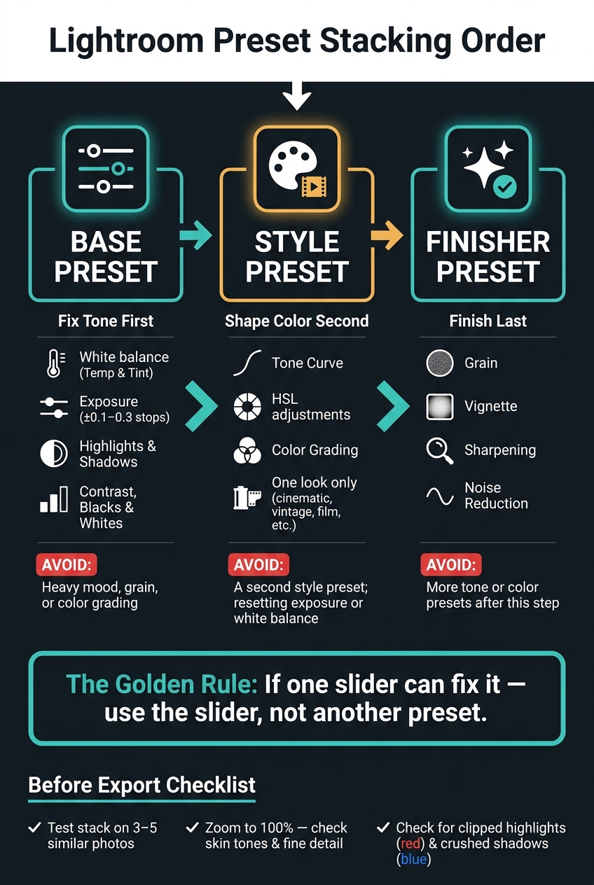
Preset order changes the final photo. In Lightroom, the last preset you apply can overwrite the same sliders from the one before it, so the safest order is base → style → finisher.
If I want clean, repeatable edits, I keep it simple:
- Base first: fix white balance, exposure, highlights, shadows, and contrast
- One style preset next: set the main look with tone and color work
- Finisher last: add grain, vignette, sharpening, and noise reduction at the end
- Stop stacking when one slider can fix the problem
- Check skin tones, clipped highlights, and crushed shadows before export
A few numbers matter here. Small exposure moves of ±0.1 to 0.3 stops are often enough after the base preset. I also test the same stack on 3 to 5 similar photos, then zoom to 100% to catch skin tone drift, detail loss, or rough sharpening.
If you remember one thing, make it this: fix tone first, shape color second, finish last. That one rule cuts down on muddy contrast, odd color shifts, and edits that seem to vanish.
| Step | What I apply | What I avoid |
|---|---|---|
| Base | White balance, exposure, highlights, shadows, contrast | Heavy mood or grain |
| Style | One look preset with Tone Curve, HSL, Color Grading | A second style preset |
| Finisher | Grain, vignette, sharpening, noise reduction | More tone/color presets |
That’s the whole system. Simple stack, fewer conflicts, cleaner results.
Lightroom Preset Stacking Order: Base → Style → Finisher
How to Layer Multiple Presets Together in Lightroom
sbb-itb-b27063b
A Simple Stacking Workflow: Base, Style, Finisher
Use a simple three-step stack: base, style, finisher.
Apply a Base Preset First to Fix Exposure and White Balance
Start with correction, not mood. Your base preset should stay technical. Its job is to give you a clean starting point by fixing exposure, highlights, shadows, contrast, and white balance.
That neutral setup matters more than people think. If you skip it, the next preset can end up fighting a color cast or pushing shadows too far.
After you apply the base preset, make a few small manual tweaks. In most cases, ±0.1–0.3 stops of exposure is enough to get the image into balance. Then adjust Temp and Tint until skin tones and neutral areas look natural. It takes an extra minute, but it can save a lot of back-and-forth later.
Add One Style Preset Next to Set the Look
Once the photo is corrected, add one style preset to set the main look. That might be cinematic, vintage film, bright and airy, or dark and moody.
A style preset should mostly shape the image through Tone Curve, HSL, and Color Grading. It should not reset white balance or exposure. That's why this step works best after the base preset is already in place.
Using more than one style preset usually creates a mess. A film look stacked on top of a cinematic preset, for example, can undo tone and color work from the first one. The result is often muddy contrast and odd color shifts. Pick one look, then leave it alone.
Apply Grain, Vignette, and Sharpening Last
Finishing effects go last because they depend on tones and colors that are already set. Add grain, vignette, sharpening, and noise reduction only after the base and style steps are done.
If you sharpen before adding a high-contrast style preset, that extra contrast can make edges look harsh or crunchy. If you add heavy grain too early, later tone changes can make the grain look uneven.
Presets.io cinematic, vintage, and film presets fit naturally into the style step.
To make batch editing faster, label your Lightroom preset folders like this:
- Base
- Style
- Finisher
That same order maps directly to the Lightroom adjustments in the next section.
The Right Order for Common Lightroom Adjustments
That same order shows up inside Lightroom’s panels too. Think of it like this: fix tone first, shape color second, finish last. If you jump ahead, the later steps can get messy fast.
Set White Balance, Exposure, and Contrast Before Color Grading
Start the Basic panel in this order: white balance → exposure → highlights/shadows → contrast and black/white points.
Why this order? Because Color Grading tends to magnify problems that are already there. If your image is too warm, too dark, or flat to begin with, grading usually makes those issues stand out even more.
Get the tone stable first. Then move into color work.
Place Tone Curve and HSL Adjustments Before Split Toning or Color Grading
Apply Tone Curve and HSL before Color Grading so tonal edits don’t throw off your color separation later.
Here’s the simple idea: later edits can override shared controls. So if you lock in tone and color channels first, your grading is easier to control and a lot more predictable.
After that, move into the finishing touches.
Add Grain, Vignette, Noise Reduction, and Sharpening Near the End
Add finishing effects last because they depend on the full edit. Leave grain, vignette, noise reduction, and sharpening for the end.
That way, each finishing choice is based on the image as it will actually look at the end, not while it’s still changing.

The Ultimate Lightroom Preset Bundle – 1,291 Presets + Video LUTs
$89.00
$1,662.00
The Ultimate Presets.io Bundle combines The Master Preset Bundle Volume I and The Master Preset Bundle Volume II into one complete collection, giving you every editing style you need in a single download. Save $37 vs. Volume I and II… continue reading

Step-by-Step Stacking in Lightroom Classic and Mobile
The same base → style → finisher order works in both Lightroom Classic and Lightroom Mobile.
Lightroom Classic: From First Preset to Final Polish
Open your photo in the Develop module. Start with your base preset, then check the histogram and clipping indicators to see whether you’re losing shadow or highlight detail. In Lightroom Classic, clipped shadows show as blue overlays and clipped highlights show as red overlays, so it’s smart to turn those indicators on before you move ahead.
When the base looks steady, add one style preset to shape the look of the image. If it comes on too strong, use the Preset Amount slider to pull it back instead of tweaking a bunch of sliders by hand. After that, add a light finisher preset. Then take one more look at skin tones and shadows before export.
Lightroom Mobile: Adjusting Intensity Between Each Step
Lightroom Mobile follows the same order, but on a smaller screen, edit strength matters even more. Apply your base preset first. Then make quick fixes in the Light and Color panels to set exposure and color temperature. Next, add your style preset and lower the Amount slider if the edit feels too heavy.
Add a finisher only after the look is locked in.
How to Avoid Overediting and Know When to Stop
Warning Signs Your Preset Stack Is Causing Color Shifts or Muddy Contrast
Once your stack is in place, the next step is simple: watch for drift.
The most obvious sign that a stack has gone too far is unnatural skin tone. If skin starts leaning too orange, magenta, or green, there's a good chance overlapping HSL or Color Grading edits are pushing against each other. Another pair of red flags: crushed shadows and clipped highlights.
In Lightroom Classic, press backslash (\) to check before and after. Then zoom to 100% and look closely at a face and the darkest shadow. If skin looks too smoothed out or fine detail starts to vanish, the stack needs to be cut back.
It also helps to test the same stack on 3–5 similar photos. If the look shifts too much from image to image, the stack isn't stable enough to trust.
When to Fine-Tune the Current Edit Instead of Adding Another Preset
If one setting is clearly causing the issue, fix that setting instead of piling on another preset.
That’s the rule of thumb here: if one slider can fix it, use the slider.
A few common examples:
- Too warm: adjust Temp or Orange HSL
- Too much contrast: ease back the Tone Curve or Blacks
Once your base + style + finisher stack is set, treat the remaining problems as small edit work, not a reason to keep auditioning more presets. At that point, adding another preset usually makes things messier, not better.
Conclusion: Keep Your Stack Simple and Repeatable
The goal is a stack you can reuse without surprises. Stop when the image feels consistent, repeatable, and done.
FAQs
Can I stack more than one style preset?
Yes. Start with a base style preset for the overall tone and color, then add other presets for more specific refinements.
You can also stack multiple adaptive presets. Each one creates its own mask, so the effects blend cleanly. Just don’t pile them on without checking the image. Lower the intensity and make manual tweaks as needed so the final result doesn’t look unnatural or overprocessed.
What if a preset changes exposure or white balance too much?
Lower the preset’s intensity with the global Amount slider. Since exposure and white balance can shift a lot based on the light in the shot, it also helps to first get your photo to a neutral starting point before you apply the preset.
If needed, you can then fine-tune exposure and white balance on their own in the Basic panel. Another option is to use presets that leave those settings alone.
How do I know when to stop adding presets?
Stop adding presets when the image already looks polished and natural, and still feels like your style instead of something pushed too far.
Watch for signs of over-editing:
- Unnatural halos
- Crushed shadows
- Blown highlights
- Oversaturated colors
It also helps to check the histogram for data loss or uneven peaks. If the edit feels too strong, pull back the Amount slider - ideally to under 40.