

Table of Contents
- 7 Instagram Grid Preset Ideas for Photo Styles
- How to CRUSH your Instagram GRID Layout 2025
- Quick Comparison
- How to Match Presets to Photo Styles and Grid Goals
- 1. Skin Tone Balance
- 2. Contrast and Mood
- 3. Color Consistency
- 4. Grid Cohesion
- Quick Comparison Table for Grid-Friendly Preset Styles
- Final Thoughts on Choosing a Preset for Your Feed
- FAQs
7 Instagram Grid Preset Ideas for Photo Styles
Your Instagram grid looks better when one edit style runs through every post. I’d keep it simple: test each preset on 6–9 photos, check the thumbnails first, and drop any preset that looks off on 33% or more of the set.
Here’s the short version:
- I’d match each preset to subject, mood, main edit focus, and how well it repeats
- For portraits and weddings, I’d watch skin tone first
- For street and film-style edits, I’d lock in contrast, shadows, and grain
- For food, I’d fix white balance and color
- For travel, I’d keep sky, land, and skin in the same color range
- I’d use one main preset plus 1–2 backup looks in the same color family
- Before posting, I’d test the look on 9–12 images in Instagram grid view
What matters most is not making every photo look the same. It’s making portraits, travel, food, weddings, street shots, film-style edits, and phone edits feel like they belong on one feed.
How to CRUSH your Instagram GRID Layout 2025
sbb-itb-b27063b
Quick Comparison
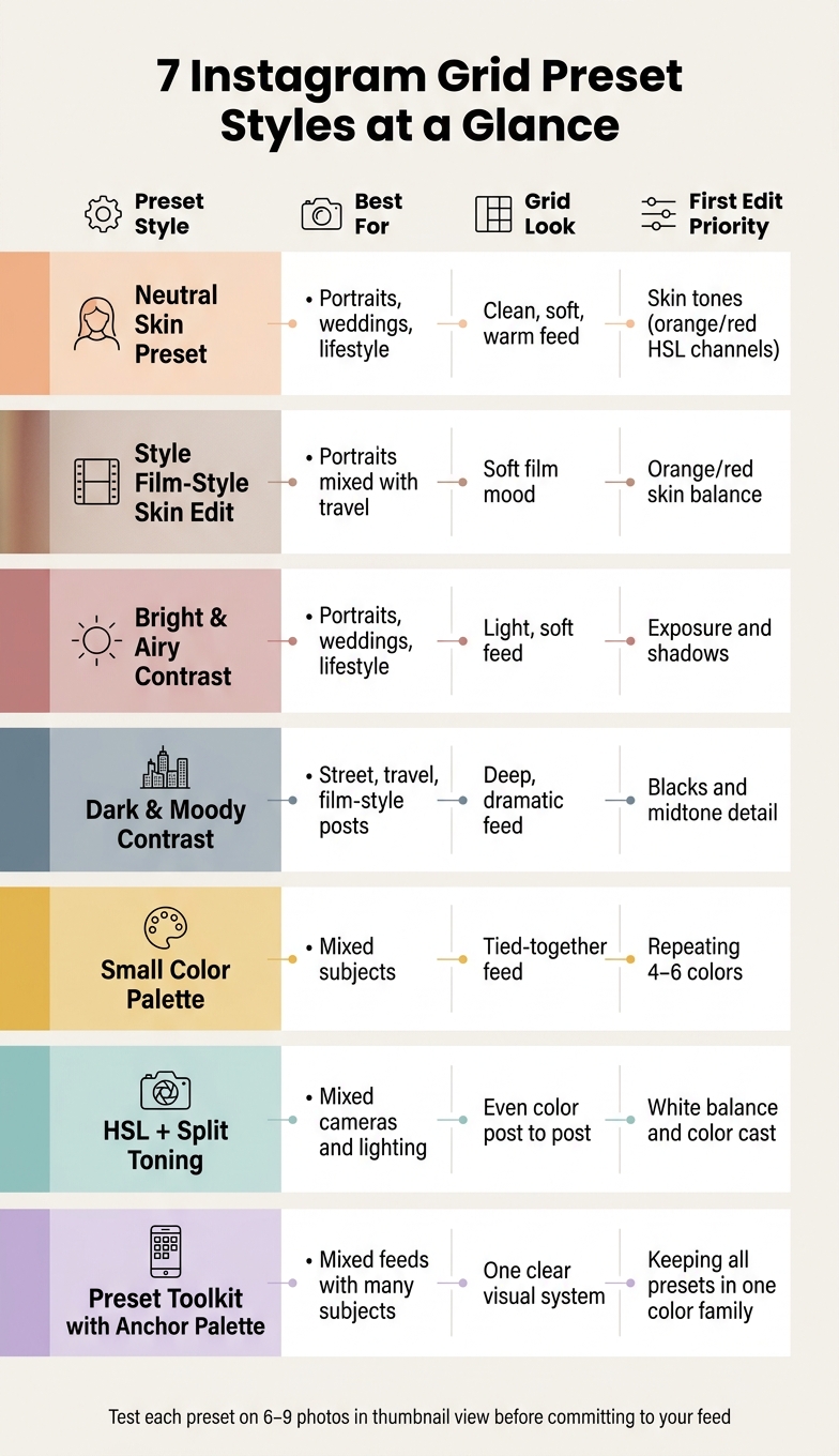
7 Instagram Grid Preset Styles: Quick Comparison Guide
| Preset idea | Best for | Grid look | First thing I’d fix |
|---|---|---|---|
| Neutral skin preset | Portraits, weddings, lifestyle | Clean, soft, warm | Skin tones |
| Film-style skin edit | Portraits mixed with travel | Soft film mood | Orange/red skin balance |
| Bright and airy contrast | Portraits, weddings, lifestyle | Light, soft feed | Exposure and shadows |
| Dark and moody contrast | Street, travel, film-style posts | Deep, dramatic feed | Blacks and midtone detail |
| Small color palette | Mixed subjects | Tied-together feed | Repeating 4–6 colors |
| HSL + split toning | Mixed cameras and lighting | Even color from post to post | White balance and color cast |
| Preset toolkit with one anchor palette | Mixed feeds with many subjects | One clear visual system | Keeping all presets in one color family |
If I were building a grid from scratch, I’d start with skin, contrast, and color, then check how the whole feed looks in thumbnail view.
How to Match Presets to Photo Styles and Grid Goals
Use four checks for every preset: subject fit, overall mood, main edit priority, and repeatability across posts. Those four checks tell you if a preset can hold up across a mixed grid. They also make it much easier to choose the right preset for each photo style.
Start with subject fit first. This is the deal breaker. If a preset doesn't suit the subject, the rest doesn't matter. A look that feels great on a moody city street can make a wedding dress turn gray or push skin tones into muddy territory. The best way to test this is simple: apply the preset to 6–9 photos from the same style, then review the thumbnails, not the full-size previews. If a third or more of them look off, skip it.
Overall mood is the tone of your Instagram grid. That might be light and airy, dark and moody, warm, or neutral. Pick one lane and stick with it. Your brightness and contrast don't need to be identical on every post, but they should stay in the same general range so the Instagram grid feels connected.
Next comes your main edit priority. Give each style one clear focus:
- Skin tones for portraits
- Color accuracy for food
- Shadow detail for street
From there, treat the preset as a base. Make small, repeatable tweaks instead of rebuilding the edit from scratch every time. That's what helps mixed posts still feel like they belong together.
Portraits, street, food, travel, weddings, film look, and mobile edits all weigh these four checks a bit differently. Once you keep those checks in mind, the seven preset ideas below become much easier to compare.
The Ultimate Lightroom Preset Bundle – 1,291 Presets + Video LUTs
$89.00
$1,662.00
The Ultimate Presets.io Bundle combines The Master Preset Bundle Volume I and The Master Preset Bundle Volume II into one complete collection, giving you every editing style you need in a single download. Save $37 vs. Volume I and II… continue reading

1. Skin Tone Balance
Consistent skin tones make portrait-heavy posts feel like one Instagram grid, not a random mix of images. When skin shifts from post to post, thumbnails can look off next to each other, even if each photo looks polished on its own.
Idea 1: Use a Neutral Skin Preset as Your Base
A neutral skin preset keeps tones close to real life with soft contrast, moderate warmth, and restrained saturation. It works well for portrait, wedding, and lifestyle grids that need a clean, timeless look.
After you apply the preset, fine-tune the orange and red HSL channels. Those two channels do most of the skin-tone work. A good starting point:
- Orange Saturation: −10 to +10
- Orange Luminance: 0 to +15
Using the same HSL range across posts helps skin read the same way in thumbnails across the grid.
Idea 2: Adapt a Film Look Preset for Skin
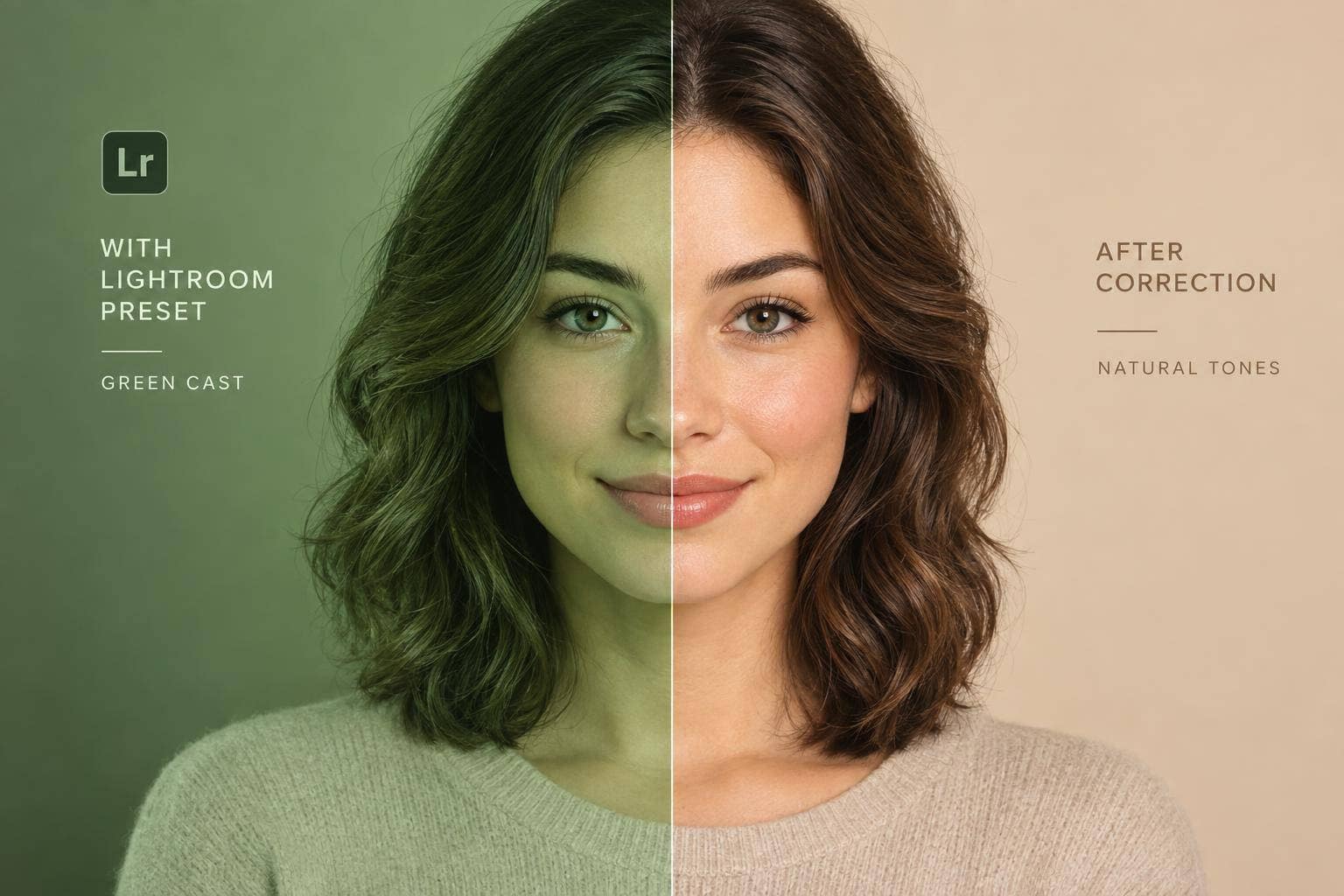
Film-inspired presets can push skin toward muddy tones or odd color casts. Pull preset strength down to 50–80%, then use HSL to bring back natural orange and red tones in the face.
That part matters more than it sounds. If you mix portrait and travel shots, repeatable skin correction is what keeps the grid from feeling disjointed. Use faces, not backgrounds, as your white-balance reference.
Once skin tones stay consistent, contrast becomes the next lever for grid mood.
2. Contrast and Mood
Contrast shapes the overall feel of your grid. It decides whether the feed looks light and open or dark and dramatic. The key is to pick one contrast direction for the whole feed, then make small post-by-post tweaks inside that same range.
Idea 3: Bright and Airy Contrast
Use low to medium contrast, lifted shadows, and soft highlights for portraits, weddings, and lifestyle posts. This look keeps images light without washing them out.
To hold that style across the grid:
- Slightly increase exposure and whites
- Lift shadows so dark areas don’t feel too heavy
- Add a gentle S-curve in the tone curve
A simple habit helps a lot here: reuse the same preset and change exposure only when needed. That keeps neighboring thumbnails in your Instagram grid looking even. If one post is much punchier than the next, the grid can feel a bit off. Keeping the same contrast range makes those lighter posts still look like they belong together.
Idea 4: Dark and Moody Contrast
A dark and moody preset fits street, film-look, and travel grids, especially in cities, forests, or sunset light. This style leans on lower blacks, stronger contrast, and a deeper S-curve. That mix gives shadows more weight while keeping midtones clear enough to hold detail.
You’ll often see cinematic and vintage preset packs use this same contrast profile. That makes it easier to keep the mood steady even when your feed includes different scenes, locations, or subjects.
After contrast is set, keep color treatment just as steady.
3. Color Consistency
After contrast, color is what holds the grid together. It's the part that makes your feed look planned instead of all over the place. The fix is simple: pick a small palette and stay with it.
Idea 5: Build a Signature Color Palette
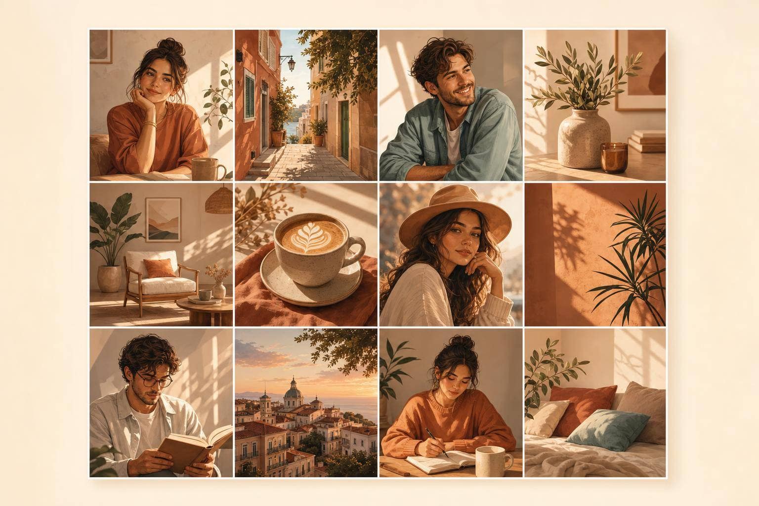
Build a 4–6 color palette with one main tone, two or three secondary hues, and one accent. That range is enough to keep portraits, travel, food, and wedding photos visually tied together on the grid without making everything look the same.
For portraits and weddings, that might mean warm neutrals with soft pastel accents. For street and travel, it could look more like muted greens, cool shadows, and one repeating accent such as teal. Food photos can fit that same system too, with warm browns, golden highlights, and gentle greens that don't fight the rest of the grid.
If a preset pushes colors outside your palette, skip it. A bright neon edit in a feed that's mostly muted and warm will stand out for the wrong reason.
Idea 6: Keep Colors Consistent with HSL and Split Toning
Use HSL and split toning to keep color steady across different cameras and lighting setups. Keep white balance and tint close from post to post. HSL helps you keep core colors, like sky blues, foliage greens, and skin tones, looking similar across portraits, street scenes, travel shots, and weddings.
Split toning adds the same warm or cool cast to highlights and shadows. That small move can tie together photos shot in very different places and lighting conditions. If you also mix in film-look or mobile edits, use the same grain and color cast across those posts too. It helps everything feel like it belongs in the same grid, which makes the next step, grid layout, much easier to control.
4. Grid Cohesion
Idea 7: Anchor Your Grid With One Signature Color Palette
Once you’ve locked in skin tones, contrast, and color, look at your Instagram grid as a whole. At that point, the job is simple: make those edits feel like they belong together.
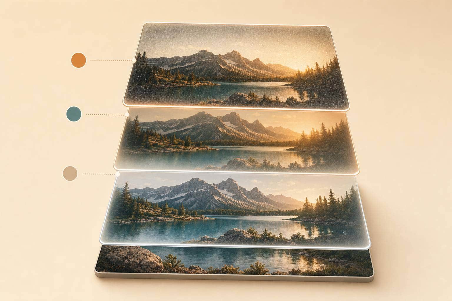
Pick one anchor palette and stick with presets that match it. A good rule is to choose 3–5 recurring tones - like warm neutrals, soft skin tones, and muted greens - and carry them through every post.
One easy way to do this is to build a preset toolkit. For example:
- one soft, skin-friendly preset for portraits and weddings
- one slightly higher-contrast option for street and travel
- one warm-toned preset for food
The key is that all three live in the same color family. That way, portraits, street shots, food, travel, weddings, film-look edits, and mobile content all fit inside one visual system. Instead of feeling scattered, the grid feels pulled together.
Preset families with the same base colors make this much easier to keep up over time. Presets.io's cinematic, vintage, and film-look collections work well for this approach because they keep different photo styles inside the same color family.
Use the table below to compare each preset style by grid use.
Quick Comparison Table for Grid-Friendly Preset Styles
Use this table to compare preset styles by subject, feed look, and what to fix first in the edit.
| Preset Style | Best Photo Style | Feed Look | First Edit Priority |
|---|---|---|---|
| Portrait – Skin Tone & Soft Detail | Individual portraits, couples, lifestyle content | Warm, inviting feed with accurate skin tones and soft backgrounds | Skin tone accuracy |
| Street – Grit & Contrast | Cityscapes, urban fashion, candid street photography | Bold, high-contrast feed with strong structure | Contrast and shadow detail |
| Food – Color & Clarity | Café posts, brunch shots, recipe content | Bright, colorful feed with neutral whites | White balance, vibrance on key ingredients |
| Travel – Atmosphere & Landscape | Destination highlights, landscapes, beach and city scenes | Balanced, atmospheric feed with unified tones | Dynamic range, color harmony across sky and land |
| Wedding – Romantic & Soft | Wedding photography, venues, bridal content | Soft, romantic feed with muted highlights and gentle warmth | Warmth and tint, highlight roll-off |
| Film Look – Vintage & Artistic | Editorial feeds, creative portfolios, lifestyle accounts | Stylized vintage feed with steady grain and soft color fades | Grain amount, tone curve for faded blacks |
| Mobile Edit – Fast & Flexible | Everyday lifestyle content, behind-the-scenes, brand feeds | Clean, polished feed with smoother exposure and color | Exposure and contrast fixes, noise reduction |
A quick pattern stands out here. Skin tones matter most for portraits, weddings, and travel. If those look off, the whole image feels off. For street and film looks, contrast and grain do more of the heavy lifting. Those are the details that shape the mood, so they need to stay steady from post to post.
If you edit on both desktop and phone, that can get messy fast. One photo gets polished on a laptop, the next gets tweaked on your phone in a coffee shop, and suddenly the grid starts drifting. That’s why tools that match across devices can help. Presets.io offers mobile presets and matching desktop collections, including cinematic, vintage, and film-look options, which makes it easier to keep one look across desktop edits and phone-first posting.
With the right preset family picked, the next step is making that look stick over time.
Final Thoughts on Choosing a Preset for Your Feed
After looking at the seven preset styles above, go with the one that fits your subjects and the kind of grid you want to build. Choose one main preset and one or two lighting setups, then stick with them.
A polished feed usually comes down to three things: natural skin tones, steady contrast, and color that stays the same from post to post.
Try not to change your look every few weeks. Your preset should feel like a signature. It can shift over time, sure, but slowly and with purpose, not on impulse.
The last thing to check is how well it works across different types of images. Test it on 9–12 photos before you use it on your feed. Look at portraits, outdoor scenes, and close-up shots together in grid view. If the preset looks good across all three, it’s a strong pick for your long-term style - one that can work across portraits, street, food, travel, weddings, film, and mobile edits. Presets.io's film, cinematic, and vintage collections are built for color consistency across different subjects.
A cohesive feed doesn’t make every photo identical; it makes every photo feel like it belongs.
Before publishing, preview the Instagram grid with several recent posts to check that the overall color palette feels balanced. A consistent Instagram grid should look connected without making every image identical.
FAQs
How do I know if a preset is too inconsistent for my grid?
Try it on a range of subjects and under different lighting. Look for odd color casts, patchy skin tones, or edits that hit too hard in high-contrast scenes.
Before you post, compare the edited image side by side with the original. If the mood and color palette feel disconnected, the preset probably needs a tweak. A preset is a starting point, not a one-size-fits-all fix.
Can I use different presets without making my feed look scattered?
Yes. Stick with one consistent preset family or one base preset, then make small tweaks for lighting and skin tones.
Apply the same edits across similar photos, and check your grid view to keep the mood and color palette in sync. Presets are a starting point, so adjust exposure, contrast, and color as needed.
What should I adjust first for my photo style?
After applying a preset, start with exposure and white balance. These two settings set the base by fixing brightness and color temperature.
Once those feel balanced, shape the mood with contrast, color grading, and selective adjustments. If needed, apply presets at 50% to 70% strength first, then fine-tune them for your subject and shooting conditions.