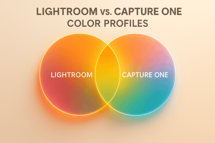

How to Create High Contrast Color Pop in Lightroom
Want bold, eye-catching photos? High contrast color pop editing in Lightroom can transform ordinary images into striking visuals by enhancing colors, textures, and tonal contrasts. Here's a quick breakdown:
- Start with RAW files. These preserve more data, giving you flexibility for adjustments without quality loss.
- Adjust globally first. Use the Basic panel to tweak contrast, whites, blacks, and vibrance for a solid base.
- Fine-tune colors. The HSL panel allows precise control over individual hues, saturation, and luminance.
- Use local tools. Brushes and gradients help refine specific areas, like skies or subjects.
- Add depth with color grading. Apply complementary tones to highlights, midtones, and shadows for a polished finish.
This method works for portraits, landscapes, and urban shots, delivering dynamic, high-impact edits. Let’s dive deeper into the tools and techniques to make your photos stand out.
Make Photos POP in LIGHTROOM - 8 TIPS & TRICKS for BETTER CONTRAST
Preparing Your Image for High Contrast Editing
Creating a striking high contrast color pop edit starts long before you dive into Lightroom. The quality of your source image lays the groundwork for how far you can push your edits without losing detail or introducing unwanted artifacts. Simply put, a high-quality image is your best starting point for achieving dramatic results.
A good source image provides the tonal range and color depth needed for bold contrasts. If your image lacks sufficient data, increasing contrast and saturation can lead to blown-out highlights, crushed shadows, or dull, lifeless colors - far from the vibrant look you're aiming for.
Choose the Right File Format
When it comes to editing for high contrast effects, RAW files are your best friend. Unlike JPEGs, which are compressed and processed by your camera, RAW files preserve all the sensor data captured during the shot. This extra information is critical for making dramatic adjustments without degrading the image.
"But all that extra information in RAWs is what gives you the latitude to tweak the white balance and exposure, for example, to a much larger degree than with a JPEG." – Nicole Morrison, Photographer
RAW files bring several advantages to the table. They hold more tonal and color information, giving you greater flexibility when adjusting exposure. This means you can recover details in overexposed highlights or underexposed shadows, making it easier to handle high-contrast scenes without losing important elements . You’ll also find color adjustments more precise, allowing for accurate reproduction even after significant changes. Plus, RAW editing is non-destructive, letting you revisit and modify your edits without reducing image quality.
"When you're shooting in JPEG, it's really important to nail your exposure." – Nicole Morrison, Photographer
This quote underscores one of JPEG's biggest limitations: the need for perfect exposure at the time of capture. With RAW, you have far more room to correct and refine.
Make Initial Adjustments in the Basic Panel
Once you’ve chosen the right file format, it’s time to set up your image in Lightroom’s Basic panel. These early adjustments are crucial for creating a strong foundation before diving into advanced contrast techniques.
Start with exposure correction. Use the Exposure slider to balance the overall brightness of your image. For high contrast edits, aim for a well-exposed photo - not too dark or too bright - so you’ll have more flexibility to adjust shadows and highlights later.
Next, fix the white balance. Lighting conditions can introduce unwanted color casts that interfere with your final look. Use the White Balance tool to neutralize these casts, either by selecting a preset that matches your lighting or by clicking on a neutral area in your image to set a custom balance.
This is also the time to refine your image’s composition. Crop and straighten your photo to remove distractions and draw attention to the areas where you’ll apply your high contrast effects. A strong composition enhances the impact of your edits.
Finally, make initial tweaks to Contrast, Highlights, Shadows, Whites, and Blacks. While you’ll fine-tune these settings later, starting with rough adjustments helps establish a solid base. You can also use the Tone Curve alongside the Basic panel for more precise control over contrast.
These foundational steps set the stage for sharper, more impactful edits down the line. Taking the time to prepare your image properly ensures your high contrast color pop effects will deliver the bold, eye-catching results you’re after.
Using Lightroom Tools to Create High Contrast Color Pop
Once your image is ready, Lightroom's tools can help you create dramatic contrast and vibrant colors. To achieve that bold color pop effect, it’s important to understand how the different panels work together to enhance both contrast and color.
Boost Contrast and Tone in the Basic Panel
The Basic Panel is your starting point for creating bold, high-contrast effects. Start by adjusting the Contrast slider to deepen the separation between light and dark areas, adding depth and vibrancy to your image. Then, use the Whites and Blacks sliders to expand the dynamic range. Push the Whites up slightly while keeping an eye on the histogram to avoid clipping, and lower the Blacks until the histogram just touches the left edge, darkening shadows without losing detail.
Next, move to the Presence sliders for added intensity. Increase Clarity for sharper mid-tone contrast and boost Vibrance to make muted colors stand out. Use Saturation sparingly, especially if your image includes skin tones, to avoid unnatural results.
Once the overall tones are set, you can move on to fine-tuning specific colors for maximum impact.
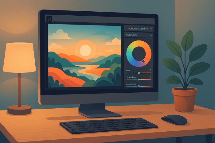
Selective Color Adjustments with the HSL Panel
The HSL Panel (now called the Color Mixer in Lightroom version 13.0) is where you can fine-tune individual colors. With separate sliders for Hue, Saturation, and Luminance, this panel lets you adjust specific colors without affecting others. For precise edits, use the targeted adjustment tool to click directly on the color in your image that you want to refine.
For example, you might shift the Hue to make blues more teal or increase the Saturation of reds to make them pop. Adjust Luminance to brighten or darken specific colors, enhancing their presence in the image. These tweaks are most effective when you’ve already established a solid overall look using the Basic Panel.
Apply Local Adjustments for Precision
After setting your global adjustments, use Lightroom’s local tools for targeted enhancements. Tools like the Brush, Linear Gradient, and Radial Gradient give you the ability to adjust specific areas of your image.
For instance, you can use the Brush tool to bring out the vibrancy in a subject’s eyes or enhance the saturation of a small detail. Linear Gradients work well for adjusting large areas, like darkening a sky while leaving the rest of the image untouched. Radial Gradients are perfect for highlighting a subject or creating a vignette effect. The key is to apply these adjustments subtly, ensuring smooth transitions between edited and unedited areas.
Add Depth with Split Toning/Color Grading
Finish your high-contrast look with Color Grading (formerly known as Split Toning). This tool allows you to apply complementary colors to different tonal ranges, such as highlights, mid-tones, and shadows. Use the color wheels to add warmth to highlights and cooler tones to shadows, enhancing the overall contrast.
Drag the target along the edge of the color wheel to adjust the Hue, and use the luminance sliders to control brightness. Keep Saturation levels low - under 10% - to maintain a natural feel. The blending and balance sliders help control how the tones interact, while the Global Toning option ties everything together with a cohesive color theme. Base your choices on solid color theory to achieve a polished, harmonious result.
Step-by-Step Workflow for High Contrast Color Pop
Now that you’re familiar with Lightroom’s tools, let’s dive into a step-by-step approach to creating a high-contrast color pop effect. This methodical process will help you achieve polished, eye-catching edits.
Global Adjustments for Overall Contrast
Start in the Basic Panel to set the stage for your edit. Adjust the overall brightness, contrast, and tones to create a strong foundation. Increase the Contrast slider, push the Whites up, and pull the Blacks down until the histogram edges near clipping. This separation in tones is key to making colors stand out.
Next, fine-tune the White Balance to establish the mood. Slide the Temperature toward warmer tones for a golden hour glow or cooler tones for a dramatic, moody blue. Boost Vibrance instead of Saturation for a more natural enhancement that keeps skin tones looking realistic.
Fine-Tune Colors with HSL
The HSL panel is where the magic happens. As photography expert Meg from PhotographyLife.com explains:
"HSL/Color is my favorite tool for making subtle color adjustments within an image, although it can be used for making more dramatic color changes as well".
Unlike the global adjustments in the Basic Panel, HSL sliders let you target specific colors without affecting the entire image. Use the HSL Target tool for pinpoint accuracy.
For example:
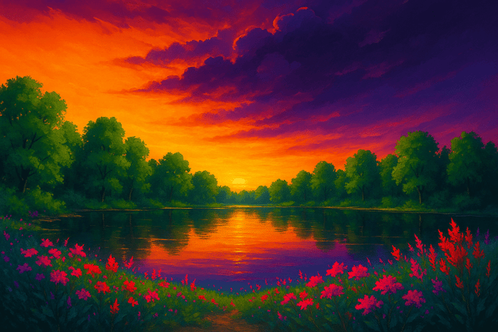
- In a cityscape, increase the saturation of red, orange, and yellow to make brick buildings pop.
- In landscapes, tweak the blue and aqua sliders in the Hue section to shift the sky toward a teal or cyan tone.
Stick to subtle adjustments here - overdoing it can lead to unwanted color noise. Once you’re satisfied with the overall colors, move on to localized edits for finer control.
Local Adjustments for Targeted Edits
With your global edits in place, use local adjustment tools to refine specific areas. The Adjustment Brush lets you “paint” adjustments onto precise regions. Graduated Filters are perfect for gradual transitions, such as balancing exposure in unevenly lit scenes. Radial Filters can help draw attention to focal points or create vignettes.
For portraits with bright, distracting backgrounds, reduce saturation in the blue or green channels to make your subject stand out. In landscapes, use the Luminance section to darken the sky by pulling the blue and aqua sliders to the left.
Leverage Lightroom’s AI masks for quick, accurate selections. You can refine these masks further using Range Masks, which allow adjustments based on color, luminance, or depth.
Polish the Look with Color Grading
Once your global and local edits are complete, bring everything together with Color Grading. Use the color wheels to add complementary tones to highlights, mid-tones, and shadows. Adjust hue by dragging along the edge of the wheel and tweak brightness with the luminance sliders. Keep saturation subtle to avoid overpowering the image. Use the blending and balance sliders to control how tones interact and create a cohesive color theme.
Base your color grading choices on solid principles of color theory to maintain harmony in your edits.
Streamline Edits with Presets
To save time and maintain consistency, use Lightroom presets. Platforms like Presets.io offer collections designed specifically for dramatic color effects, including cinematic and artistic styles.
You can also create your own local adjustment presets to save specific combinations of edits for future projects. This allows you to build a personalized library of presets that can be fine-tuned to suit each photo.
Avoiding Common Mistakes and Best Practices
To keep your high contrast color pop edits dynamic yet realistic, it's essential to follow some best practices and steer clear of common pitfalls. While this technique can transform images, overediting often leads to an unnatural appearance.
Avoid Oversaturation and Loss of Detail
A common mistake is overdoing saturation, which can result in color clipping, posterization, and noise. When colors are pushed too far, the finer details that make an image feel natural can disappear.
Instead, try using vibrance rather than saturation to enhance colors more naturally. Vibrance selectively boosts less-saturated tones while protecting hues that are already vivid, including skin tones. Unlike saturation, which increases all colors evenly, vibrance offers a subtler, more balanced adjustment. Start with vibrance to create a natural base, then add a touch of saturation for extra impact.
Keep an eye on your histogram to avoid clipping and oversaturation. If you notice colors hitting the edges of the histogram, scale back your adjustments and fine-tune specific colors using the HSL sliders.
Make gradual changes and frequently toggle between the edited and original versions - or use a split view for direct comparisons. This helps you stay in control and avoid overprocessing your image.
Maintain Realism While Boosting Colors
Preserving a natural color balance is just as important as managing saturation. A light touch often yields the best results for achieving a high contrast color pop that feels effortless. Use tools like the HSL panel, saturation curves, and masking techniques to fine-tune color intensity exactly where it’s needed. This approach allows you to enhance background colors while keeping skin tones true to life.
Apply vibrance and saturation adjustments only after addressing basic corrections like white balance, exposure, and contrast. This ensures your color enhancements build on a strong foundation instead of trying to fix multiple issues at once.
For scenes like landscapes or cityscapes, focus on enhancing specific color ranges. For example, you might emphasize the blues in the sky, greens in foliage, or warm tones during golden hour. This selective approach adds visual interest while keeping the image grounded in reality.
Balance Global and Local Adjustments
The most polished high contrast color pop edits combine global and local adjustments effectively. Start with global adjustments to set the overall tone and mood. Then, use local adjustments to refine specific areas, adding depth and detail where needed.
While global adjustments are quick and efficient, overrelying on them can flatten your image and diminish natural contrast. Local adjustments, though more intricate, offer greater precision. Striking the right balance between the two is key.
When working with local adjustments, use masks to target specific areas. Pay attention to brush size, feathering, and flow to ensure smooth transitions and avoid harsh lines that might distract from the overall composition.
For even more precision, combine HSL adjustments with color grading. Use the HSL panel to target particular colors, then apply color grading to unify the mood across highlights, midtones, and shadows. This layered approach helps create a cohesive, polished look.
Periodically step back and compare your edits to the original image. This practice keeps your perspective objective and ensures that your adjustments complement the image rather than overpower it.
The goal is to create a striking image that still feels natural. When your audience focuses on the subject and composition rather than the editing, you’ve nailed the perfect balance.
Conclusion: Achieving High Contrast Color Pop
Creating a high contrast color pop in Lightroom is all about mastering the tools and making thoughtful adjustments to turn everyday photos into eye-catching masterpieces. The techniques discussed here work together to help you craft images that grab attention while staying true to life.
The secret lies in balancing contrast and vibrancy. Contrast adds drama and intensity, ensuring your subject stands out, while vibrant colors breathe life into the scene. As Wassily Kandinsky famously said, "Color is a power that directly influences the soul." When you pair that emotional power with technical skill, your images can leave a lasting impact.
Start with global adjustments to set the foundation, refine your work using HSL sliders and masking tools, and tie it all together with color grading. If your images include people, pay close attention to maintaining natural skin tones. Training your eye to spot potential contrasts and harmonies in your surroundings can also make a big difference in your edits.
For a more efficient workflow, high-quality presets can be a game-changer. Presets.io offers professional-grade options that can give your photos a polished look with just one click. Whether you're aiming for a cinematic vibe, a vintage feel, or something inspired by classic film, these presets can save time and help you learn new techniques.
Experimentation is key to finding your unique style. By exploring these strategies, you'll be able to craft bold, refined edits that stand out in today’s visually saturated world. With practice, your photography will not only turn heads but also tell stories that resonate.
FAQs
Why should I use RAW files for creating high contrast color pop effects in Lightroom?
When working in Lightroom, starting with RAW files is a game-changer for creating vibrant, high-contrast color effects. Unlike other formats, RAW files hold unprocessed image data, giving you far greater control over adjustments like colors, contrast, and tones - all without sacrificing image quality.
Using RAW allows you to fine-tune highlights, shadows, and saturation with precision, making it easier to achieve eye-catching colors that still look natural and polished. Beginning with a high-quality file lays the foundation for bringing your creative ideas to life.
How can I create high contrast edits in Lightroom that still look natural and balanced?
To create high-contrast edits in Lightroom while keeping your photos looking natural, it’s all about subtlety. Adjust tools like contrast, clarity, and tone sliders with a light touch, ensuring you don’t overdo it. If the colors start to feel too intense, try gently reducing the saturation or vibrance sliders to bring them back to a more natural state.
For even greater control, use masks to target specific areas of your photo. This allows you to boost contrast and color in certain spots without affecting the entire image. By focusing on these small, deliberate changes, you can achieve edits that are both striking and realistic.
What are the best ways to use local adjustment tools to enhance specific parts of a photo in Lightroom?
To fine-tune specific parts of your photo in Lightroom, take advantage of tools like the Adjustment Brush, Graduated Filter, and Radial Filter. These features let you apply detailed edits to particular areas, whether it’s brightening your subject or enhancing the contrast in the background.
Begin by choosing the area you want to adjust and use masking options like Select Subject or Object Masking to refine your selection. To ensure precision, turn on overlays to see exactly where your adjustments are being applied. Aim for subtle, natural changes to keep your edits looking polished and professional. With a bit of practice, these tools can help you achieve impressive, refined results.