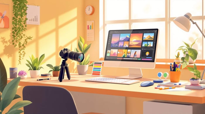

Color Theory Basics for Fashion Photography
Color theory is a key element in fashion photography, helping you create eye-catching and emotionally resonant images. Here’s what you’ll learn to improve your photos using color theory principles:
- Color Wheel Basics: Understand primary, secondary, and tertiary colors to create balanced combinations.
- Mood Through Color: Use hue, saturation, and value to evoke emotions like boldness or elegance.
- Color Schemes: Explore complementary, analogous, and triadic color schemes for impactful visuals.
- Outfit and Background Pairing: Match clothing and settings strategically.
- Light and Editing Tips: Control lighting and refine colors in post-processing with tools like Lightroom.
Quick Tip: Start with a clear color plan, balance your lighting, and use presets to save time while keeping your edits consistent.
How I use #Color Theory in my #Fashion Shoots
Color Theory Fundamentals
Color theory plays a major role in creating impactful fashion photography. It helps you understand how different color elements work together to create visually compelling images.
Color Wheel Basics
The color wheel acts as a guide for combining colors effectively in fashion photography. Here’s a quick breakdown:
- Primary Colors: Red, blue, and yellow are the starting points for all other colors.
- Secondary Colors: Green, orange, and purple are formed by mixing primary colors.
- Tertiary Colors: These are blends of primary and secondary colors, like blue-green or red-orange.
These relationships are essential for creating intentional compositions. For instance, a bold red dress against a deep blue background uses primary color contrast to grab attention. Similarly, pairing a yellow blazer with purple accessories highlights complementary colors, making the image pop.
Now, let’s unpack how hue, saturation, and value can refine your color choices.
Hue, Saturation, and Value
These three properties determine how colors appear in your photos:
Hue refers to the pure color, like red, blue, or yellow. It sets the tone:
- Warm hues (reds, oranges) evoke energy and passion.
- Cool hues (blues, greens) create a sense of calm and sophistication.
Saturation measures a color’s intensity or purity:
- Highly saturated colors work well for bold, editorial shoots.
- Desaturated tones are ideal for minimalist or vintage aesthetics.
Value is about how light or dark a color is:
- High-value (lighter) colors naturally draw the eye, creating focal points.
- Low-value (darker) colors add depth or drama to a scene.
Here’s how these properties interact in fashion photography:
| Color Property | Effect on Fashion Photos | Best Used For |
|---|---|---|
| High Saturation | Creates bold, striking visuals | Editorial or avant-garde |
| Low Saturation | Offers a subtle, muted look | Minimalist or classic styles |
| High Value | Draws attention to key elements | Highlighting focal pieces |
| Low Value | Adds mood and depth | Creating dramatic effects |
For instance, pairing a highly saturated, low-value color can create a dramatic focal point, while high-value, low-saturation tones can provide understated backgrounds that let the clothing take center stage.
Color Schemes in Photography
Color schemes play a key role in shaping the creative direction of fashion photography. Choosing the right color combinations can turn a simple shot into a visually compelling image that grabs attention.
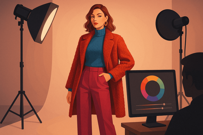
Using Complementary Colors
Complementary colors are located opposite each other on the color wheel. These combinations create strong visual contrasts, helping key elements in your photos stand out. They can add vibrancy and energy to your shots.
Here are some popular complementary pairs in fashion photography:
| Color Pair | Best Applications | Effect |
|---|---|---|
| Blue-Orange | Outdoor/Golden Hour | Warm-cool contrast, ideal for sunset scenes |
| Red-Green | Editorial Fashion | Bold contrast for striking, high-impact images |
| Purple-Yellow | Studio Portraits | Combines royal tones with brightness |
| Teal-Coral | Summer Collections | Modern, fresh vibe with balanced intensity |
Tips for using complementary colors effectively:
- Balance the intensity of the paired colors to avoid overwhelming the viewer.
- Make one color the primary focus and use its complement as an accent.
- Opt for muted tones if you're aiming for a more subdued, elegant look.
If complementary colors aren't the right fit for your project, consider exploring analogous or triadic schemes for a different approach.
Analogous and Triadic Colors
Analogous color schemes feature colors that sit next to each other on the color wheel, creating a smooth, harmonious effect. Triadic schemes, on the other hand, use three evenly spaced colors, offering a vibrant yet balanced look. Both are excellent choices for editorial work.
How to make the most of these schemes:
- Choose one dominant color and use the adjacent or evenly spaced hues as supporting tones.
- Keep saturation levels consistent to ensure a cohesive palette.
| Color Scheme | Characteristics | Best Used For |
|---|---|---|
| Analogous | Smooth, harmonious | Luxury brand shoots, high-fashion editorials |
| Triadic | Vibrant, balanced | Campaign shoots, editorial spreads |
In post-processing, these schemes can guide your editing decisions. Using presets tailored to specific color relationships can enhance your photos while maintaining natural skin tones. For instance, the Moody Blue Preset Collection [1] offers tools to fine-tune these color schemes without compromising the original image quality.

Color Theory in Practice
Learn how to apply these principles effectively.
Outfit and Background Selection
Pairing the right outfit and background can create striking visuals. Start with a clear plan for your color choices before the shoot.
Planning Color Combinations:
- Primary Subject: Begin with the model's outfit as the focal point, then build complementary or similar color schemes around it.
- Background Elements: Choose or design backgrounds that highlight the outfit without overpowering it.
- Props and Accessories: Add accent colors thoughtfully through props or accessories.
| Outfit Color | Background Choice | Accent Elements | Visual Effect |
|---|---|---|---|
| Deep Blue | Warm Orange Wall | Gold Jewelry | Bold and High Contrast |
| Soft Pink | Light Green Foliage | Silver Accessories | Soft and Stylish |
| Bold Red | Neutral Gray | Black Props | Sleek and Professional |
| Pure White | Deep Purple | Bronze Details | Elegant and Luxurious |
Once you've aligned the outfit and background, adjust the lighting to amplify these color choices.
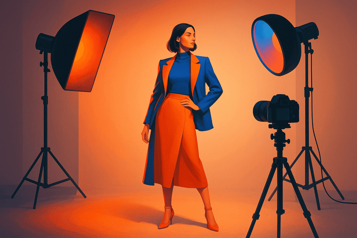
Light Setup for Color Control
Lighting plays a key role in how colors appear in your images. Use soft, diffused lighting to avoid color distortion, position fill lights to maintain consistency in shadows, and carefully manage color temperature when mixing light sources.
Tips for Enhancing Color Through Lighting:
Main Light Setup
Position the key light at a 45-degree angle to preserve true colors and add depth. Use presets like the Cinematic Light preset[1] to achieve specific effects.Color Temperature Control
Keep the color temperature consistent across all lights to avoid unwanted color shifts. Matching light sources ensures a cohesive look.Modifiers for Precision
- Softboxes: Great for accurate color representation.
- Umbrellas: Perfect for softer, diffused lighting transitions.
- Reflectors: Handy for filling shadows without altering colors.
This approach supports the complementary color strategies outlined earlier.
Pro Tip: During post-processing, use tools like the Master Preset Bundle[1] to refine color relationships while keeping skin tones natural.
For intricate setups, sketch a lighting diagram to create a seamless integration of your chosen color palette.
Color Editing with Lightroom
Lightroom offers powerful tools and presets that make color editing more efficient and deliver polished results, especially in fashion photography.
Preset Color Management
Lightroom’s preset adjustments simplify your workflow and help maintain consistent color quality. Here are some common adjustments you’ll use:
- Temperature and Tint: Adjust overall color balance.
- HSL Panels: Fine-tune specific colors.
- Split Toning: Add creative color effects.
| Color Aspect | Preset Benefit | Application |
|---|---|---|
| Skin Tones | Keeps tones natural | Portrait and beauty shots |
| Fabric Colors | Boosts vibrancy | Garment detail shots |
| Background Tones | Creates balanced tones | Full-body fashion shots |
| Shadow Details | Adds depth to colors | Editorial-style images |
These adjustments, combined with preset collections, make it easier to meet the unique demands of fashion photography.
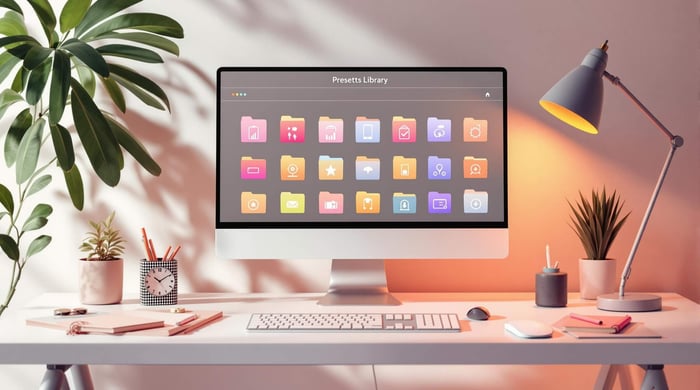
Presets.io Fashion Collections
Preset collections specifically designed for fashion photography take your editing to the next level. They’re tailored to preserve garment colors, enhance skin tones, and deliver a polished look.
Key Features of Fashion Presets:
- Cinematic Style
- Adds contrast, professional toning, and ensures skin tones look natural.
- Aesthetic Style
- Balances highlights, deepens shadows, and refines overall color grading.
The Master Preset Bundle includes 721 presets and is priced at $49.00. It covers a wide range of fashion photography scenarios. Individual collections - such as minimalist, vintage, and aesthetic styles - are available for $27.00 but often drop to $12.00 during sales [1]. These presets help you achieve consistent, professional results while saving time.
Tips for Using Presets Effectively:
- Begin with a properly exposed image.
- Apply presets early in the editing process.
- Adjust individual color channels after applying a preset for a perfect finish.
- Save custom variations to maintain a consistent style for your brand.
Conclusion
Main Points Review
Color theory plays a key role in turning fashion photography into visually striking art. The color wheel helps with coordinating outfits, choosing backgrounds, and setting up lighting. By understanding complementary and analogous color relationships, you can craft images that grab attention while maintaining a balanced aesthetic.
Here’s a quick breakdown of how different aspects of color theory influence fashion photography:
| Color Aspect | Application | Impact |
|---|---|---|
| Complementary Colors | Adds contrast and drama | Creates visual tension |
| Analogous Colors | Keeps outfits cohesive | Ensures visual flow |
| Color Temperature | Balances lighting | Sets emotional tone |
| Color Saturation | Highlights garments | Directs viewer focus |
Use these concepts as a foundation for your next shoot. They can help you refine your creative process and achieve more polished results.
Getting Started
Ready to apply these ideas? Follow these steps to integrate them into your workflow:
- Start with a Color Wheel: Use it to select effective color combinations for outfits and backgrounds.
- Practice Consistent Editing: Tools like Lightroom presets, such as the Master Preset Bundle, can help maintain uniformity across your images.
- Experiment to Find Your Style: Try different preset collections, ranging from soft and aesthetic to bold and cinematic looks.
Improving your mastery of color in fashion photography takes time and experimentation. With thoughtful planning and consistent editing, you can create photos that stand out every time.
FAQs
How can I use color theory to create more emotionally impactful fashion photography?
Color theory is a powerful tool in fashion photography, as it helps evoke specific emotions and set the mood of your images. Start by understanding the basics: primary colors (red, blue, yellow), secondary colors (green, orange, purple), and complementary colors (colors opposite each other on the color wheel, like blue and orange). Combining these effectively can create balance or striking contrast in your photos.
To enhance emotional impact, use colors intentionally. For example, warm tones like red or orange can convey energy and passion, while cool tones like blue or green evoke calmness and serenity. Experiment with different color palettes to highlight your subject’s outfit or the story you want to tell.
For seamless editing, consider using high-quality presets that align with your desired color scheme. Presets can save time and ensure consistency across your work, helping you achieve professional results effortlessly.
How can I effectively match outfits and backgrounds using complementary colors in fashion photography?
Complementary colors are pairs of hues that sit opposite each other on the color wheel, such as blue and orange or red and green. In fashion photography, using these color combinations can create striking visual contrast and make your subject stand out. To pair outfits and backgrounds effectively, consider the following tips:
- Choose one dominant color: Use one color as the primary focus (e.g., the outfit) and its complement for the background or accents.
- Experiment with saturation and tones: Adjust the intensity of the colors to achieve a balanced look, especially if the hues are very bold.
- Use neutral elements: Incorporate neutral tones like gray, white, or beige to soften the contrast and avoid overwhelming the composition.
By thoughtfully applying complementary colors, you can create dynamic and visually engaging images that draw attention to your subject while enhancing the overall aesthetic of your photos.
How can Lightroom presets help create consistent colors and elevate fashion photography edits?
Lightroom presets, like those available from Presets.io, simplify the editing process by ensuring consistent color tones and styles across your fashion photography. They allow you to quickly apply pre-designed adjustments, saving time while maintaining a cohesive aesthetic.
With collections ranging from cinematic to vintage looks, these presets are tailored to enhance the visual appeal of your images. Whether you're aiming for bold, vibrant colors or a soft, muted palette, presets make it easy to achieve your creative vision with just a few clicks.