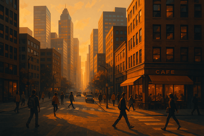

Color Grading Tips for Fashion Photography
Color grading can completely transform your fashion photos. It enhances fabric textures, highlights garment details, and aligns images with a brand's identity. Here's a quick breakdown of what you'll learn:
- Set the right mood: Use color grading to evoke emotions and reflect brand styles (e.g., muted tones for luxury, bold colors for youth-focused brands).
- Prepare your images: Start with proper white balance, exposure, and technical corrections like noise reduction and lens adjustments.
- Fine-tune colors: Use tools like the HSL panel, split toning, and local adjustments to make garments look vibrant and true to life.
- Achieve editorial looks: Apply techniques like teal-orange color balance or minimal color styling for a professional finish.
- Streamline your workflow: Use presets and batch editing to save time and maintain consistency.
Want faster results? Tools like the Presets.io Master Bundle ($49.00) or the Minimalist Collection ($12.00) can help you achieve polished, professional edits with ease. Start with foundational adjustments and gradually refine your skills for stunning, cohesive fashion photography.
COLOR GRADING IN FASHION PHOTOGRAPHY // ft. Mert & Marcus, Alasdair McLellan, and Annie Leibovitz
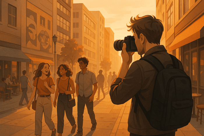
Basic Image Preparation
Getting your images ready is the first step toward effective color grading. Making the right initial adjustments helps bring out the natural qualities of your photos. Start by setting the white balance and exposure to create a neutral foundation.
White Balance and Exposure Setup
White balance plays a big role in how skin tones and fabric colors appear. Begin by adjusting it to reflect the actual shooting conditions. Pay close attention to:
- Fabric color accuracy: Make sure the garment colors in your images match how they look in real life.
- Light source adjustments: Correct for mixed lighting to ensure a consistent look.
Keep details intact in both the highlights and shadows to retain the texture of light and dark fabrics. Tools like Presets.io can help balance exposure across various textiles effectively.
Image Quality Corrections
Before diving into creative edits, address technical issues to ensure a clean starting point. Focus on these areas:
1. Lens Corrections
Fix issues like vignetting, chromatic aberration, and distortions that can affect the edges of garments.
2. Noise Reduction
In areas with solid colors, apply selective noise reduction to:
- Smooth out grain in solid-colored fabric.
- Retain important texture details in garments.
- Keep edges around clothing details sharp and clear.
3. Color Fringing
Remove any color fringing around high-contrast edges, metallic accents, or intricate garment details that could distract from the overall image quality.
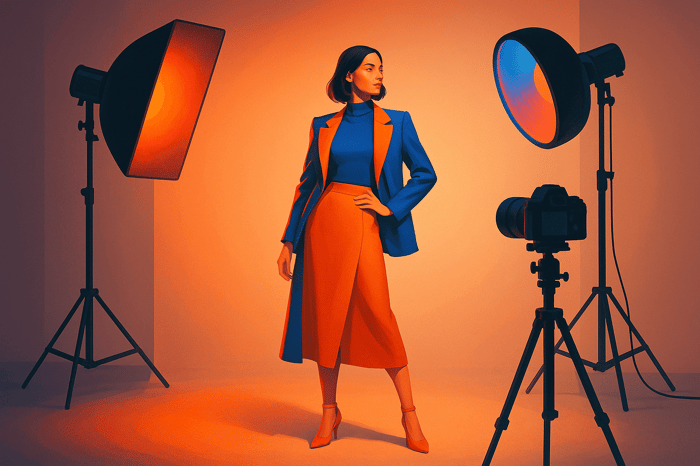
Color and Texture Adjustments
Tweaking colors and textures can make garments look more realistic and visually appealing. Once white balance and exposure are properly set, precise color adjustments can take your images to the next level. These steps help ensure accurate representation of both color and texture.
HSL Panel Color Control
The HSL (Hue, Saturation, Luminance) panel is a great tool for fine-tuning colors:
- Hue: Adjust to keep fabric colors accurate and true to life.
- Saturation: Manage color intensity to avoid oversaturation.
- Luminance: Control brightness levels to bring out fabric textures.
For denim, focus on fine-tuning the blue channel. This helps highlight the texture while staying consistent with the brand's visual identity.
Once individual colors are adjusted, use split toning to balance the overall feel of the image.
Split Toning Effects
Split toning adds depth and character to fashion photos by blending warm and cool tones. For a balanced look, apply warm tones to highlights and cooler tones to shadows. This technique creates a more dynamic and polished appearance.
If you're short on time, tools like Presets.io offer ready-made split toning presets that deliver a professional finish with minimal effort.
Local Color Adjustments
Local adjustments let you focus on specific parts of the image for more precise edits. Try these techniques:
- Use radial or graduated filters to draw attention to fabric details.
- Boost saturation and contrast selectively to highlight key garment features.
- Apply clarity and noise reduction to enhance textures and give the image a refined look.
These targeted edits ensure your garments stand out while maintaining a polished, professional feel.
sbb-itb-b27063b
Editorial Style Color Grading
Refining your images with precise adjustments and thoughtful color techniques can give your photos a polished, editorial finish. These methods help highlight garments while maintaining their true appearance.
Teal-Orange Color Balance
The teal-orange color balance is a classic choice for editorial depth. It contrasts warm skin tones with cooler backgrounds, creating a visually striking effect. Here's how to achieve it:
- Shift blues and cyans toward teal in the shadows.
- Adjust oranges to bring out natural skin tones.
- Use split toning to balance highlights and shadows for a cohesive look.
Keep the adjustments subtle to ensure the result feels natural yet eye-catching.
Minimal Color Styling
Modern editorials often use a simplified color palette to let the garments take center stage. Focus on these key steps:
- Lower overall saturation to avoid overwhelming the image.
- Retain natural skin tones for a realistic look.
- Enhance contrast and luminance to tie everything together.
This approach creates a clean, sophisticated aesthetic that complements fashion photography.
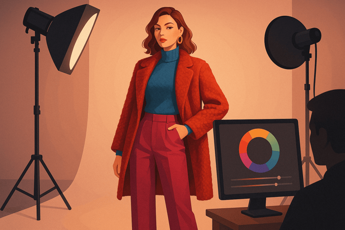
Presets.io Style Options

For faster implementation, consider using professional-grade presets. The Presets.io Master Bundle ($49.00) offers over 700 presets tailored for fashion photography. Here are some standout collections:
| Collection Type | Best For | Regular Price |
|---|---|---|
| Minimalist | Clean, modern editorials | $27.00 |
| Cinematic | High-end fashion spreads | $27.00 |
| Vintage Film | Story-driven editorials | $27.00 |
The Minimalist Collection, now available for $12.00 (down from $27.00), is ideal for contemporary editorial styles. These presets are customizable, ensuring consistent, professional results across your projects.
Multi-Photo Editing
Keep your images visually consistent by maintaining the same color grading across all photos. Batch editing can help you save time and ensure a smooth workflow.
Copying Edits Between Photos
To achieve a cohesive look, start with a "hero image" that serves as your template for all other photos.
Make your color grading adjustments on this hero image, focusing on skin tones and garment colors. For photos taken under similar lighting conditions, you can apply:
- White Balance Sync: Match white balance across images for a consistent tone.
- HSL Adjustments: Adjust individual color channels to ensure fabric colors stay true.
- Tone Curve: Use balanced adjustments to work across varying exposure levels.
These techniques lay the groundwork for quick and effective batch processing using professional presets.
Presets.io Batch Processing
The Master Bundle, priced at $49.00, offers 721 presets compatible with major editing software. These presets are designed to handle specific adjustments, including:
| Feature | Purpose | Use Case |
|---|---|---|
| Global Presets | Establish a consistent base look | Apply across an entire shoot |
| Local Adjustments | Focus on finer details | Tailor edits to specific images |
| Sync Settings | Speed up your workflow | Copy edits between similar shots |
- Editorial Styles: Achieve clean, polished finishes.
- Campaign Effects: Add bold, commercial-ready touches.
- Lookbook Aesthetics: Create a cohesive series of images.
To get the best results, group photos by lighting and style before applying batch edits. The Minimalist Collection, currently on sale for $12.00, offers a sleek and modern base that can be customized for individual images. This approach ensures consistency while letting you make creative tweaks as needed.
Conclusion
Key Takeaways
Color grading plays a major role in transforming fashion photography. Here’s a recap of the essential techniques we discussed for creating polished, professional images:
- Basic preparation: Start with proper white balance and exposure settings to set a solid foundation.
- Color control: Use tools like HSL adjustments and split toning for precise color adjustments.
- Workflow efficiency: Apply batch processing and preset systems to ensure consistency across multiple photos.
These methods help photographers establish a distinctive, professional aesthetic.
What’s Next?
Take your skills to the next level by practicing these techniques on a variety of fashion images. For those looking to streamline their process, the Master Bundle from Presets.io ($49.00) includes 721 presets tailored for fashion photography workflows.
Here’s a simple guide to structure your practice:
| Stage | Focus Area | Suggested Actions |
|---|---|---|
| Learning | Basic Techniques | Practice white balance and exposure tweaks |
| Development | Style Creation | Experiment with HSL and split toning |
| Production | Workflow Refinement | Use batch processing for consistency |
Begin with foundational adjustments, then gradually incorporate advanced techniques as you gain confidence. For an affordable starting point, try the Minimalist Collection ($12.00), perfect for creating clean, polished looks that suit a range of fashion styles.
Consistent practice is key to developing an efficient workflow and delivering top-tier results. Stay on the lookout for new preset collections to expand your creative options and keep your style evolving.
FAQs
How can I make sure the colors in my fashion photos match the real-life look of the garments?
To ensure the colors in your fashion photos accurately reflect the garments in real life, start by setting your camera's white balance correctly during the shoot. This helps maintain natural tones under different lighting conditions. Use color calibration tools, like a gray card or color checker, to fine-tune your settings for precision.
In post-production, focus on subtle adjustments to enhance the image without altering the garment's original color. Tools like Lightroom presets can streamline the process, helping you maintain consistency across your edits while achieving the desired mood and tone for your photos. Always compare your edits to the actual garment under neutral light to ensure accuracy.
How can using presets improve color grading and workflow in fashion photography?
Presets simplify color grading in fashion photography by providing a fast and consistent way to enhance tones and establish a specific mood. They enable photographers to achieve professional-quality edits without spending hours fine-tuning every detail.
By applying pre-designed styles, presets help streamline the editing process, saving time and ensuring a cohesive look across multiple images. This efficiency is especially valuable in fast-paced projects like fashion shoots, where quick turnaround times are often essential.
How can I create a consistent and cohesive look for all photos in a fashion shoot?
Achieving a cohesive look across multiple fashion photos involves maintaining consistency in color tones, lighting, and mood. Start by using a well-defined color palette that complements the theme of the shoot. Adjust highlights, shadows, and contrast uniformly across all images to ensure they feel part of the same story.
Using Lightroom presets or similar tools can significantly streamline this process. Presets allow you to apply the same adjustments across multiple photos with just a few clicks, saving time while ensuring consistency. Consider experimenting with presets that enhance the aesthetic you're aiming for, such as cinematic, vintage, or film-inspired styles. Fine-tune each photo afterward to account for any variations in lighting or composition during the shoot.
Finally, always review your final set of images as a whole to ensure they flow together seamlessly and evoke the intended mood or style.