
Table of Contents
- How to Edit Moody Portraits in Lightroom
- Dark And Moody Portrait Tutorial - Adobe Lightroom Classic
- Step 1: Prepare Your Image for Editing
- Step 2: Adjust Basic Settings for a Dark Foundation
- Step 3: Add Mood with Color Grading
- Step 4: Add Contrast with the Tone Curve
- Step 5: Refine Details with Local Adjustments
- Step 6: Use Presets for Speed and Inspiration
- Conclusion
- FAQs
How to Edit Moody Portraits in Lightroom
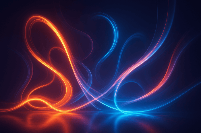
Editing moody portraits in Lightroom involves creating dark, atmospheric images with deep shadows, muted colors, and high contrast. This style emphasizes emotion and storytelling, making it ideal for dramatic photography. Here's a quick summary of the process:
- Start with RAW Files: Always shoot in RAW to preserve detail and allow for extensive tonal adjustments.
- Set Up Your Workspace: Organize Lightroom panels (Basic, Tone Curve, Color Grading, HSL) for easy access.
- Adjust Basic Settings: Lower exposure, increase contrast, and reduce highlights to create a dark, dramatic base.
- Fine-Tune Shadows and Highlights: Deepen shadows and manage highlights for a balanced, rich tonal range.
- Color Grading: Use split toning to add complementary colors to highlights and shadows (e.g., warm highlights and cool shadows).
- Tone Curve Adjustments: Create an S-curve for contrast and lift the blacks for a soft, faded effect.
- Local Adjustments: Use tools like the Brush and Radial Filters to brighten your subject and refine details.
- Presets: Apply moody presets for quick edits and consistency, then personalize them for each image.
This workflow transforms portraits into cinematic, emotional visuals while maintaining precision and control over the final look.
Dark And Moody Portrait Tutorial - Adobe Lightroom Classic

Step 1: Prepare Your Image for Editing
Getting your image ready for editing is about more than just opening Lightroom. It's about laying the groundwork for a smooth, effective editing process. The quality of your starting image plays a huge role in how much you can enhance it without compromising its integrity. A poorly captured photo leaves little room for adjustments.
To ensure you're starting with the best possible foundation, follow these steps.
Shoot in RAW Format
If you're aiming for moody portraits, shooting in RAW format is non-negotiable. RAW files retain all the unprocessed sensor data, giving you the freedom to make dramatic tonal adjustments without sacrificing quality. In contrast, JPG files are already compressed and processed, meaning much of the image's detail is lost before you even begin editing.
Why does this matter for moody portraits? When you're darkening shadows and playing with tones to create an atmospheric vibe, you need as much detail as possible. RAW files allow you to recover highlights and shadows that would be irretrievably lost in JPGs. For example, if you push a JPG's shadows too far, you'll quickly notice banding, noise, and a drop in overall quality. RAW, on the other hand, gives you the flexibility to deepen shadows and still maintain smooth transitions and rich detail.
This difference is especially noticeable in high-contrast scenes, which are common in moody portraiture. Imagine a portrait where one side of the face is brightly lit while the other is in shadow. RAW files let you tone down overexposed highlights and bring out details from the shadows without introducing artifacts. Yes, RAW files are larger - typically 20-30 MB compared to 5-10 MB for JPGs - but the editing possibilities they unlock are well worth the extra storage space.
With your file format sorted, it's time to set up a workspace that supports your creative flow.
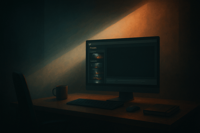
Set Up Your Lightroom Workspace
Once your RAW files are ready, the next step is to organize your Lightroom workspace for maximum efficiency. Start by importing your images into Lightroom and getting familiar with essential panels like Basic, Tone Curve, Color Grading, and HSL/Color. These tools are key to crafting the dark, moody tones you're after, so arrange your workspace to keep them within easy reach.
Lightroom’s non-destructive editing is a game-changer here. Every adjustment you make is applied to metadata, not the original file, meaning you can experiment freely without risking permanent changes. Want to try warm orange tones, then switch to cool blues? Crank up the contrast and then tone it down? Go for it - your original image stays untouched.
Before diving into edits, ensure your photo is a solid starting point. A well-exposed, well-composed image straight out of the camera makes all the difference. Lightroom can enhance a good portrait, but it can’t fix one that’s severely underexposed or poorly framed. Take a moment to check your image’s exposure and composition before you begin.
Most photographers approach Lightroom’s panels sequentially, starting with basic adjustments, moving on to tone curve tweaks, and finishing with color grading and local edits. If you find yourself constantly scrolling to access the same tools, consider creating a custom workspace layout. Keep your most-used presets handy for quick inspiration - we’ll talk more about presets later in the guide.
Finally, don’t underestimate the importance of preparation. Spending a few minutes organizing your workspace and calibrating your monitor (if possible) can save you a lot of frustration later. Eliminate distractions, give yourself room to focus, and set the stage for creating the moody, atmospheric portraits you envision.
Step 2: Adjust Basic Settings for a Dark Foundation
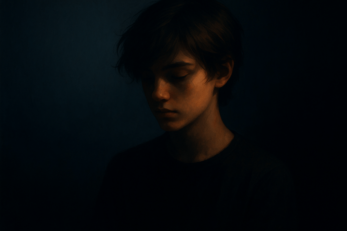
With your workspace ready and your RAW files loaded, it’s time to establish the base for your moody portrait. The Basic Panel in Lightroom is where you’ll start shaping the dark, dramatic vibe you’re aiming for. Think of this step as laying the groundwork for all the refinements that follow.
The objective here is straightforward: create a darker, more atmospheric version of your image while keeping your subject prominent and captivating. This isn’t about fixing a bad photo - it’s about taking a good one and pushing its tonal range toward the shadows for a more intentional, dramatic effect.
Here’s how to start building that dark foundation.
Balance Exposure and Contrast
Begin by darkening the overall image using the exposure slider. Unlike simply tweaking brightness, adjusting exposure impacts the entire tonal range of your photo. For a moody portrait, lowering the exposure sets the stage for a shadowy, dramatic look, but you’ll want to keep key details intact.
To maintain depth and avoid a flat appearance, increase the contrast (try starting around 40). This adjustment separates the tones, ensuring the image remains dynamic and visually engaging rather than simply dark and lifeless.
Before diving into the sliders, decide on the mood you want to convey. Are you aiming for a warm, cozy feel - like someone sipping whiskey in a dimly lit room? Or perhaps a cold, enigmatic look reminiscent of a shadowy alleyway? Your vision will guide your choices. Since Lightroom editing is non-destructive, don’t hesitate to experiment. Move the sliders around, compare the before-and-after views, and see what resonates with your desired aesthetic.
Manage Highlights and Shadows
Now that your exposure and contrast are set, it’s time to enhance the depth and drama by fine-tuning the highlights and shadows. This is where your image starts to take on the rich, atmospheric quality that defines moody portraits.
- Reduce highlights and whites to around -100. This step minimizes any overly bright areas that could pull attention away from your subject. By suppressing these distractions, the darker tones take center stage.
As you lower the highlights, you’ll notice the image gaining depth. The tonal range shifts, allowing the darker areas to dominate while still preserving a cohesive look. This creates the rich shadows and subtle contrasts that make moody portraits so compelling.
Working with RAW files gives you the flexibility to make bold adjustments - like pulling highlights and whites all the way down - without losing critical details or introducing artifacts. This tonal latitude is one of the key advantages of shooting in RAW.
Adjust the White Balance
White balance might seem like a small detail, but it plays a huge role in setting the emotional tone of your portrait. Even slight changes in color temperature can dramatically alter how the image feels. Cooler tones with hints of blue evoke a mysterious, dramatic mood, while warmer tones with golden hues create a more intimate, inviting atmosphere.
For a classic moody aesthetic, try setting the color temperature to a cooler range (around 3,745K or lower). The blue tones complement the dark foundation you’ve built, adding a sense of chill and atmosphere. Cooler temperatures work well with the reduced exposure and contrast adjustments, enhancing the overall mood.
That said, don’t feel confined to cool tones. If your vision leans toward a warm, candlelit vibe or golden hour glow, adjust the temperature slider toward the warmer end. The key is to make sure your white balance aligns with the feeling you want to convey. For instance, combining warm highlights with cool shadows can create a striking contrast, but we’ll explore that technique further in the color grading section.
White balance isn’t just about technical accuracy - it’s a creative tool. Use it to evoke emotion and reinforce the dramatic tone you’re building. Experiment with different temperatures and see how they transform the atmosphere of your portrait.
At this stage, you should have a solid dark foundation in place. The exposure is lowered, contrast is balanced, highlights are subdued, shadows are deepened, and the white balance complements the mood. This groundwork sets you up for the next phase: advanced adjustments like color grading, tone curves, and local refinements that will elevate your moody portrait even further.
Step 3: Add Mood with Color Grading
Now that you’ve established a dark foundation, it’s time to introduce deliberate color tones to shape the mood of your portrait. The Color Grading Panel in Lightroom is where you truly transform your image. This step goes beyond exposure tweaks - here, you’re using color to evoke emotion and add depth.
Color grading lets you apply specific tones to the highlights, midtones, and shadows independently. This level of control takes your image from feeling flat to cinematic. By blending complementary or contrasting colors across tonal ranges, you can create visual tension and direct the viewer’s eye exactly where you want it.
Colors carry emotional weight. For example, cool blues can add a sense of mystery, while warm oranges feel inviting and intimate. When you combine these tones thoughtfully, you can make your subject stand out against a darker background. To take this further, you can use split toning to assign different color tones to your highlights and shadows.
Use Split Toning for Highlights and Shadows
Split toning is a simple yet effective way to add dimension to your portrait. The idea is to apply one color to the highlights and another to the shadows. This creates contrast and depth that uniform color adjustments just can’t achieve.
For a classic moody look, try setting the Highlights hue to around 30 with a saturation level between 10–20. For the Shadows, use a hue around 220 with similar saturation. This combination adds a warm glow to the highlights while introducing a cool tone to the shadows, giving your image that atmospheric quality. The contrast between warm highlights and cool shadows naturally draws the eye, as orange and blue are opposites on the color wheel, creating visual interest.
Feel free to adjust these hues based on your image. While tweaking the color wheels, pay attention to the balance slider at the bottom of the Color Grading Panel. This slider determines how much the highlight and shadow tones influence the midtones. Moving it left emphasizes shadow tones, while moving it right highlights the lighter areas. For most moody portraits, keeping it near the center works well, but fine-tuning it can help you achieve the perfect balance.
After applying these tones, it’s time to refine the overall look by selectively reducing saturation.
Reduce Saturation Selectively
Once you’ve added color to the highlights and shadows, it’s important to refine where those colors appear. Selective desaturation is crucial for a dark and moody aesthetic. By toning down distracting colors in the background, you allow your subject to take center stage.
Head to the HSL panel in Lightroom, where you can target specific color ranges without altering the entire image. For instance, you might reduce the saturation of greens and blues in the background by 30–50%, depending on your image. This subtle desaturation creates a natural hierarchy, drawing attention to the areas that retain their vibrancy - your subject.
Be cautious with skin tones. Over-desaturating oranges and reds can leave your subject looking lifeless. If you notice this happening, use the Brush Tool to selectively restore saturation to your subject’s face and body. While we’ll cover local adjustments in Step 5, it’s worth noting here because color and saturation adjustments often go hand-in-hand.
The goal with selective desaturation is subtlety. You’re not creating a black-and-white image with a single pop of color - that’s an overused trick. Instead, you’re gently guiding the viewer’s focus by making some colors fade into the background while others stand out. The result should feel natural, not forced.
As you make these adjustments, check your image at 100% zoom and then zoom out to assess the overall effect. Sometimes, what looks great up close can feel overdone when viewed as a whole. Trust your instincts, and don’t hesitate to tone things down if they start to feel unnatural.
At this stage, your moody portrait should have a rich, atmospheric quality. The split toning adds depth with complementary colors, while selective desaturation ensures your subject remains the focal point. These techniques, combined with the dark foundation you created earlier, set the stage for the next steps, where you’ll refine contrast and detail for a polished, dramatic finish.
Luminar Neo Cross-Device Perpetual Desktop Software

$129.50
$159.00
Luminar Neo Cross Device Perpetual Desktop Software Luminar Neo is a visionary AI-powered photo editor that redefines creativity with cutting-edge technology. Effortlessly achieve studio-quality results with next-gen tools designed to empower and inspire. Harness the power of GenAI to erase… continue reading
sbb-itb-b27063b
Step 4: Add Contrast with the Tone Curve
Now that your color grading is done, it’s time to focus on contrast - the secret ingredient that gives moody portraits their striking depth. Enter the Tone Curve, a Lightroom tool that allows you to fine-tune tonal ranges with precision. Unlike the Basic panel’s contrast slider, the Tone Curve offers more targeted control, letting you craft a cinematic look that feels layered and intentional.
The Tone Curve essentially maps input tones (shadows, midtones, and highlights) to output values. By adjusting this curve, you can transform a flat image into one that feels dynamic and full of character. What’s great is that it works independently from the Basic panel, so you can layer your adjustments without them clashing. For moody portraits, you’ll typically rely on two key techniques: creating an S-curve for balanced contrast and lifting the blacks for that soft, film-like fade.
Create an S-Curve for Balanced Contrast
The S-curve is a go-to technique for adding contrast to moody portraits. It’s named after the “S” shape that forms when you adjust the curve. This method deepens shadows and brightens highlights, making your subject pop against darker backgrounds.
Here’s how to create an S-curve:
- Place four control points on the Tone Curve: one in the shadows, one between shadows and midtones, one between midtones and highlights, and one in the highlights.
- Drag the shadow point downward to darken shadows and the highlight point upward to brighten highlights.
- Keep the midtone points smooth to ensure a natural transition between dark and light areas.
While adjusting, watch out for blown-out highlights or overly dark shadows. The goal is to create depth without crushing details. For example, deep shadows should still retain subtle texture, and highlights should preserve important details rather than turning into flat white patches. If you notice harsh transitions or visible tonal bands (posterization), soften the curve by flattening its steep sections slightly.
Once you’ve nailed the basic contrast, you can take it a step further by tweaking the blue channel in the Tone Curve. Raising the blue channel in the shadows introduces cool tones, while lowering it adds warmth. These subtle color shifts can enhance the mood of your portrait, adding depth and complementing your earlier color grading work.
With the S-curve in place, it’s time to refine the contrast further by lifting the blacks for a more atmospheric feel.
Lift Blacks for a Faded Look
Lifting the black point is a subtle but powerful way to give your portraits a vintage, film-inspired vibe. This technique lightens the darkest areas of your image, replacing pure blacks with soft grays. To do this, grab the bottom-left point of the Tone Curve and drag it upward along the left edge.
- For a subtle fade, lift the black point by about 5–10%.
- For a stronger, more pronounced effect, go up to 15–20%. Be careful not to overdo it, as too much lift can make your image look washed out rather than moody.
What makes this approach different from simply using the Shadows slider? The Shadows slider affects a wide range of dark tones, while lifting the black point specifically targets the deepest blacks. This gives you more precise control, allowing you to add a fade without lightening the entire image.
This technique works beautifully when paired with your earlier adjustments. The softened blacks balance out the cool tones you may have added during color grading, creating a cohesive look. Plus, the faded effect prevents the image from feeling overly heavy, adding a touch of elegance to the darker composition.
Keep an eye on your subject as you lift the blacks. If important details, like the texture of clothing or hair, start to disappear, scale back the adjustment slightly. The goal is to add atmosphere without sacrificing clarity.
When you’re done, take a step back and review your image as a whole. The combination of a balanced S-curve and lifted blacks should result in a dramatic play of light and shadow, giving your portrait a cinematic edge. With the Tone Curve mastered, you’re ready to move on to refining specific areas using local adjustments.
Step 5: Refine Details with Local Adjustments
Now that you've completed the global edits, it’s time to zoom in on the finer details of your portrait. Local adjustments let you selectively brighten your subject without disrupting the moody vibe you’ve worked so hard to create. These tweaks add depth and separation, ensuring your subject stands out without the image feeling flat or lifeless. Think of it as fine-tuning - a way to elevate your work by building on the foundation you’ve already laid.
Instead of brightening the entire image and risking the loss of that dramatic tone, focus on enhancing specific features like the subject's face or eyes. This approach creates a sense of depth and hierarchy, much like adding spotlights to a dimly lit stage. The overall darkness remains intact, but your subject becomes the clear focal point.
Lightroom’s masking tools make this process intuitive. The Brush Tool and Radial Filters are your go-to options here, each serving a unique purpose. The Brush Tool lets you precisely target small areas, while Radial Filters are perfect for broader adjustments. Using these tools together can transform an already good portrait into something extraordinary.
Use the Brush Tool to Brighten Key Features
The Brush Tool is perfect for drawing attention to your subject’s face and other important details. In darker portraits, features can sometimes get lost in the shadows, so a touch of brightness can make all the difference.
Start by selecting the Brush Tool from the masking panel. Set the Feather to 80–100% for smooth transitions between the adjusted areas and the surrounding shadows. A hard-edged brush can leave harsh lines that look unnatural, so keeping the feather high is essential.
Adjust the Exposure by +0.3 to +0.7 stops - enough to brighten features without overexposing them. You can also lift the Shadows slider (around +10 to +20) to recover details in darker areas, like under the eyes or along the jawline. Paint over the subject’s face, focusing on areas that naturally catch light, such as the forehead, cheeks, and nose. Use the eraser or adjust the Flow and Density controls to refine the mask as needed.
For a natural look, avoid brightening uniformly. Instead, mimic how light naturally falls on the face by emphasizing high points like the bridge of the nose, cheekbones, and forehead. This adds dimension and prevents the portrait from looking flat.
Pay special attention to the eyes. Create a separate brush adjustment to sharpen and brighten them. Increase Exposure slightly and boost Clarity (around +10 to +20) to make the eyes pop. Since eyes often draw the viewer’s focus, enhancing them can make your portrait more engaging.
Keep an eye on skin tones as you brighten. Adjustments can sometimes alter the color balance, making skin look too warm or cool. Use the Temperature slider within the brush settings to correct this. Add a touch of warmth (+5 to +10) for cooler tones or cool things down (-5 to -10) for warmer tones.
Subtlety is key. If your edits are too noticeable, they can distract from the overall composition. The goal is to enhance the subject naturally, so if your adjustments feel too heavy-handed, dial them back until they blend seamlessly.
Apply Radial Filters for Broader Focus
While the Brush Tool is ideal for precise edits, Radial Filters are great for defining larger zones of emphasis. These filters can add soft light around your subject or darken the edges of the frame, creating a vignette effect that draws the eye inward.
To use a Radial Filter, select it from the masking panel and drag a circular or oval shape over your subject. By default, the adjustments apply to the area outside the circle, but you can invert this by checking the Invert box in the adjustment panel.
For moody portraits, you’ll often want to brighten the area around your subject while keeping the edges darker. Place the filter over the subject, invert it, and increase the Exposure by +0.2 to +0.5 stops. This creates a gentle glow that mimics natural light falloff and adds a cinematic touch.
Set the Feather to 70–90% to ensure a smooth transition between the brightened area and the darker surroundings. A low feather value can create harsh edges that disrupt the natural flow of light.
You can also use Radial Filters to deepen shadows in the background. Create another filter around your subject, but this time leave it un-inverted. Lower the Exposure by -0.3 to -0.7 stops to push the background further into shadow, naturally guiding the viewer’s attention to the subject.
For added creativity, tweak the Highlights and Shadows sliders within the radial filter. Reducing highlights in the background minimizes distractions, while lifting shadows can add a soft, atmospheric quality that complements earlier adjustments made with the Tone Curve.
Don’t hesitate to stack multiple radial filters. For example, you might use one to brighten the subject, another to darken the background, and a third to add a subtle glow to the hair or shoulders. Just keep each adjustment subtle - overusing filters can make the image look artificial or overworked.
As you work, zoom out periodically to view the image at 100% or fit-to-screen. This helps you see if your adjustments blend naturally or if there are any harsh transitions that need smoothing. If something looks off, tweak the feather or reduce the intensity of the effect.
Local adjustments are where your artistic vision truly comes to life. By carefully controlling light and shadow, you can create a portrait that feels intentional and polished. The combination of the Brush Tool and Radial Filters gives you the power to direct the viewer’s attention exactly where you want it, ensuring your subject shines while the moody backdrop enhances the overall atmosphere.
These refinements set the stage perfectly for quick adjustments using presets in the next step.
Step 6: Use Presets for Speed and Inspiration
Presets are a game-changer when it comes to editing portraits efficiently while staying true to your creative vision. Editing every photo manually from scratch can be exhausting and time-consuming. With presets, you can apply multiple adjustments in just one click, achieving polished results quickly and consistently - all without losing creative control.
Think of presets as a shortcut to a specific look, like a dark and atmospheric mood. They provide a solid starting point, especially for RAW files, allowing you to refine the details afterward. This approach is especially handy when you're working on a series of images from the same shoot, ensuring your portfolio feels cohesive while saving you hours of repetitive work.
Why Moody Presets Work So Well
Moody presets take the guesswork out of creating a dark, dramatic aesthetic. They’re not just a time-saver; they’re a learning tool. After applying a preset, you can explore the settings panel to see how each slider adjustment contributes to the overall vibe. It’s like a mini-lesson in editing techniques.
For example, Presets.io offers a collection of expertly designed moody presets that can instantly elevate the atmosphere of your portraits. Whether you’re after cool, chilling blues or a deeper, more dramatic effect, their presets are tailored to help you achieve that look with ease.
These presets work across a variety of scenarios, from indoor studio portraits to outdoor golden hour shots and even low-light environments. This versatility ensures you maintain a consistent style while cutting down on the time spent tweaking each image individually.
Presets also encourage creative exploration. Trying out different moody presets on the same photo can spark ideas you might not have considered, helping you enhance your original vision. And when you use a consistent preset across multiple projects, you start to develop a recognizable style - something clients will associate with your work.
Once you’ve applied a preset, the next step is to fine-tune it to match the unique characteristics of each image.
Personalize Presets for Each Photo
Presets are a starting point, not the final step. Every photo has its own lighting and tonal nuances, so small adjustments are essential to make the preset work perfectly for your image.
Begin by assessing how the preset affects your photo. If the exposure feels off - too dark or too bright - adjust the Exposure slider until it feels balanced. Skin tones are another critical area to watch. Moody presets often introduce cool tones, which might require a slight warming adjustment using the Temperature and Tint sliders to keep skin tones natural.
If you notice shadows losing detail or highlights becoming too harsh, tweak the Shadows and Highlights sliders to recover those areas. The Color Grading panel is another powerful tool. If the preset adds a hue that doesn’t quite fit, you can experiment with different tones to find a better match. Similarly, you can refine the Tone Curve to adjust contrast if needed.
For more precise adjustments, use tools like the Brush Tool or Radial Filters to brighten specific areas - such as your subject - so they stand out against the darker, moody background.
When you’re happy with your edits, consider saving your adjustments as a custom preset. In Lightroom, simply go to the Presets panel, click the "+" icon, and select "Create Preset." This lets you build a personal library of presets that reflect your style and can be reused in future projects.
Before committing to a preset for a major shoot, test it out on a sample image to ensure it aligns with the lighting and mood you’re aiming for.
For those looking to expand their preset collection, the Master Preset Bundle from Presets.io is a fantastic option. With 721 presets for both mobile and desktop Lightroom, plus weekly updates, it offers a wealth of choices to help you achieve consistent, moody edits - whether you’re working from your computer or editing on the go with Lightroom Mobile.
Conclusion
Bringing everything together, crafting a moody portrait involves a seamless blend of techniques. By starting with the integrity of the RAW file and layering adjustments like foundational edits, subtle color shifts, tone curve refinements, and precise local corrections, you can create a truly captivating image. The white balance sets the mood, while split toning adds dimension and character. The tone curve enhances contrast and introduces that soft, faded effect by lifting the blacks. Local adjustments, like using the brush tool or radial filters, help direct attention to your subject, ensuring they stand out against the dramatic atmosphere. These combined steps transform a simple portrait into something cinematic.
Don’t be afraid to experiment. Lightroom’s non-destructive workflow means you can try new things without fear of ruining your work. Play with color tones, adjust the depth of the blacks, or tweak saturation levels. Every adjustment teaches you something new, and with time, you’ll develop an instinct for what works best under different lighting conditions and with various subjects. Through this process, your personal editing style will naturally evolve.
Once you’ve nailed your local adjustments, presets can take your workflow to the next level. They not only speed up the editing process but also spark creativity. Presets.io offers collections tailored for moody aesthetics, with fresh options added weekly. For those looking for a broader range, the Master Preset Bundle includes 721 presets across 56 collections, offering endless opportunities to explore different moody styles.
However, remember that presets are just a starting point. Adjust them to suit the unique lighting and mood of each image. Whether it’s tweaking temperature, shadows, or color grading, these small changes ensure your final product feels both consistent and personal. This balance of efficiency and customization allows photographers to maintain their signature style while adapting to each portrait’s unique qualities.
Mastering the art of moody portraits takes time, experimentation, and a willingness to push creative boundaries. Dive into new techniques, refine your edits, and keep challenging yourself. Over time, your portraits will reflect the depth and skill you’ve cultivated.
FAQs
Why should I shoot in RAW format when editing moody portraits in Lightroom?
Shooting in RAW format is a game-changer when it comes to editing moody portraits in Lightroom. Why? RAW files store all the data your camera's sensor captures, giving you unmatched freedom to tweak exposure, shadows, highlights, and colors without sacrificing quality.
This extra detail is crucial for crafting a dark, moody vibe. It lets you fine-tune tonal adjustments and make subtle tweaks that bring your vision to life. With RAW, you can pull out rich textures and create deep, dramatic contrasts - something that’s much harder to achieve with compressed formats like JPEG.
How can I make my subject stand out in a moody portrait while keeping the dramatic feel?
To give your subject prominence in a moody portrait while keeping that dramatic vibe intact, pay close attention to lighting and contrast. Tools like the Radial Filter or Adjustment Brush in Lightroom can be your best friends here. Use them to subtly brighten your subject, ensuring they draw the eye without disrupting the overall mood.
Next, tweak the shadows and highlights to add depth. Darkening the shadows can enhance the atmospheric feel of the background, while slightly boosting the highlights on your subject helps them stand out. Don’t forget about color grading - cool tones or muted hues often work wonders for amplifying the moody aesthetic.
If you’re short on time, high-quality Lightroom presets for moody portraits can be a lifesaver. They let you achieve that polished, professional look in just a few clicks.
What mistakes should I avoid when using presets for moody portrait editing?
When working with presets for moody portrait editing, it's easy to fall into the trap of relying solely on the preset without making any further tweaks. While presets can be an excellent starting point, every photo has its own character. You’ll often need to fine-tune elements like exposure, contrast, or color balance to bring out the best in each image.
Another common misstep is over-editing. For instance, pushing shadows too deep or highlights too intense can leave your photo looking unnatural. The goal should be to create a balanced, polished look that enhances the mood while keeping important details intact.
Lastly, resist the urge to apply the same preset to every photo without considering the unique lighting and tones of each one. Each portrait deserves adjustments tailored to its specific qualities to ensure a consistent and professional finish.