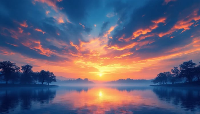
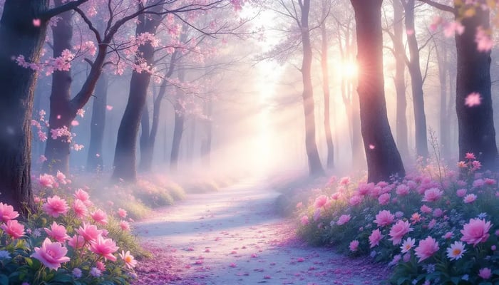
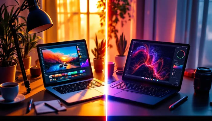
Here are the top Lightroom tips for creating a cinematic mood in your photos so that you can instantly elevate them, giving your images a dramatic, film-like quality.
With Adobe Lightroom, achieving this look is easier than you might think. In this post, we’ll dive into 10 essential Lightroom tips that will help you enhance the cinematic feel of your photos.
From color grading techniques to adjusting contrast and shadows, these tips will guide you in transforming ordinary images into scenes with deep, evocative moods.
Whether you're a beginner or a seasoned photographer, these Lightroom tips will take your editing skills to the next level. Here's how to create cinematic moods in Lightroom:
- Underexpose by -1 stop when shooting
- Use the Tone Curve for contrast and color
- Split tone with warm highlights, cool shadows
- Tweak HSL for specific color adjustments
- Add subtle film grain
- Create vignettes with Radial Filters
- Enhance clarity and texture selectively
- Adjust white balance for mood
- Use Graduated Filters for dramatic lighting
- Make precise edits with masking
Quick Comparison:
| Technique | Effect | Best For |
|---|---|---|
| Tone Curve | Contrast, color balance | Overall mood |
| Split Toning | Color in shadows/highlights | Film-like look |
| HSL | Fine-tune specific colors | Color grading |
| Grain | Texture, noise reduction | Film simulation |
| Vignette | Focus, depth | Drawing attention |
| Clarity/Texture | Detail enhancement | Sharpness, pop |
| White Balance | Color temperature | Setting atmosphere |
| Graduated Filter | Partial adjustments | Sky enhancements |
| Masking | Targeted edits | Precise adjustments |
Remember: Subtle tweaks often work best. Experiment to find your style, but don't overdo it.
Featured Video: Master the Art of Cinematic Photo Editing
Getting Ready in Lightroom
Let's set up Lightroom for smooth cinematic edits.
Importing and Sorting Photos
1. Import images directly into Lightroom. This handles identical file names and ensures all photos upload.
2. Cull in the Library module:
- Use flags, colors, or ratings for keepers
- Focus on keep/discard decisions
- Skip the Develop module (it's slower)
Speed Up Your Work
1. Master batch processing:
- Sync button: Apply edits across multiple photos
- Previous button: Copy settings to the next image
2. Set up presets:
- Create custom cinematic looks
- Apply during import to jumpstart editing
3. Adjust key settings:
Try this quick cinematic base:
| Setting | Value |
|---|---|
| Contrast | -15 |
| Highlights | -40 |
| Shadows | +30 |
| Whites | +12 |
| Blacks | +30 |
| Clarity | +60 |
| Vibrance | -5 |
| Saturation | -20 |
If +60 clarity looks too strong, dial it back.
4. Use the tone curve:
- Select "medium contrast" for an instant cinematic boost
5. Add a subtle vignette:
- Set post-crop vignetting to -15 for gentle edge darkening
These are starting points. Adjust for each photo's unique qualities.
Working with Tone Curves
The Tone Curve in Lightroom is your secret weapon for cinematic looks. It's all about tweaking contrast and color balance like a pro.
Creating an S-Curve
Want to add some oomph to your image? Here's how:
- Find the Tone Curve panel in Develop
- Hit that Point Curve icon
- Make an S-shape:
- Drag a point down in the shadows
- Pull another point up in the highlights
Boom! You've got instant drama.
For a film-like vibe:
- Nudge those shadows up a bit
- Bring the highlights down
- Flatten the curve ends
This trick gives you that soft, filmy look with less punch in the blacks and whites.
Playing with Color Channels
Time to get colorful:
- Pick a channel (Red, Green, or Blue)
- Tweak the curve to add or subtract color
- Remember: Up = more color, Down = less color
Want warmer shadows? Go to the Blue channel and pull down the bottom. Hello, yellow tones!
Pro move: Use the targeted adjustment tool. Click and drag right on your image. Lightroom does the curve magic for you.
| Channel | Up | Down |
|---|---|---|
| Red | More red | More cyan |
| Green | More green | More magenta |
| Blue | More blue | More yellow |
Split Toning for Color Effects
Split toning in Lightroom lets you add different colors to highlights and shadows. It's a quick way to give your photos a cinematic look.
Here's how to do it:
- Open the Color Grading panel
- Pick colors for highlights and shadows
- Adjust saturation for each
- Use the balance slider to fine-tune
Want that movie look? Try orange highlights with teal shadows. It's a classic combo that pops.
Cinematic Color Pairs
| Highlights | Shadows | Look |
|---|---|---|
| Orange | Teal | Hollywood classic |
| Yellow | Blue | Daytime cinema |
| Magenta | Green | Sci-fi vibe |
| Red | Blue | High drama |
For a subtle film feel:
- Keep saturation low (10-20%)
- Use warm highlights (yellows, oranges)
- Go cool on shadows (blues, teals)
"Split toning adds visual sophistication. Think moody and cinematic." - Jan Erik Waider, Landscape Photographer
Pro tip: Hold Alt (Option on Mac) while adjusting hue to see full effect. Makes color picking easier.
Using the HSL Panel With These Lightroom Tips
The HSL panel in Lightroom is your secret weapon for nailing that cinematic look. Here's how to use it:
- Hue: Shifts color tone
- Saturation: Tweaks color intensity
- Luminance: Adjusts color brightness
HSL Tips
Start small. These sliders pack a punch. For a moody vibe, dial down the saturation of main tones. Want to add some pop? Bump up the saturation of lighter tones like orange and yellow.
Pro move: Use the HSL Target tool. Just click on a color in your image and adjust.
Want that cinematic green? Here's how:
1. Find the green channel
2. Drop the saturation (-20 to -30)
3. Lower luminance a bit (-10 to -15)
4. Nudge the hue towards yellow (+5 to +10)
"Tweaking Hue (+14), Saturation (-28), and Luminance (+17) brightens the image and makes colors pop."
Remember: Make your big moves in the Basic panel first, then fine-tune with HSL.
| Color | Hue | Saturation | Luminance | What it does |
|---|---|---|---|---|
| Orange | +5 | -10 | +15 | Warms up skin |
| Blue | -10 | -20 | +10 | Deepens sky |
| Green | +10 | -25 | -10 | Moodier foliage |
Adding Film-like Grain With These Lightroom Tips
Want to make your photos look like they're straight out of a movie? Adding film grain in Lightroom is your secret weapon. It's not just about nostalgia - grain can hide flaws, add texture, and create a mood that digital just can't match.
Here's how to do it:
- Go to the Effects panel in Lightroom's Develop module.
- Find the Grain sliders: Amount, Size, and Roughness.
- Start with Amount: Try 20. This controls how much grain you're adding.
- Adjust Size: Depends on your image resolution. Start between 20 and 80.
- Fine-tune Roughness: Defines the grain's character. Start at 50 and tweak.
Natural-looking Grain
Balance is key for realistic film grain. Pro video editor and photographer Alik Griffin says:
"A little bit of grain can often hide little flaws or fringes that come from over-sharpening."
Tips for natural grain:
- Soft grain: Keep Roughness and Size close together.
- Crispy grain: Move Size and Roughness further apart.
- Always keep Roughness at least equal to Size.
There's no perfect setting. Experiment to find your style. Here's a starting point:
| Grain Type | Amount | Size | Roughness |
|---|---|---|---|
| Soft | 20 | 25 | 30 |
| Crispy | 25 | 20 | 50 |
Pro tip: Add grain to high ISO images to mask digital noise. It makes the image feel more organic.
Remember: Less is more with grain. Take breaks and come back with fresh eyes before finalizing your edit.
Creating Vignettes With These Lightroom Tips
Vignettes can make or break your cinematic edits. They're like a spotlight, drawing eyes where you want them. Here's how to nail them in Lightroom:
For a quick vignette:
- Hit the Effects panel in Develop
- Find Post-Crop Vignetting
- Slide Amount to -15
Boom. Instant mood boost for street shots, travel pics, portraits - you name it.
Radial Filters: Vignettes 2.0
Want more control? Radial filters are your friend:
- Grab the Radial Filter tool
- Draw an oval on your image
- Flip the mask (effect outside the oval)
- Tweak exposure, shadows, and clarity
Pro move: Layer multiple radial filters. It's like painting with light.
Quick comparison:
| Vignette Type | Good | Bad |
|---|---|---|
| Post-Crop | Fast, easy | Limited control |
| Radial Filter | Precise | Takes longer |
sbb-itb-b27063
Improving Clarity and Texture With These Lightroom Tips
Want to give your photos that crisp, cinematic look? Let's talk about Lightroom's clarity and texture tools.
Clarity is your midtone magic wand:
- Open Develop module
- Find Clarity slider in Basic panel
- Try +15 to +25 for a subtle boost
Don't overdo it. Too much clarity? Your image looks fake.
Now, Texture:
- Targets high-frequency areas (think fabric or skin details)
- More subtle than Clarity
- Start with +10 to +20
Quick comparison:
| Tool | Effect | Best for |
|---|---|---|
| Clarity | Midtone contrast | Overall punch |
| Texture | Fine detail enhancement | Specific areas |
Targeted Clarity Improvements
Want more control? Use the Adjustment Brush:
- Select Adjustment Brush tool
- Set Clarity to +20, Texture to +15
- Paint over areas to enhance
Pro tip: Hold Alt/Option while painting to see your mask.
Small adjustments make a big difference. Less is more.
Don't forget sharpening:
- Amount: Start at 50
- Radius: Keep at 1.0
- Detail: Try 25
- Masking: Hold Alt/Option, drag to apply selectively
These tools are your secret weapons for that cinematic look. Play around, find what works for you.
Changing White Balance for Mood
White balance in Lightroom can transform your photos' mood. By tweaking temperature and tint, you'll create a cinematic vibe that boosts your storytelling.
Color Temperature Basics
Color temperature is measured in Kelvin (K):
| Light Source | Kelvin Range |
|---|---|
| Candlelight | 1900K |
| Golden Hour | 2800K-3000K |
| Midday Sun | 5000K-5500K |
| Overcast Sky | 6500K-7500K |
| Blue Sky | 10000K |
Lower numbers = warmer tones. Higher numbers = cooler tones.
Lightroom Tips for White Balance Tweaks
- Open Develop module
- Find White Balance section
- Use Temperature slider for warmth/coolness
- Fine-tune with Tint slider
Pro tip: Start with Auto, then manually adjust.
Mixing Warm and Cool
Want a cinematic look? Mix warm and cool tones:
- Set base temperature for main subject
- Use local adjustments for contrasting temperatures
- Keep skin tones slightly warm
Small changes go a long way. A 500-1000K shift can make a big impact.
Mood-Setting White Balance
Different temperatures = different vibes:
- Warm (2000K-4000K): Cozy, intimate
- Cool (7000K-9000K): Calm, mysterious
Example: The 2003 film "Thirteen" used color grading to show the main character's journey. They started dull, moved to orange (danger) and green (corruption), and ended vibrant (hope).
Using Graduated Filters With These Lightroom Tips
Graduated filters in Lightroom are game-changers for enhancing skies and foregrounds. They let you tweak specific parts of your image without messing with the rest.
Creating Dramatic Lighting
Here's how to use the Graduated Filter tool:
- Pick it in the Develop module (or hit M)
- Click and drag across your image
- Hold Shift to keep it straight
Now, let's make your photos pop:
Darken skies: Drag down from the top and lower exposure. A -0.50 exposure can work wonders for a sunrise shot.
Boost sky colors: Crank up the Saturation for those blue skies. Don't worry, it won't mess with your foreground.
Add contrast to clouds: More Contrast = more dramatic cloudy skies.
Pump up sunrise/sunset colors: Use presets for orange, red, or purple to really set the mood.
Rey Benasfre, a Visual Flow Ambassador, swears by the Graduated Filter with the Sky & Clouds Brush Preset for jaw-dropping skies and clouds.
Pro tip: Hit O to see where the filter's working. Shift + O changes the mask color.
Want more control? Try these:
- Use the Brush tool to erase filter effects from specific spots
- Add color effects with the "Color Box" in the Graduated Filter panel
- Play with the Sharpness slider for partial blur effects
Masking for Precise Edits With These Lightroom Tips
Masking in Lightroom lets you make targeted adjustments to specific areas of your image. It's key for creating cinematic moods without affecting the whole photo.
Brush Tools for Local Changes
The Brush tool is perfect for precise edits. Here's how to use it:
Access the Brush tool: Press 'K' or find it in the Develop module.
Adjust brush settings:
- Size: '[' and ']'
- Feather: Shift + '[' and ']'
- Flow and Density: Control in brush panel
Paint your mask: Click and drag over areas to edit. Use Auto Mask ('A') for edge detection.
Fine-tune: Hold Option/Alt to erase parts of the mask.
Make adjustments: Use sliders to change exposure, contrast, color in the masked area.
Pro tip: Toggle mask overlay with 'O' to see where adjustments apply.
Quick reference for cinematic effects:
| Effect | Mask Area | Adjustment |
|---|---|---|
| Vignette | Image edges | Lower exposure, increase contrast |
| Highlight subject | Around subject | Increase exposure, clarity |
| Moody atmosphere | Background | Lower exposure, adjust white balance |
| Dramatic sky | Sky | Increase contrast, adjust hue/saturation |
For a cinematic look, less is more. Small tweaks often work best.
"Masking is the secret sauce for creating mood in your images. It's not about changing everything, but enhancing what's already there", says Adobe Lightroom expert Julieanne Kost.
Final Touches in Effects Panel With These Lightroom Tips
The Effects panel is where you'll add that cinematic flair to your images. Here's how to use it like a pro:
Dehaze: Your Atmosphere Maker
Dehaze can make or break your cinematic look:
- Slide right: Adds clarity. Great for foggy scenes.
- Slide left: Creates a dreamy vibe.
For a noir feel, try +10 to +20 Dehaze with a subtle vignette.
"Dehaze is like seasoning. A little goes a long way, but too much ruins the dish."
| Dehaze | Result |
|---|---|
| -20 to -10 | Dreamy look |
| 0 | No change |
| +10 to +20 | Subtle pop |
| +30 to +50 | High contrast |
Don't go overboard. +50 and up? Your image might look fake.
Vignette: Spotlight Your Subject
- Amount: Start at -15 to -30
- Midpoint: 60-80 for a slow fade
- Roundness: -20 for widescreen vibes
- Feather: Keep it high (50-70)
Want to mix it up? Try a white vignette with a positive Amount.
Wrapping Up Our Lightroom Tips
Creating a cinematic mood in Lightroom boils down to mastering light, color, and effects. Here's a quick recap to help you develop your style:
Push Your Boundaries
Experiment to find your unique cinematic look:
- Mix warm and cool tones
- Play with dramatic lighting
- Explore color grading
| Technique | Effect | Example |
|---|---|---|
| S-Curve in Tone Curve | Increases contrast | Noir-style shadows |
| Split Toning | Adds color to highlights/shadows | Teal and orange look |
| Grain | Adds texture | Film-like appearance |
| Vignette | Draws focus to subject | Subtle darkening of edges |
These are just starting points. Find what works for your images and style. Practice will help you develop an eye for what makes a photo cinematic.
"Cinema has perhaps the most thoughtful post-processing workflow of any visual medium, and so there is a lot that can be learned from it."
This quote nails it. Study films, apply these techniques in Lightroom, and transform your photos into visual stories.
Don't be afraid to break the rules. Your unique vision will set your work apart and give it that cinematic edge.
FAQs on These Lightroom Tips
How to make photos look cinematic in Lightroom?
Want that movie-like feel in your photos? Here's how to do it in Lightroom:
1. Tweak the lighting: Play with exposure, contrast, highlights, and shadows.
2. Warm it up: Shift temperature towards yellow and tint towards magenta.
3. Get that cinematic color: Use HSL sliders and color wheels for a cohesive look.
4. Add some effects: Bump up texture and clarity, then throw in a subtle vignette.
5. Sprinkle in some grain: But go easy - too much can ruin the effect.
How do I edit a photo to make it cinematic?
Here's the secret sauce for that cinematic feel:
- Play with curves: Pull the white point down and black point up. Less contrast = more cinematic.
- Dial down saturation: Just a tad. It'll give you that film-like vibe.
- Warm it up: Try nudging the color temperature up a bit.
- Consider a crop: Want to go all out? Try a 2.35:1 aspect ratio.
How to color grade properly with these Lightroom Tips?
Lightroom's color grading is all about those three wheels:
| Wheel | What it does | Pro tip |
|---|---|---|
| Shadows | Tweaks dark areas | Add blue for night scenes |
| Mid-tones | Adjusts middle range | This is your mood maker |
| Highlights | Changes bright areas | Yellow or orange for a natural look |
Start with highlights and shadows, then fine-tune with mid-tones.
Is Lightroom good for color grading?
For beginners? Lightroom's a great place to start. It's:
- Easy to use
- Quick to learn
- Strikes a good balance between control and simplicity
But if you're after pro-level color work, some folks prefer Photoshop's extra bells and whistles.
"If you're just dipping your toes into color editing, Lightroom's a solid choice. It's quick and intuitive." - Austin James Jackson, Landscape Photographer


.png)

