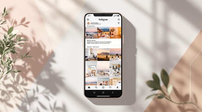

Creating a consistent Instagram feed isn’t just about looks - it’s a powerful way to boost your brand. A unified aesthetic builds trust, increases engagement, and makes your content stand out. The easiest way to achieve this? Lightroom presets.
Here’s what Lightroom presets can do for you:
- Save time: Apply pre-set edits like exposure and color balance with one click.
- Build a signature style: Choose or create presets that reflect your brand’s personality.
- Keep your feed cohesive: Ensure every photo matches your visual theme.
Quick Steps to Get Started:
- Choose or create Lightroom presets that match your style.
- Apply presets to your photos and make minor adjustments as needed.
- Use tools like Planoly to organize your feed layout and maintain balance.
A polished Instagram feed is within reach. Let’s dive into the details.
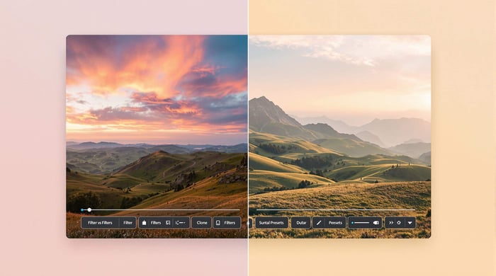
What Are Lightroom Presets and How Do They Work?
Understanding How Lightroom Presets Work
Lightroom presets are pre-set configurations that instantly apply edits - like exposure, contrast, and color balance - to photos with just one click. As Julieanne Kost, Adobe Principal Evangelist for Photography, explains:
"Presets are a great way to achieve a consistent look in your photos, and they can save you a lot of time in the editing process" [2]
These presets are a time-saver, cutting out repetitive manual adjustments. They allow you to quickly establish a cohesive style while leaving room for minor tweaks. This is especially helpful for photographers aiming to maintain a uniform look, such as on Instagram. In fact, 62% of photographers say presets help them keep their work consistent [2].
Different Types of Lightroom Presets
Lightroom presets come in a variety of styles to suit different needs. Here’s a breakdown of some popular types and where they shine:
| Preset Type | Best Used For | Key Characteristics |
|---|---|---|
| Cinematic | Storytelling content | Deep contrasts, dramatic tones |
| Vintage | Nostalgic imagery | Muted colors, film-like texture |
| Bright & Airy | Lifestyle content | High exposure, soft highlights |
| Minimalist | Product photography | Clean whites, subtle changes |
| Moody | Artistic shots | Deep shadows, rich tones |
While presets provide consistency, they can - and should - be adjusted to match your style. For example, a preset designed for landscapes might need tweaks to work well with portraits. The goal is to find presets that complement most of your photos while achieving the aesthetic you’re aiming for.
Keep in mind that presets are just a starting point. Fine-tuning settings like exposure or color temperature ensures each photo looks polished while still aligning with your overall visual theme.
With this understanding of preset types, you’re ready to dive into choosing or creating ones that suit your Instagram feed perfectly.
How to Pick or Make the Right Presets
Tips for Choosing Presets That Match Your Style
Choosing presets that reflect your brand's visual identity helps maintain a polished and cohesive Instagram feed. Start by reviewing your current content to identify key visual elements that define your style. Pay attention to these three aspects:
| Aspect | What to Consider | Why It Matters |
|---|---|---|
| Color Palette | Brand colors, tonal preferences | Keeps your visuals aligned |
| Lighting Style | Bright/dark, contrast levels | Sets the mood and atmosphere |
| Overall Mood | Warm/cool, vibrant/muted | Highlights brand personality |
When exploring preset options on platforms like Presets.io, test them on a variety of photos - portraits, landscapes, or product shots - to ensure they work well with your typical content. Check how they perform in different lighting conditions, such as bright or low light, and across various subjects. A good preset should enhance about 80% of your photos without heavy tweaks.
Before making a purchase, look for providers that offer:
- Previews to see how the presets look
- Clear installation instructions
- Tips for making adjustments
Steps to Create Custom Lightroom Presets
Making your own presets gives you full control over your Instagram look. Here's a step-by-step guide to creating a preset that matches your style:
1. Choose Your Base Photo
Start with a photo that’s well-exposed and represents the type of content you usually post.
2. Make Core Adjustments
Focus on these key settings:
- Adjust basic exposure and contrast
- Set white balance to ensure consistent color tones
- Use the tone curve to add depth and mood
- Apply color grading to create your signature look
3. Fine-Tune the Details
Refine your photo with adjustments like clarity, texture, and split toning for highlights and shadows. Add grain or vignetting for extra character.
4. Test and Refine
Apply your preset to different types of photos and watch for common issues, such as:
- Overdone effects in high-contrast scenes
- Unnatural color shifts in varied lighting
- Inconsistent skin tones in portraits
Tweak your settings until the preset works well across a range of images. A well-made preset should enhance your photos while keeping them natural.
Pro tip: Create several versions of your preset tailored for different lighting conditions (e.g., indoor, outdoor, low light) while keeping your core aesthetic intact. This ensures your feed stays consistent, no matter the scenario.
Once you've nailed your presets, you're ready to apply and tweak them for seamless results across your Instagram feed.
How to Use and Adjust Presets for Better Results
How to Apply Presets in Lightroom
Applying presets in Lightroom is straightforward but varies slightly between the desktop and mobile versions. On the desktop, head to the Develop module and find the Presets panel on the left. For mobile, go to the Edit menu and look for the Presets tab at the bottom.
Here’s a quick guide to applying presets on both platforms:
| Action | Desktop | Mobile |
|---|---|---|
| Select Multiple Photos | Press Ctrl/Cmd + Click | Long press, then tap additional photos |
| Access Presets | Develop module > Left panel | Edit > Presets tab |
| Batch Edit | Use "Sync" feature | Copy edits, then paste them |
| Preview Changes | Press "\" key | Tap and hold the photo |
Start by applying a preset to one photo. Then, use the Sync feature (desktop) or Copy and Paste edits (mobile) to apply the same changes across similar images. This keeps your photos visually consistent and aligned with your chosen style.
Adjusting Presets for Individual Photos
Presets offer a great starting point, but fine-tuning is essential to adapt them to different lighting or shooting conditions. Pay attention to these key adjustments:
| Adjustment Type | When to Use | Common Settings |
|---|---|---|
| Exposure | For uneven lighting | Adjust ±0.5 to ±1.0 stops |
| White Balance | Mixed light sources | Use Temperature and Tint sliders |
| Color Grading | To unify tones | Adjust Highlights, Shadows, Midtones |
| Detail | For texture and sharpness | Use Clarity, Texture, Sharpening tools |
Begin with exposure and white balance to correct lighting and color. After that, use color grading to refine the overall tone. For portraits, focus on skin tones by tweaking highlights and shadows. For landscapes, enhance clarity and vibrance, but keep edits subtle - small changes (like a 10% increase) often work best to avoid oversaturation.
To keep your aesthetic consistent, compare your edits in grid view. This helps ensure your photos work together as a cohesive set without making them look identical. Instead of matching every detail, aim for a similar mood and color palette across your images.
The goal is to create a balanced, polished look that ties your feed together while letting each photo stand out in its own way. Once your edits are consistent, you can move on to organizing your feed for maximum visual appeal.

How to Plan and Organize Your Instagram Feed
Using Tools to Plan Your Feed
Consistently applying Lightroom presets lays the groundwork for a visually unified Instagram feed. Tools like Planoly and Preview can make the process easier by offering grid previews, scheduling options, and performance analytics.
Here’s how these features can help streamline your feed planning:
| Feature | Purpose | Best Practice |
|---|---|---|
| Grid Preview | See how posts look together | Test layouts before posting |
| Content Calendar | Schedule posts in advance | Plan content 2-3 weeks ahead |
| Analytics Dashboard | Measure performance | Track engagement weekly |
| Story Planner | Sync stories with posts | Match stories to your feed’s vibe |
After editing your photos with Lightroom presets, upload them to your planning tool. This step helps you spot any mismatched visuals or transitions before your posts go live. The goal is to create a smooth, visually pleasing sequence that reflects your brand.
Once your presets and tools are aligned, it’s time to arrange your content for maximum visual appeal.
Simple Techniques for a Balanced Feed
With your feed planned, focus on layout strategies that enhance both harmony and engagement. A well-balanced feed requires thoughtful organization. Start by alternating between different types of content while sticking to your preset-based aesthetic.
Here are some layout ideas to inspire your feed design:
| Layout Pattern | Description | Visual Impact |
|---|---|---|
| Checkerboard | Alternate light and dark images | Adds rhythm and variety |
| Color Blocking | Group photos with similar tones | Creates cohesive sections |
| Diagonal Flow | Align similar elements diagonally | Guides the viewer’s eye |
| Row Theme | Group similar content in rows | Keeps content organized visually |
To avoid overwhelming your audience, pay attention to how vibrant images are spaced out. For instance, if you’re using bold, high-contrast presets, mix in subtler photos to create natural breaks and keep your feed visually appealing.
Finally, think in rows of three. Since Instagram shows three posts per row, plan your content in these groupings to create mini-stories within your feed. This approach not only enhances your overall aesthetic but also ensures a consistent flow that tells a cohesive visual story.
How to Get a Consistent COHESIVE Instagram Feed
Wrapping Up
Crafting a cohesive Instagram feed with Lightroom presets is a mix of creativity and technical know-how. The key is blending your personal style with the efficiency that presets offer.
Consistency is Key: Presets help establish a uniform look, but they’re just the starting point. Adjustments are essential to ensure each photo fits seamlessly into your overall aesthetic.
Essential Workflow Elements: A solid editing process hinges on a few critical components:
| Component | Purpose | Role in Consistency |
|---|---|---|
| Preset Selection | Sets the foundation for style | Creates a consistent base look |
| Custom Adjustments | Tailors edits to each photo | Keeps quality aligned with style |
| Feed Planning | Organizes your layout | Ensures a visually pleasing grid |
| Regular Review | Evaluates overall harmony | Keeps your brand identity intact |
By combining these steps, you can streamline your editing process, create a polished Instagram feed, and strengthen your brand’s visual presence.
Your Instagram feed is a reflection of your growth and creativity. Start with a clear vision, leverage presets, and plan your posts for a harmonious look. Lightroom presets are a fantastic tool to help you create a cohesive feed that truly represents your brand.
FAQs
Now that we've covered Lightroom presets and feed planning, let's dive into some common questions about achieving a consistent Instagram feed.
How can I create a consistent Instagram feed using Adobe Lightroom?
Building a consistent Instagram feed takes a focused approach. Here are the key steps:
| Step | Purpose |
|---|---|
| Style Selection | Sets the foundation for your visuals |
| Preset Creation | Simplifies and speeds up editing |
| Editing Process | Ensures a uniform look across images |
The goal is to keep your feed visually aligned while introducing small creative touches to keep it fresh [2][4].
How do I make Instagram photos look consistent?
Consistency in your Instagram photos comes down to a few essential techniques:
Key Technical Tips:
- Shoot in RAW format for better editing flexibility.
- Use batch editing to apply the same adjustments to similar photos.
- Keep exposure levels steady across your images.
- Stick to the same cropping ratios for a uniform layout.
A consistent style helps your photos stand out and makes your feed instantly recognizable, while small variations keep it visually appealing.